
My thoughts on Antipol
The sans-serif display typeface Antipol by Roland Hörmann is near and dear to my heart. Not just because Roland’s office is next to the hip coworking office in Vienna, where I was located for 12 years. (You know, the time before I left to live a boring small-town life with three kids and a house. Gee, I hope my family still does not read my newsletters, even though I forced my wife to be the first subscriber 😅). Antipol it is also special to me, because using it in a project makes me feel that I’m still cool, and young, and urban.
But what’s exactly so fontastic about it? It’s a so-called horizontal or reversed stress typeface. This means it deliberately flips the aspect ratio of horizontal and vertical stroke widths. And this is what breaks our visual conventions.
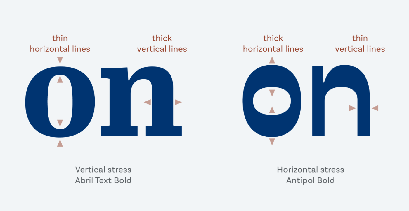
This is the reason why Antipol looks so cool, and arty, and a bit crazy. Like the popular typeface Antique Olive from the 1960s. So it also has some retro vibes going on. I can vividly imagine it taking you back to a 70ies sci-fi poster for example. Antipol is not suited for long reading text. If you have only a little text, it will work fine, and sprinkle it with extra personality. So use it in titles or headings, maybe in a short paragraph. What comes quite handy are the three different widths and weights when you apply it in a striking display.
Recommended Font Pairing
If you need something similar for body or functional text, the dynamic sans-serif typeface Massilia, but also geometric Fixel would be a good match.


Learn more about pairing typefaces using the Font Matrix.
What do you think? Is Antipol something for an upcoming project? Tell me in the comments below!
Interesting find! Another favourite reverse stress typefaces of mine is Ribes from Colletttivo: http://collletttivo.it/
Absolutely, Thomas! Thanks for sharing it!
Antipol, you know me, Oliver, I chose the skinny one. Antipol is the star of the movie poster or a book cover.
Surprisingly, Antique Olive, you know it! I thought no one knows that noble font. It’s like an old lady from a kingdom family.
On the other hand, Antipol is more of a genderless, modern type. It has a futuristic vibe in the star-like cross on T. Antipol is Gemini in astrology. It has two or more personalities. Look at the wide version, at one point it’s cowboy-induced, Western cartoonish. In other, it’s all future-spacey. Very intriguing, yet naive at the first glance!
Love that Antique Olive comparison to the old lady 😍!
No wonder why I do what I do – creative writing. Thanks to, often, an ever-inspiring content like yours.💫
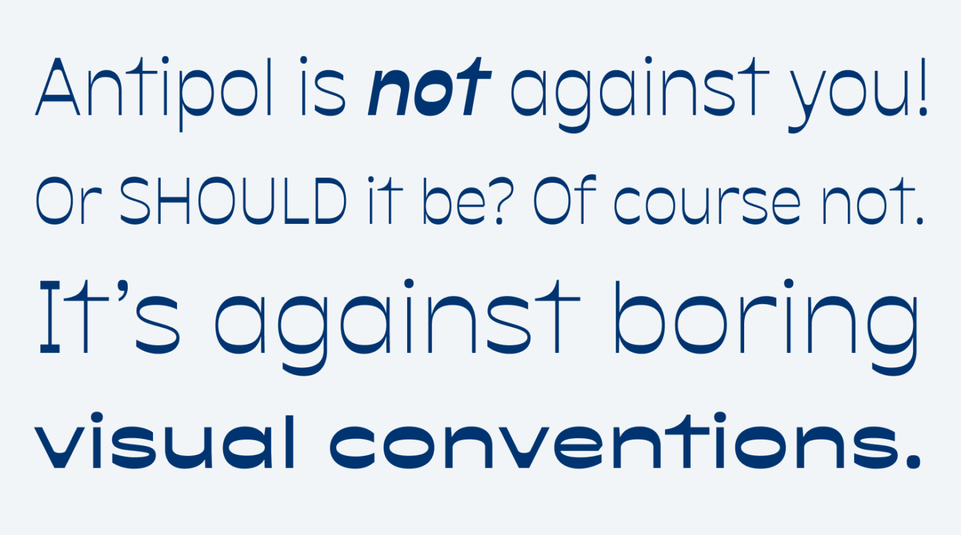
Antipol is “anti-boring”! They have beautiful examples on their website. Thanks for share this 😀
Glad you enjoy it, Caco 😎!