
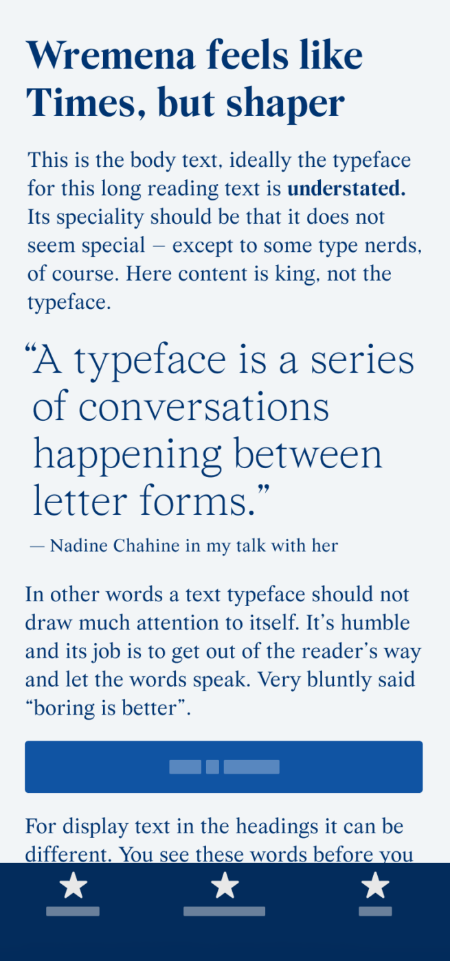
My thoughts on Wremena
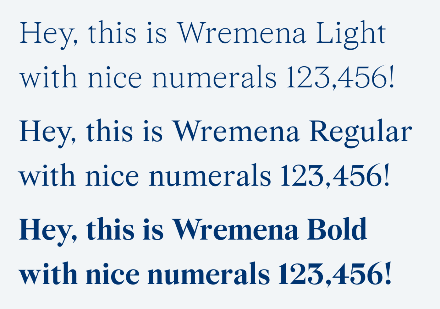
Last time I suggested an alternative to overused Roboto, this week I’ll present you with a fresh choice for the most widespread typeface of all, Times New Roman. Wremena caught my attention because of its beautiful light weight and the striking triangular serifs. Both give this free font a certain twist, something interesting, and out of the ordinary while not being too distracting.
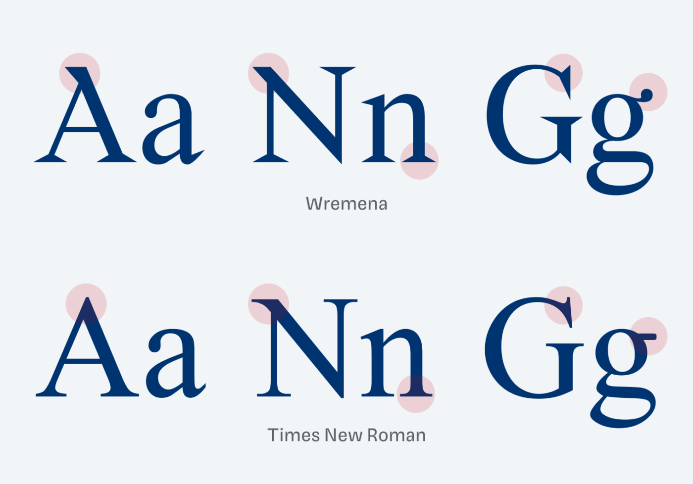
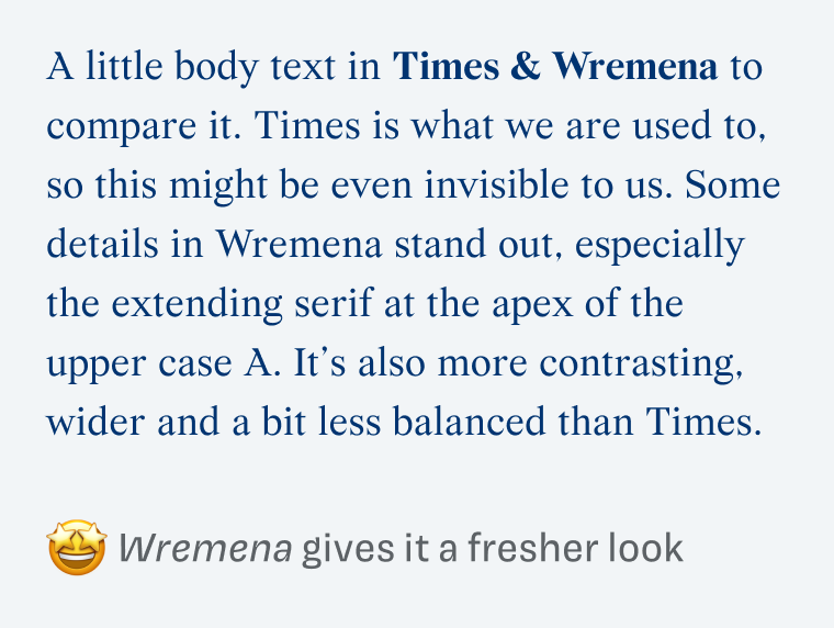
The details are what makes Wremena so special. Look at the triangular serifs, the flag serifs at the top of the A, the sharp serif at the top left of the N, and in contrast the delightful drop shaped ear of the lower case g.
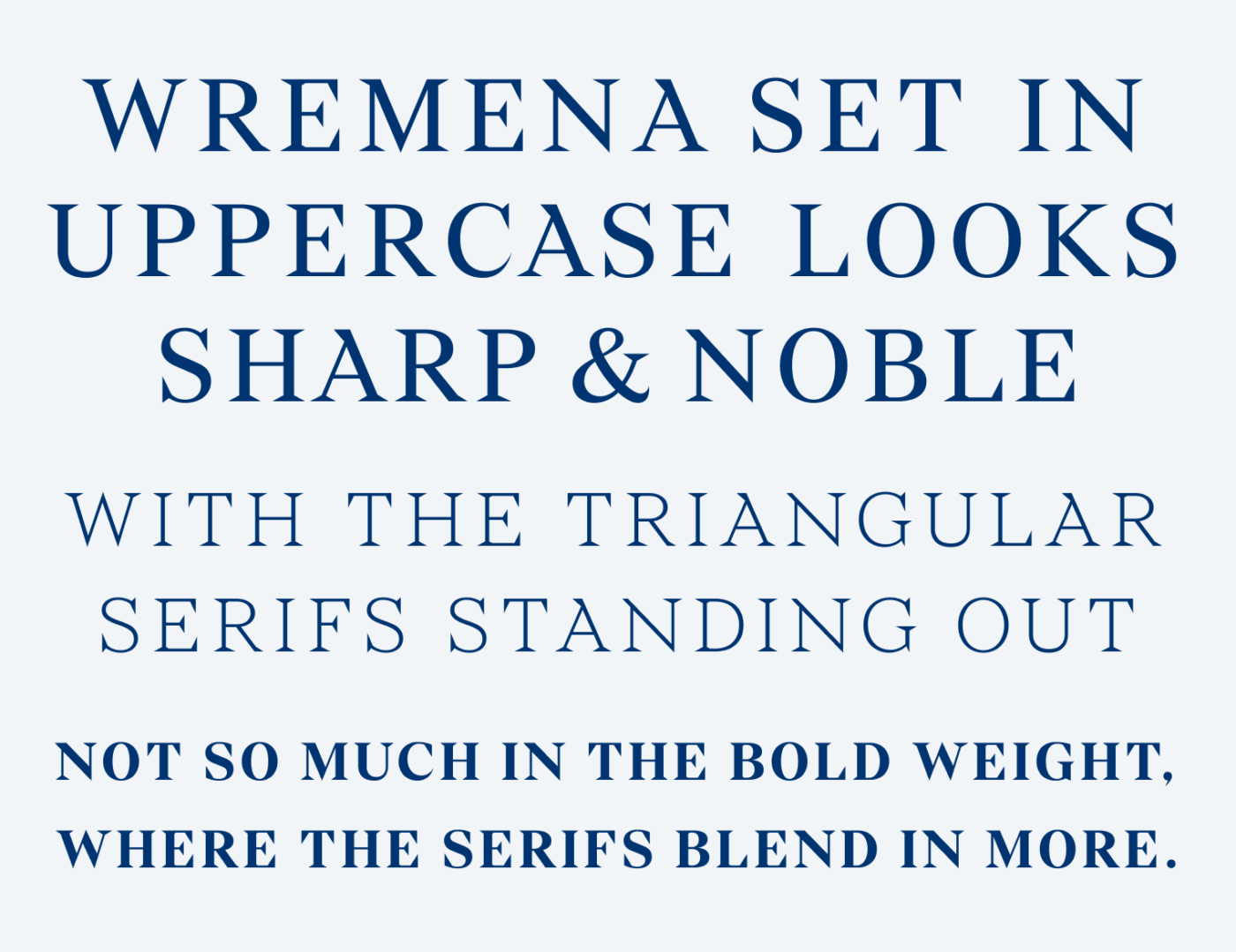
At large, these details also make the typeface more interesting for headings, and especially in all caps. I really enjoy looking at the Regular and Light weights. Bold seems less interesting, since the stems and serifs are less contrasting there.
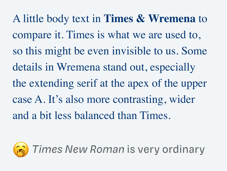
Side by side compared to Times New Roman you can see, that Wremena is fresher, wider, but also a little less balanced. Vertical letters like the y and the w feel a bit too short, not so sure why.
Next time you look for a cool alternative to Times New Roman that’s not that far away, give Wremena a try! Use it in slightly larger sizes and avoid it for anything below 16 px, where it would become too delicate.
Font Pairings for Wremena
Wremena is a quite dynamic, contrasting serif typeface. Create an overall softer impression by pairing it with playful, quite dynamic Sirenia for headings.


Learn more about pairing typefaces using the Font Matrix.
What do you think? Is this typeface something for an upcoming project, or do you have a font recommendation? Tell me in the comments below!
Well, well, Wremena, or in my language Vremena means Times’ – time but plural, anyway Roman😄
This is ou so nice surprise. You’re right about the small w, it’s short 🤔 but it’s not ruining Wremena’s elegance and nobility. This is a serious font! I can’t believe it’s free. So much dignity yet not inaccessible or cold. It’s a mature type.
I like the bold option when in combination with regular and light, it gets dynamic. And all caps are striking-strong attitude bold. Look at the word Wremena, letters – mild ocean waves.
I see its use in some historical, societal, political organization. Definitely saving it to my archive of favorites!
Have you reviewed Vollkorn?
Oh, now this makes perfect sense! It’s from a Russian type designer, of course! Those are all good applications, Jana. It definitely is something serious.
No, I have not reviewed Vollkorn yet. I tend to avoid the super popular Google Fonts, but it’s a very friendly typeface!
Hi Oliver!
Thanks for the recommendation.
I’ll use this font for a lawyer website, I’ll share the result with you as soon as I finish the website.
Best!
Very cool, Caco! Thanks for sharing, very curious how it will turn out. I’m sure it will look great 😉
You may be familiar with Nowie Vremena, a sans-serif from same type designer. https://www.myfonts.com/collections/nowie-vremena-font-abstrkt?rfsn=6624849.1cf93c