
My thoughts on NaN Holo
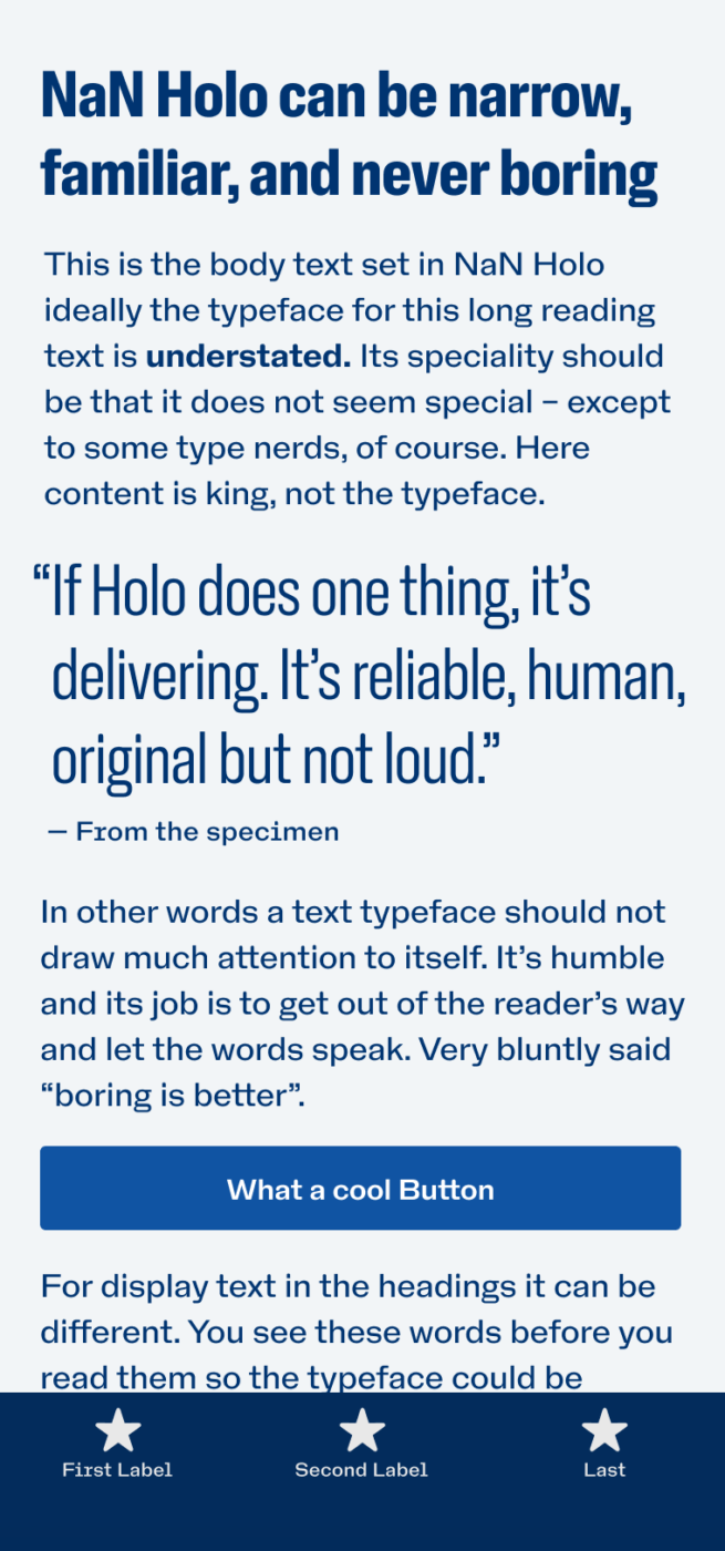
For many applications, Roboto and San Francisco are okay. They are the defaults, and this Neo-Grotesk style is currently expected in UI design. But maybe you want to break out of that, while not going into a totally different direction? Add a bit more warmth and uniqueness to the visual voice of your project? This is where NaN Holo comes into play.
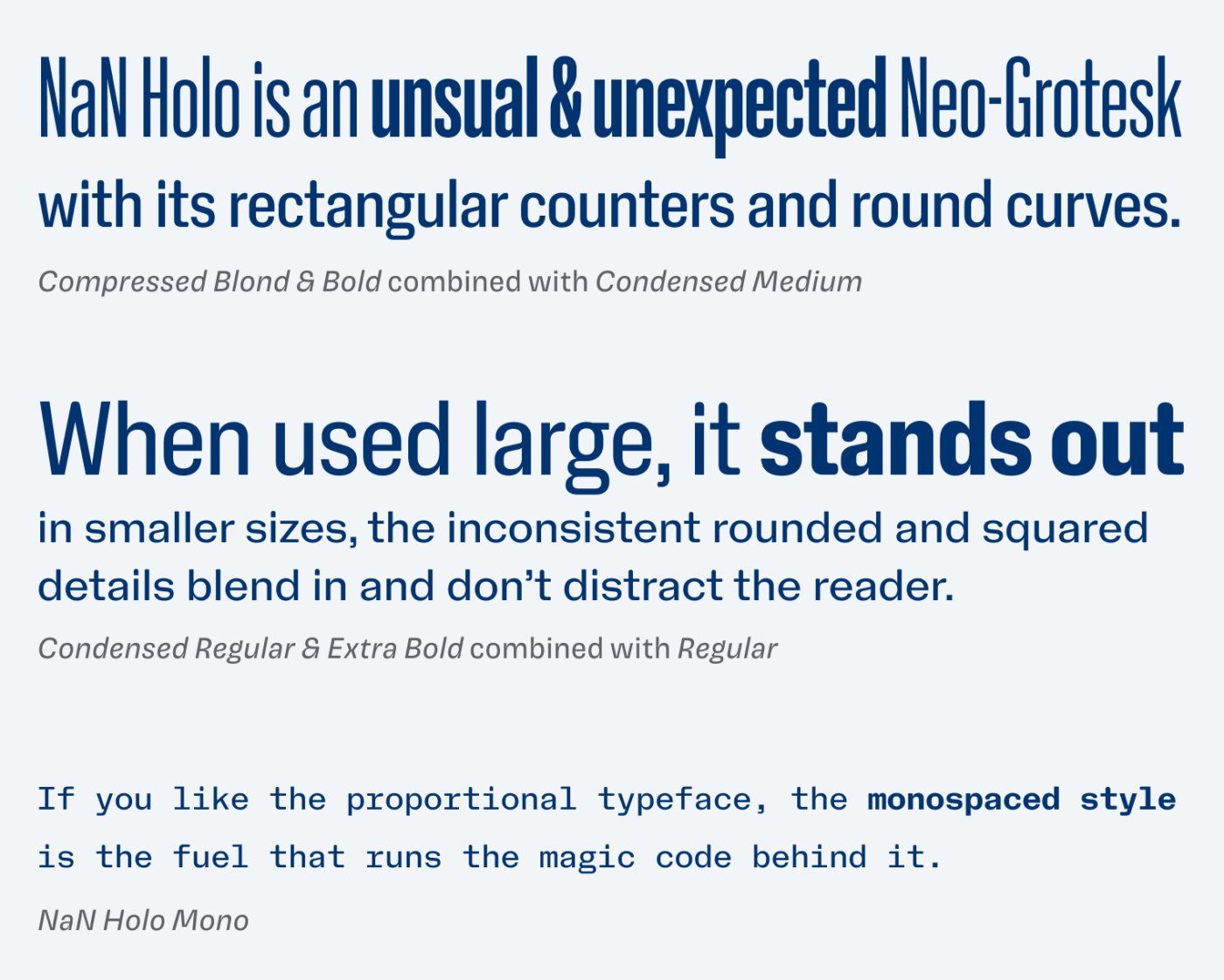
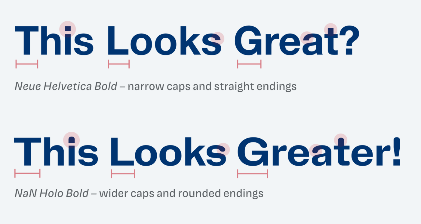
Nan Holo is an unusual interpretation of that Neo-Grotesk style. The typeface comes with rectangular counters and rounded curves. So you break out of that sameness in larger sizes, where more attention is drawn to them, while they blend in nicely when it comes to small text. Classic win-win situation 😉. When you compare it to the archetypical Neo-Grotesk Helvetica, you see the differences.
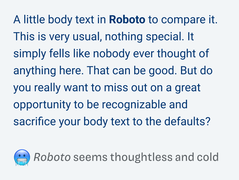
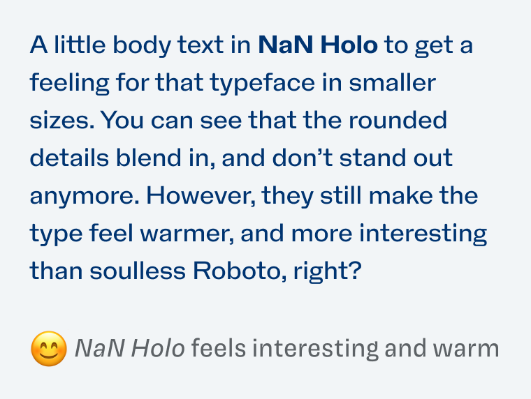
These tiny details add up, so your text creates an over all warmer impression, while still being related to that overall style. See how it looks compared to Roboto.
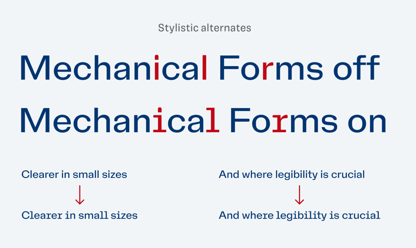
Besides the possibility to make NaN Holo narrower, I see great potential for UI and app design in this typeface. Especially the stylistic alternates with mechanical forms improve legibility for smaller sizes or functional text. And there is also a simple alternative to the striking double-story g, if it is too much for you.
So next time a client demands you to use the overused defaults, sneak in NaN Holo and use all its greatness and subtle weirdness. Watch a short video review of this typeface on YouTube.
What do you think? Is NaN Holo something for an upcoming project, or do you have a font recommendation? Tell me in the comments below!
The name is in the game 😉 Oliver, now we’re talkin’! 🤝🏻
Compressed Bold and Condensed Medium yes, please.
Nan Holo is all-inclusive 👏🏻 That’s its specialty.
For the next 2 months, I’m going to do a whole verbal branding – project for my client. And besides (micro) & brand website copy, I’m immersing my fingers in creative direction as well. I can easily see NaN Holo there. So, if the concept and their budget permits, I’d recommend it to the designer.
The best part of this font that makes it friendlier and non-generalist is ‘rectangular counters and rounded curves’. Thank you, O.!
Very neat, Jana! If they use it, let me know and I’ll share it! Always eager to know what comes of my suggestions.
It is very smooth. I find I keep seeing the lower case ‘y’ given the more angular nature of it.