
My thoughts on Sirenia
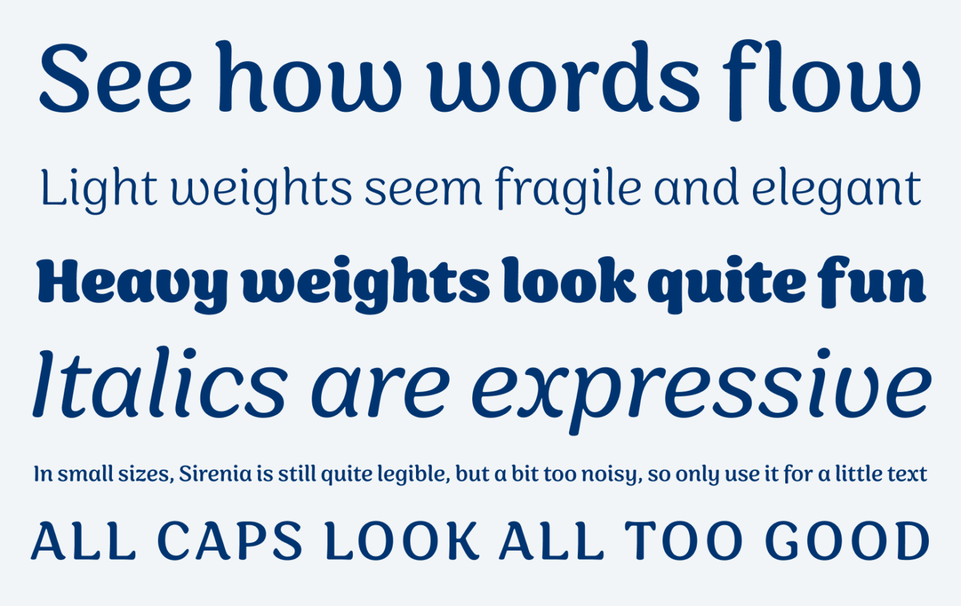
The flowing, organic display typeface Sirenia was designed by Felix Braden. You might already know Felix from Capitana or Arpona, but this typeface is quite different, seeming very natural and smooth. You feel the calligraphic background of this beauty, while the tender contrast, and the soft curves create a natural vibe. Interesting are also the diverse aesthetics of the thin and thick weights. Light feels more elegant and airy, while Bold and Black shift the atmosphere into something playful and cheeky.
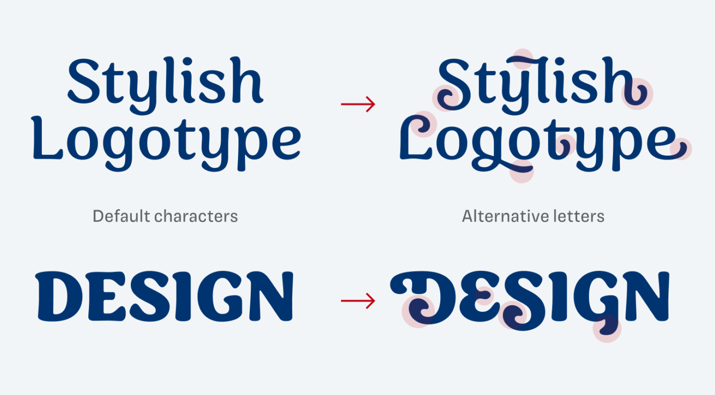
But to me the biggest advantage of Sirenia lies in the many stylistic alternates. Every character has at least one alternative, and for many up to four variations. It is a lot of fun to browse through all the possible characters, ornamental swashes or spectacular medium letters. You really have to hold yourself back a bit, so the end result won’t be over the top 😅. Truly a great typeface for stunning headings or logotypes.
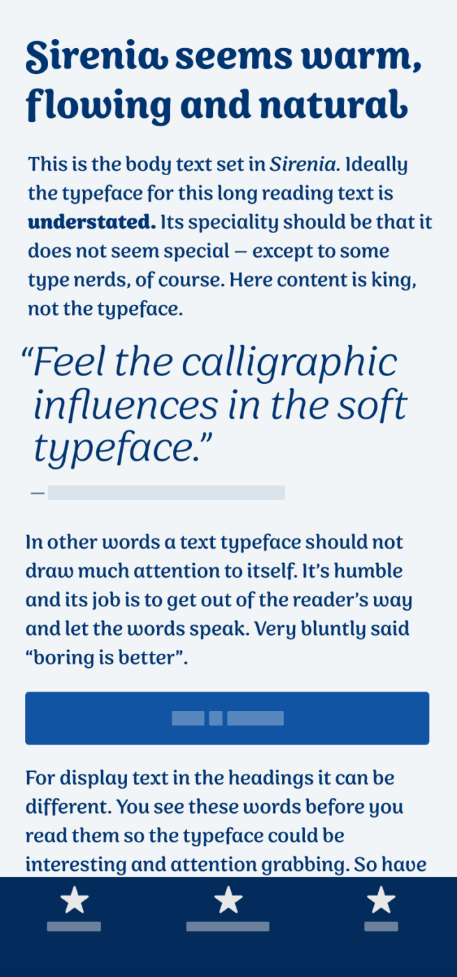
Interestingly enough, Sirenia is also quite legible in smaller sizes. But I would not recommend it for body text or tiny UI text. In these situations the typeface appears a bit too noisy, wavy and intrusive. So use it for headlines, titles, maybe a little intro text. It will definitely shine in branding or packaging projects, and everywhere, where you want to convey a certain authenticity and naturalness.
Font Pairings for Sirenia
Sirenia is a contrasting sans-serif typeface that lies between dynamic and rational form models. So it would pair well with both. For body text, I’d recommend warm and clean Commissioner or very different Wremena.

- Headings
- Copy


Learn more about pairing typefaces using the Font Matrix.
Do you have another font recommendation I should share? Tell me in the comments!
What do you think of this week’s typeface? Let me know in the comments!
Her Majesty, Sirenia dances, and flows effortlessly on the screen. 💃🏻She’d be great for a creative publishing platform.
Long reading text? Still good! I don’t mean paragraphs of paragraphs but a decent 7-8 rows, could be!
Look at Light weight, even if it’s fragile it’s stable though. I’m certain, Sirenia will be at the top of Pimp My Type for 2023.
Haha, good to hear that you already have a favorite 😉!