The number one mistake in web typography is not providing the font files. This might have happened with Wordle – the super popular word guessing game, that floods your social media – too. This post and short video are about how it would look better with the intended typeface, and how you can have that superior typographic experience as well.
After reading this article, you will learn about CSS font stacks, what makes a good font for games (hence user interfaces), what impact typography has on a digital product, and why you should care. Ready? Then let’s start!
I didn’t want to look into this
The story begins with Artur. He is one of the lovely 1,079 subscribers to the Pimp my Type newsletter, and asked me:
“Have you heard about Wordle? What do you think about the font?”.
I have! Played it twice, but did not really think about it a lot. It seemed to me, it used the sans-serif browser default fonts. Yes, you could totally make it visually more interesting, but it didn’t really hook me, a lot of things could look better. Just to be sure, I checked the stylesheet. And there something sparked my interest. Wordle was supposed to look better than it actually does! The font-family I saw was not the one of the first spot in the font stack. Why? And how would the game look like in that mysterious typeface?
Wordle’s font stack
The CSS font stack is a list of typefaces in which the text of a website should be display in. In Wordle’s case, it looks like this:
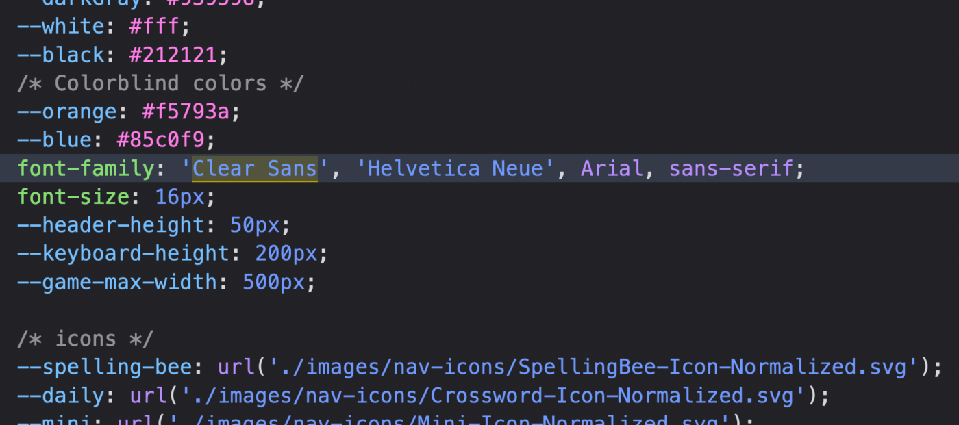
You can never be sure, if a web font is loaded, or if a certain font-family is locally installed on a device. This is why it’s common practice to add several font-families in descending preference, separated by a comma. The browser moves through the list, and renders the site in the first available font-family. The font stack should end with a generic keyword. If none of the font-families is available, this will then fall back to the default in that category. In Wordle’s font stack, it is sans-serif.
Nothing special about this, so far, except the first choice on that list: Clear Sans. But why is it, that Clear Sans is not shown then? That’s because it is not a preinstalled system font on any device, and the web fonts were not provided in the CSS.
Wordle looks different on every platform
So, Clear Sans is not available. Let’s take a look at the font stack again:
font-family: 'Clear Sans', 'Helvetica Neue', Arial, sans-serif;
If you have an Apple device, you will experience Wordle in Helvetica Neue, because it is installed on macOS and iOS. On a Windows machine it is not, so it will be the next available typeface in that font stack, which is Arial. On an Android device, none of the listed font-families are installed, and Wordle will be rendered in Roboto, the default sans-serif. By the way, if you want to know what fonts are installed on what platforms, Font Family Reunion is a great resource for that.
All those typefaces are okay, but Clear Sans would be – pun intended – clearly better. Clear Sans is a free font designed for Intel by Daniel Ratighan at Monotype. It was intended for UI design and on-screen display. Let me show you why.
How it would look like in Clear Sans
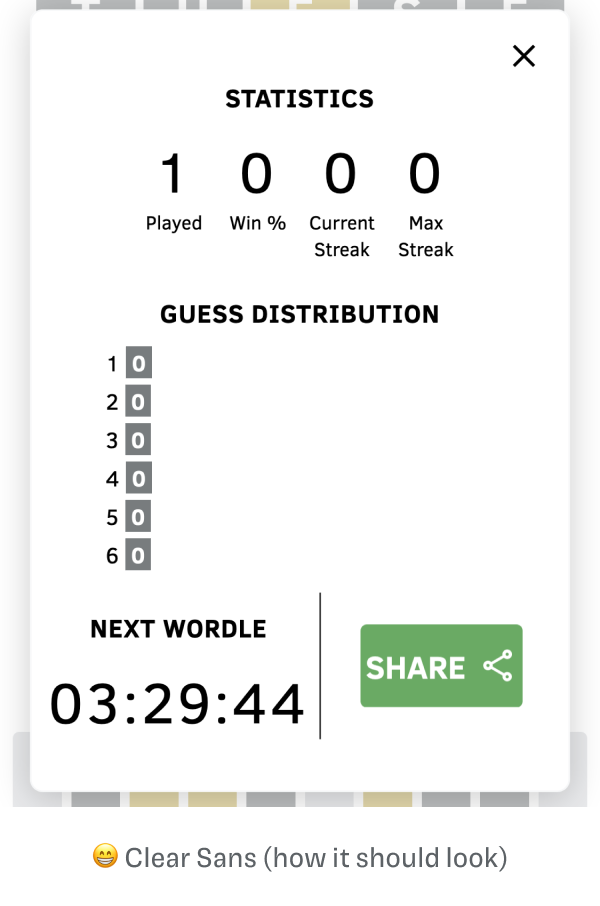
It is not totally different, but it is different. Wordle suddenly looks more sophisticated, less default, it gets a more unique character. All because of the typeface. You can even better see it, when you compare the statics screen. It appears so much friendlier and more focused.
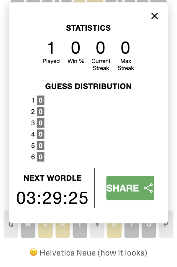
So what makes Clear Sans superior to Helvetica Neue? Mainly the letter shapes. Clear Sans has everything a decent typeface for UIs should have, and Helvetica Neue with its super closed apertures, not. That’s why it is inappropriate for functional text.
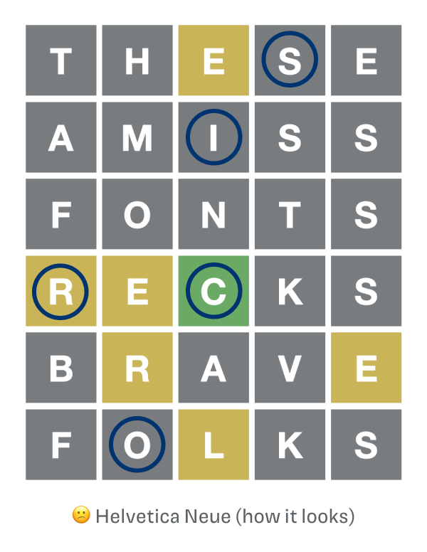
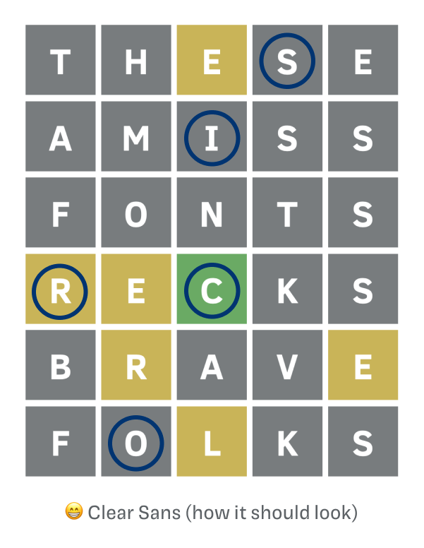
The divine is in the details. The letter shapes of Clear Sans are more open to its surroundings, see the S. The “I” has serifs, which makes it more distinct. The aperture of the C is wider, very helpful in the keyboard in smaller sizes. Overall, Clear Sans has slightly narrower proportions, which you can see at the O. Also, K, M, and Q are less dark. All these details add up, and help legibility. And this is, what a proper font for user interfaces should do, find more on that here.
There is still some work to do
I don’t want to hide the fact, that it’s not perfect, yet. Set in Clear Sans Wordle looks a bit off. The vertical alignment is different, the text sits a bit lower, and it seems slightly smaller as well. This is not problematic in the playfield, but in the keyboard it would need some slight adjustments. If Clear Sans was served as a web font, this all could be adjusted, and then create a more cohesive impression across different platforms.
Why then is Clear Sans not provided as a web font?
You tell me, that’s the big question! I can only guess, but it could have several reasons:
- The font was too expensive. Just kidding, Clear Sans is free to use.
- The creator of the game did not care or know about good typography, and what it can do to improve the gameplay. Luckily, you know now.
- The creator of the game did not know, Clear Sans was not a system font. He had it installed on his machine and did not check it on another device. Or he did not notice, that the typeface was different. Maybe?
- Because of file size and page load times. Probably, but I don’t think it would be such an issue. The subsetted woff2 font files for Clear Sans Regular and Clear Sans Bold combined could be under 50 to 75 KB. Considering, that you only download this once, and you can reuse it again and again, since it’s stored in the browser, it’s a good deal.
How you can see Clear Sans on your device
Good news is, that you can have this superior typographic experience on your computer at least! If you download and install the free font, you will see Wordle set in. If you don’t know how to do it:
- Here’s a guide how to install fonts on a Mac or PC.
- On iOS, you’ll need to download an app to install fonts. I did not test it, let me know in the comments if you have some experience with it!
- On Android, I don’t know. Maybe you do, then go ahead and tell me in the comments!
What you can take away from this
Okay, this turned out to be more in depth, than I wanted it to be. Besides being super trend hopping, and clickbaity 😜. But what I want to leave you with are three things:
1. Care about good typography. It will make your designs better on an emotional and functional level.
2. Always check, if the web fonts are loaded. If you don’t have an eye for that, compare it closely, or ask a designer friend who can spot the difference between Arial and Helvetica 😉.
3. Your font stack is important, check how a design will look in all the different typefaces in the stack. If one is super different, don’t put it in there.
What do you think about this? How do you feel about Wordle in Clear Sans? Do you prefer it, or do you like Hellvetica more? Tell me in the comments!
Support Pimp my Type
Make typographic knowledge practical, fun and accessible to everyone. I’m greatful for your support in any of these ways:
- 🤘 Share it with a someone, who you think might benefit from it.
- ☕️ Buy me coffee to get me through late night editing.
- 🌟 Consider my premium services.
Terrible advice. The last thing I want is websites forcing their preferred fonts down my throat. I would much rather prefer that websites stick to a few default fonts that is guaranteed to be picked up from the list of my installed fonts. Saves bandwidth.
Thanks for sharing your option, Jake. Depends on the value you see in decent typography. It’s always seeking a balance between performance and aesthetics. A web font would ensure a more consistent experience across platforms. And we are not talking about a ton of data, there are font files as small as 20 KB, so maybe 40 KB in total. And you could still lazy load that, and show the webfoot first, so it won’t affect performance at all.
When I see my results and hit the Share link and share to wife’s Gmail, she doesn’t see the coloured squares, but just small rectangular shapes with X . It looks like Wordle uses a graphic font that is not on her Android phone. Gmail is set to show images.
Any clues?
I guess Wordle is using an emoji here. The square with the x says that the character is not available. I guess the operating system of your wife might be a bit dated. Does she see other emoji?
This was fun!
Yay 🤩! Happy you enjoyed it, Pascale!
This is the best! I love the correct font. Thanks!
Thank you, Kit! Happy you like it 🤩!
I appreciate so much that you took the time to research and write this article. The only reason I found this article is because I use a .xlsx template to help me “map” my wordle options each day, and was trying to make my own Excel file look the same as the wordle website.
After reading this article, I installed Clear Sans; now both the site and my own file look —no other word for it— gorgeous!
Thank you!
Brilliant, Matt! The ways of the internet are always mysterious. Happy you enjoy your spreadsheet now even more 😉.
Mine finally shows as Clear Sans today, and it made me crazy. I immediately noticed it looked different. It would probably be fine if the vertical alignment were adjusted, but I’d gotten used to the Helvetica Neue, which sat perfectly in place on the game board and the keyboard below. Clear Sans is reminding me of the Windows fonts, Tahoma or Verdana, and now makes the game look amateurish.
Oh no, JW! Well, it definitely is a problem, because after a time you get used to everything and misalignment is definitely irritating. But you can still uninstall Clear Sans on your machine, I guess 😉.