Are these wedding invitations to fall in love with? Karina asks me for my typography feedback. Let’s get most out of it by improving the typography in three simple steps!
The original design
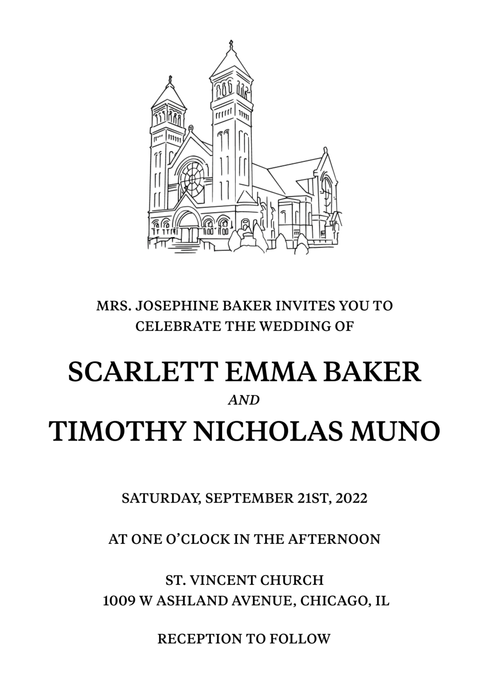
Karina’s design seems quite slick and classy, but it still lacks a certain level of sophistication. The clean illustration is paired with gorgeous Tiempos by Klim Type. And while the font choice works well, the text still appears a bit messy, and too dense. Mostly, the names of bride and groom seem a bit dull.
So let’s tackle these issues! But first, Karina, if you’re reading this, sorry for saying the wrong name in the video 😅.
1. Adjusting the body text
First, I set the body text a bit smaller, and change it from 14 to 12 pt. I also would triple the current letter spacing to give to more space to breathe. This is always helpful with all caps text, more about it. I also would group the information a bit differently. By bringing the date and time together. Now the text is less fractured, which makes it easier to skim.
2. Making the names more interesting
Instead of Tiempos Text, I’d set the names in Tiempos Headline. This display style is more contrasting, delicate and better suited for headlines sizes, like the 28 pt here. Look at those delicate lines! They much better fit the illustration.
Now what about this “and”? It’s the only element on the page that is using an italic, this is why I would ditch it and simply use the body text style on it. Less different styles make the design more coherent and let the names even stand out more.
3. Addressing the vertical spacing
One thing is till left until we can be happily ever after, the vertical spacing. The text seems to sit anywhere. Here I would introduce a baseline grid, based on the line height of body text, which is 21 pt. These are the invisible lines that will tie everything together.
When I position the text on it, the names still can break out of it, since they are so special. But the rest of the body text, including the “and” follow along.
Before and after
What was already a great starting point now looks much more refined and professional. These changes all might have been tiny, but they added up. This results in a more nuanced and balanced wedding invitation design.
More about this on Talk Paper Scissors
Referencing this design, I had the joy to chat with Diana from the Talk Paper Scissors podcast about Untapped Typographic Potential. There I also explain what “typographic color” means, tried and true techniques for emphasis, prioritizing optical distance in typesetting, as well as the role intentionality plays in the process.
What is most helpful to you in this post? Tell me in the comments below! Also consider submitting your project for a free review or take advantage of my private coaching calls.
I absolutely love your work with theses posts, Oliver. Thank you very much for everything!
Oh, thank you Raúl! Happy you enjoy them, that’s the whole reason for making them.
Each of the 3 improvements taught me something, though I had to slide the slider a few times to see the difference Tiempos Headline made.
The point about a baseline grid is especially helpful, and I’ll use one in posters etc.
Outstanding edition of the blog! Thanks, Oliver
Yeah, you gotta look closely, but the differences are there 😉. So happy you could take away something from it, Tim!
This is really valuable knowledge for me (I’m not a designer). Thank you very much.
I’m curious, with what did it help you specifically?