To a user of a digital product, the interface is the product. But what makes a good visual design? In the past 15 years, I created and reviewed plenty of UI and apps designs. In this article and video, I distilled the essentials for you with some practical examples. So you can assess your own products better.
Taking ACTION
When your UI design is streamlined, everything works together smoothly. It put the business in action by letting the user take action. This is why I center the six criteria of the UI Design Check around the acronym of ACTION, which stands for:
Ready? Then let’s dive into it with some examples!
Appeal
Do you know the feeling of being cheated … by a design? First, it makes a great impression, everything nice and shiny 😍. The marketing pages lures you in, you feel confident, you want it! Your high expectations are set, but once you’re in, everything looks so different and you feel disappointed 🫤.
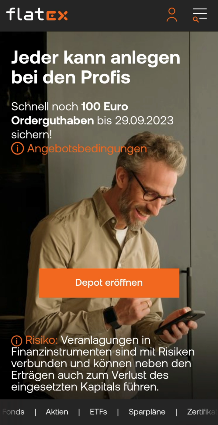
To me this happened with the online broker Flatex. It made a slick and shiny impression from the outside, but it is cluttered, laborious and looking dated on the inside.
Appeal matters, because to the user, the app is the product. It strongly influences how well it will be adopted. Ask yourself for your own app design:
- Is it making the right impression?
- Does it fit the branding?
- Is the design coherent and meeting expectations?
Clarity
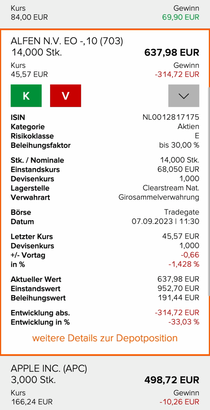
This is about life and death! At the children’s hospital, doctors have to do a lot of calculations each day, also my wife Birgit. To do that, she’s using an app, which is death to the eyes.
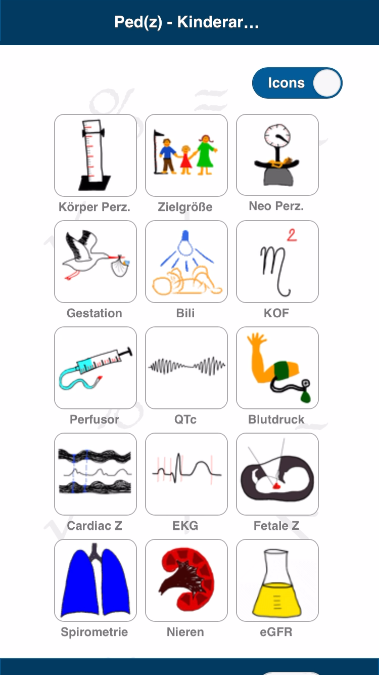
So many things are wrong here:
- A cluttered overview with clumsy doodles
- Input fields that align anywhere and constantly lose focus
- Weird tool tips pop up
- And all on a very noisy background!
This layout does not help to reduce cognitive load, while treating patients.
To bring clarity to your design, ask yourself:
- Is cluttering avoided?
- Are alignment and spacing consistent?
- Are similar elements reused for similar things?
Typography
Let’s stay in the medical field. My wife Birgit is studying like crazy right now for her specialist examination. But what’s even crazier, is the Anki flashcard app she’s using.
It has several severe issues:
- The text with no hierarchy
- The alignment is horrible, all centered
- Font sizes change from 11 to 32 pt
With only a little care about typography, this all would make learning so much easier. I quickly mocked this up here. If you want me to dive deeper into it and explain what I did, tell me in the comments! And to be fair, as I found out, Anki is just the app, the flashcards are made by people in the community, and I guess they just followed a bad template.
Make typography better in your app design by asking yourself:
- Is the text set in a clear way?
- Are font sizes appropriate?
- And is color contrast sufficient?
This helps you to unite words and meaning with the power of typography!
Interaction
Let me tell you a quick story of a personal success and a big failure. For the first time, I participated in the city run of my hometown. Super proud of my superhuman top athletic 5k performance 🏅, I wanted to check the results on the website, but they just did not show up!
Well, actually they showed up … but way below! I had to scroll down an enormous list to see my rank. Not very obvious 😕.
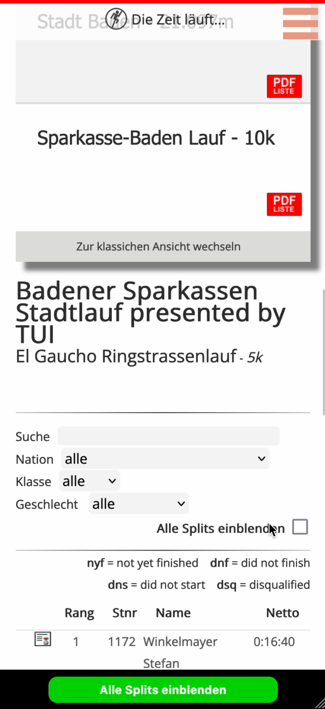
You can improve the interaction with your UI or app, by asking:
- Are changes of state clearly shown?
- Is it clear what’s interactive?
- Are there sufficient target sizes?
- Is information not only relying on color?
Order
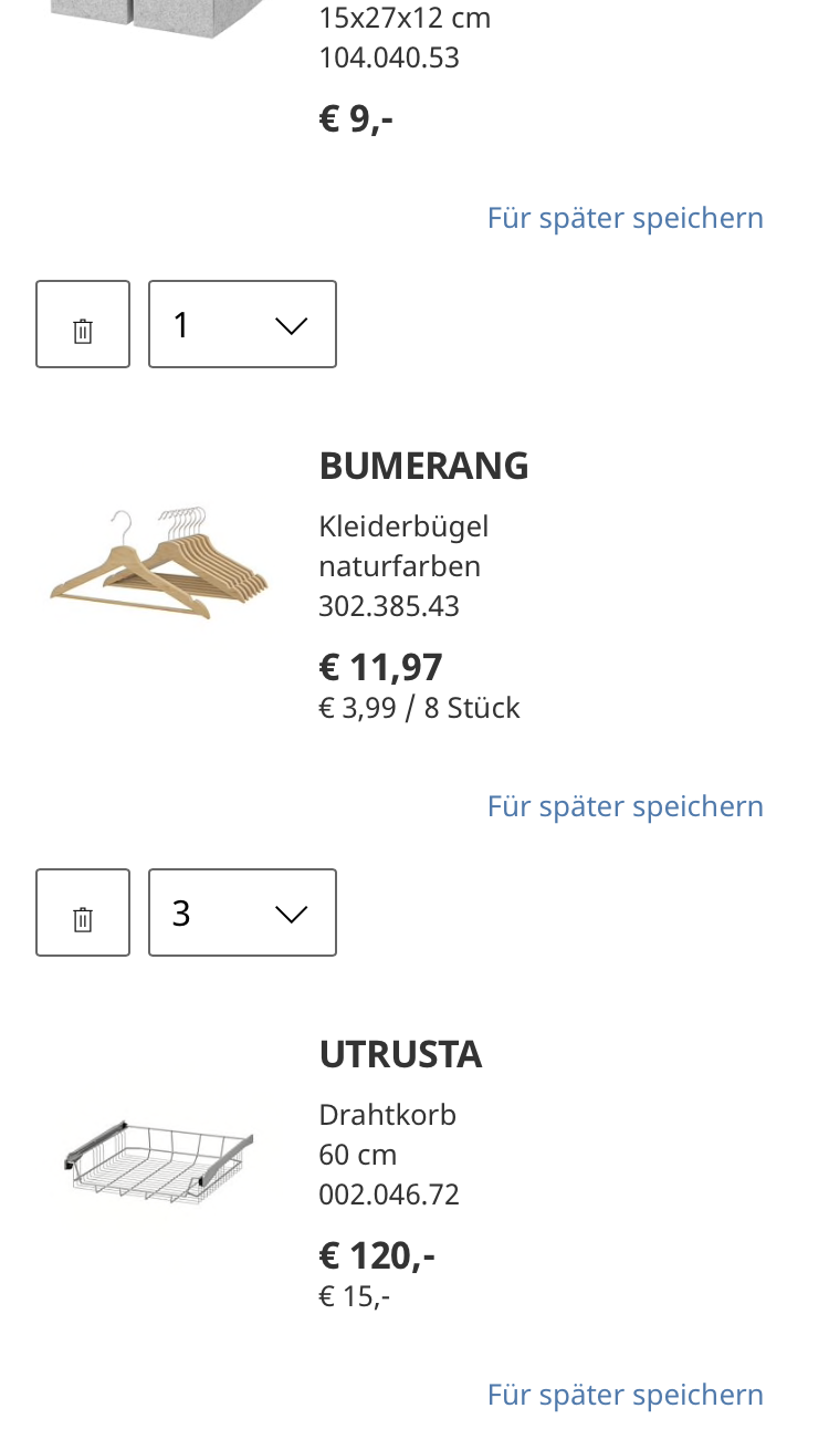
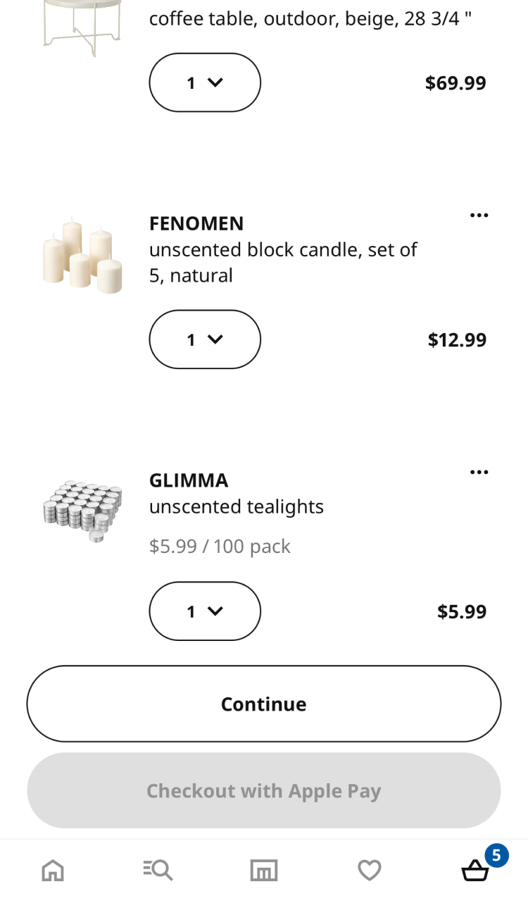
A few years ago, IKEA’s shopping bag on mobile had a problem. The elements were not obviously grouped together. When scrolling through a few items in the shopping bag, it was not clear if the amount belonged to the previous or the next product 😐.
In visual design, there is the rule of proximity. What is close together, belongs together. By now, IKEA fixed it, with a compact design, that clearly uses white space between the individual items, so that they can be easily differentiated 😁.
With these questions, you can bring order to your design:
- Are elements that belong together also grouped together?
- Is the most important information/action on top?
- Are the other hierarchies clear?
Navigation
Let’s complete the ACTION acronym with a story of another family member, because my sister is losing her nerves over this app. Her additional health insurance allows her to submit doctor’s bills, but she constantly loses track of what bills were covered and what not 😡.
Because once she goes back from the details, the whole list is collapsed again! Resulting in a complete loss of orientation and multiple submissions of the same invoice. They could solve that by saving the position after you opened the pdf.
Put your users in control with a clear Navigation by asking yourself:
- Is it clear where I am?
- Is it obvious where to go next, and how to go back?
- Is progress clearly shown?
Check the visual design of your UI, web or app design according to these six criteria around the acronym ACTION. Ask yourself the following questions.
Do you want me to check your design?
Maybe you’re not 100% design savvy, or feeling uncertain what might not work with your visual design? I give you a clear assessment, point out problem areas, and give practical advice. So you know what to focus on, when creating a professional impression of your website or app.
What is the most important criterion to you? Or do you know an app that clearly fails one? Tell me in the comments below!