
My thoughts on Reforma
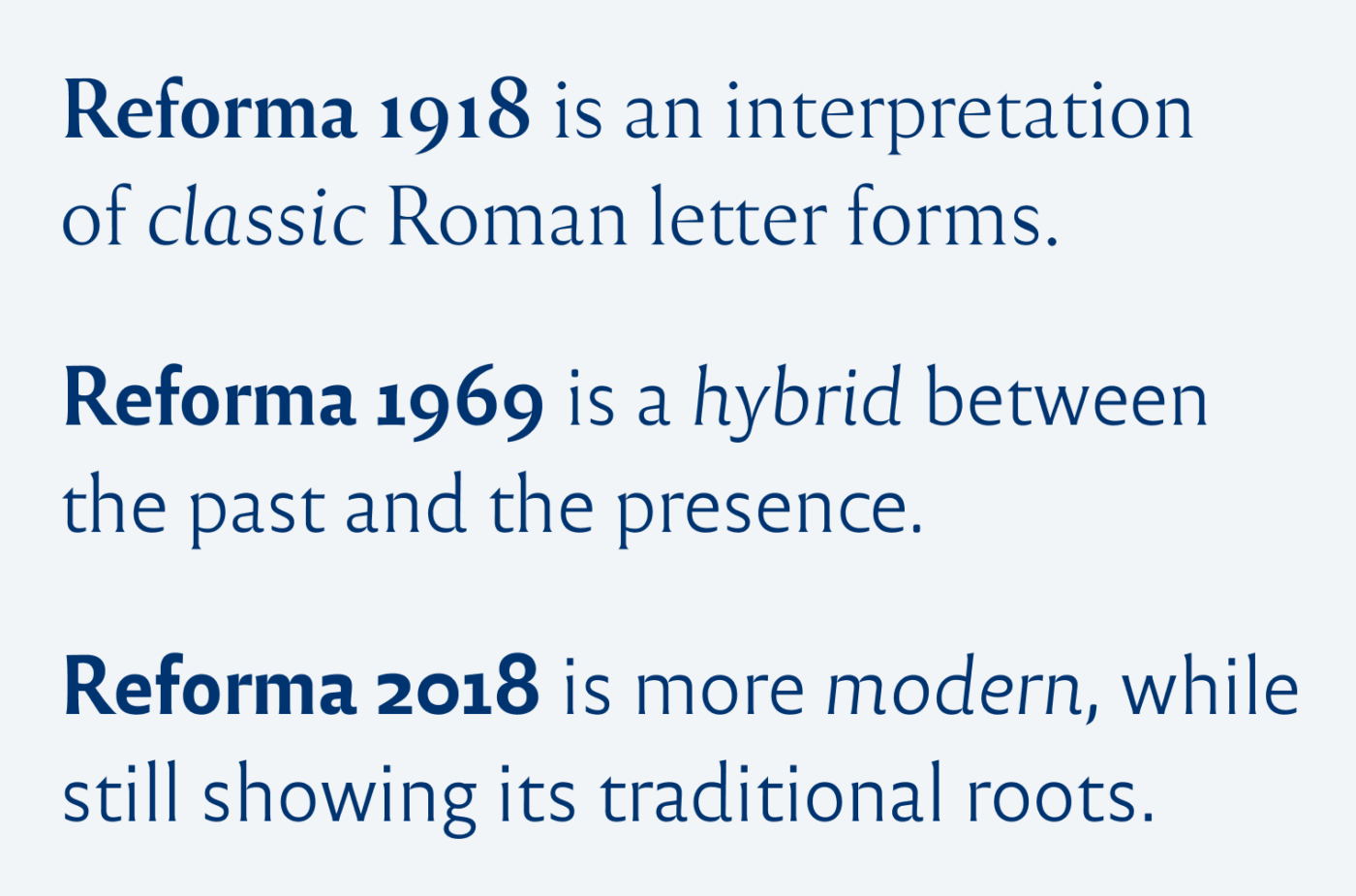
Reforma is a font family in three different styles that was designed by the Argentinian foundry PampaType for the Universidad Nacional de Córdoba. The occasion to create this typeface were the celebrations for the centenary of the University Reform. Its vibe takes you back to traditional Roman stone engravings, which quite fits the educational background of the project.
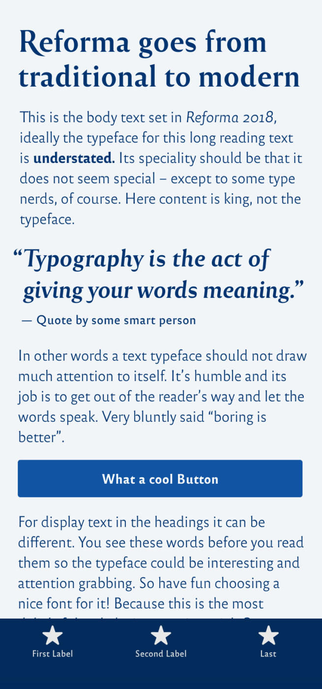
Even though I full appreciat the project, I’m a bit uncertain of Reforma. At times, the typeface seems unbalanced, especially the in-between style Reforma 1969. The lower case “a” kind of leans to the right and the strokes of the capital letters feel thicker than the ones from the lower case letters. The regular, Blanca, weight is a bit too light for screen display, which is also the reason why I would not recommend it for UI designs.

So, you might ask yourself why I picked the typeface then, when I think it’s not perfect? I also think that these imperfections give Reforma its charm, make it more alive. The italics are a bit wired, sometimes goofy, but also very organic. And this then comes down to taste and, as always, that it has to fit to your project.
Recommended Font Pairing
To compensate for Reforma’s larger x-height and light strokes, I recommend using a different dynamic linear sans-serif, like Foreday for functional text.

- Headings
- Copy


Learn more about pairing typefaces using the Font Matrix.
What do you think? Is Newsreader something for an upcoming project? Tell me in the comments below!
This font indeed has a personality… I like the mix of old versus modern styles. Great!
Glad you enjoy it, Lara!
Ah, Reforma!
I have been using the 2018 version, mainly Blanca as white text on a dark background, for several years now on my personal website https://urbino.nl. In this form I still quite like it. For body text it is pleasant to the eye and easy to read and I love the all-capital headings :-).
It totally fits your web aesthetic. In the white version on the transparent and with picturesque background, so elegant so much cultural spirit!
Very cool, Henk! Like it a lot there and appreciate how you spaced out the all caps text! 😍 May I suggest on slight improvement? For the Colophon, I’d increase the letter-spacing to
letter-spacing: 0.02em;😉.I have Reforma✌🏻There is something historical in it, like from the ancient paper, organic with “mistakes” in that stroke that your sharp eye hunts to the high-end perception.🧐 I’d go with the classic. It’s the safest but also where Reforma’s charm mostly shines.
I love when numbers are this crazy😜 like they’re joking. My grandpa who is 102 now and has published his 7th book last year, would love Reforma. It can replace his old typewrite machine. (oh yeah Oliver, we’re trying to explain to him that his typewrite cannot be fixed.🤦🏻♀️)
Oh, no! I guess it’s horrible that your grandpa’s typewriter is broken. But I guess it lasted longer than my MacBook Pro 2013 which is about to be replaced soon 😉.