My thoughts on Pausa
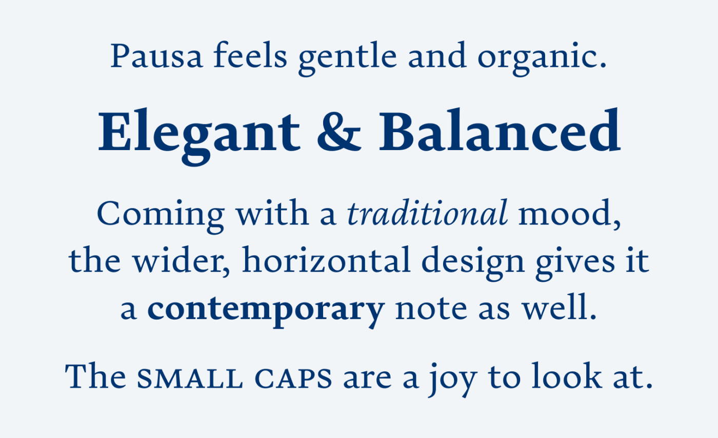
The serif typeface Pausa, from Fabio Haag Type, comes with a traditional vibe, which is not very surprising. But thanks to the sturdy strokes, organic curves and quite wide design, it comes with a contemporary note. It feels balanced and elegant, I really adore the small caps and the combination with the lively italics.

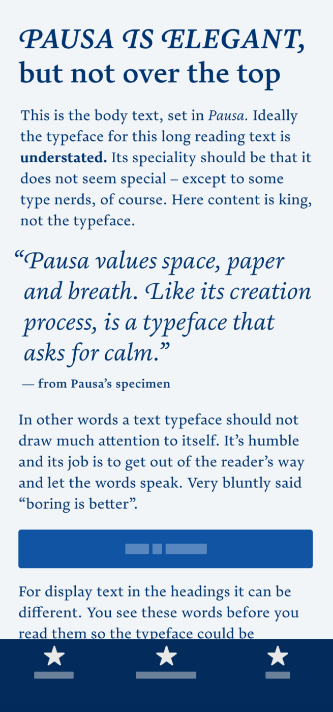
As claimed on the website, Pausa requires space. In larger sizes (24 px and above), the upright style can quickly become too dull, especially the bold weight. Pausa is made for long reading text. But then again, not for very small text either, because of the quite low x-height. I recommend anything between 14–20 px or 8–14 pt.

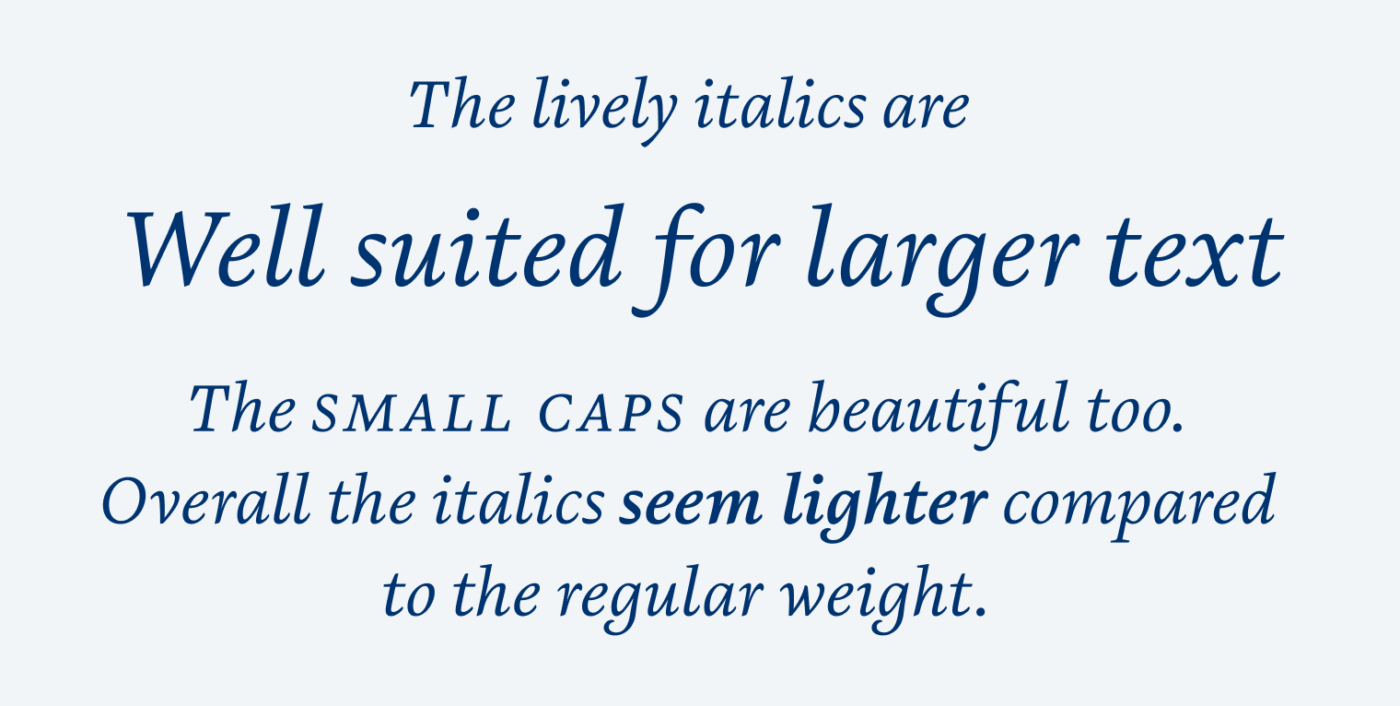
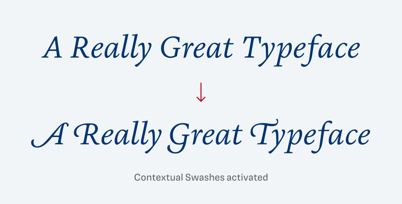
The italics are lighter, more delicate and therefore also suited for a little display text, like a pull quote or a prominent heading. They also are equipped with gorgeous contextual swashes, so they definitely will spice up a neat title.

You rarely see such simple and approachable licensing like with Fabio Haag Type. They only sell complete families, free trial fonts can be downloaded, and the various packages do not include any limits when it comes to page views or app downloads. I apprecitae that.
Recommended Font Pairing
Looking for a striking heading font? Quirky Mayenne Sans could spice everything up. But also dynamic Muller Next would make a great combination for functional text.
- Headings
- Copy
Learn more about pairing typefaces using the Font Matrix.
What do you think? Is this typeface something for an upcoming project, or do you have a font recommendation? Tell me in the comments below!


B R E A T H E Oliver, b r e a t h e 🧘🏻♀️🧘🏻♂️ Take a PAUSE!
It really is making me stop and mindfully grasp what you’re saying. Meditation app? Yes! I’m somewhat hypnotized.
Words “organic” and “contemporary” are the words in which Pause shows its compact despite PAUSES between letters.
Letter g is the letter with the most dignity.
Italic🤔nja
Did not see the dignity in the g before, but now as you say it … 😊