So many designers make this mistake. Light text seems fancy, but if it’s not large enough, it’s a pain to read. See three ways how to fix that, all illustrated with a practical example.
TLDR: Ensure that body text is contrasting enough. If the typeface looks too strong in the regular weight, see if it’s a variable font and try something between Light and Regular. Also consider if a typeface is suited for body text at all.
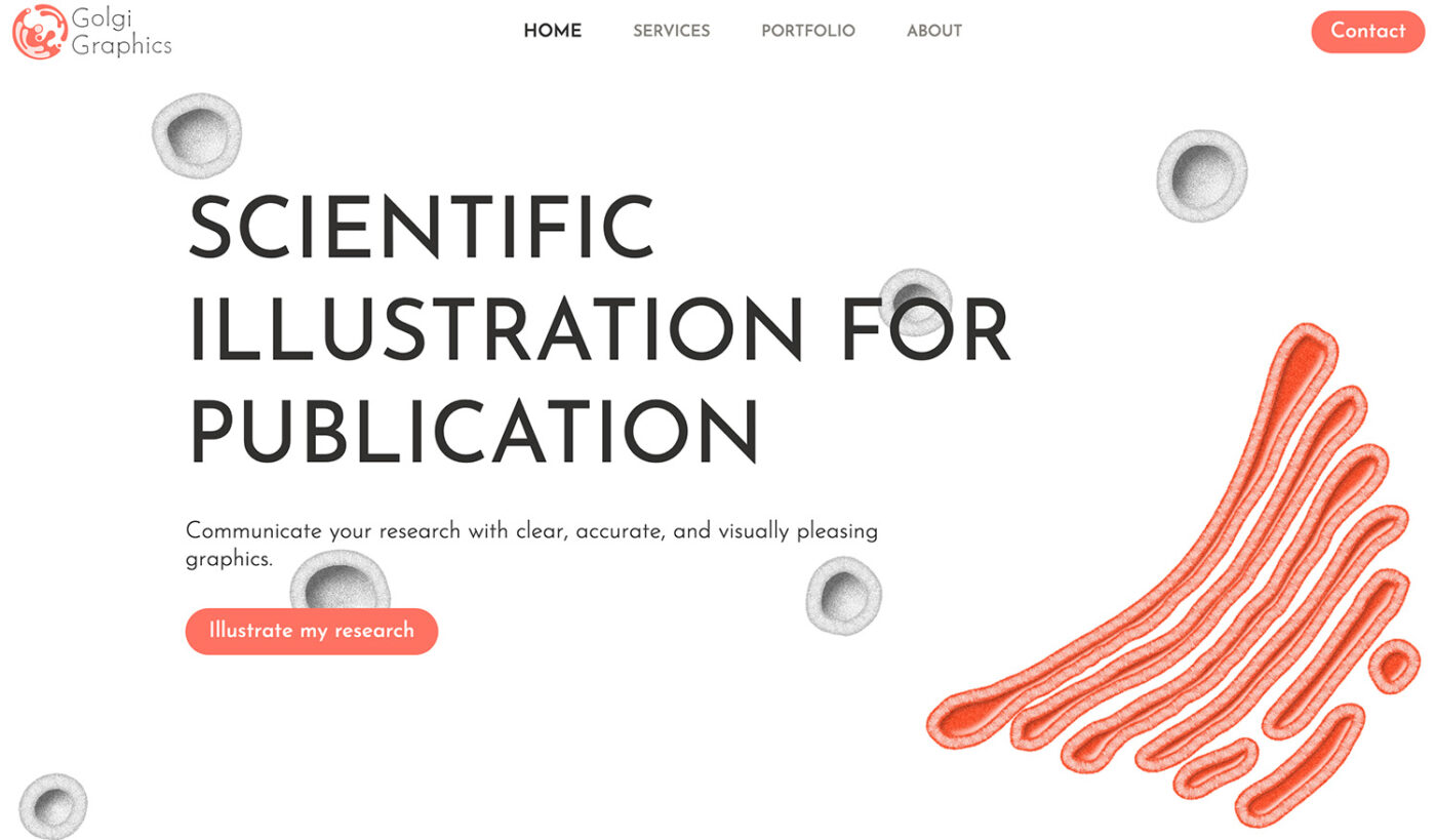
Gorgeous – at first sight
Josh’s submitted his website Golgi Graphics for typographic review. At first, it makes a great impression. The site seems clean and noble, while showcasing the gorgeous scientific illustrations he creates. He uses the common typeface Josefin Sans in various weights, mostly light. And this creates an undesirable effect.
The Problem: Light text is hard to read
Light fonts seem elegant and nice, but that does not count for body text. At font size sizes between 14 to 20 px or smaller, it soon looks too delicate, making it straining on the eyes. Of course, this always depends on the exact typeface and color of your text. With our example here, Josefin Sans in font-weight 300 and gray seems way too thin.
Fix 1: Make it stronger
When taking a look at the available weights of Josefin Sans, it can guess why Josh mad the body text so light. Because the regular weight looks way too dull and contrasting, destroying the overall airy impression his website makes.


But since Josefin Sans is also available as a variable font, one approach to solve this dilemma is picking a weight that lies between too light and too dark, like font-weight: 350 here.

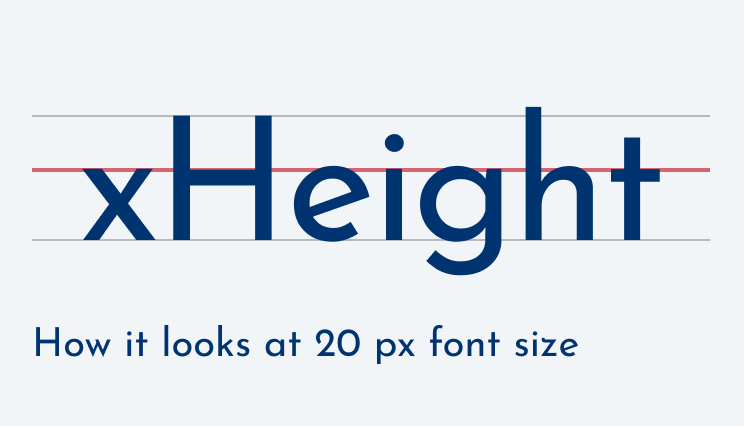
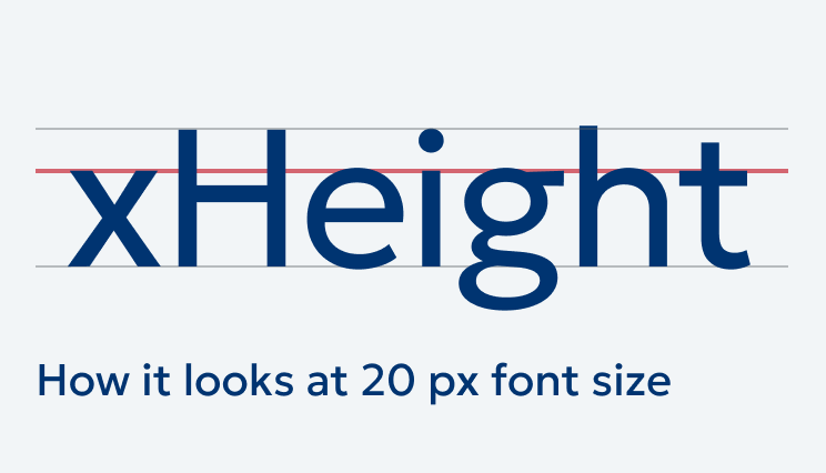
But even with a sufficient weight, Josefin Sans is not ideal for body text. It is way too striking, while having an incredibly low x-height. This is why the text seems very small, even at 20 px font-size.
Fix 2: Use another typeface
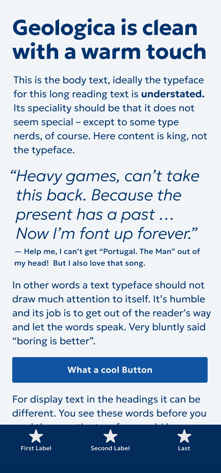
To compensate for that, let’s pick another, similar typeface. Gelogica is also quite geometric, like Josefin Sans, but it comes with higher lower case letters (aka x-height). Letters are also more distinct, which makes Geologica more suited for body text.
Replacing it dramatically improves contrast and therefore readability. The all caps text above the heading almost does not change, while the mixed case text in the copy seems larger due to the increased x-height. And all of that without changing the font size. Isn’t that amazing?
However, the mood of the page also shifted, because now the headings lost their elegance. They were so elegant because of that low x-height and the light weight. So why not keeping the best of both worlds?
Fix 3: Combine two typefaces
Both typefaces are based on a geometric form model (more about form models in the Font Matrix article). So let’s keep Gelogica for the body text and combine it with Josefin Sans for the headings. This it works, because both typefaces are used for different roles, display text and body text, while not being super close to each other. It would not, if they were next to each other in one line. In these cases it would look strange.

Almost perfect, but there still are some tiny adjustments we should take.
Optimizing line height and tracking
This wouldn’t be Pimp my Type if we would not take a closer look at the line height and tracking. Because the line height also is influenced a lot by the typeface you choose. Josefin Sans looked good at a line-height of 1.2, also because of the low x-height. With Geologica, 1.2 is too dense. I would increase it to 1.4 times the font size which gives the text more space to breathe.

But the horizontal spacing of the heading is slightly off as well. At a font size of 80 px, “Our services” and the other headings almost falls apart. So I set the letter-spacing: -0.02em, and give it a negative margin-left: -0.05em to visually align it with the rest of the text.
Before and after
We started with an elegant site that made a decent first impression, with quite some problems when it comes to contrast regarding the copy. By choosing a different typeface that is more suited for body text, adjusting line height and letter spacing, we achieved a professional looking result, and a blissful reading experience. And all of that with the power 💪 of typography!
Big names make this mistake too
Like Hello Fresh. The emails I get use way too light text, making them horrible to read. Even though the font size is quite large most of the time. So if anyone from Hello Fresh reads this, please, fix it.

How do you feel about the changes? Tell me in the comments below! If you want my feedback on your project, submit it here or schedule a typographic coaching call.
Love this case study and the overall story. Seeing x-light typography so prevalent makes me wonder why more people don’t call it out, then I remembered—Nobody. Reads. Anymore.
(small UX thing: I wish the “after/better” image was always on the right for consistency)
That’s true, Kel. Making it even more important to intrigue people with good typography 😉. About the UX thing, you’re right, I unfortunately picked a screenshot where the right side does not change. So to make it obvious that something has changed I swapped it one time. Next time I’ll think about that more when curating screenshots 😅.
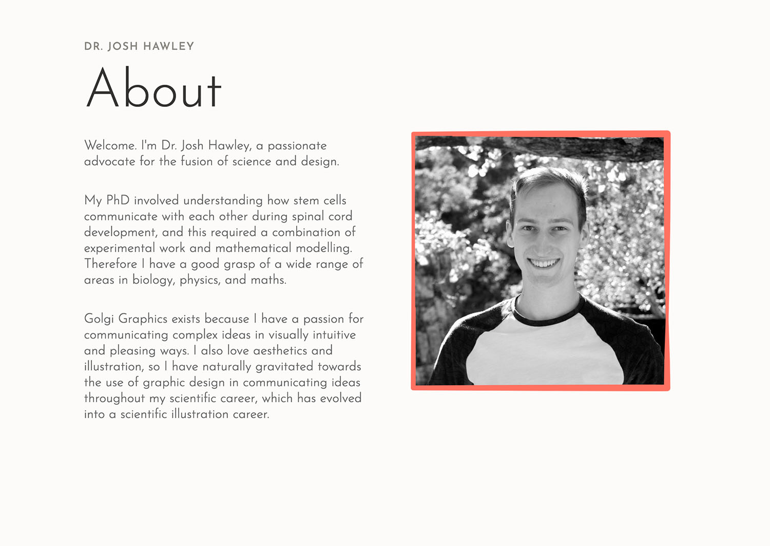
I don’t go micro, I’m more of a macro-wide perspective person so… What I notice is that Josh’s About page now feels MORE CONFIDENT. And that is so important. See how a “simple” but not easy typography tip can make a huge difference in your personal brand/folio perception. It influences how your clients and prospects react when they visit your page.
Oliver, 😍what an exciting new option on your website! Sliding for “before and after.” It reminds me of when an entomologist changes lenses on my glasses to check if my vision is better with the higher no. diopter.
Thanks for that addition, Jana. Did not really see it, was too close to the details. And you’re absolutely right! Glad you enjoy my slider 😉.
Good point! I see the problems with too light text on a daily basis. What I’d like to add is also different rendering of the fonts on different operating systems. Mac and Linux give smoother fonts, Windows rendering is more pixelated. What looks great on Mac (and many designers use Mac) might not be that good looking on Windows. IMHO lighter fonts look better on Mac than on Windows, thus many designers tend to use too light fonts. Testing the work on more platforms could solve some problems.
100%, Błażej! Also, Figma renders it differently, much smoother which is kinda misguiding. I use an average office monitor when I design, so that I see fonts perform there, not only on my glossy, flawless MacBook Pro retina display.
I don’t work with Figma, but I have checked out my Zettelkasten notes after reading your article. And I have there a note, that Mac renders fonts without hinting, using antyaliasing only. And the way it renders the fonts, makes them look thicker than they really are. That’s why many Mac designers tend to use light fonts, because on their screens it looks thicker, like regular fonts e.g. on Windows. I did that either when I was working on Mac (long time ago). Currently I work mostly on Linux, and font rendering is much better than on Windows (though theoretically it uses similar engines to render fonts).
Absolutely, that makes total sense. And that’s also why I prefer sturdier fonts, especially for UI context 😉.
Nice Post