
My thoughts on Kristal
Kristal, designed by Eyal Holtzman and published by Bold Monday, is a fresh look at Renaissance text typefaces. Sounds cool, right, but what does this smart type history statement even mean? Well, Renaissance typefaces these super classic, old-style typefaces, like Palatino or Bembo, that appear rather calm and elegant. But Kristal is different. It’s very lively, energetic, and not that smooth or balanced like you would expect from a typeface of this category.
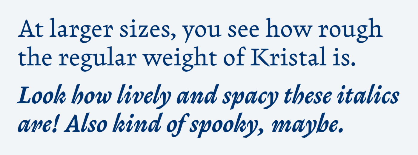
But still, the book face is very versatile for body text. It has good contrast, is very readable, and it comes with this certain something. The sharp stroke endings almost appear like little blades (see the y and the K). I absolutely adore the spirited italics! It all seems a bit too rough and hard to grasp in larger sizes. That’s why you should primarily use it for text set at reading sizes between 16 and 20 px.
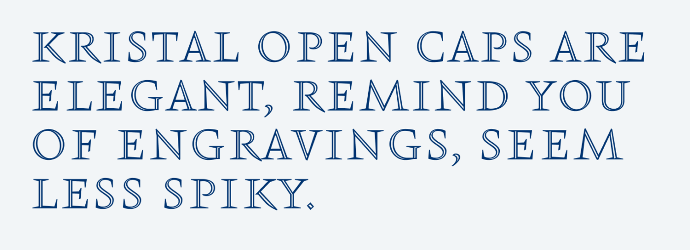
But there also is the all-caps inline title style Open Caps that’s a great addition. It has a festive look, and – which is very important to me – the proper all-caps spacing has already been taken care of. When using it, bear in mind that, due to its delicate thin lines, Kristal Open Caps should be set at a minimum font size of 34 to 40 px and is quite space consuming.
Font Pairings for Kristal
Kristal is a quite dynamic contrasting serif typeface. If you are looking for something smooth and calm that pairs well with it, pick dynamic Radio Canada.

- Headings
- Copy


Learn more about pairing typefaces using the Font Matrix.
What do you think? Is Kristal something for an upcoming project? Tell me in the comments below!
The Kristal Open Caps are elegant indeed. Reminds me of he open Lutetia, the capital Contura from Dick Dooijes. The italic versions are way too restless for me.
Restless puts it well, Philipp 😂 Oh, Lutetia Open is very pretty, thanks for bringing my attention to that classic!
Open Caps is really something! It reminds me the logo for the latest Marvel movie Eternals. It looks as if some Roman letters (Trajan) form chiselled into the surface of the stone and then the 2 facets were used to style the font.
Had to look it up, Doctor, and yes, absolutely reminds you of that! That’s the inline style. And sure, all caps styles all go back to Trajan, the holy base of lettering 😇!
P.S.: not sure if I said it before, but I love your nickname 🐙😂!