
My Inclusive Sans Font Review
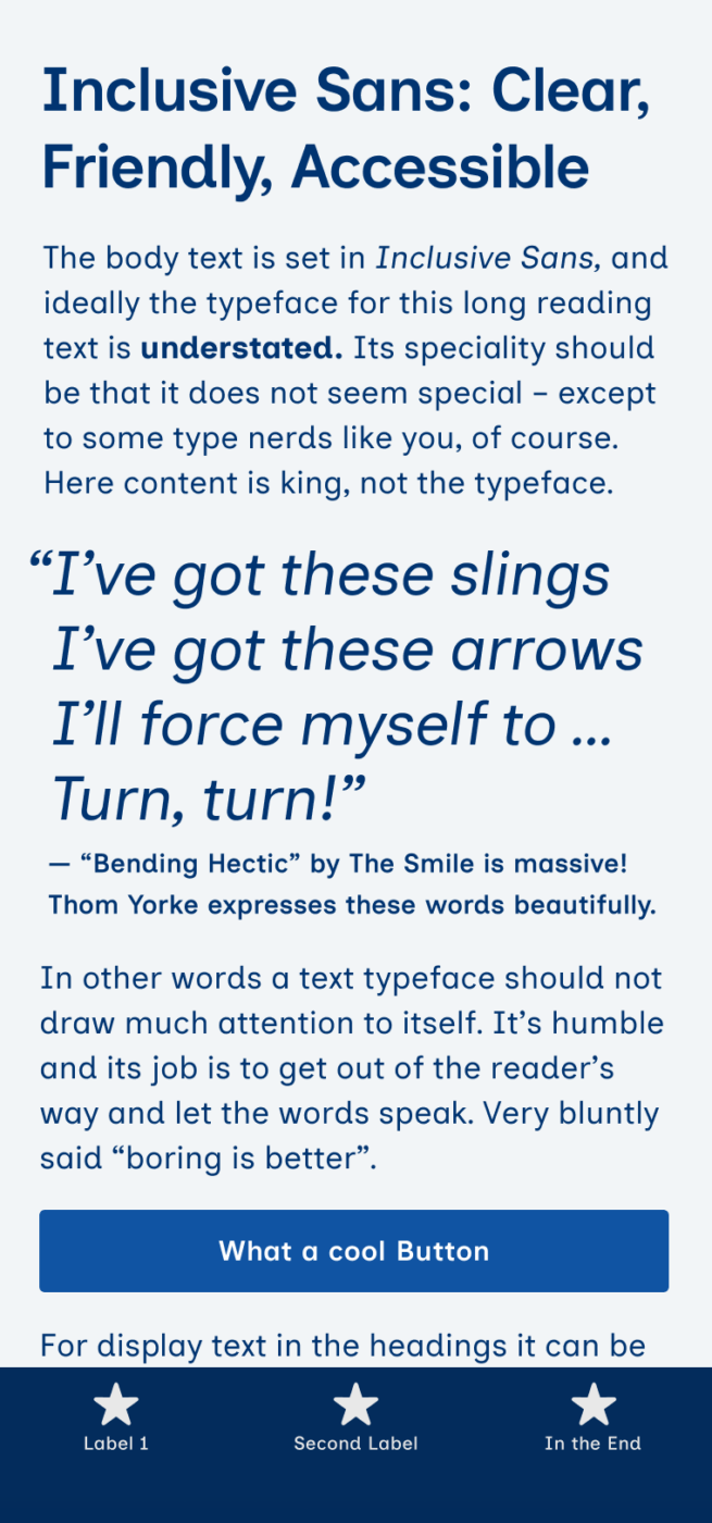
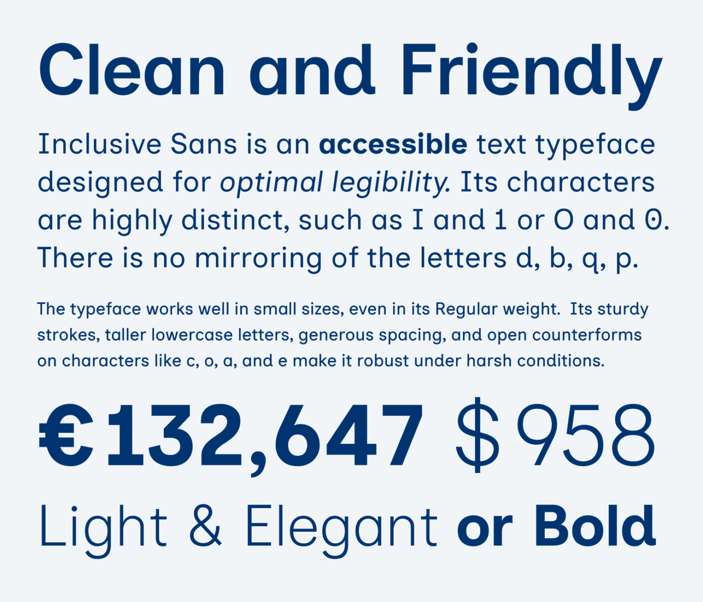
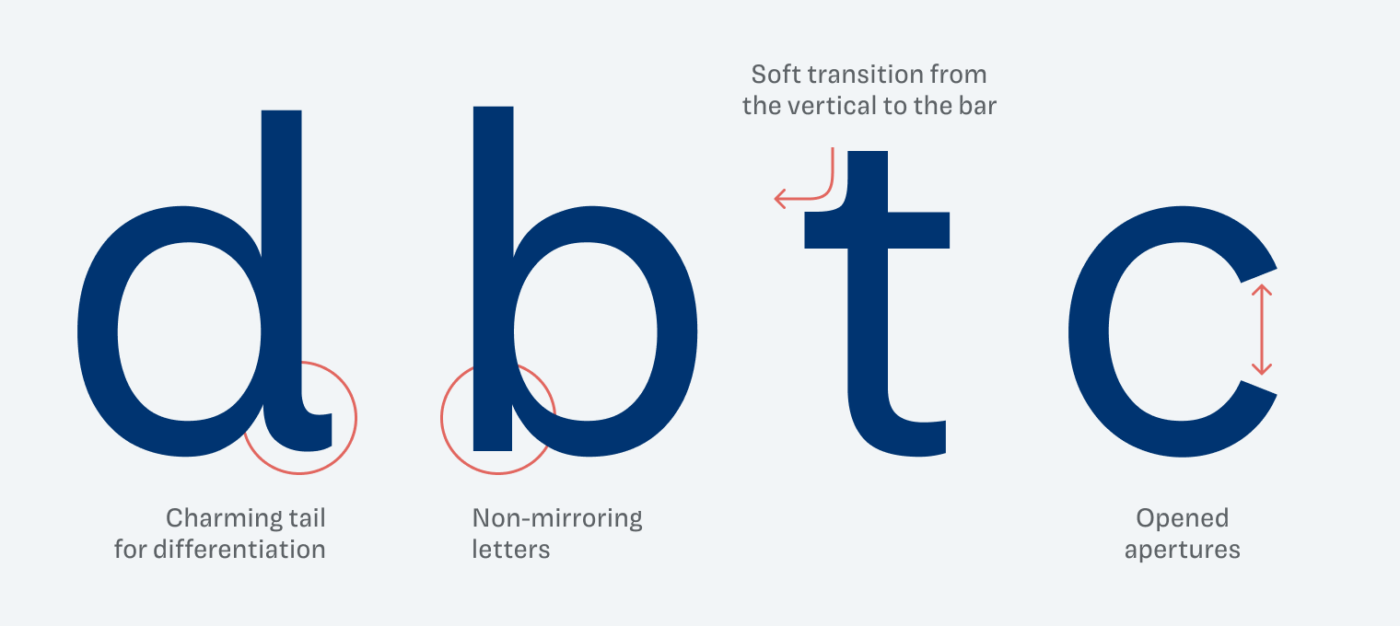
This week’s typeface perfectly follows up with my conversation about Fonts for Accessibility. Inclusive Sans designed by Olivia King, is a free and open-source font optimized for body text. It incorporates essential features for high legibility, such as clear character differentiation and no mirrored letters. Complemented by sturdy strokes and generous spacing, it performs well even under challenging conditions.
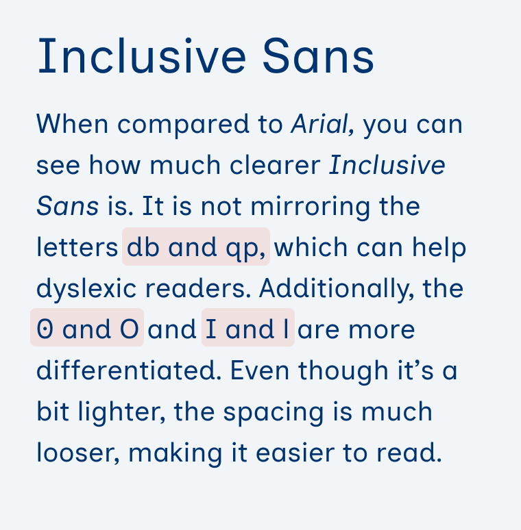
What I like about it is how elegantly the typeface includes these features. It’s a contemporary neo-grotesque, similar to Helvetica or Arial with a geometric touch. But thanks to these tiny adjustments it has a distinct attitude and warmer touch, as you can see below.
Arial is often considered to be a good choice for accessibility. I discussed this with type designer Eleni Beveratou during our session. You can see for yourself whether this holds true, by directly comparing Inclusive Sans to Arial. Which one of these is easier to read?

Originally, Inclusive Sans was only available in two styles: Regular and Italic. Fortunately, the type family has since expanded and now includes five weights, ranging from Light to Bold. Since its spacing and design are optimized for smaller sizes, I recommend pairing Inclusive Sans with one of my suggested heading fonts.
Font Pairings for Inclusive Sans
Inclusive Sans is a quite rational linear sans-serif typeface. It pairs well with anything else in that category that is more contrasting or interesting for headings, like wild Roslindale, but also more quite similar sans-serif Inklination.

- Headings
- Copy
- UI Text


Learn more about pairing typefaces using the Font Matrix.
What do you think of it? Tell me in the comments! Also, share with me your favorite typeface for accessibility!
Sofort verliebt! Sieht toll aus. Eine tolle Schrift für gut lesbare Texte, wenn mensch sicher inklusiv sein will und die Atkinson nicht so passend ist.
Schön, dass sie dir gefällt! Sobald die weiteren weights da sind, ist sie sicher auch gut einsetzbar für die meisten Projekte.
Choosing a single-storey ‘a’ really changes the tone of a typeface to me since it’s relatively uncommon, and on a high frequency letter. I like it here.
I’d be interested in your opinion of Arial if using Stylistic Set 3 and expanded 0.5 point. Yes, that’s takes effort compared to using it out of the box, but it’s a very different beast than stock Arial.
I’m super intrigued, Jeremy, but I can’t find these stylistic sets. On my machine, I’m having Arial version 5.01 from 2006. What’s yours?
What do I think? 😁
Inclusive Sans is a people-pleaser! It’s way spaced out, for my taste.
We can’t talk about fonts that have one weight, can we?
The best part of Pleaser Sa… Pardon, Inclusive Sans is, a charming differentiating tail. How cute, how kind.
I don’t like, in general, monumental I. 😑 This font is ideal for elementary school, and children’s books, the little ones would benefit from it.
My team uses Arial 🤢in Google Docs. And to alleviate all the stress from reading from it, I immediately switch to the opposite, super soft – even though – not my favorite, Karla.
Thank you for the wonderful show with Eleni. 🙌🏻Gem packed, insightful, engaging. It suits you well to lead Live streams.
Song for some future Font Fri’ay
https://genius.com/The-cure-friday-im-in-love-lyrics
Hello Oliver,
thank you for the article.
Although I am quite aware of all the problems related to Arial and even though I do not like all the omnipresent dull neo-grotesque clones, I have to admit that, for some weird reason, every time I see Arial on computer screens at regular font sizes, it seems very readable, sharp, and clear to me. This is definitely not the case at larger font sizes, when it becomes quite messy and chaotic for me.
I think I am the black sheep, but in your direct comparison between Arial and Inclusive Sans, I would choose Arial, because it seems much more sharp and clear to me on my screen which I prefer more that being able to easily distinguish between l, I, and 1.
Also, I would say that Helvetica, Arial, and Liberation Sans all have some kind of inner rhythm, balance, and order, which is quite pleasing to my eye and. I am still not able to find out why they seem so harmonic to me. I guess I am somehow too conservative, old-fashioned, and boring when it comes to sans serifs 😀
Quite recently, I decided to set Arial as my default font in Excel. I realized that nowadays, I tend to use the most common typefaces, such as Arial, in my written documents because these fonts are completely neutral and do not disturb me during reading which enables me to fully focus on the content and not on the typeface. I think this kind of font-neutrality, which is quite an important aspect, is often unfairly forgotten or neglected.
Cheers!
That’s fair, Viktor. And we definitely read best what we read most. I also type this in Helvetica right now, too lazy to change the settings of my email 😅.
Hey Oliver,
it seems like more weights are now available (on GitHub). Time for an update? 😬
Kind regards from Germany,
Sebastian
PS: I loved your talked at the Smashing Conf Freiburg last year!
Sebastian! Thanks for the hint, I just updated the article and will share it next week ☺️
Hey Oliver,
just a heads-up, your link to get the font is broken. The page on Olivia’s site has moved to https://www.oliviaking.com/inclusivesans/feature
Best, Lippe
Fixed! Danke, Patrick! ☺️