My thoughts on Georama
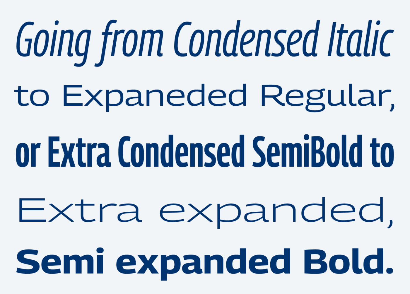
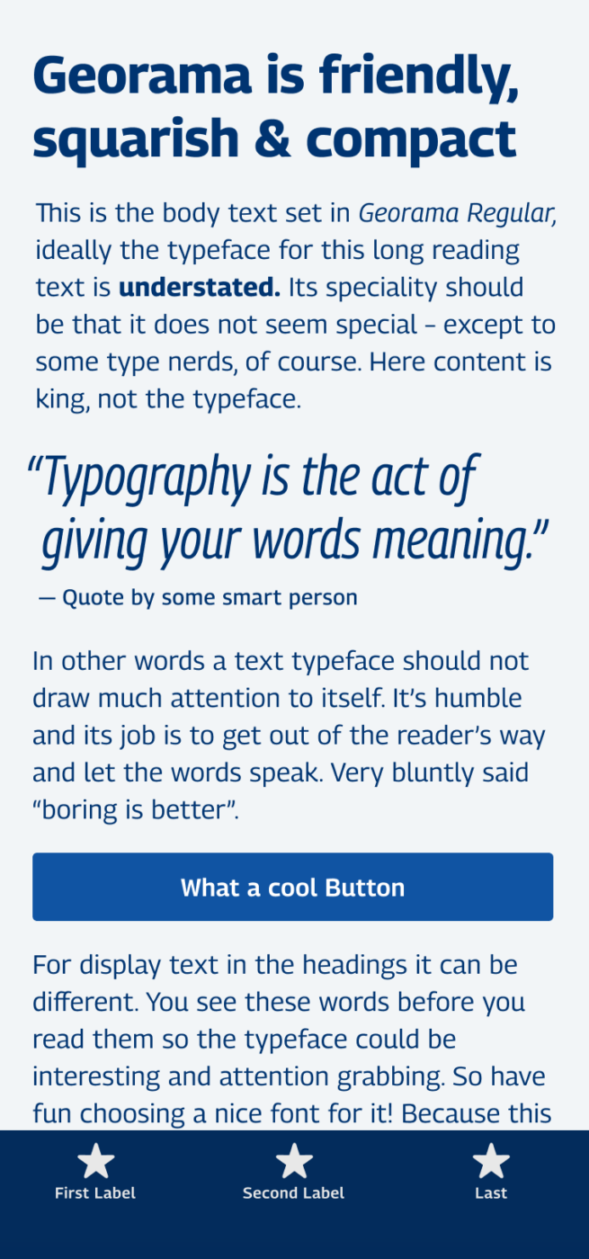
Georama is a friendly and versatile free sans-serif typeface by Production Type, and available via Google Fonts. The design comes with a rather large x-height, and open letter shapes. If you paid attention to any of my content, you know, that this is very beneficial for long format reading text, or UI and app design. The different widths from Extra Condensed to Extra Expanded are very handy for display text as well.

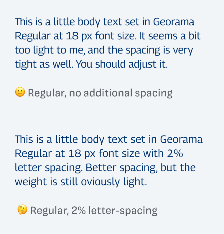
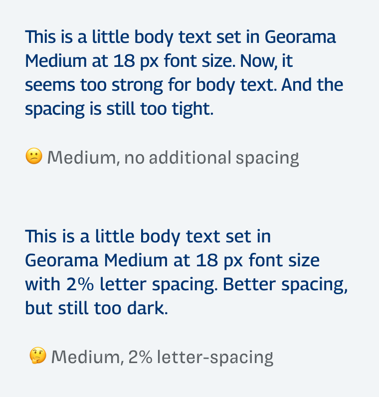
There are two things you should consider when using Georama. First, it fells to me, that the Regular weight is too light for body text. It simply has too little contrast for text sizes. And the next weight, Medium, is too dark. You can fix that with the variable font by picking a weight in between, like font-weight: 450. But that won’t work everywhere – looking at you Figma. The second issue I have is the letter spacing. For reading text, it’s too tight. So if you set it for body text at 16 to 20 px, I recommend increasing the letter-spacing by 2% or 0.02em.


Nevertheless, if you pay attention to those issues, and know how to set it right, Georama is a true workhorse type family. It even might overwhelm you with all its possibilities as a variable font.
Font Pairings for Georama
Georama is a dynamic, linear, sans-serif typeface. Pair it with wild, dynamic and contrasting Mazius Display for striking headings, or Corsair PE for a friendly handwritten touch.
- Headings
- Copy
- UI Text
Learn more about pairing typefaces using the Font Matrix.
What do you think? Is Georama something for an upcoming project, or have you used it in the past? Tell me in the comments below!


Finally, a font properly named!
You lost me, Oliver, with so many options in Georama. 🤪It’s a practical font even though it’s not my personal lettering style. But it’s great for playing with spacing and widths.
I see it useful in headings with Semi-expanded Regular. And excellent for UIs text! It’s good for i.e. poster design combining condensed and expanded to get dynamic in typography-driven applications.
Regular is on the lighter side, however, I won’t add letter-spacing ’cause the lightness is what’s already making it easier to grasp, while it’s readable enough. Not too tight for my eyes at least.
Time and time again, I’m impressed by your sharp eye to catch the tightness among letters. Georama is a clunky kind of guy, not carrying too much. Meant for some freestyle website, definitely not a commercial or banking profile.😆
Cool, glad you like it, Jana, especially the name 😉. Letter spacing depends on the actual size, which is a bit hard to show in my responsive image settings here on the site.
Eine schöne Schrift. Danke für den Tipp!
Aber gerne, Lena! Freut mich, dir etwas Neues gezeigt zu haben!
This font is great for subtitles. I’m using Georama Semi Condensed Semi Bold without outline, with shadows.
Absolutely, Gerald! Good choice for this use case ☺️.