

My thoughts on Inklination
You know me ranting about Helvetica and the replaceable, soulless feel it creates. Together with Arial, Roboto, or San Francisco it belongs to the category of neo-grotesque sans-serif typefaces. They have their purpose, but we’ve seen them too often recently. Man, I almost fall asleep while thinking about them … and this is why I celebrate a typeface that comes from that category but does it differently.
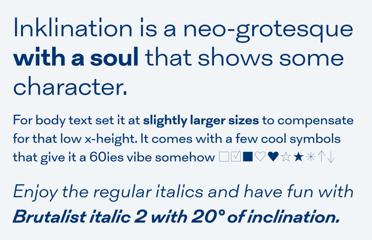
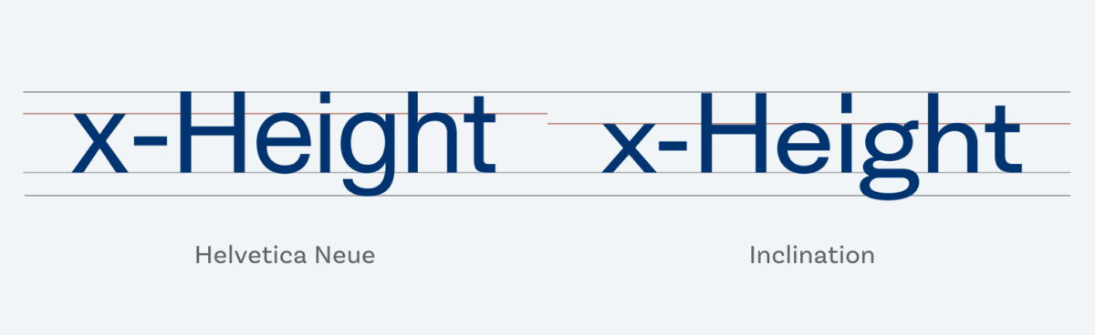
Inklination by Emtype Foundry is a neo-grotesque that shows some character. Gee, I love that rectangular long periods and dots on the i, the double-story g, the soft way the t’s crossbar connects to the stem on the upper left side, and how elegant the long ascenders and decenders let it seem. It has a rather low x-height, which also differentiates it from other typefaces in that category. It also means for body text you should set it in slightly larger sizes while decreasing the line height a bit. It’s apertures (the opening between the counter and the outside of the letter) are quite closed, which makes it an edge case for functional text in small sizes.
What I find super fun is the italic 2, that comes with the doubled obliqueness (or inclination, hence the name) of twenty degrees. It looks very off, distorted, hurts and that’s its point. Ideal if you want to slip a bit of that trend into your design for a heading or some big text but still need a robust typeface for your running text that fits. What do you think about it? Leave it in the comments below!
Font Pairings for Inklination
Inklination is a rational linear sans-serif typeface. It pairs well with anything else in that category that is less striking and more robust, especially for UI text. Like Inclusive Sans.

- Headings
- Copy
- UI Text

Learn more about pairing typefaces using the Font Matrix.
As you’re tired of neo-grotesque Sans-serif, I’m seeing all around the www Sofia Pro, Nunito and alike, rounded, large, thin/light-weight, oblique, geometric, “modern”, millennia-baby… Inclination has a sounding name. For my taste, it’s too wide and the x-height is low down under. However, it threatens some serious general usage!
Thanks for the suggestions, Jana! Yeah, these light gemoetric sans-serif are on the rise for quite some time now. And as I always say, it depends on the project 😉