

My thoughts on Outfit
What a beautiful typeface! Outfit is a geometric sans-serif and the official typeface for brand automation company outfit.io. It’s a free font, available on Google Fonts, and also comes as a variable font with a weight axis. What I like about it, is that it appears simplistic, but in a friendly and approachable way. It works great for headings, but also in body and functional text, Outfit performs well. With one caveat for UIs: its proportions are a bit wide, so it’s rather space consuming.
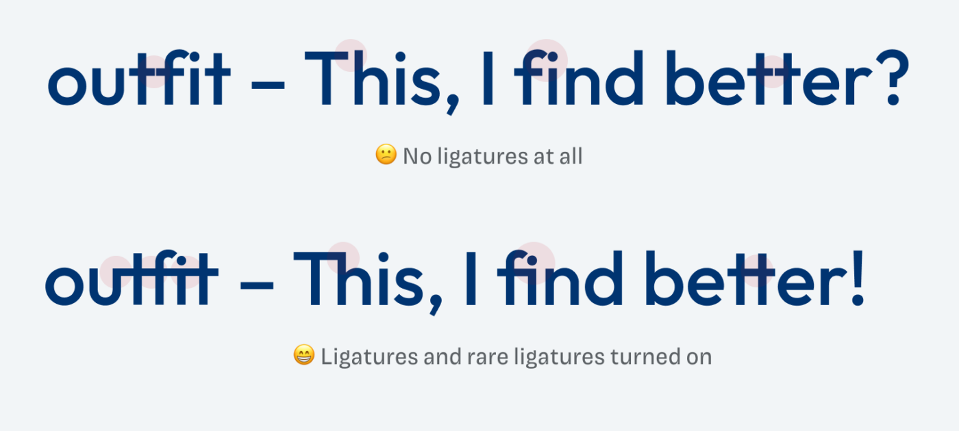
One of its specialities are the many rare ligatures, that can create quite interestingly connected titles. For body text, it would be too distracting and make the text too dense, so I would recommend only activating them for headlines. This is followed by another feature you can prominently see on the quote in the phone graphic on top. The stylistic alternates can create a very different mood. Suddenly everything is more striking and a bit retro. My advice is to use it sparingly for some special text, only.
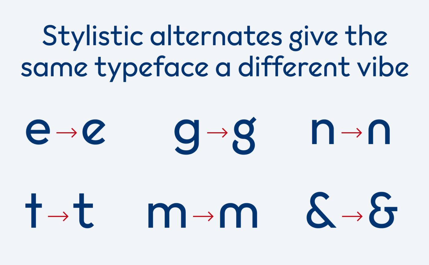
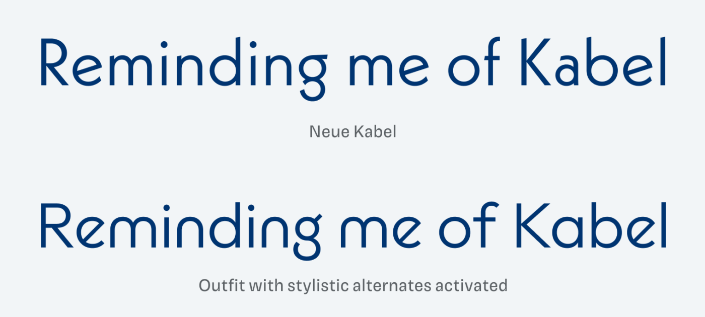
Outfit is mixing two styles of very popular geometric sans-serifs. It has a lot of the elegance of Futura in it. It also blends in influences from Kabel, another very recognizable geometric sans-serif classic from the 1920ies. You see this mostly in the stylistic alternates. Overall, Outfit it a blended revival of two cool classics, done in a contemporary and feasible way for nowadays applications. Thanks to Henk, who pointed me to this gem in a comment.
Recommended Font Pairing
Outfit is a geometric linear sans-serif typeface. If you look for a contrasting combiation for headings, pick all-caps Ancho. Or for very a very different vibe in your body Fraunces.


Learn more about pairing typefaces using the Font Matrix.
Update: Piazzolla is also the typeface you see in the body text of this very page. Learn more about my process of selecting it in this article.
What do you think? Is Outfit something for an upcoming project, or have you used it in the past? Tell me in the comments below!
I’m not that enthusiastic about the ‘Outfit’ myself. The rounded shapes of the font make it somewhat unsettled. The spacing with ligatures is also not optimal (‘better’ > the tension between ‘t-t’ and ‘e-t’ or ‘t-e’). And this font needs a lot of line spacing. So it doesn’t seem very suitable for long reading text. Certainly not on small devices. The outfit does have a distinct character of its own. That is definitely true!
Thanks for sharing your thoughts, Philipp! I agree with you, it would not be my go-to font for body text either, if it’s a very text heavy site. For marking purposes, little text, it’s sufficient. The ligatures only work in display sizes, for small sizes, it’s too much.
I agree with Phillip on the long reading text, it looks stubborn. But for non-nerdy type loves (me) it’s a true outfit for a Great Gatsby party💃🏻 so ’20s. Everything that looks a little bit Futura is sure my thing! I’m a Gemini Oliver, but my second zodiac is Sagittarius. I flirt between the styles as long as they’re not loud, but stylish, fashion-oriented.
Alternate g and e and &… character for branding that is standing! 🤩
It’s similar to the beloved font on my website, headings: https://allfont.net/download/futuris-cyrillic/ Futuris Cyrillic. (I’m waiting for a developer to fix the issue on an entrance, something went from with the homepage. But you may see it action on my blog https://soulcostume.com/journal/)
Back to the Outfit, my dear rounded letters, they’re in symphony as a military. I see it best in headings. My choice – Thin weight.
I really like this font! As you mentioned, it has a such friendly welcoming appearance. I love the roundness and the ligatures! Could be a lot of fun to play with. With those aspects in mind, I have a feeling many companies would also enjoy this font if they want to emulate those same characteristics (friendliness, welcoming) with their customers.
Happy you like it, Cam! This trend of friendly geometric sans-serifs was very dominant in the last years, and it still kind of is. Especially with tech companies, Google Sans or Airbnb Cereal are some examples of that. So it’s a bit overused. What makes Outfit a bit different are the ligatures. So it follows that trend, but still prevails a sense of individuality.
I think the key word here is free. Sure there are premium fonts that offer a little more in some departments, however this is a fairly inoffensive choice with a number of weights and a friendly feel. It’s a lot fresher than Open Sans or some of the other over used Google fonts.
Yep, free is always a trigger 😉.
I’m curious as to how one accesses/uses the special characters and ligatures available. For example I can access é by holding down the option key and pressing the e key, then pressing e once more. How do I use ligatures?
Great question, Daniel. That goes under OpenType features. Depending on the software you are using, you have to activate these OpenType features. Here’s a quick overview by Matthew Butterick, but you should search for it in your specific situation. What software are you using?
I really like the font, and it’s a great fit for a project I’m working on. However, for the longer texts, I’d like to combine it with a very legible font that conveys a sense of professionalism and seriousness. I can imagine using either a serif or sans serif font. Do you have any ideas for a combination? It’s best to include one from Google Fonts, because cost is unfortunately a factor.
If you’re looking for something serious, choose Gambetta, a lovely, modern serif font, which would make a very contrasting pairing. If it has to be something geometric and simple, Figtree is a good choice, it’s like a simpler version of Outfit. Used this pairing in a web design project for an art gallery in Vienna 😊.
I agree with you that it is a very friendly geometric sans serif. It’s simple and approachable without feeling fussy. It’s like a free alternative to Brown, Aperċu, or FF Mark.
The one knock I have against it was trying to use it in Google Docs. As body text it doesn’t really flow comfortably (the lowercase t’s in particular feel wimpy) and the weights are a bit heavy out of the box. So, not a true workhorse…but it’s beautiful in UI mockups and design documentation.
Some other free alternatives with a similar vibe: Figtree (very similar to Avenir) or Urbanist (similar to Avant Garde).
The breath-taking ligature u-t-f-i-t is just for the word “outfit” and its verb/noun forms (outfits, outfitted, outfitting).
The moment you try words with “fit”, i+t don’t… ligate?
Let’s be honest, that is quite misleading.
In honor of such behavior, I used in a fake parody website RushIQ: https://rushiq.netlify.app/. A fitting font 🤡.