
My thoughts on TT Autonomous
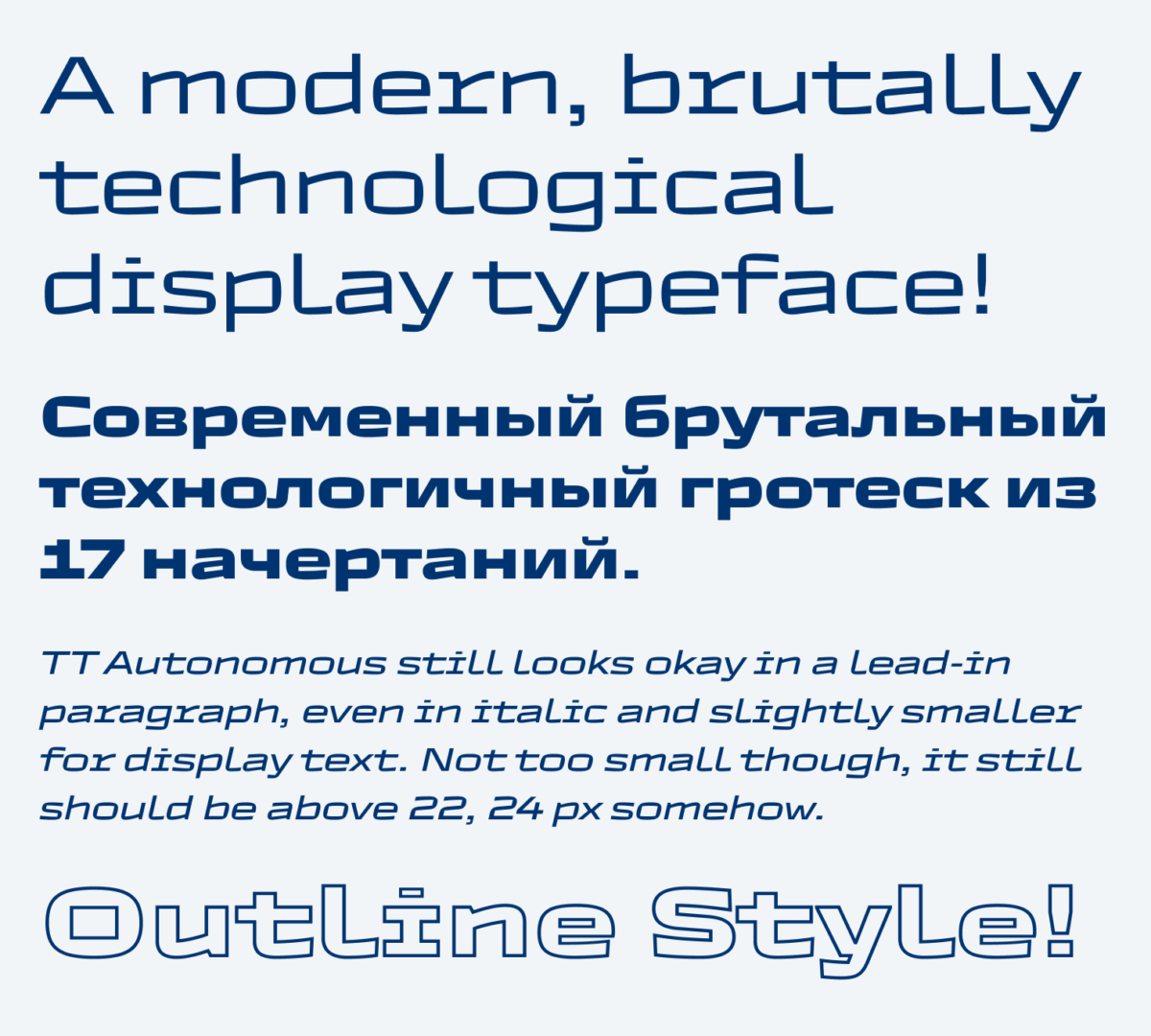
TT Autonomous by the TypeType Foundry from St. Petersburg just caught my eye when I saw it. I immediately fell in love with this very wide and squarish design. It’s rounded on the outside, but it has rectangular insides. I like the tension this creates, it has a somehow futuristic feel to it, but it also has a brutalist, broken touch to it. The italic seems very fast, and did you see that crazily wide dot on the i?
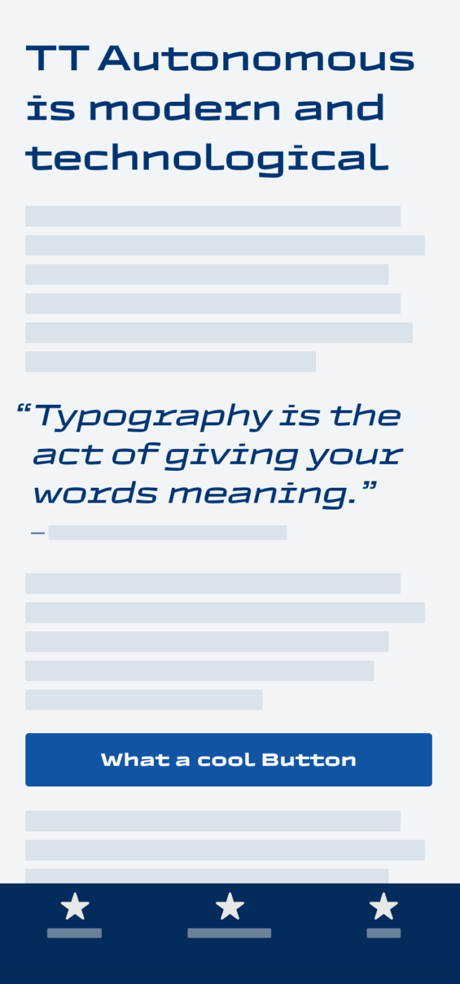
This is definitely not a typeface for body text, and for functional text it’s too wide. I could imagine it for a title or some headings, maybe an intro text? When set in a paragraph, It’s not super readable, it more or less creates a rhythmical pattern. And for mobile design it needs too much space. These are all arguments against it, but still, I love the way it looks and the vibe it creates. This speed. For a desktop web design, that goes more into an editorial direction, I could definitely imagine it, or anything that’s more horizontally oriented will benefit from it.
Font Pairings with TT Autonomous
TT Autonomous is a dynamic linear sans-serif font. Since it’s super wide, I recommend pairing it with something calmer for body text or UI text.

- Headings


Learn more about pairing typefaces using the Font Matrix.
But what do you think? Is TT Autonomous something for an upcoming project? Tell me in the comments below!