
My thoughts on Sligoil Micro
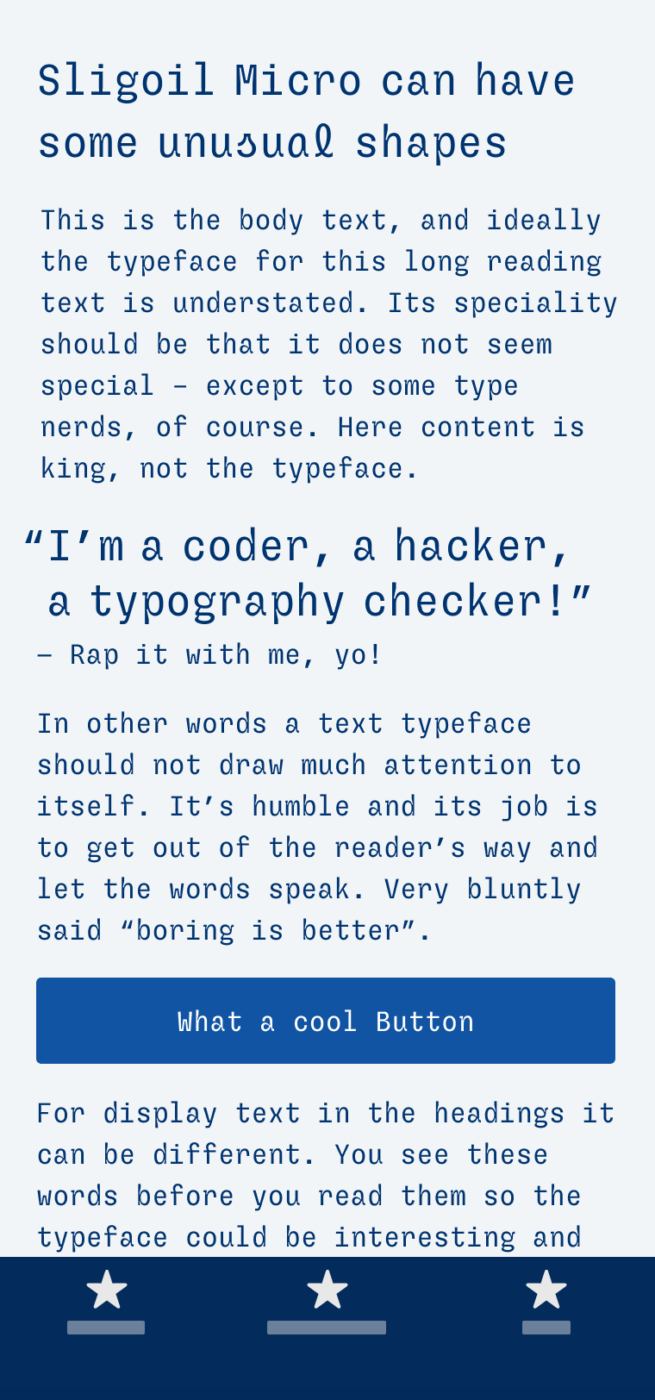
Let’s dig into the world of monospace, again! Sligoil Micro is a very striking and interesting free font, designed by Ariel Martín Pérez for the interface of the Unknown Number game. Within that, “Sligoil” is the name of an evil fictional company. The typeface is rather contrasting, and exaggerates some features, which gives it a lot of personality. You can clearly see that compared to other monospace typefaces.
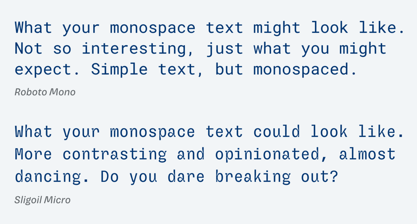
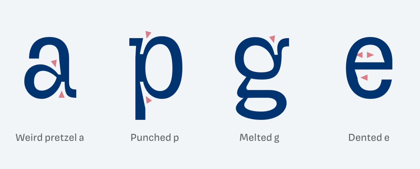
For a little body text or some UI-components, the large ink traps spice everything up. When looked at in detail, you can better see how funky, wobbly, and crazy some letter shapes are. Not taking things too seriously and making the monotenous spacing of monospace more fun.
Sligoil Micro is a typeface that works well in – surprise, surprise – small sizes, like 12 or even 10 px font size. Also, nicely on a dark background. You might consider it for coding, or maybe for the code snippets in your blog?
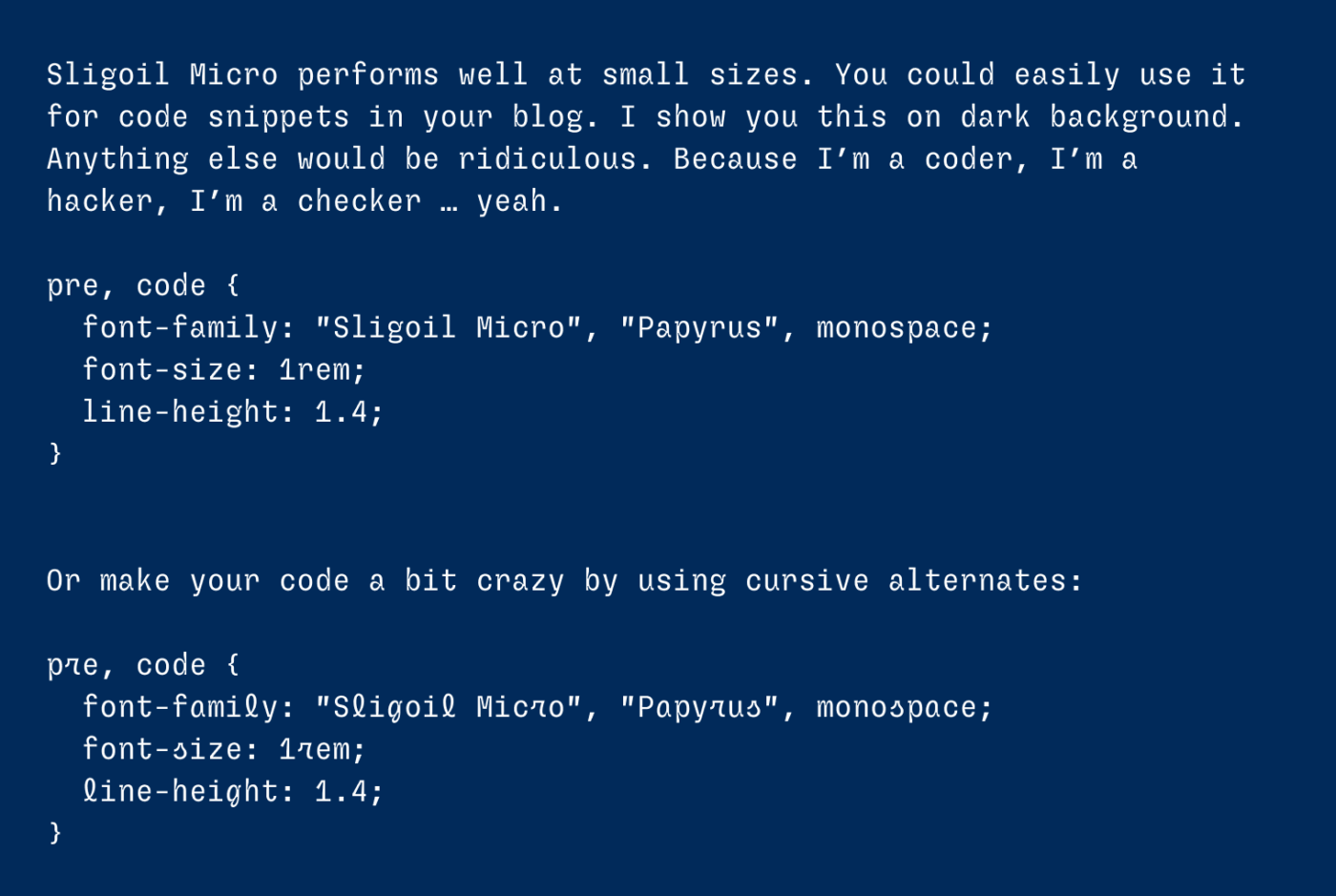
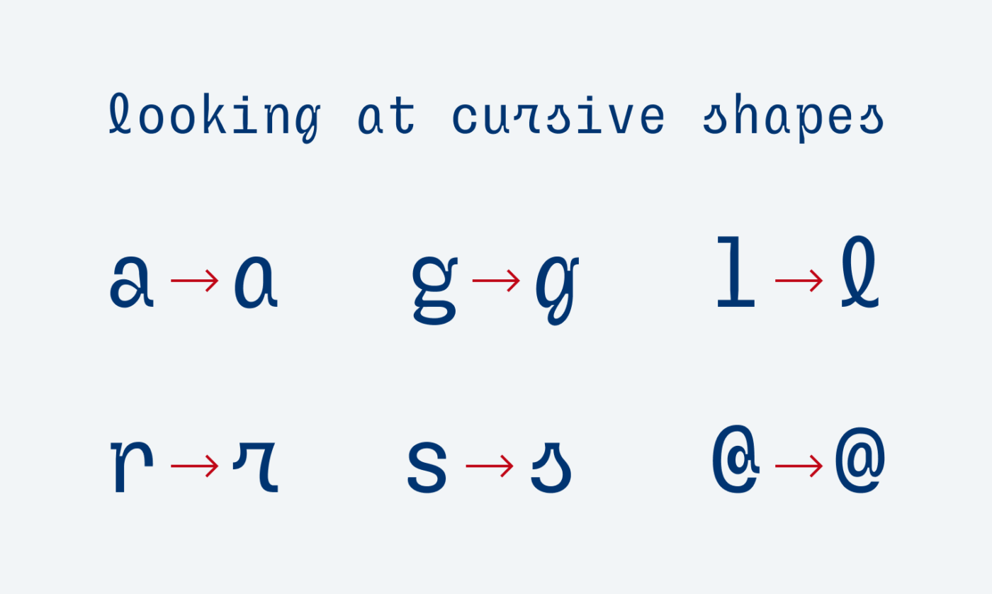
A nice feature are the stylistic alternates, where you can activate cursive shapes that turn certain characters into upright italics. This is rather unusual, and unexpected in monospace typefaces.
As with any monospace font, use it wisely and adjust spaces for larger text. If you want to learn more about that, check out this review.
Font Pairings with Sligoil Micro
Sligoil Micro is a quite rational, linear sans-serif monospaced typeface. Pair it with one of my recommendations here.

- Copy
- UI Text


Learn more about pairing typefaces using the Font Matrix.
What do you think, of this week’s font recommendation? Tell me in the comments below, also if you have a suggestion for another typeface.
A ton of personality, playfulness, monospace – a style I adore, finally properly named font and FREE?
This is a lottery Oliver!
Project? This might be a UX superstar for my upcoming website redesign.
🤩
YAY! 🤗 Jackpot! So happy to hard that, Jana!
Cool font! 🤩 To help people looking for how to enable cursive alternatives in VS Code:
“editor.fontLigatures”: “‘ss01′”
Thanks a lot for adding that, Matija!