
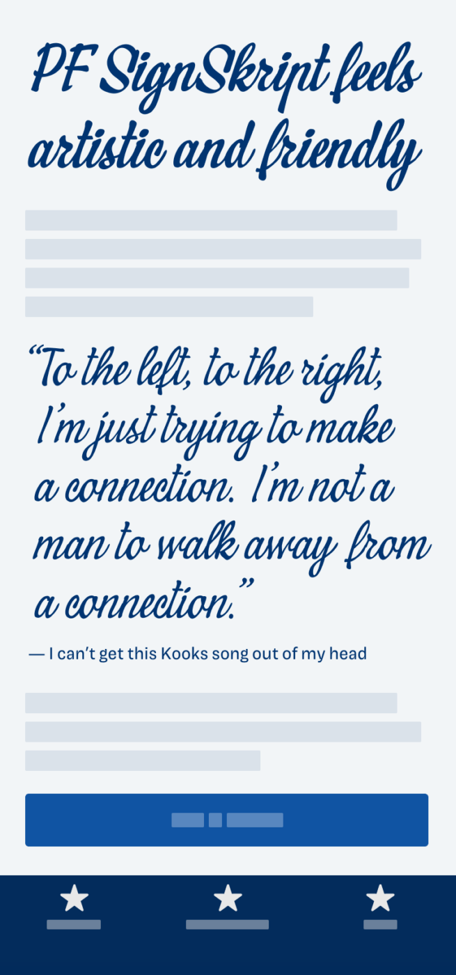
My thoughts on PF SignSkript
When I received a newsletter from the Greek Parachute Type Foundry that featured PF SignSkript I was super intrigued. It is a very lively, casual, and calligraphic brush script typeface, ideal for short headings, even just a single word in very large sizes. What I particularly like about it, is that it is not super polished. It is not that smoothened like Bello by Underwear, but also not that refined in some details, but more on that later.
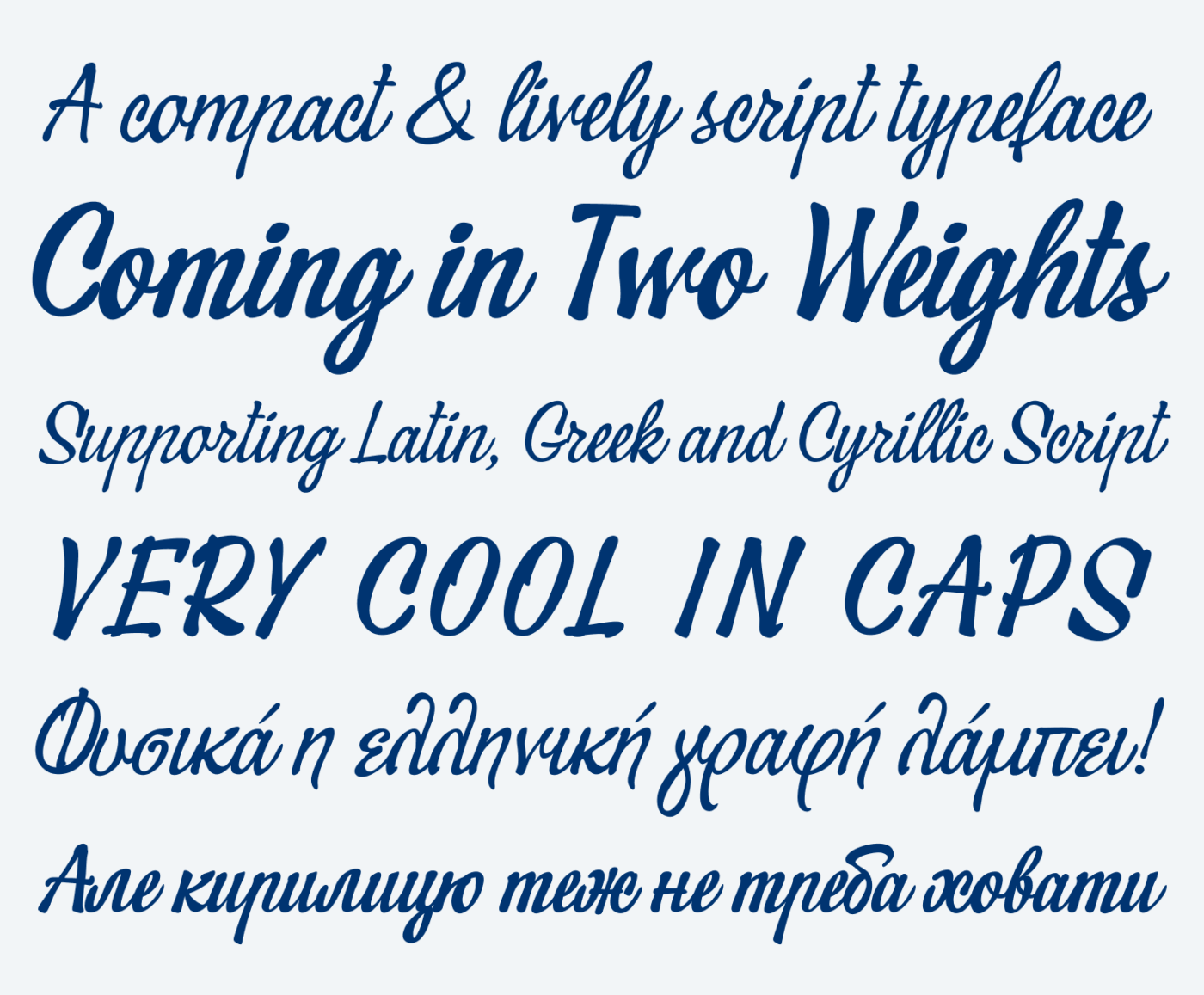
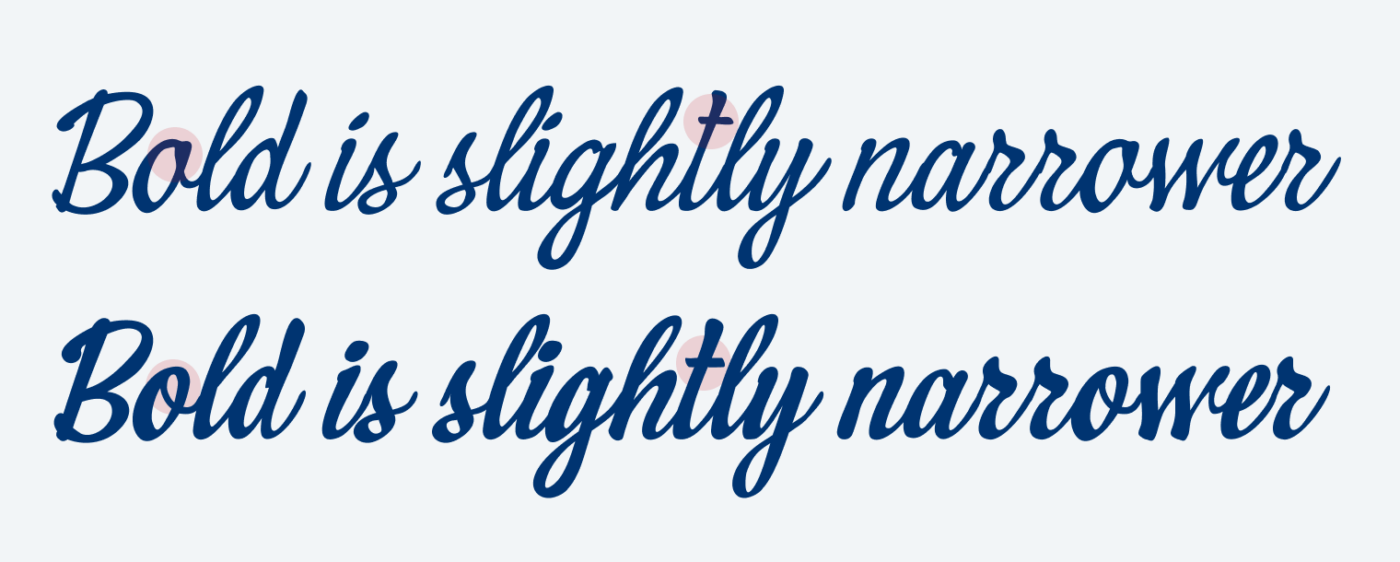
PF SignSkript evokes an artistic but still approachable feeling. Interestingly, the bold weight differs quite a bit from the regular. And it also is a tiny bit narrower, resulting in a darker and more contrasting appearance, giving you the impression that it was really written with a thicker brush.
When picking a script font, you want to create a natural, handwritten impression. And key to that is how the letters are connected. You can quickly see when it does not work (below), but to spare you trying out every possible word, save time with this trick. Type the lower case “r” and see how it connects to other letters. If this is done well, you’re good to go in most cases. See it in this silly short video, and shout out to Rob Leuschke, an experienced script typeface designer, who told me about that.
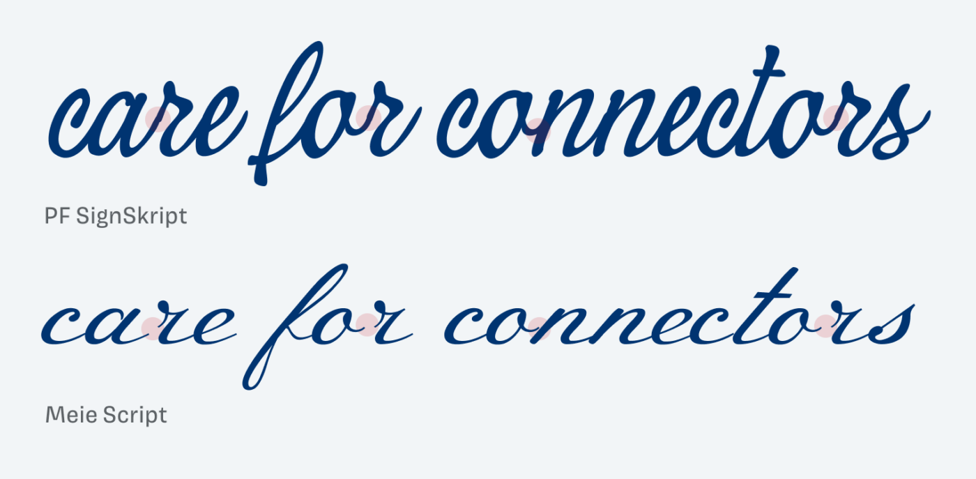
PF SignSkript creates fairly well-connected words, although even there some things don’t align 100% smooth, as you can see above. And with some contextual alternates it could be even better. Also, in some cases the kerning is off and I had to adjust it manually.
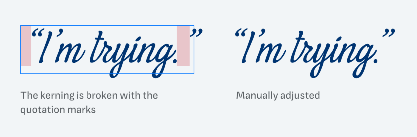
However, I still treasure more that PF SignSkript makes the impression of a more natural and rough typeface, that’s not optimized to the last bit, and I’m sure these bugs will be handled by Parachute.
What do you think? Is PF SignSkript something for an upcoming project, or do you have a font recommendation? Tell me in the comments below!
I think that the Slavic population should take advantage of this unusual script font. It shines in Cyrillic and Greek.
I don’t love the bold version.
It’s great for merch design (greetings, invitations, etc.) and everything printed.
I think so too! I don’t know a lot about Cyrillic and Greek script, but this one feels right!