My Spektra Font Review
When I first spotted Spektra I was immediately drawn to it. Its strong contrast creates a dense, almost ornamental typographic impression. Paired with the daring slanted and backlanted style, it made me want to review it even more. But besides these features, something much more special was revealed when I took Spektra for an extensive test drive.
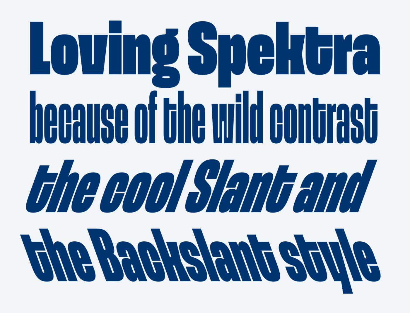
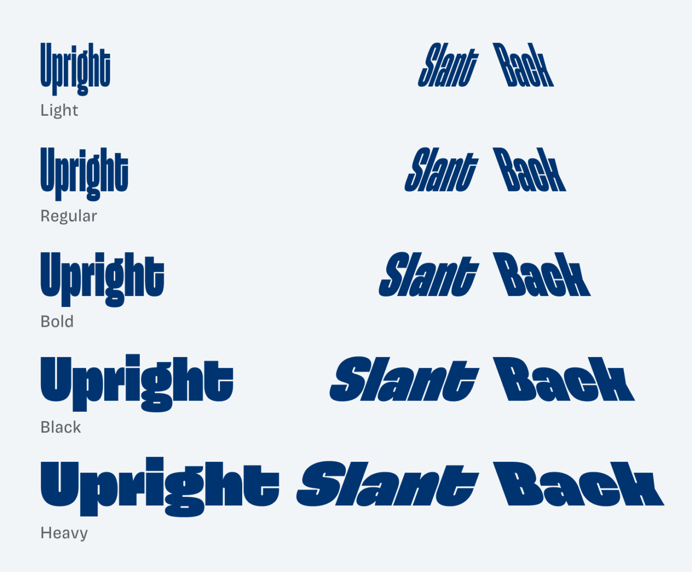
One peculiarity is, when Spektra gets bolder, it also becomes wider. This way, the narrow inner space is maintained across all weights, though the light styles can be harder to read at smaller sizes.
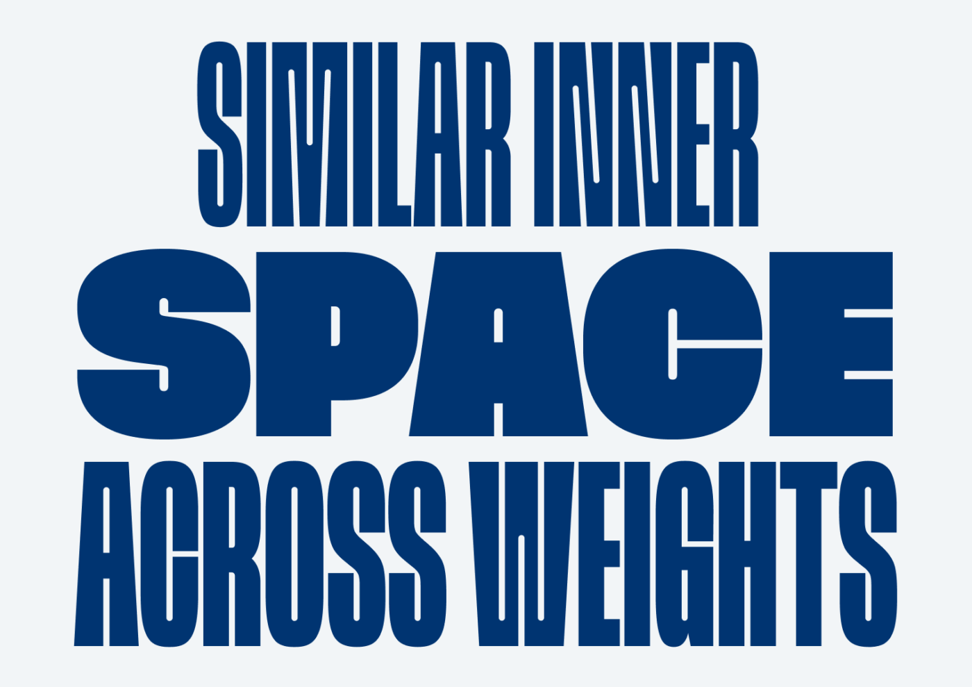
This is remarkable because it allows you to create intense typographic patterns. And I feel like these look especially convincing in all caps. The example below could already be a poster design.
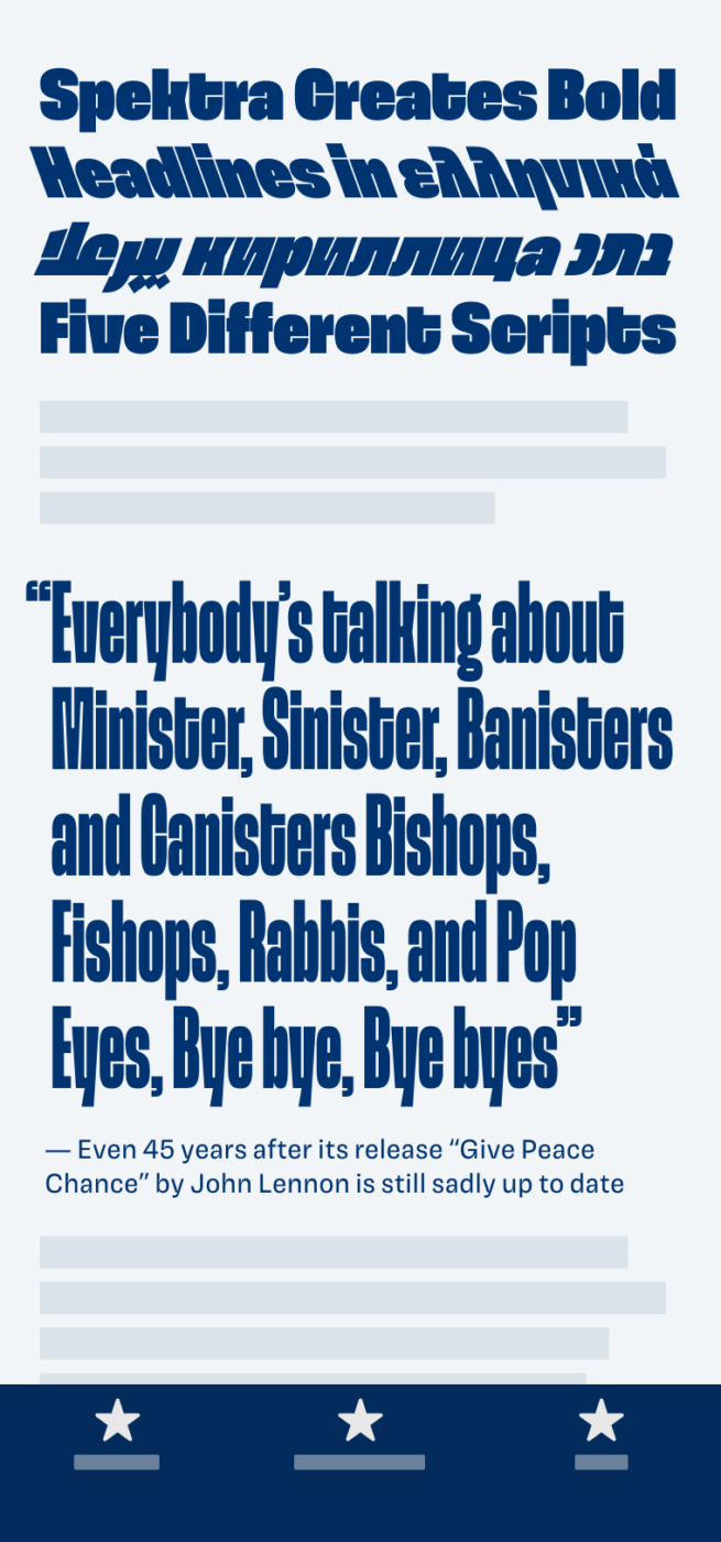
But the one thing that really surprised me with Spektra is how homogenous it seems across the five scrips it covers: Greek, Cyrillic, Hebrew, Arabic and Latin. At first glance, the example below does not reveal how diverse these scripts actually are. It seems more like a typographic pattern, and that’s where its beauty lies.
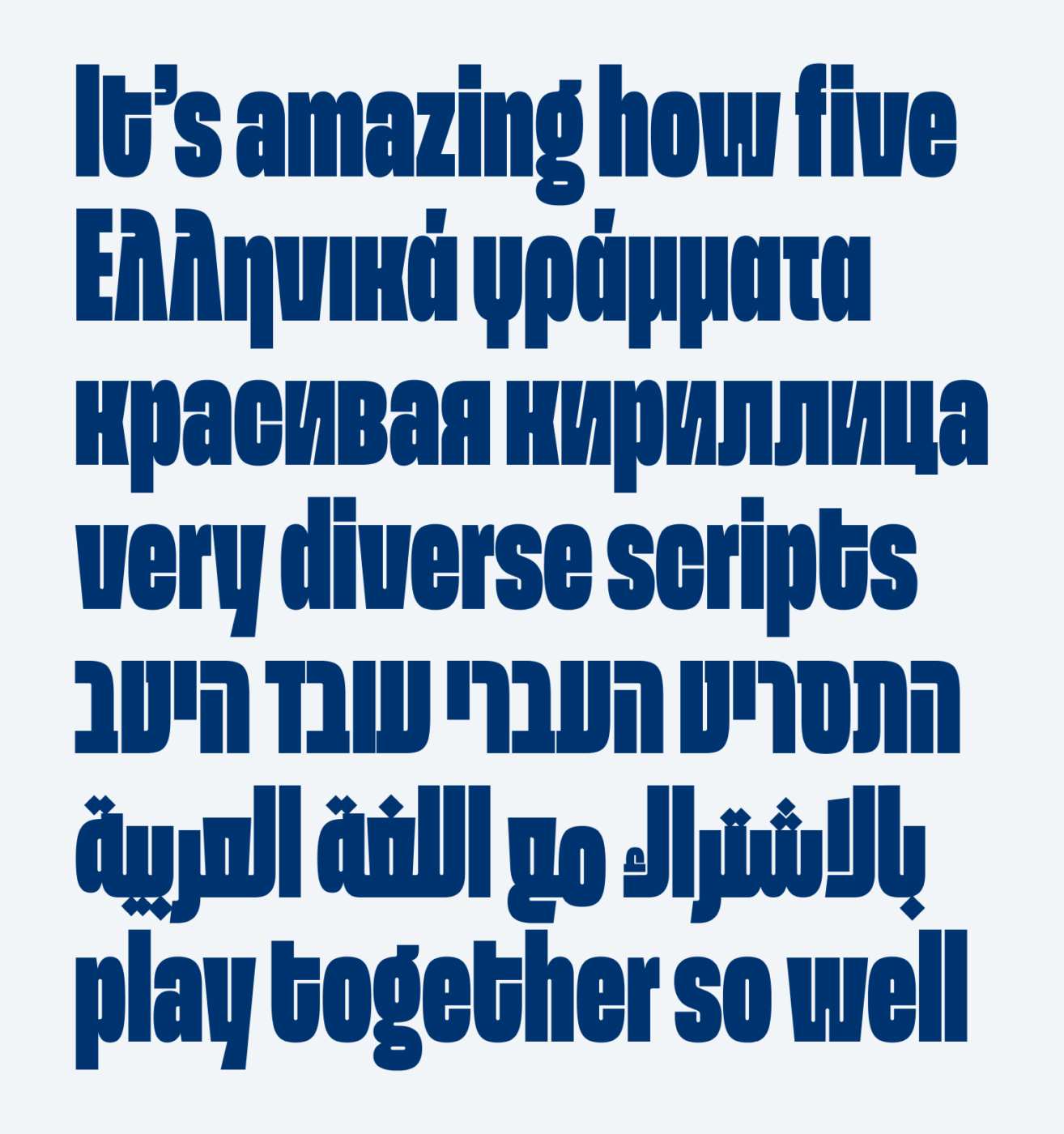
Latin, Greek and Cyrillic script have many related shapes and combine more subtly. However, Arabic and Hebrew are very different from them and normally stand out more. You can better appreciate how well Spektra works when comparing it to Noto Sans. In Noto Sans, the Arabic and Hebrew text immediately draw attention.
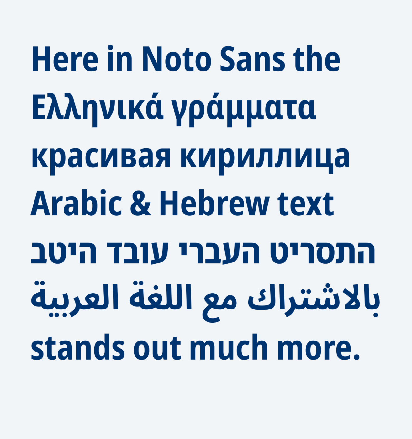

So if you’re looking for a special, flashy headline font, give Spektra a try. Have fun exploring it for your titles, posters, or logotypes, maybe across several scripts even.
Font Pairings with Spektra
Spektra is a quite rational, linear sans-serif display typeface. Pair it with quite similar Magnet for body text, or something else from my recommendations.
- Headings
Learn more about pairing typefaces using the Font Matrix.
How do you like Spektra? Tell me in the comments, also what cool typeface I should review next!

Hi Oliver,
Love your Font Fridays 🙂
Would be interesting to hear your take on “Sarabun” – available for free in the Google fonts library.
I find this typeface extremely easy to read. To me, the legibility is similar to our boring old friend Times New Roman.
I especially like the light version for body/copy text.
A bit unsure of what to pair it with for the headings. Would a Geometric font like Poppins Medium/Semibold work?
Fun fact: Sarabun is considered the “National font” of Thailand (both Thai and Latin version) used in all formal documents.
Cheers,
Dan
Oh, thanks for the suggestion, Dan! I like that it’s Thai and Latin script! From its construction it is a quite dynamic typeface, pairing it whit a geometric one might work, it might be different enough, but it depends on the case. I’ll look into it!