Sans-serif typeface

from Google Fonts
designed by Kostas Bartsokas

Variable Font

4 axes: Flare, Volume, Weight, Slant

18 Styles

9 Weights: Thin to Black
with matching obliques

Additional Scripts

Cyrillic, Greek

Best for

  • Headings (display text)
  • Long reading text (body text)
  • User Interfaces (functional text)

License

Free and Open Source

Specialty

A versatile and warm free sans-serif typeface with hidden additional styles, that can give it a fairly different voice.

My Commissioner Font Review

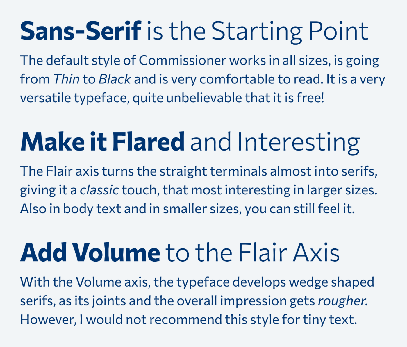
Commissioner by Greek designer Kostas Bartsokas is an extraordinary sans-serif typeface, that I recently discovered on Google Fonts. It has a warm and friendly vibe, with is the sturdy strokes, open letter shapes and classic proportions. The typeface is very versatile, from tiny to large text, Light to Black. But the coolest part are its hidden features, only available with the variable font.

Classic, Noble, Warm. Commissioner is a lovely humanist typeface, that has three voices. The default a clean sans-serif, as you can see here, which is ideal for calm body text or small functional text. Big, Black & Flared. Sturdy, Clean and Legible. Extra Bold meets slanted. Elegant & well formulated.
Friendly and varied – Commissioner is an all-round free font, working from tiny UI text to big titles

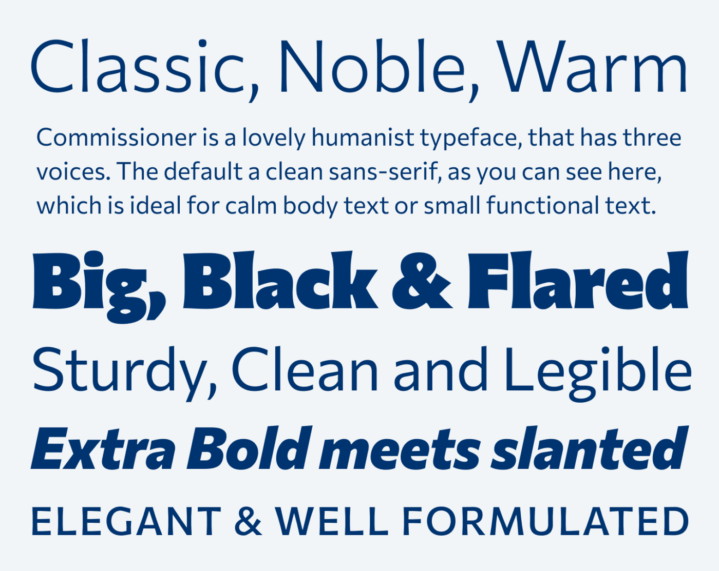
The variable font comes with four axes, of which Flared and Volume are most interesting, because they can change Commissioner’s voice quite a lot. With the Flared axis, you can watch how the straight terminals get broader, which is giving them a softer, more noble touch. If you now turn up the Volume 😉, everything gets a bit rougher and edgier, as the serifs turn wedge shaped. Note that the Volume axis only shows an impact when you also increase the Flare axis.

A capital “I” and a lower case “n” in three different styles. The default sans-serif style shows soft junctions and straight terminals. The flared style shows sharper junctions and softly flared terminals. The Volume style shows edgy junctions and wedged terminals.
The three voices of Commissioner – see how the details change.

These differences are most obvious in larger sizes and stronger weights. And this is where I also recommend using them. Nevertheless, also in regular weight body text, you can feel a slight impact. But keep in mind, the smaller the text, the noisier it might look with the Volume turned up.

Sans-Serif is the Starting Point. The default style of Commissioner works in all sizes, is going from Thin to Black and is very comfortable to read. It is a very versatile typeface, quite unbelievable that it is free!

Make it Flared and Interesting. The Flare axis turns the straight terminals almost into serifs, giving it a classic touch, that most interesting in larger sizes. Also in body text and in smaller sizes, you can still feel it.

Add Volume to the Flare Axis. With the Volume axis, the typeface develops wedge shaped serifs, as its joints and the overall impression gets rougher. However, I would not recommend this style for tiny text.
See the various styles in action: Flare and Volume work best in larger sizes.

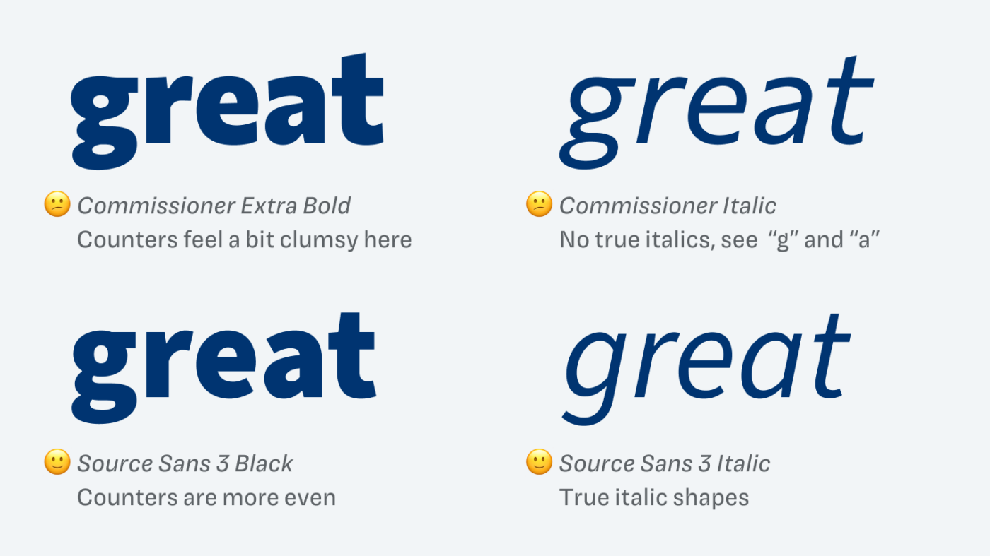
Besides all these positives, there are two things that bug me a bit about Commissioner. Firstly, in the stronger weights, the counters – especially from the lower case “g” – feel a bit off. Secondly, I wish there were true italic shapes, which would so much better fit a humanist sans-serif, than a slanted double story “g” and “a”.

Commissioner Extra Bold: Counters feel a bit clumsy here. Source Sans 3 Black: Counters are more even. Commissioner Italic: No true italics, see “g” and “a”. Source Sans 3 Italic: True italic shapes.
I wish Commissioner’s counters seemed a bit more even in the darker weights, and the typeface would come with true italic single-story shapes.

Overall, Commissioner is a brilliant typeface, that I’m eager to use in a web or app design project. Especially when it comes to larger text in addition with that delightful flared terminals.

Font Pairings for Commissioner

Commissioner is a dynamic, linear sans-serif typeface. If you want something more striking for headings, choose the dynamic, crazily contrasting serif typeface NaN Tragedy.

Commissioner (free)
Commissioner (free)
  • Headings
  • Copy
  • UI Text

Learn more about pairing typefaces using the Font Matrix.


Do you have another font recommendation I should share? Tell me in the comments!

Typographic power to your inbox

  • Font Friday: I recommend one typeface per week, free fonts included.
  • Type Tuesdays: articles & videos that up your design game.
  • Join 2500+ typography enthusiasts, unsubscribe anytime.
Edition #158, published

2 Comments

Leave a Reply

Your email address will not be published. Required fields are marked *