
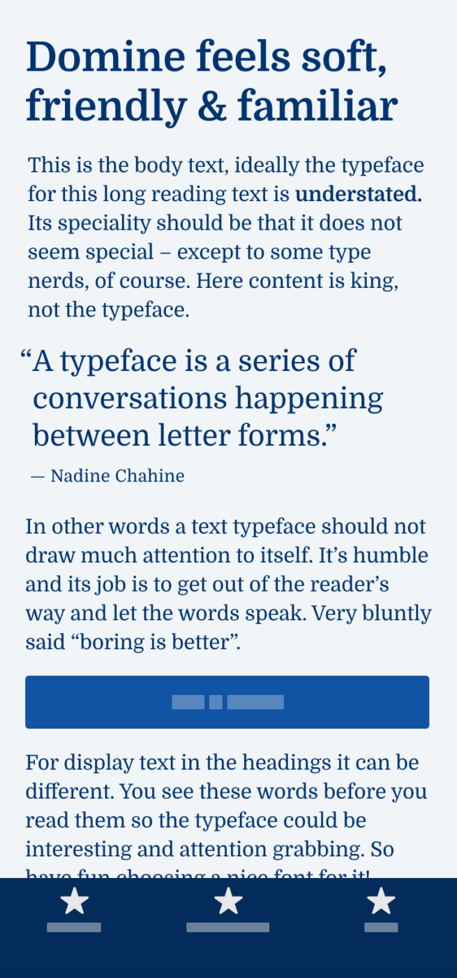
My thoughts on Domine
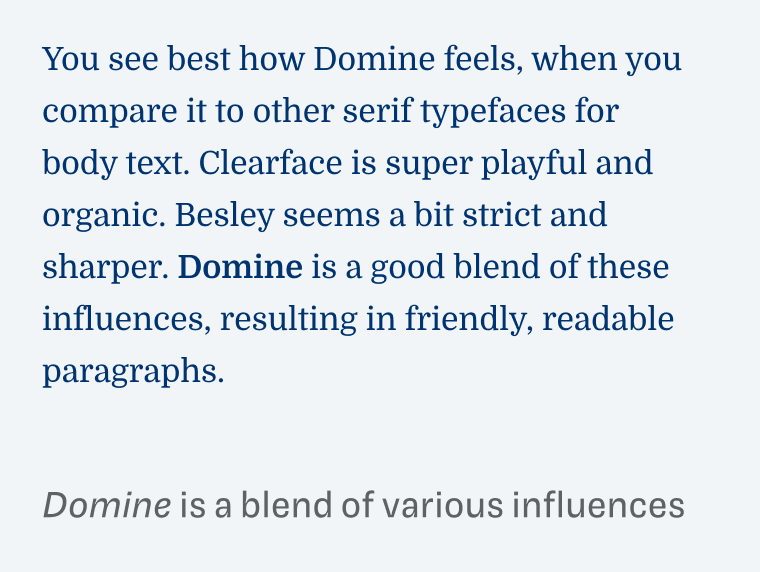
This week I take you on a journey how various influence shape a typeface and its perception. Ready? Then let’s go! Domine by Pablo Impallari is a very friendly, soft and approachable serif typeface, made for long reading text on screens. This is because it combines many classic elements of familiar and popular typefaces. In my opinion, the most influential are Clearface and Clarendron. Let’s take a closer look at that and what it means.
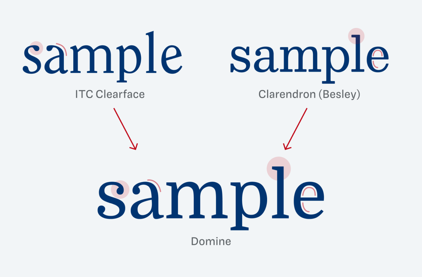
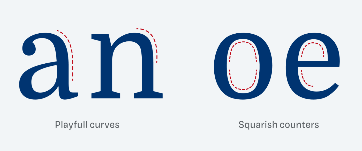
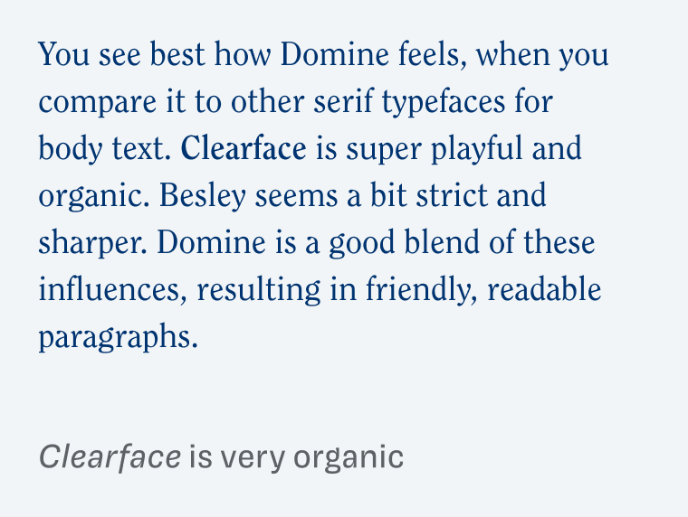
Clearface from 1907 is a very organic, and lively typeface. Clarendon dates back to 1845, and is much stricter and stiffer. Now see how playful curves (at the a and m) and the ball serifs from Clearface are combined with the stricter serifs and squarish counters of Besley (here representing the Clarendron style).
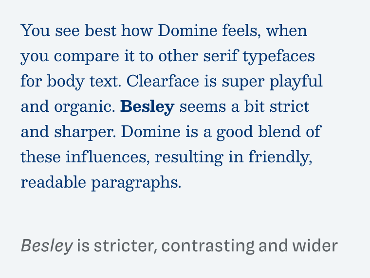
All these details add up to create a certain impression when set in long reading text. And you will see it looking at the examples below. Besley seems very strict and contrasting. It is also quite space consuming. Clearface is super fluid, and simply too much for long reading text. Domine is bringing it all together.
There are only two things I’m not so happy with this typeface. Firstly, Domine only comes in four weights: Regular, Medium, SemiBold and Bold. Unfortunately, the Bold is a bit too light to stand out among the Regular. It’s not contrasting enough to emphasize text, especially on screen. You can see that in the example above, especially when you compare it to Besley. And secondly, an italic would be great to be really a useful typeface for long reading text.
The good news is, that you can seamlessly adjust the weight, since it’s a variable font. So smaller captions can become font-weight: 500, which is neat. Overall Domine is a good choice for your next project, when you want the body text to be a traditional, but in a friendly and approachable way.
Font Pairings for Domine
Domine is a quite rational, contrasting serif typeface. To emphasize its soft and playful touches, pair it with expressive Avril for headings or make it wild with rational FR Kraken Slab.

- Headings
- Copy


Learn more about pairing typefaces using the Font Matrix.
What do you think of this week’s typeface? Let me know in the comments, and share it with me when you used it in a project!
New Year – fresh New inspired Oliver! I’m noticing the positive difference in this new post🤩
Congrats on your start on Patreon, first and foremost. It was an epic Live on YouTube. Please, keep ’em comin’!
I’ve also noticed improved verbal branding on your website🙌🏻
On this week’s font👉🏻 Domine, amiable ‘it’ (neither he nor she). I used it for small business owners’ branding where the budget and demand for long-reading content were small. In that way, it shines sophistically! Its squarish inside curves lean to a more corporate feel. While playful curves relax the situation. It’s a good balance, that’s why it works so nicely. Solid font, overall with the best utility in headlines, especially for graphic design!
I wonder, have you written about Freight Text Pro?
Yay! New Year, new delightful comments by Jana! 😉 I always appreciate how you describe typefaces “while playful curves relax the situation” 😍.
I have not written about Freight Text, I know and like it, but there is already a lot said about it. Anyway, thanks about reminding me of it!
All seemed fine in reading Oliver’s piece, but when I looked at Domine in Google fonts, I was struck by the uniformity and blandness—and not in a good way for this type nerd. We do want fonts to have good color, but the color of Domine is so homogenized it’s monotonous. I’m not sure why; maybe it’s the low contrast. Domine comes in 4 weights (not 2), and I agree they are far too similar. All that and no italic make this a no-go for me.
Thanks for your thoughts, Steve! I can understand why you find it very monotonous. Thanks for the feedback, updated the article, not sure why I only had two weights in there …
Hi Oliver! In your font matrix article, you give Bitter as an example of a dynamic typeface. To my untrained eyes, Domine looks pretty similar in a lot of ways, but its closed a and e made me think it rational. Where would you put Domine on the matrix?
(really appreciating the wisdom, keep it up!)
Yes, Domine has a rational form model 😉.