
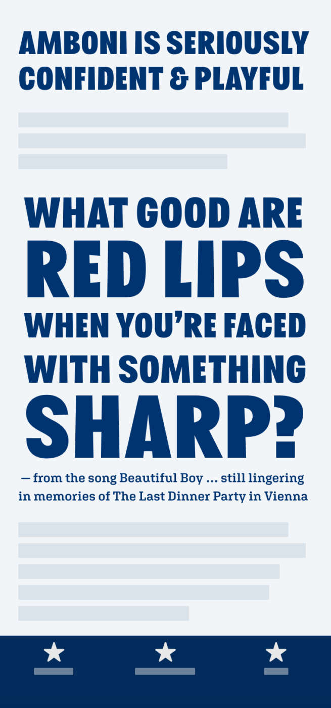
My Amboni Font Review
This all caps, sans-serif typeface makes me genuinely smile. Amboni is a display typeface for serious, bold, and striking text, that does not take itself too seriously 😉. Made for big titles, headlines, posters, or any other larger text, that wants attention. Thanks to the narrow proportions and slightly squarish design, it remains optically balances while fitting a fair amount of text in little space.
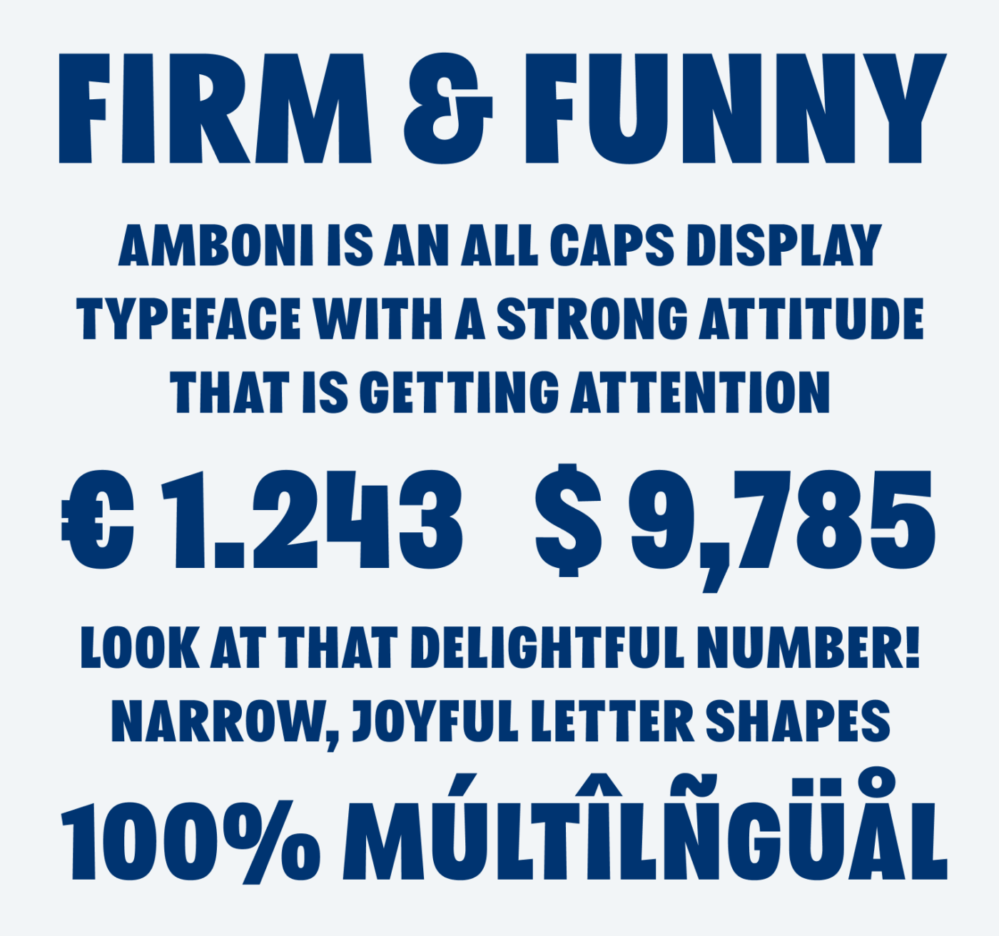
What I like about Amboni is, how the natural confidence that comes with all caps and the bold weight, is balanced with wonky angles. This way Amboni can pair firm with funny, confident with playful, stable with wobbly. And it shows when you examine its details.
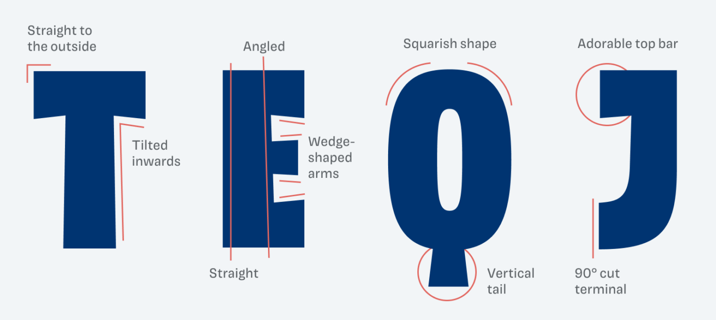
At times, and in sizes below 40 px, I feel Amboni renders a bit unclean, especially the small counters from letters like “A” or “B”. Also, in my opinion the “R” seems a bit too dark and clumsier than other letters. But since this is a typeface for a little text only, it might not be problematic, and only highlight its subtle and lovable craziness.
Font Pairings for Amboni
Amboni is a rational linear sans-serif typeface. So rational Aglet Slab would make a good match. But since Amboni is all caps, quite narrow and bold, combining it with an obviously different typeface like Arida works well.

- Headings


Learn more about pairing typefaces using the Font Matrix.
What do you think? Do you embrace the boldness of Amboni? Or is it too much? Tell me in the comments!
This plays with my eyes/mind in a fun way. Its letter forms don’t depart all that far from the typical when you look at one in isolation, yet it’s very clear that it’s deliberately non-regular when you just read the whole. More than the sum of its parts in that respect and right in the sweet spot IMO. A nice selection, Oliver, and congratulations to the designer of course.
“More than the sum of its parts” is very well said, Jeremy! Glad you enjoy it!