
My thoughts on Self Modern
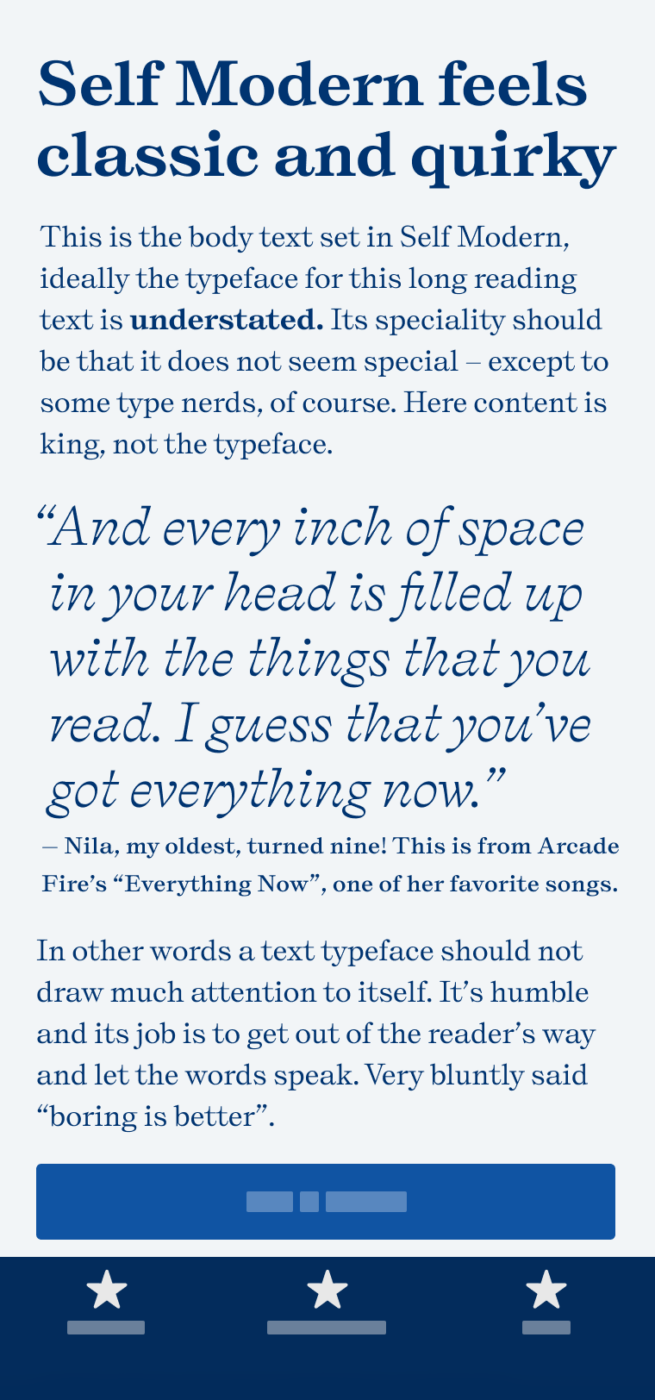
I immediately fell in love with this classic, contrasting, and quirky typeface that combines so many influences. Self Modern is a rational, strict serif typeface, working great for unique, confident headings and some playful body text.
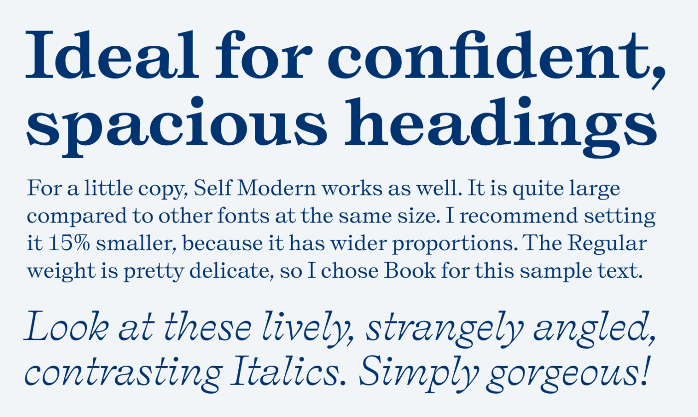
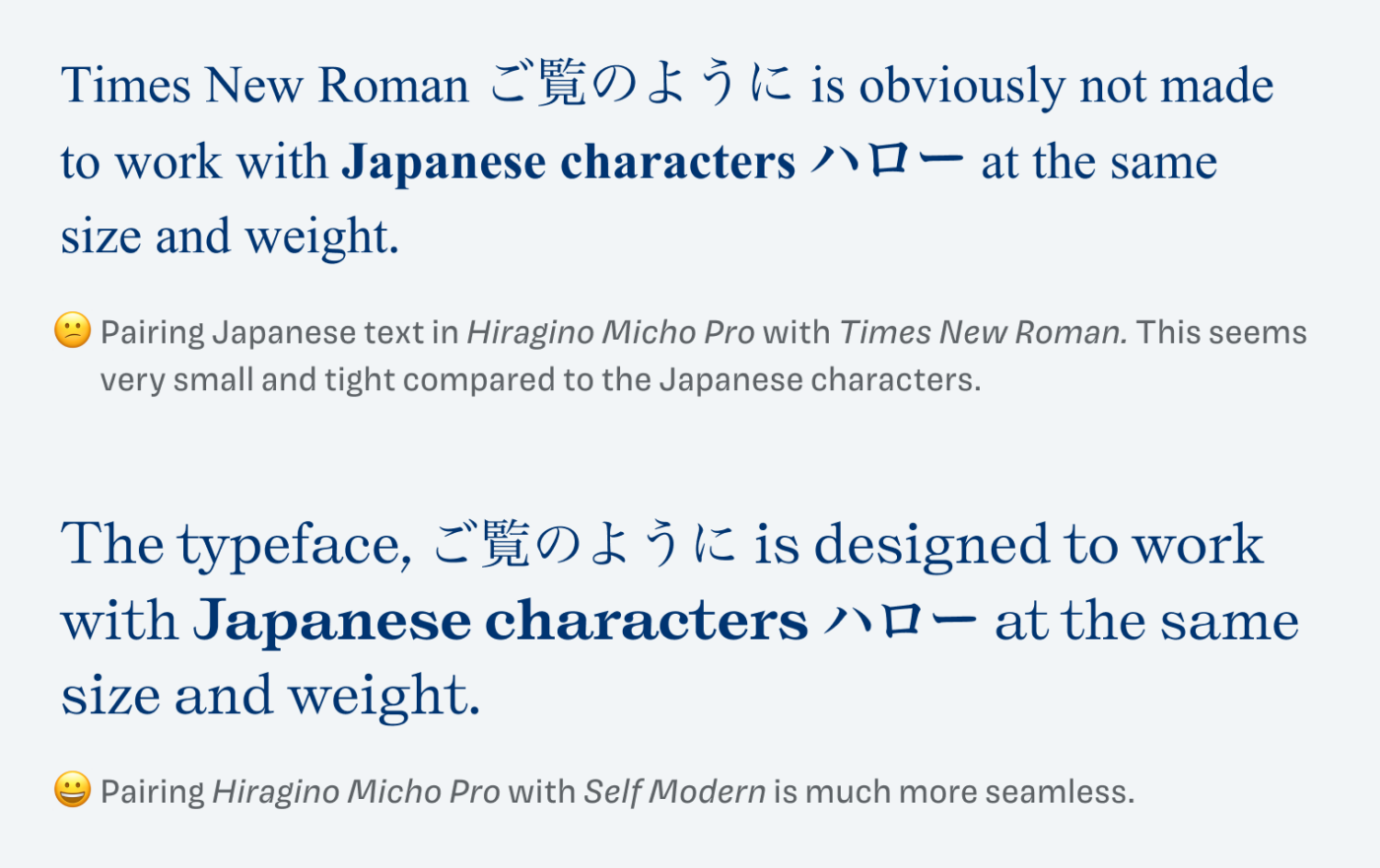
It has as quite wide proportions and seems pretty large, compared to other serif typefaces, even of the same genre, like Besley. It was inspired by specimens of traditional serif Japanese typefaces, called “Mincho”, which are the dominant style in print. This is also why it pairs very well with Japanese characters set at the same size and weight, which you can not say of every other Latin typeface. But I’m not an expert in this, so if you are familiar with Japanese typography and have additional thoughts, please add a comment below!
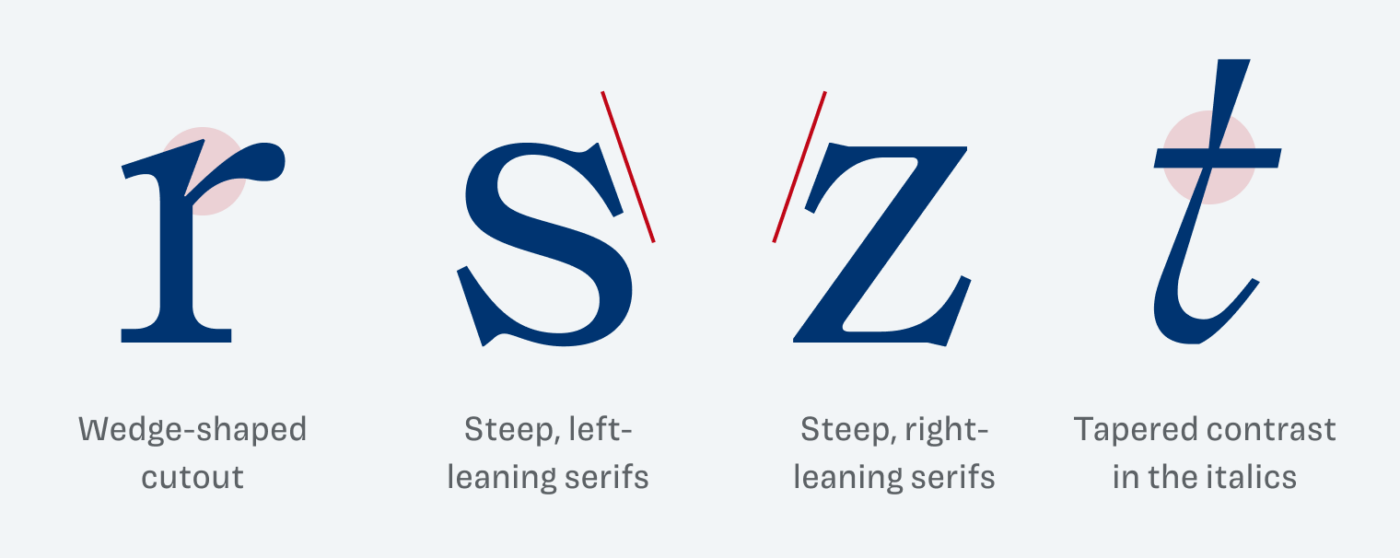
It seems very sturdy and sober, when looking at the upper case M. But then, the details break out of that, which makes Self Modern very playful on the second sight, pulling in several directions, and showing its liveliness.
Especially the italics are so charming and beautiful, working perfectly for larger text. I only wish they were also available in more than the Regular weight … So overall a great choice for stunning poster, and interesting websites, where the text can be a bit more spacious and striking. For a lot of reading text, it might be too spacious.
Font Pairings with Self Modern
Self Modern rational, contrasting serif typeface. Pair it with rational Easy Grotesk for playful body text or soft, dynamic Asap.

- Headings
- Copy


Learn more about pairing typefaces using the Font Matrix.
Thanks to Lorcan, a supporting Patron who suggested Self Modern to me! Do you have an idea which font I should review next? Tell me in the comments!
Interested to see the italic used to nice effect on the interesting Font Brief site. See here on the about page. Also mouse over the personality labels, and see at the bottom of some pages.
https://www.fontbrief.com/about
Yes, the italics are the most beautiful part of this typeface! Also spotted them in Vienna on a poster in a shopping window. It is so distinct. Once you’ve seen it, you always see it.
This typeface is beautiful—especially those italics! I loved your point about it pairing well with Japanese.
Happy you enjoy that one, Adam! Biggest fan of the italics, too 🤩!