
Slab Serif typeface

from Blaze Type
designed by Ale Grau

Variable Font

1 axis: Weight

12 Styles

6 Weights: ExtraLight to ExtraBold
with matching italics

Best for

  • Headings (display text)
  • Long reading text (body text)
  • User Interfaces (functional text)

License starting

around $50 (one style)
around $600 (bundle)

Specialty

A warm, confident slab serif with wide proportions, dominant inward-curved serifs and lovely small caps. Best in wider text columns.

My Guirnalda Font Review

Guirnalda is a gorgeous slab serif that brings a certain warmth and a unique, stable style. It immediately evokes something nostalgic, but also something very friendly and approachable – in a confident way. What I find most interesting are the wide proportions. Guirnalda is quite spacious, so it takes up a lot of room. It works well for a wider column of text, but on mobile the column is almost too narrow. So I wouldn’t really use it if your main focus is mobile design and running text. At larger sizes, though, it’s an interesting font that draws you in.
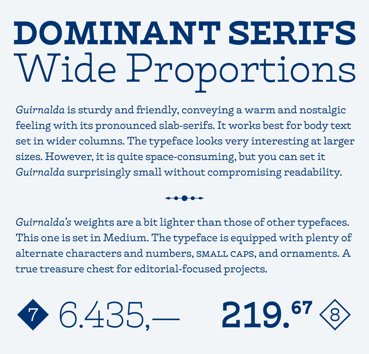
DOMINANT SERIFS
Wide Proportions
Guirnalda is sturdy and friendly, conveying a warm and nostalgic feeling with its pronounced slab-serifs. It works best for body text set in wider columns. The typeface looks very interesting at larger sizes. However, it is quite space-consuming, but you can set it Guirnalda surprisingly small without compromising readability.
....
Guirnalda's weights are a bit lighter than those of other typefaces.
This one is set in Medium. The typeface is equipped with plenty of alternate characters and numbers, SMALL CAPS, and ornaments. A true treasure chest for editorial-focused projects.
Guirnalda feels very even and flows beautifully in body text. But also in headlines it looks very interesting

One thing, though: the weights are a bit lighter than in other typefaces. The Medium is sturdier, and I’d recommend it for body text that’s smaller than 20 px font size. And there are so many options you can include! Numerals in diamond shapes, squares or circles, but also ornaments. But most exciting to me are the small caps!
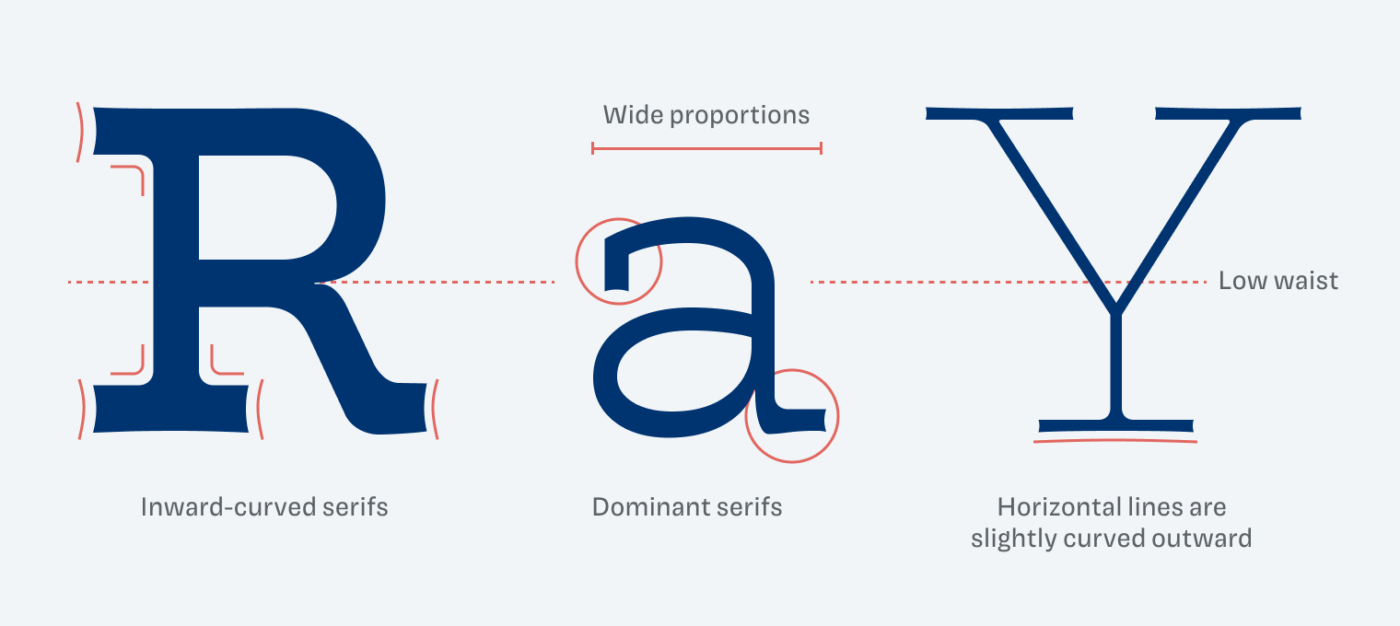
Notice the inward-curved serifs on the ‘R’, and how the horizontal serif of the ‘Y’ bends ever so slightly.

Now let’s take a closer look at those dominant serifs. They aren’t straight. They’re curved inward and rounded. They’re very pronounced where they attach to the lowercase ‘a’, and quite long, too. That way they underline the wide proportions. And here’s an extremely small detail: even the horizontals curve slightly.

So there’s a lot of good stuff going on. Give Guirnalda some room, set it a bit larger and make something beautiful with it!

Font Pairings with Guirnalda

Guirnalda is a dynamic, linear slab-serif typeface. Pair it with AR One Sans for UI text, or something else from this list.

Guirnalda
Guirnalda
  • Headings
  • Copy

Learn more about pairing typefaces using the Font Matrix.


Are you into these kinds of reviews? Do you want to see me just fall in love with typefaces? Then tell me in the comments!

Better typography. Every Friday.

  • Font Friday: biweekly standout font recommendations – free & paid.
  • Type Tips: sharp, actionable advice for stronger UX and UI design.
  • Join 3200+ UX designers & typography fans – unsubscribe anytime.
Just a sec …

Hooray, typographic glory on its way! Check your inbox (or spam folder) to confirm your subscription.

Edition #205, published

Leave a Reply

Your email address will not be published. Required fields are marked *