

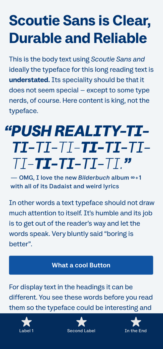
My Scoutie Sans Font Review
Scoutie Sans, designed by Ty Finck, is a free sans-serif variable font that blends the traits of a wonky grotesque like Work Sans with the boredom soberness of a Helvetica. It covers a wide range of weights and works very well for any kind of use case, showing sufficient character for large text while being legible enough for UI text.
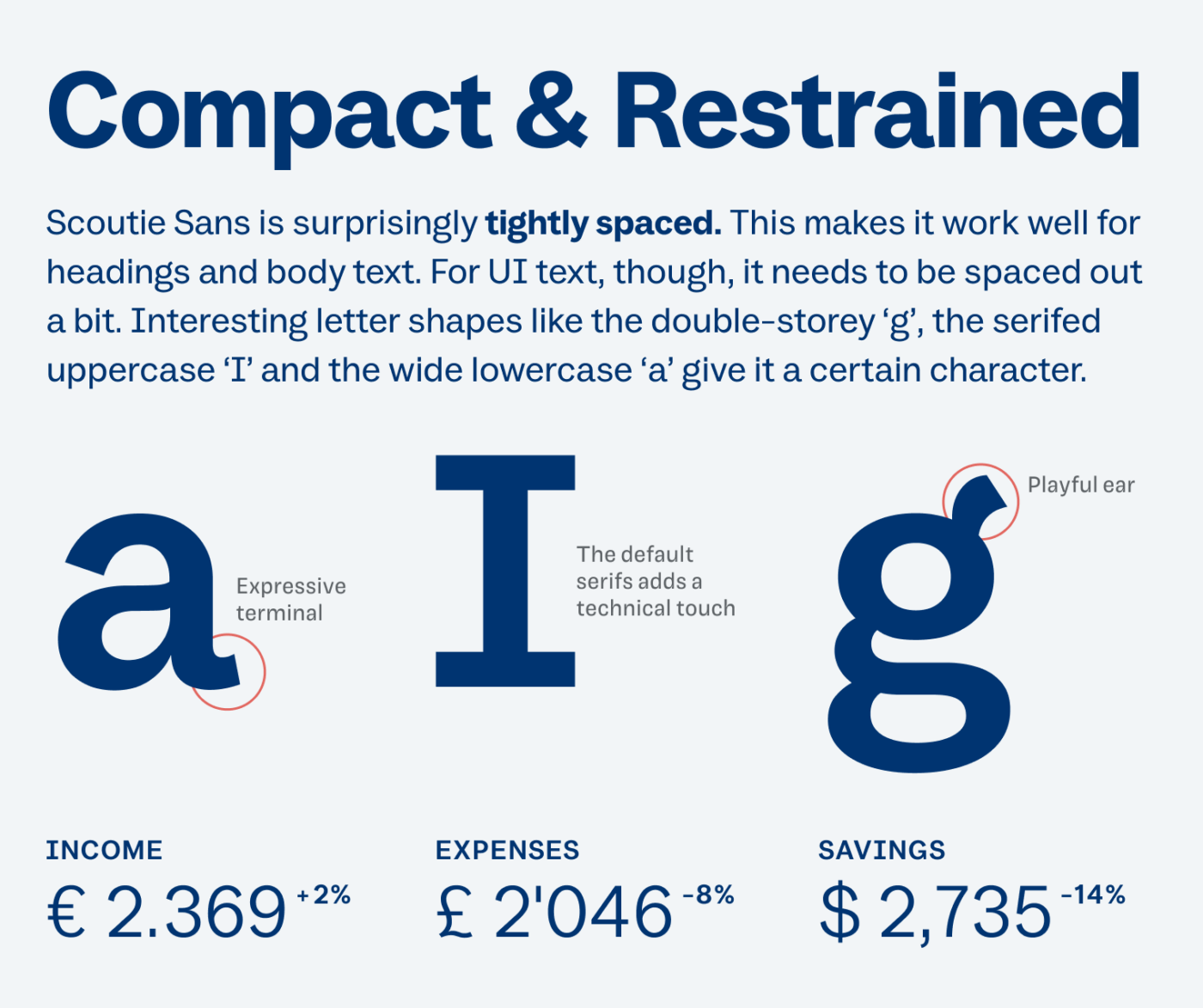
By default, characters like the lowercase ‘a’ and ‘g’ show a certain kind of warmth, while the uppercase ‘I’ adds a technical touch with its serifs. It also makes mix-ups between AL and AI impossible 😉. Note that all these default shapes and a few others have alternatives, which makes Scoutie Sans very versatile. I also really like how legible the numerals are, so try this one out for your next dashboard design.
Font Pairings with Scoutie Sans
Scoutie Sans is a rational, linear, sans-sans-serif typeface, similar to Helvetica. Pair it with Young Serif or one of my other suggestions for more playful, expressive headings.

- Headings
- Copy
- UI Text


Learn more about pairing typefaces using the Font Matrix.
What do you think about Scoutie Sans? If your not a spamming AI-agent, happy to hear your thoughts below! Also share one of your favorite fonts.