The holiday season is just around the corner, so in this article and video I’ll show you ten top typefaces that will add a touch of festive charm to your designs! Using these will make your Christmas cards, season’s greetings or Santa’s social media post fontastic!
I will cover traditional, flourished, more simple, or playful fonts, both free and paid options. Not only showing the typefaces, also giving you some tips how you use them best. And I’ll give myself a little challenge, trying to make a decent Christmas card with … well the one typeface that does not fit the others in the list below. Because it’s not only about the font choice, it’s what you make of it.
Full Christmas transparency: all paid fonts are available on the wonderful I Love Typography shop, where I’m an affiliate partner. So purchasing them via my links will also support my content creation with a little kickback. But now let’s kick it off with a quite traditional choice.
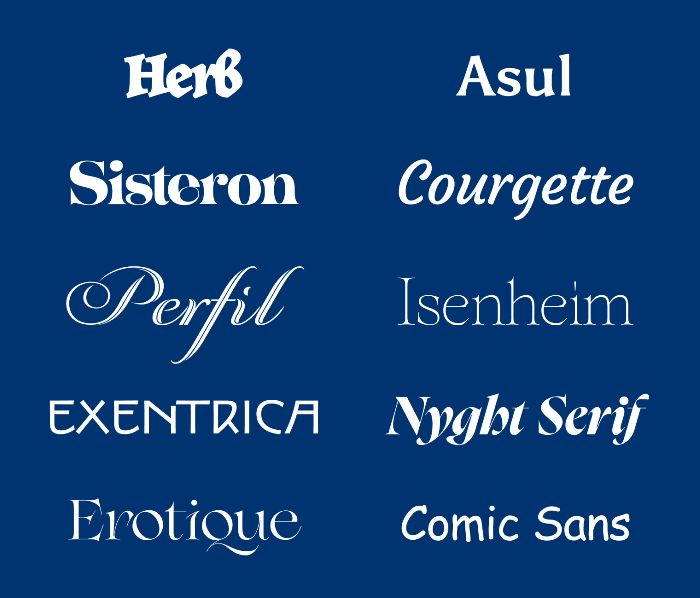
JAF Herb
The calligraphic vibe immediately takes you back to the old days. Herb by Just Another Foundry is inspired by sixteenth-century cursive broken scripts. The extremely tight spacing and strong contrast make it so special, also fun to play around with the connecting terminals. For a few bold words, perfect!

But Herb can also be quite intense, so it could make sense to combine it with something more simple, like my next recommendation.
Asul (free)
Asul is a free semi-serif typeface by Mariela Monsalve, available on Google Fonts. The flared stem terminals give it something noble, while the slight contrast makes it simplistic. I personally think that it looks best in all caps, with its narrow proportions, but still conveying a calligraphic touch. I reviewed it in more detail on the Font Friday Blog.

Now it’s time to get lavish and playful, and Sisteron is the best companion for that!
Sisteron
Sisteron from The Beasts of England is a display font in the Jugendstil style. It shows heavy contrast and joyful organic shapes, while these teardrop overhangs drive tears of joy into my eyes! It is at its best when you arrange it tightly, and what I love most about Sisteron are the swash cap alternates! Look at these! It’s Christmas – to my eyes!

Let’s take it a bit easier now, still playful but in a more casual way with …
Courgette (free)
The free font Courgette by Karolina Lach conveys an easygoing charming vibe, since it’s based on American commercial brush lettering from the 1950ies. As an unconnected script font, it is easy to work with, when rocking around the Christmas Tree, while the font is also available on Google Fonts.
In larger sizes, the words are a bit too loose, so I recommend tackeling the spacing and reducing the tracking. Also adjusting the kerning between individual characters might be needed. The letters still should not touch, but be a bit closer. I reviewed Courgette in the Font Friday Blog here.
Perfil
Gorgeous Perfil from DS Type is an inline script font, perfect for elegant and exuberant designs. What’s particularly interesting are the many swashes, and ornaments that can truly jingle up your design. At times it might be a bit heard to read, but for a few words that’s all fine.
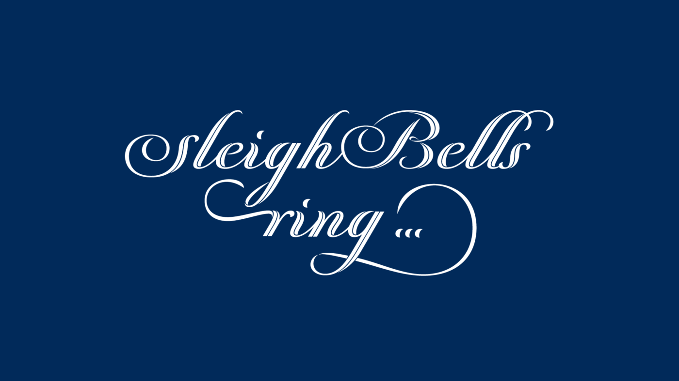
So play around with it, choose the best alternate characters, and remember to set it frailty large, so that the delicate inline stroke remains visible.
Isenheim (free)
Isenheim is a free serif typeface by Benoît Ferran. It has medieval influences, you can see this best in this distinct upper case A, which also has a very interesting alternative, and I encourage you to discover them all, to make your text look best for the festive season.

I love that extended leg of the R, and also the round E and T feels very traditional here. It is available in tow weights, Fin and Regulier, both very delicate. So let’s use that light asterisk and let it snow!
Exentrica
The amazing type family Exentrica from G-Type is inspired by Vienna. Its designer Nick Cooke was so fascinated by the work of the Viennese Secession artists, that he put that Jugendstil vibe into a striking type family. The ton of stylistic variations let you set your text perfectly.
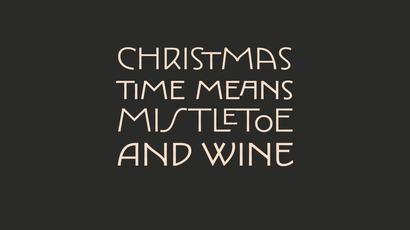
It’s a variable font with a weight and a contrast axis. Utilizing it will make it even more noble. So what do you like better for Christmas? Exentrica Monoline or Contrast?
Nyght Serif (free)
Shchaslyvoho rizdva is ”Merry Christmas” in Ukrainian, and maybe you can pronounce that better than me 😅. Because Nyght Serif is a beautiful, spicy, serif free font from Ukrainian Designer Maksym Kobuzan, covering both Cyrillic and Latin script. The contrasting forms combine smooth and sharp curves into one expressive typeface. I especially love the italics.
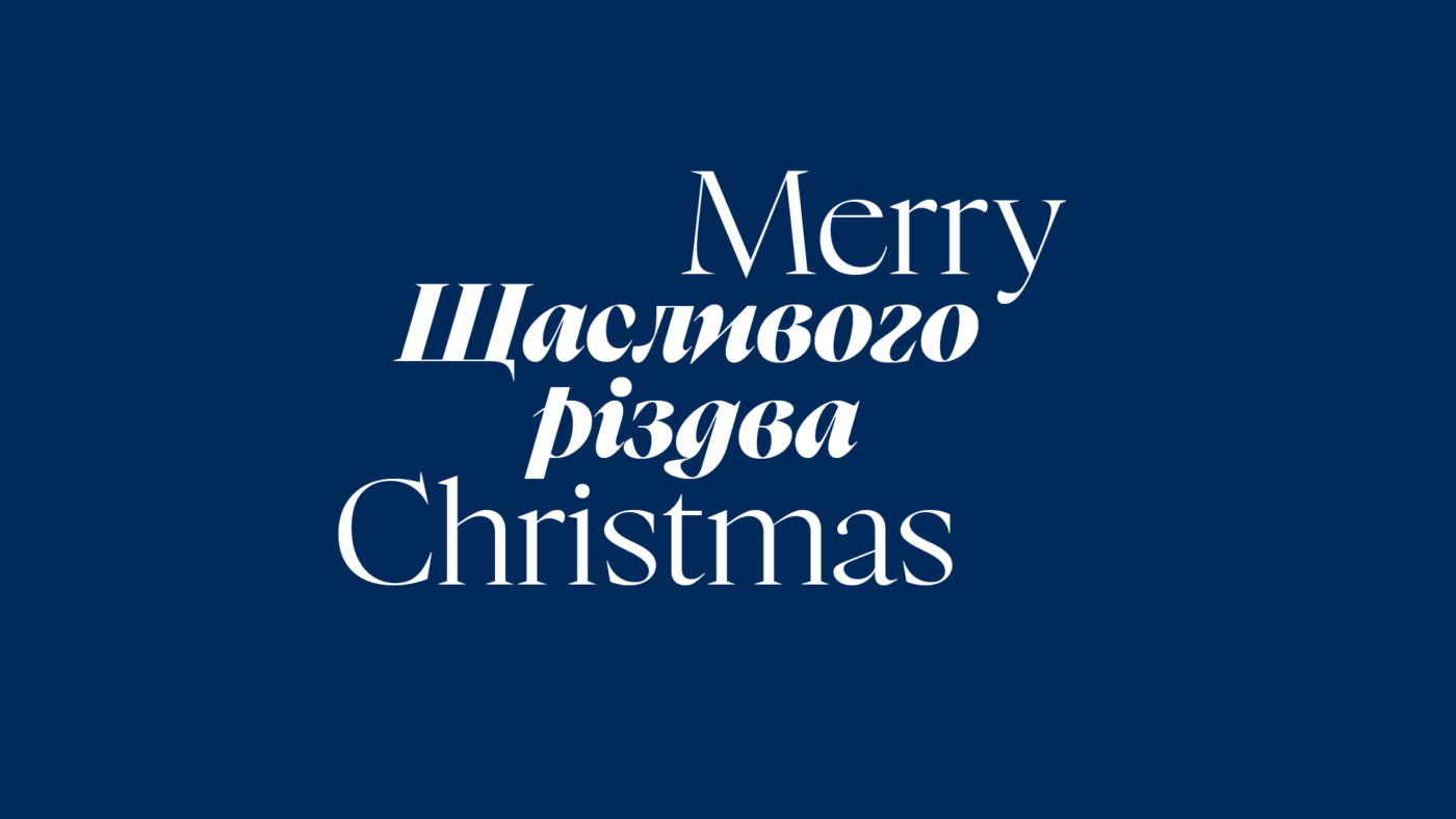
Let’s set our Ukrainian text in Dark Italic, while with the English “Merry Christmas” we are using the light, upright style. This is about contrast, different languages, weights, and styles. Nyght Serif also received the Typographic Excellence Certificate by the Type Directors Club … unbelievable that it is a free font!
Erotique
Erotique from Zetafonts is letting my heart beat faster! It’s a high-contrast serif typeface, is showing elegance but also a slightly edgy, aggressive touch in these sharp serifs. I enjoy browsing through the many stylistic alternates, also set it a bit below the baseline for the second half of the lines.
And what I really like about it, is the simple monoline style. It emphasizes the interesting letter shapes and also forms a connection relating to the thin lines in the bold text. Wow 😍, that contrast is super erotic.
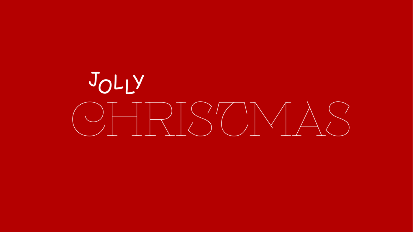
Comic Sans (fatal)
But now the time has come … I will accept the challenge and see what I can do with … Comic Sans. You can see this best in this section of the video, but here I’ll summarize my results.

If you just write “Merry Christmas” in Comic Sans it looks awful. Maybe because we are so familiar with that typeface … and because this noble text does not fit. So if we can’t change the typeface, let’s make the message fit to it. I replace it with “Jolly” and arrange it dancing around the baseline. So maybe Comic Sans seems more intentional now? Let’s combine it with Erotique, maybe? But that’s also cheating.
So I try the second line with “Holidays” in bold. To make it less Comic-Sansy, I replace the uppercase O with the lowercase one and the distinct uppercase I with the serifs with a simple lower case l. This is something I did not do in the video, when trying to hide a mandatory typo, but I don’t think it gets to a better end result.
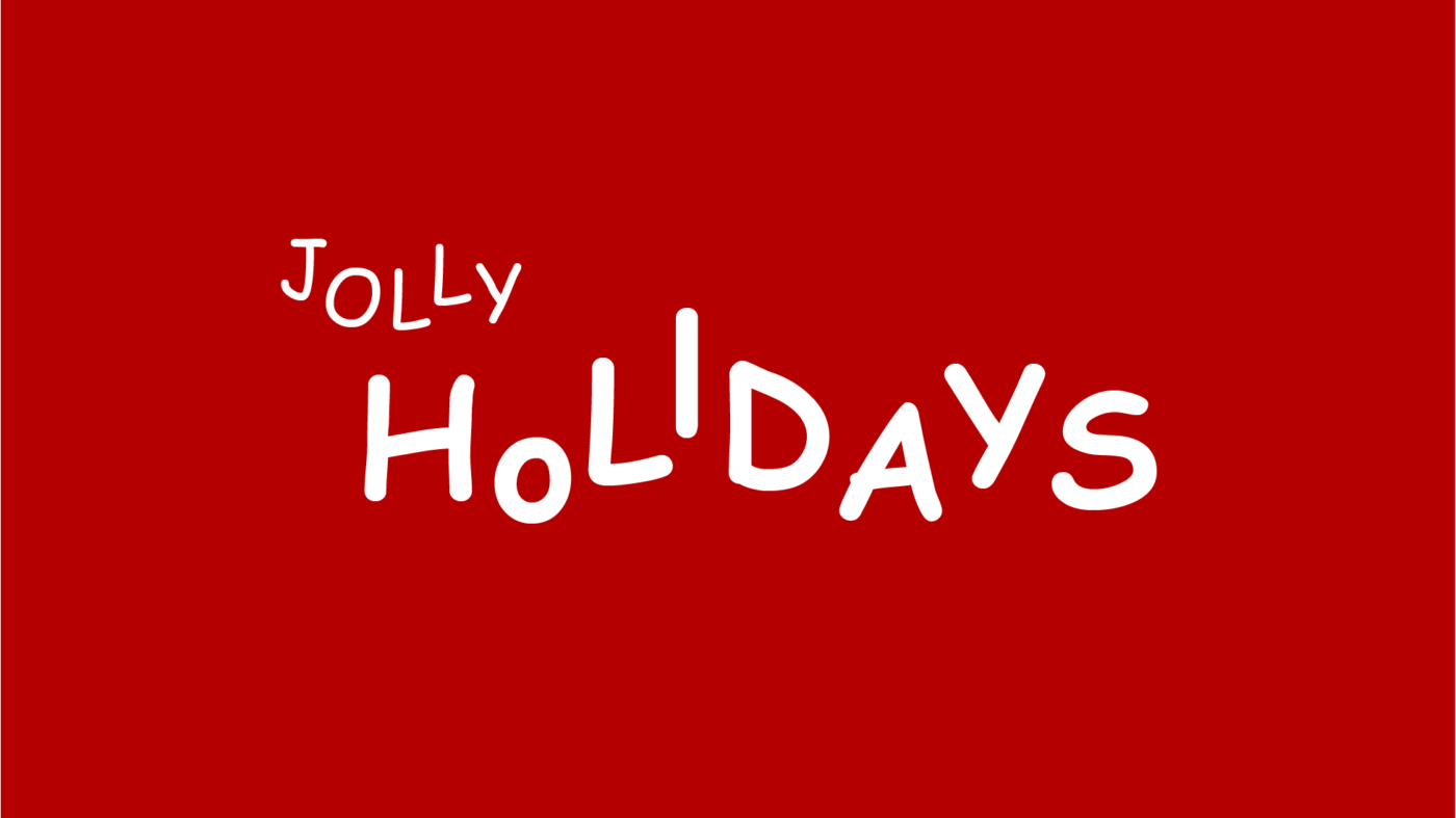
How do you feel about it? Half okay or still Comic Sans craziness in disguise? Write it in the comments! If you’re sick of this typeface now, I understand and I also collected some good Comic Sans alternatives.
Choose a font that fits to your message
What can you take away from that debacle? That you should choose a font that fits to the mood and message you want to convey. Sometimes it’s more noble, sometime a bit more casual. Authoritative or approachable. Playful and lavish, or simple and festive. Let the typeface emphasize or intentionally contrast it. So what fits best to your message? See all ten typefaces in direct comparison below.

By the way, if you want to know how I designed the Christmas card samples used in the article and video, there is a recording of the live stream, where I did that. Showing you how I approach working with a typeface.
And if you say now: “You’re a fraud, Pimp my Type guy! You promised us ten top typefaces, and you’re including Comic Sans?! FONT you!”. Well, if you have a better suggestion, tell me in the comments 😉.
Was ist denn das für eine auf der folgenden Website?
https://thelittlegreyfilm.com/
Hi Christian, das müsste die „Riviera“ von Polina Soldatova sein, mehr hier: https://www.behance.net/gallery/181520675/Riviera-font
Viele Grüße
Alex
Thanks for finding this out! How did you? Because I tried and did not 😂.
Hi Oliver,
I’m using a browser extension called “Fonts Ninja”:
https://addons.mozilla.org/de/firefox/addon/fonts-ninja/
The extension is great as it gives you links to where you can download/buy the fonts found on a website. In some cases, you can even download the fonts right there from the extension. You can also test drive and bookmark the fonts in there – see this screenshot: https://share.laikalaika.de/v1uB6dmb
Other than that, you can inspect the code with the Browser DevTools. The Firefox has a dedicated section for fonts – see this little explainer: https://devtoolstips.org/tips/en/list-used-fonts/
Hope this helps!
Cheers – and Happy New Year!
Alex
Hi Alex!
Danke für die Info!
Wünsche dir einen guten Rutsch und alles Gute im Jahr 2024
Gerne! Dir auch alles Gute fürs Neue Jahr!
The Chromatic Etruscan font (https://www.thibault.org/fonts/chromatic-etruscan/) is the most Christmasy looking font I ever did see. And would make some great cookies designs
For cookies, absolutely. It feely very organic, a bit bubbly, why not 😉.
Great roundup! 🎄 Sisteron and Perfil are my favorites for festive flair. The Comic Sans challenge made me laugh — really shows how much context matters in font choice. Thanks for the inspiration!
Christmas comes early, right? 😉 Happy you enjoyed it, Fiona.