Sans-serif typeface

from ParaType
designed by Alexandra Korolkova, Vitaly Kuzmin

Variable Font

1 axis: Weight

8 Styles

5 Weights in Golos Text: Regular to Black
3 Weights in Golos UI: Regular to Bold

Additional Scripts

Cyrillic

Best for

  • Headings (display text)
  • Long reading text (body text)
  • User Interfaces (functional text)

License

Free

Specialty

A free sans-serif typeface by with rather closed apertures, but still open enough to be readable. A good pick for reading text, UIs and app design.

My thoughts on Golos

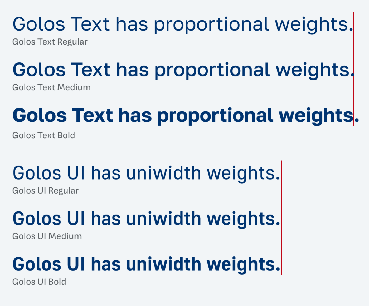
Golos is a free sans-serif typeface by Paratype with rather closed apertures, but still open enough to be readable. It comes in two styles, as Golos Text and Golos UI, both available as variable fonts with a weight axis.

Golos Text is a sans-serif typeface with rather closed apertures, but still open enough to be readable. It includes five weights Regular to Black. Set in large sizes, Golos Text looks a bit dull, as you can see above. Also, the spacing becomes too loose. Maybe the Black weight might work, but not really. This typeface is, as the name suggests, made for text sizes. There it shines!
In this text sample, you see that Golos Text is not suited for display text. At larger sizes, it is too dull. It shows its best in text sizes.

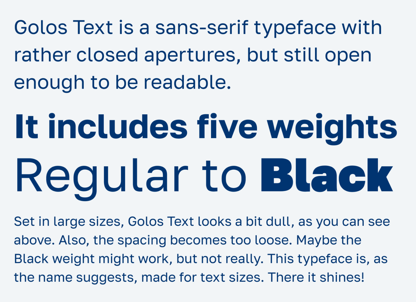
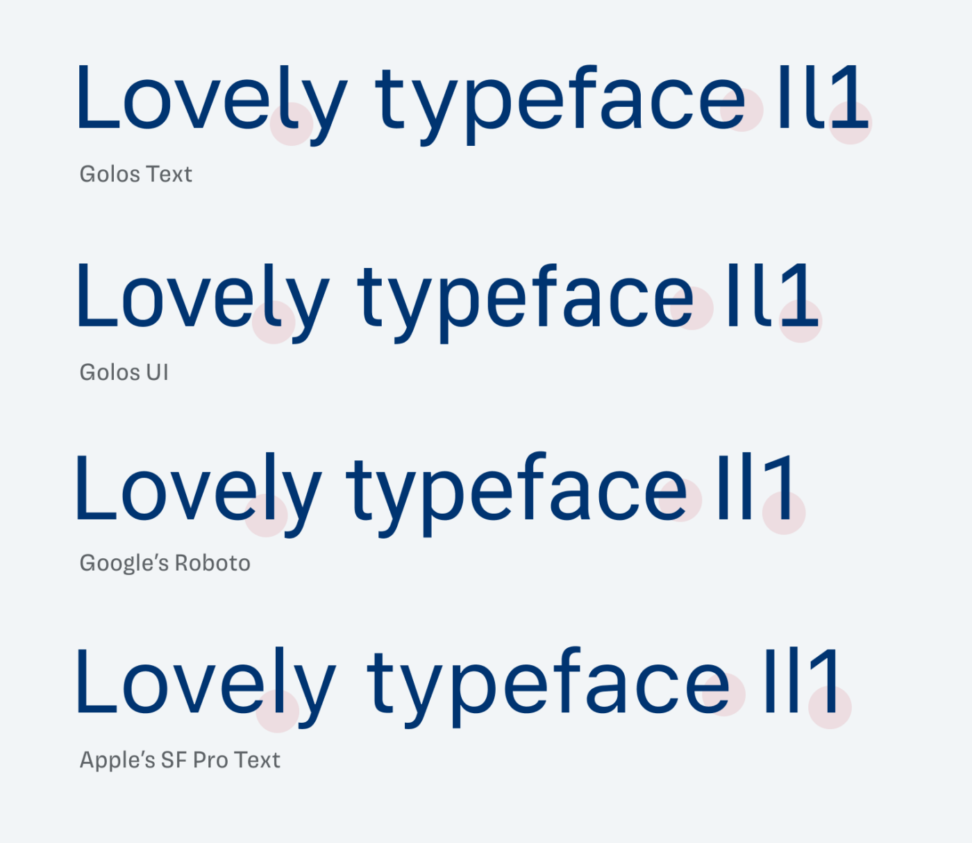
Golos is made for screen display, mostly in text sizes and smaller, so don’t use it for larger text. It falls in the same category as the most popular UI typefaces. Like Google’s Roboto and Apple’s SF Pro, it is a neo-grotesque style. But Golos is a bit more distinct, hence readable, coming with a serif on the lower case l and 1, which I appreciate! Its design is also a bit more squarish, which makes it seem a bit more technical, even in the text style.

”Lovely typeface Il1“ set in Golos Text, Golos UI, Roboto and SF Pro Text
Compared to Roboto and SF Pro, you see that Golos is rather wide, squarish, closed, and sturdy. But also a bit more legible with the serif on the lowercase L and 1.

Golos UI is a bit sturdier, and has slightly narrower proportions. This saves space in controls and menu bars. There, the uniwidth is also a great feature. Because it means, that the line length remains the same across all three weights. This all makes Golos is a good pick for reading text, UIs and app design.

Golos Text has proportional weights. Golos UI has uniwidth weights.
Compared to Golos Text, you can see how the uniwidht of Golos UI works. The overall width of the line remains the same, in all three weights.

Recommended Font Pairing

You’re looking a special combo for headings? Geometric, playful all-caps font Majör Mono Display works well, but also energetic Sharpie. Quirky Fig Grotesk quite similar but works much better for headings.


What do you think? Is Golos something for an upcoming project? Tell me in the comments below!

Typographic power to your inbox

  • Font Friday: I recommend one typeface per week, free fonts included.
  • Type Tuesdays: articles & videos that up your design game.
  • Join 2500+ typography enthusiasts, unsubscribe anytime.

Leave a Reply

Your email address will not be published. Required fields are marked *