Sans-serif typeface

from Monokrom
designed by Frode Helland, Sindre Bremnes

Variable Font

4 axes: Sharp, Weight, Italic, Slant

18 Styles

9 Weights: Thin to Black
with matching italics

Additional Scripts

Cyrillic, Greek

Best for

  • Headings (display text)
  • Long reading text (body text)
  • User Interfaces (functional text)

License

Free and Open Source

Specialty

A warm, appealing sans-serif typeface, ideal for calm body text and UIs, but also striking headings with a certain edge using the Sharp axis.

My thoughts on Geologica

Just another dry geometric typeface?! Not really, the sans-serif free font Geologica is different. Ideal for a clean first impression, but with a certain warmth. But why is that? It’s because of the dynamic letter shapes, which are based on traditional typefaces dating back to the renaissance (learn more about different form models). Pairing them with a geometric touch and interesting details, results in a confident and yet approachable typeface.
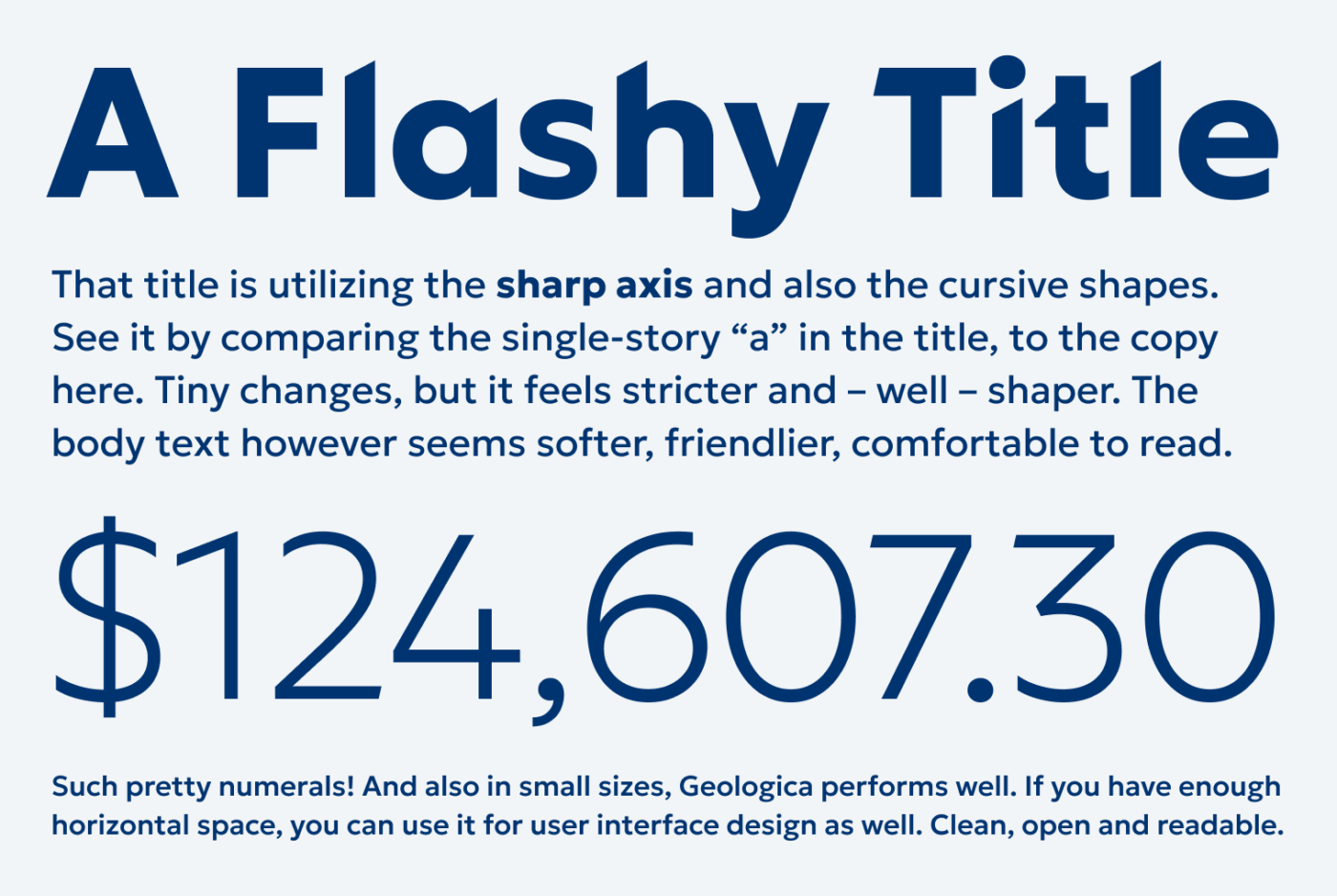
A Flashy Title
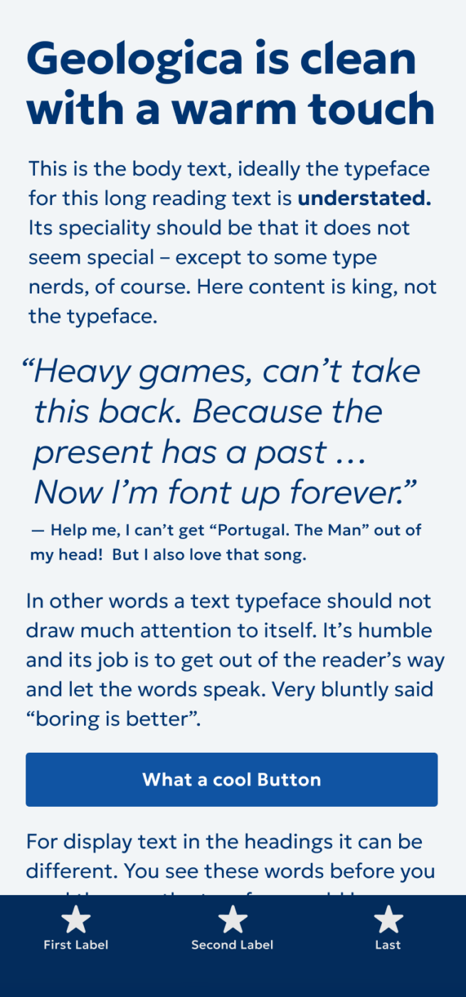
That title is utilizing the sharp axis and also the cursive shapes.
See it by comparing the single-story "a" in the title, to the copy here. Tiny changes, but it feels stricter and - well - shaper. The body text however seems softer, friendlier, comfortable to read.
$124,607.3C
Such pretty numerals! And also in small sizes, Geologica performs well. If you have enough horizontal space, you can use it for user interface design as well. Clean, open and readable.

The superpower of Geologica is a stylistic variation, called sharp, which angle the stem tops, giving them an appealing, minimalistic dynamic. It looks best used with bolder and larger text. The smaller and lighter it is, the cut-off stem tops seem like being broken. You could start to feel that when looking at the headline in the phone graphic at the top.
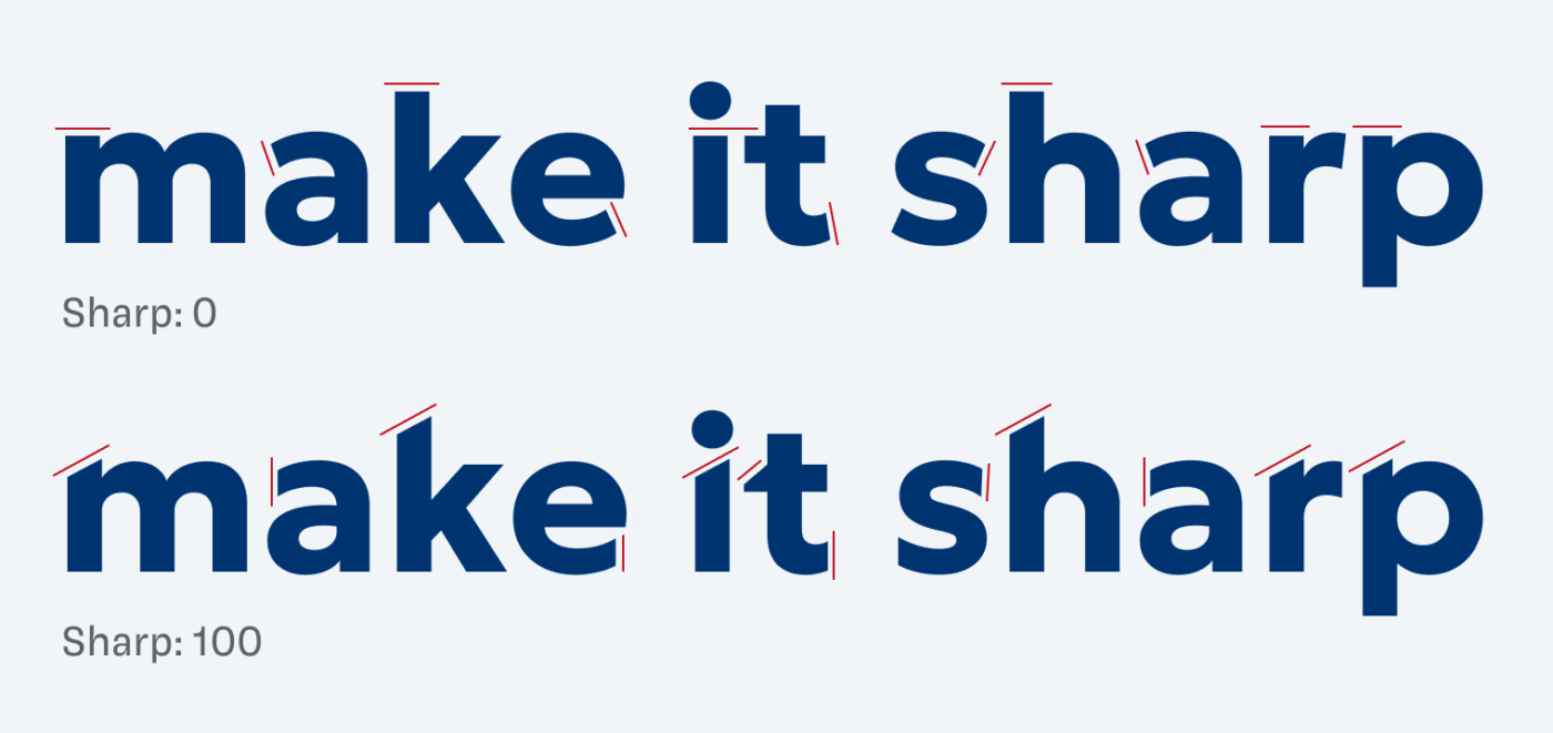
See how the stylistic “Sharpness” axis changes the terminals of some letter shapes

Geologica is well suited for a range of applications, even UI design, if you have enough horizontal space. But there is one thing you should consider: the weight. In my opinion, the typeface appears a bit too strong, maybe even dull in body text. This of course depends on the size and use case, but I want to encourage you to adjust it, if needed.
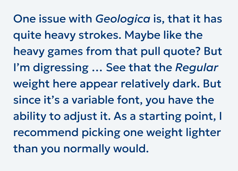
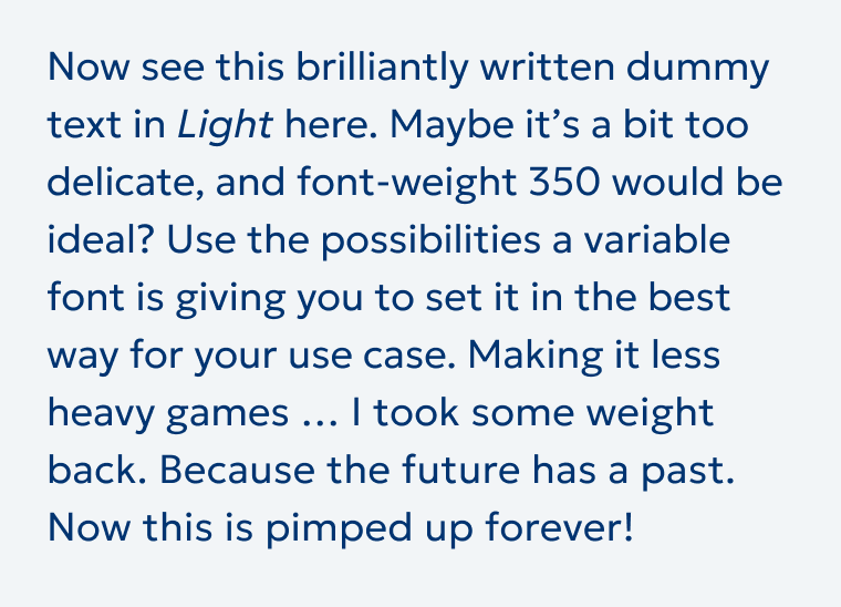
One issue with Geologica is, that it has quite heavy strokes. Maybe like the heavy games from that pull quote? But I'm digressing .. See that the Regular weight here appear relatively dark. But since it's a variable font, you have the ability to adjust it. As a starting point, I recommend picking one weight lighter than you normally would.
😕 Geologica Regular can seem too heavy for copy.
🙂 Geologica Light looks more even, and still it could be slightly stronger.

Overall, Geologica has something unique and does a much better job than dusty Gill Sans, especially when it comes to body text. Its higher x-height, wider proportions and even strokes are clear advantages.

See how Geologica compares to Gill Sans, on Patreon in the October review.

Recommended Font Pairing

Geologica is a dynamic linear sans-serif. You need something more traditonal for body text? Combine it with dynamic contrasting serif typeface Andada. For more functional text, like UIs Atkinson Hyperlegible is a good choice.

Geologica (free)
Geologica (free)
  • Headings
  • Copy
  • UI Text

Learn more about pairing typefaces using the Font Matrix.


What do you think about Geologica? Tell me in the comments, also if you spotted a brilliant typeface that I should review.

Typographic power to your inbox

  • Font Friday: I recommend one typeface per week, free fonts included.
  • Type Tuesdays: articles & videos that up your design game.
  • Join 2900+ typography enthusiasts, unsubscribe anytime.
Just a sec …

Hooray, typographic glory on its way! Check your inbox (or spam folder) to confirm your subscription.

Edition #134, published

Leave a Reply

Your email address will not be published. Required fields are marked *