The Font Matrix is a different way of seeing typefaces. Knowing about it earlier would have saved me a lot of time and guessing, when it comes to choosing, but especially to combining typefaces. It is based on the work of Indra Kupferschmid, and helped me to finally make more sense of type categorizations. Now, I want to share with you what I have learned with it.
In this video and article, I’ll explain to you:
- what the Font Matrix is,
- how you can apply it in your work as a designer, and
- become faster and more confident in your type combinations.
TL;DR: Try to describe typefaces based on their form model (dynamic, rational, or geometric), if they are contrasting or not, and if they have serifs or not. Combine typefaces that have the same form model or are very different. Avoid similar appearances with diverse form models. Take this all with a grain of salt, don’t forget to have fun and discover 😉.
Common advice in combining typefaces is little helpful
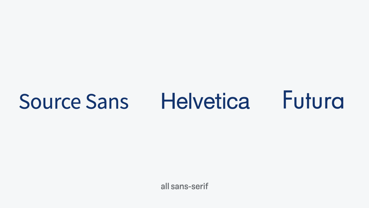
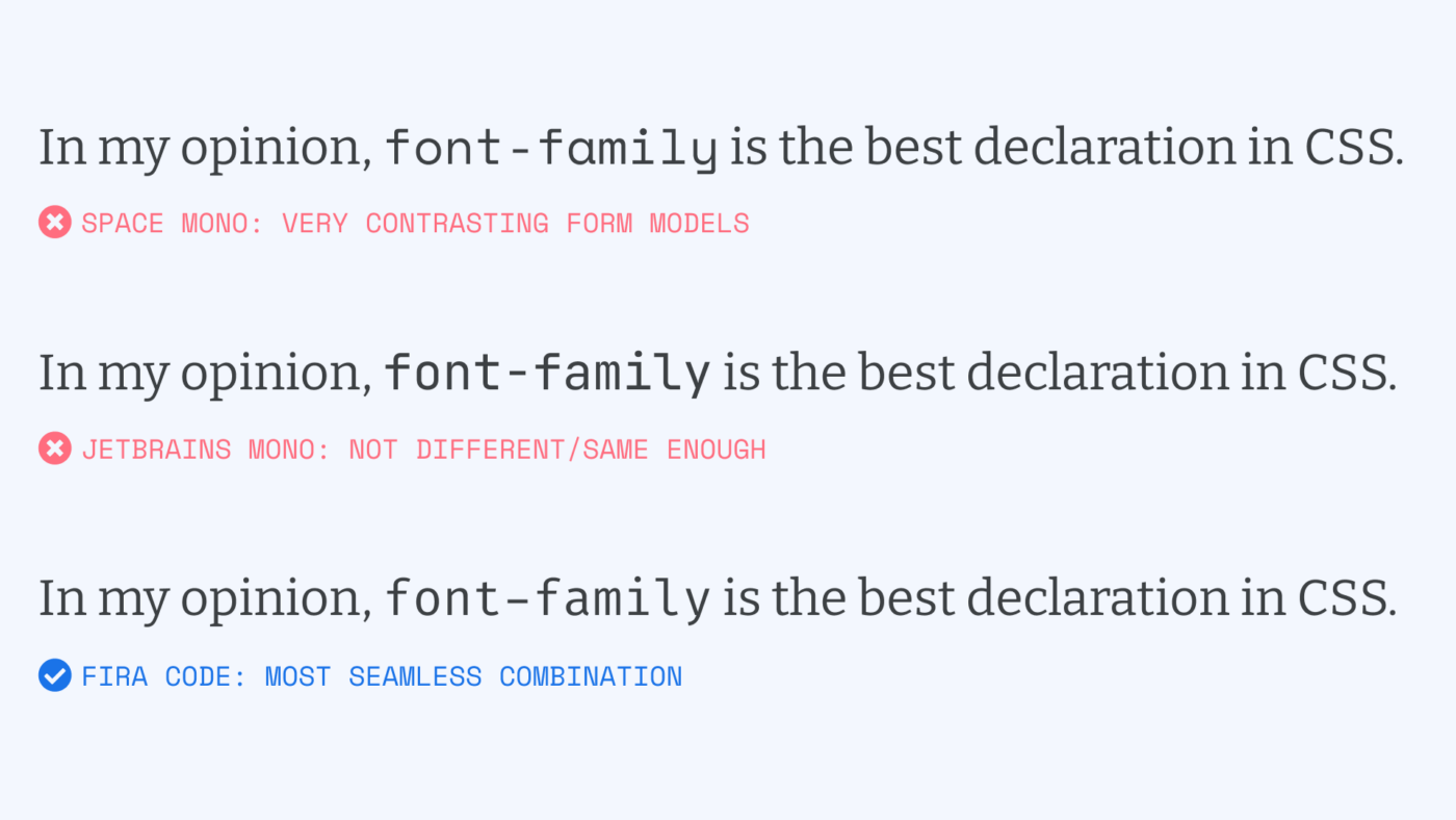
You often hear you should mix sans-serif and a serif typeface. I get that this is a helpful suggestion for beginners, and in a lot of cases it might achieve pleasant results. But is it a guideline that really always works? Can you mix any sans-serif with any serif typeface? Do the serifs make such a big difference? For example, Source Sans, Helvetica, and Futura are all categorized as sans-serif. But they feel quite different when comparing them.
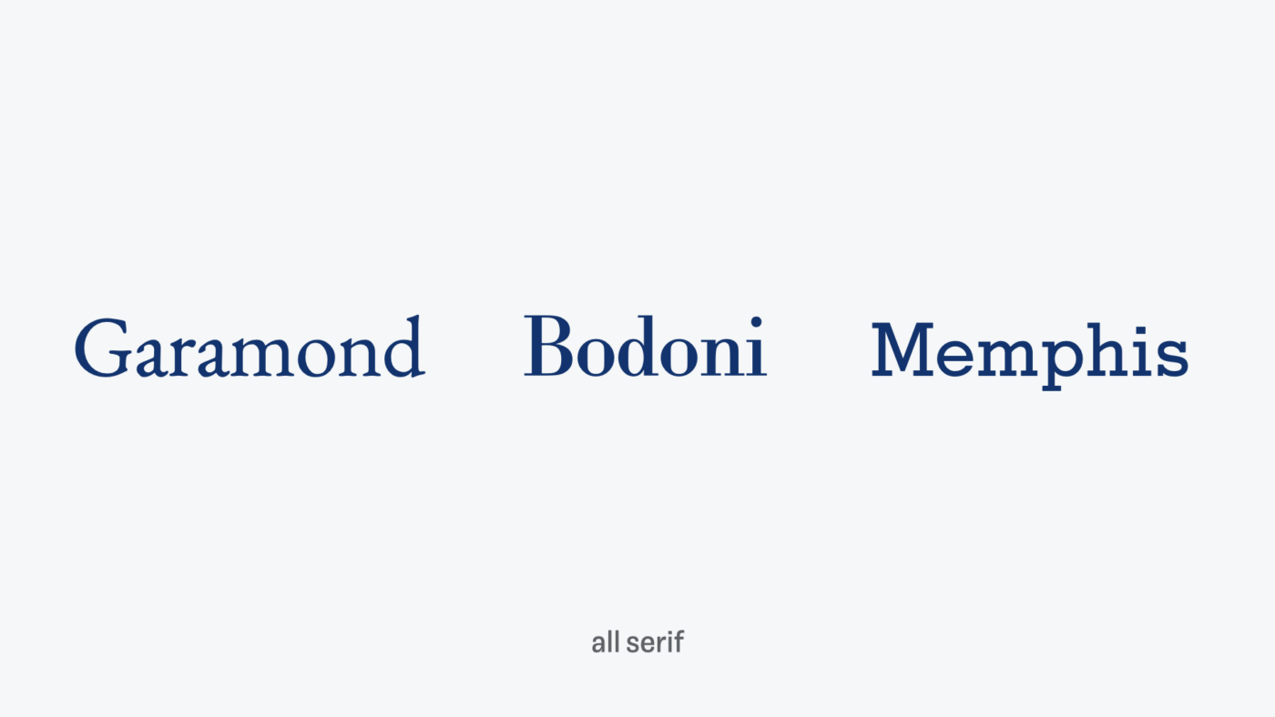
On the other hand, Garamond, Bodoni, and Memphis all have serifs. And they seem very diverse as well. Again, are the serifs really the most crucial part here?
Luckily, there is a way how you can see typefaces differently, see beneath the superficial. To have a guideline to make better decisions when looking for harmonious matches for any typeface. Too simple and too complicated type categories that haven been pulled over your eyes to blind you from the truth.

Do you want to know what it is? The font matrix is everywhere. It is all around us. But you’ll have to see it for yourself. You take the blue pill, the story ends, you wake up in your bed, and you see in typefaces whatever you want to see. You take the red pill, and I’ll show you how deep the rabbit hole goes …
I had to do that, 😂 all in for a little drama 😉. Well, then let’s take that red pill.
Less guessing, when pairing fonts
As Indra Kupferschmid, the author and typography professor behind this approach, said in my conversation with her: “It’s a great adventure to combine typefaces, and no-one should be afraid of it!” I totally agree with her. There are no absolute rules in design, it always depends on your project, circumstances and skills. Typography police won’t show up, when you make an inappropriate type combination, enjoy pairing type, and don’t take it so seriously.
But besides having fun, going for your gut feeling can be a hard, when you did not train it yet. When you always feel like guessing, and are unsure why certain type combinations work better than others. It seems to me that the advice or recommendations behind pairing fonts is either super vague or just random. With gigantic font catalogs already existing, and new ones coming out each day – how can you find what you look for? And this brings us to classifications.
Classification is helpful but only takes you so far
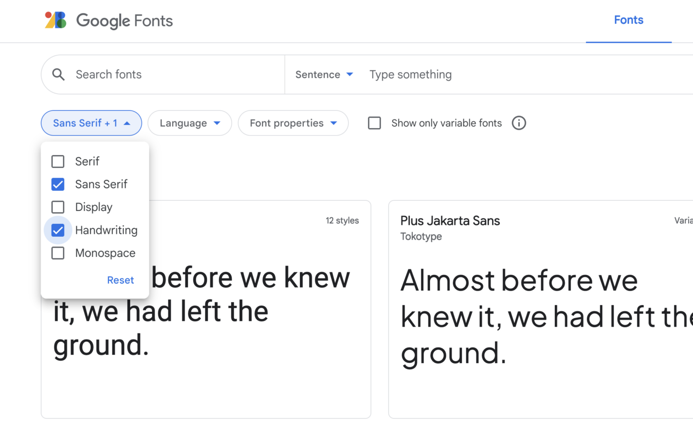
Very broad categorizations like sans-serif and serif are a good starting point, but they still leave us with too many options. When you pick sans-serif on Google Fonts, you still get more than 500 typefaces. Besides other filters, a mental model that would help you assess these, would be great.
On the other hand, historic classifications are dated, inconsistent, and not very practical. For example, the serif typefaces Bodoni from 1786 is classified as “Modern” and Times New Roman from 1931 as “Transitional Old Style”. Without having more type history background knowledge, it is super confusing, and little helpful when your goal is to pick a typeface. The historic approach eventually falls apart, when it comes to type designs that mix influences from various periods of time.
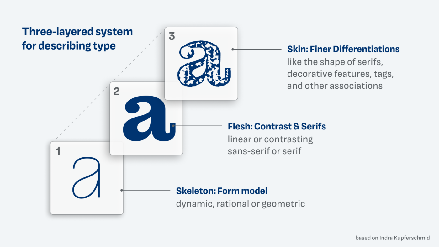
This is why Indra Kupferschmid developed a way how to describe a typeface that is less based on the track of history and more open towards overlap. It is a three-layered system:
- Layer 1: Skeleton (from model)
- Layer 2: Flesh (contrast & serifs)
- Layer 3: Skin (finer differentiation)
This seems a bit complicated now, but bear with me, you will soon see how this evolves into something brilliant!
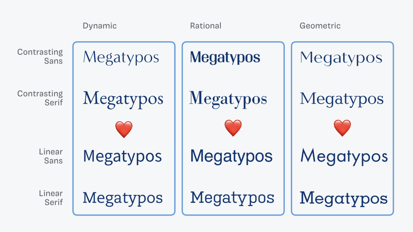
Layer 1: Skeleton – Form model
There are three basic form models, the dynamic, the rational, and the geometric form model. Dynamic forms have diagonal contrast and open shapes. The rational form model has vertical stress and closed shapes, and the geometric form model is seemingly monolinear, with no contrast. It’s clearer with contrast and serifs, but you can still feel it in the sans-serif shapes.
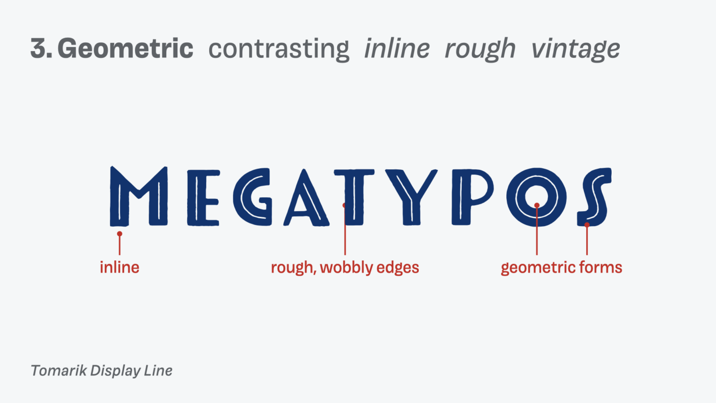
This might be a bit confusing still, but if we write a word in these different form models, you will see it clearer. Let’s use “Megatypos”, because, you will always find a lot of typos in my content 😉 (and it contains different letter shapes).
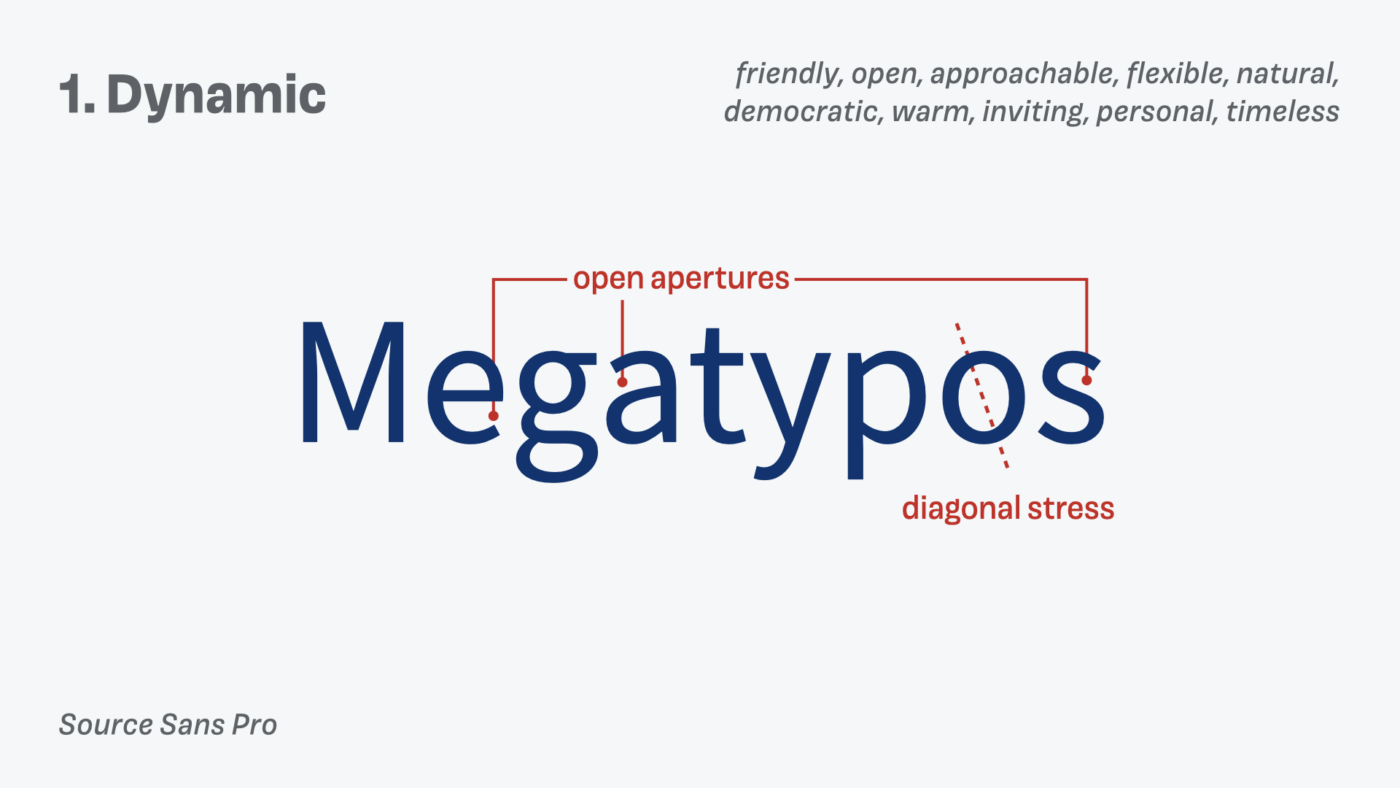
Looking at the dynamic form model, you can see the open shapes, the diagonal stress. And this all adds to the friendly, open and approachable feeling dynamic typeface create. Indra associated the form models with certain adjective. This is super helpful when picking a typeface that should follow a certain mood. Naturally this mood might shift when there are serifs or no serifs, or other stylistic features, but it’s a good starting point.
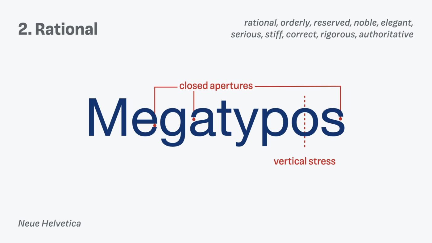
With a rational typeface, you see these apertures are closed, which then creates a more orderly, reserved or serious feeling.
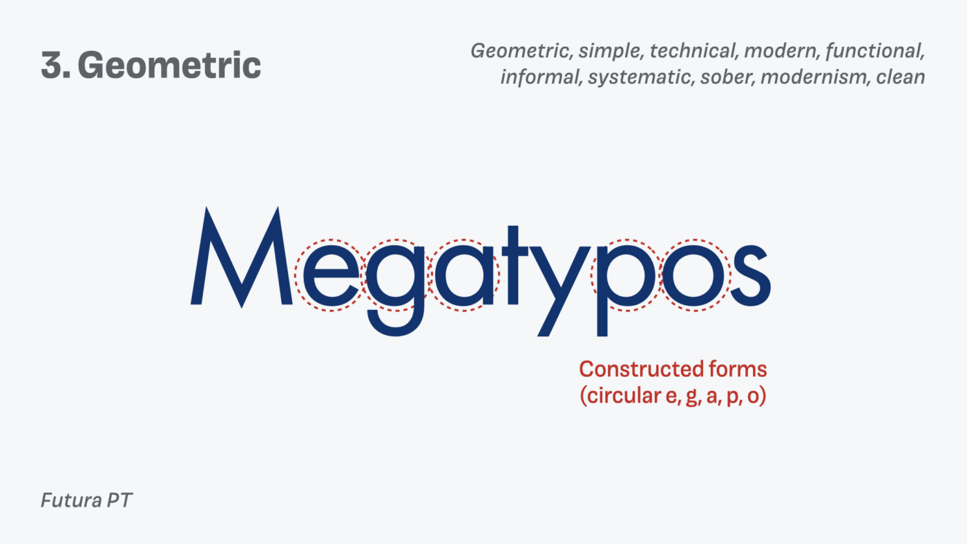
And with the geometric typefaces the apertures are not that important, it is more how constructed the letter shapes are. Like the circular e, g, a, p, and o, or the simple t. This creates a clean, modern and functional appearance.
Now, knowing these underlying form models should make it easier for you to pinpoint the differences between the three sans-serif typefaces from the beginning of the article, and take you one step closer towards seeing type more differentiated.
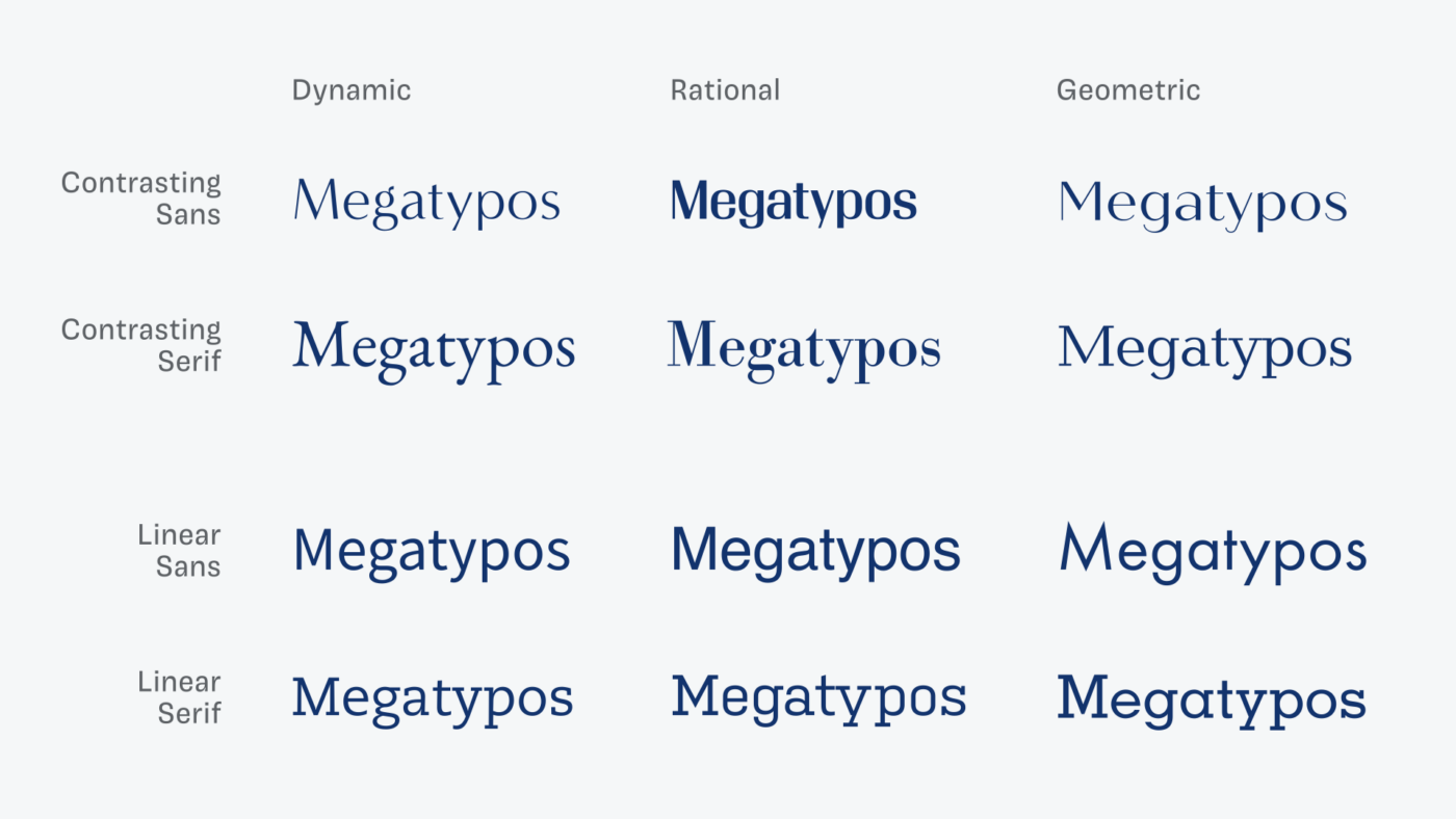
Layer 2: Flesh – Contrast & Serifs
In the second layer, the Flesh, we’re adding contrast and serifs to our descriptions. This will make the skeleton even clearer.
Before, I showed the dynamic form with no contrast (linear) and sans-serif. Here, we are adding contrast and serifs. This changes its appearance, but still the same skeleton, open apertures, diagonal stress remains, just with more flesh on top.
Our rational linear sans-serif becomes a rational contrasting serif. Helvetica turns into Bodoni 🤯 same skeleton, different flesh.
The geometric linear sans, becomes contrasting with serifs added on top. Still geometric from its construction.
Not everything aligns here, proportions, x-height, and some letter shapes differ. But don’t be irritated by that. Focus on the form model, and you should see, that at its core the same principles still apply.
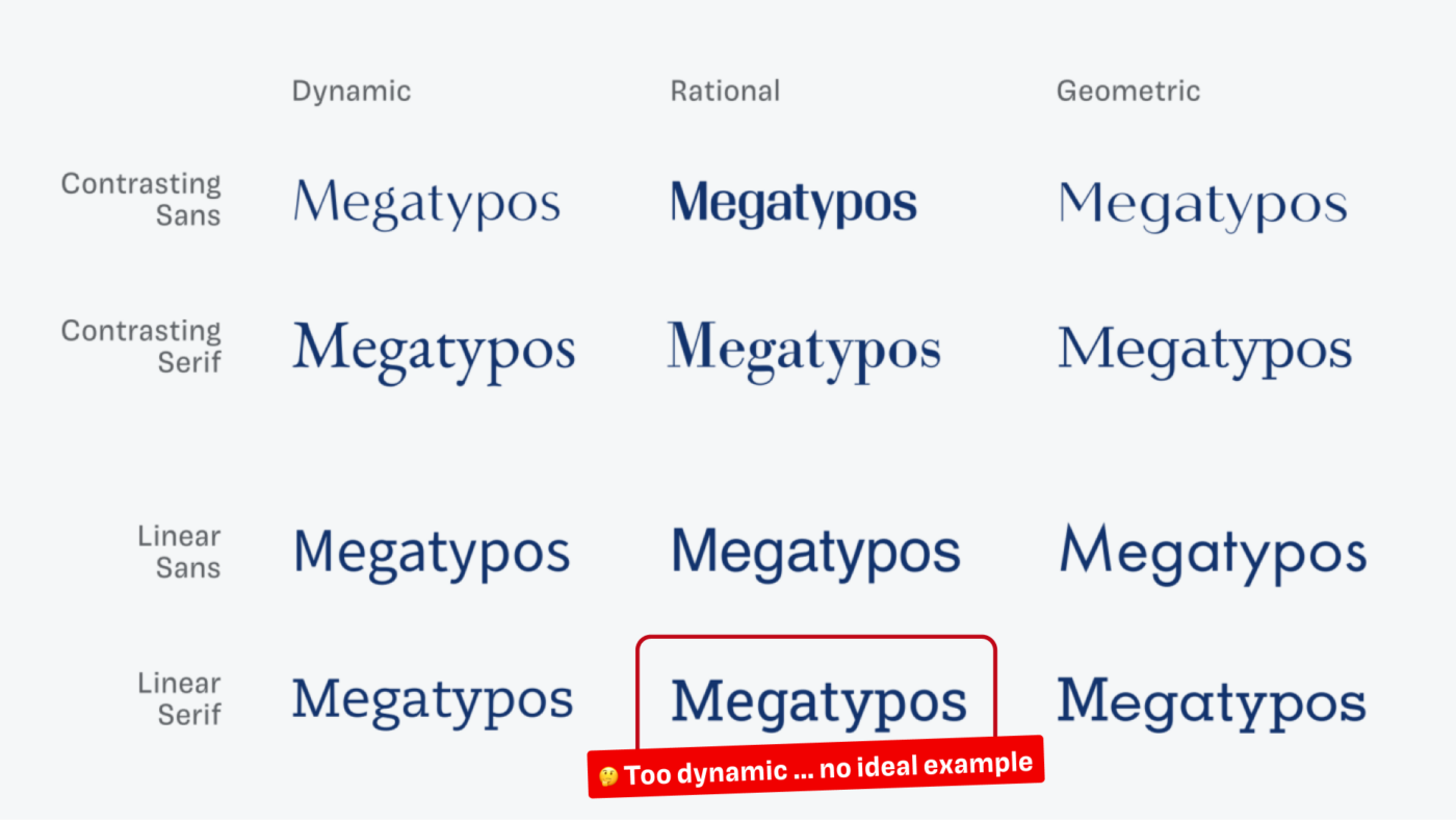
Using the Font Matrix for better font pairs
When we arrange these two layers in a grid, with the skeleton in the columns, and the flesh in the rows, the Font Matrix is revealed!
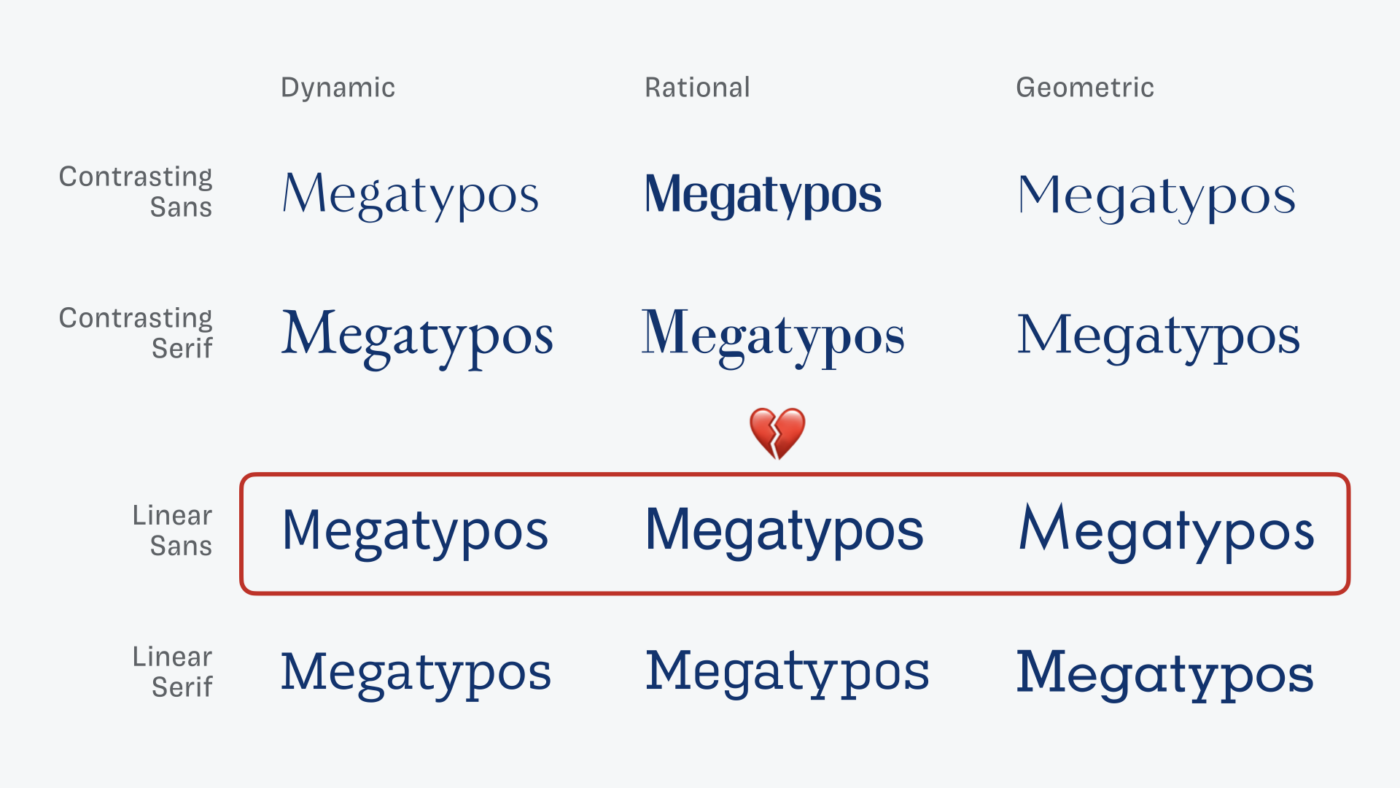
And what becomes obvious here is, that not the serifs are the thing, that bind it all together. It’s the bare bones underneath it. This is why typefaces with the same form model regardless of sans or slab or serif make a good match. The columns fit together.
Or that typefaces that are very contrasting make a good match. When, the columns are next to each other, it depends.
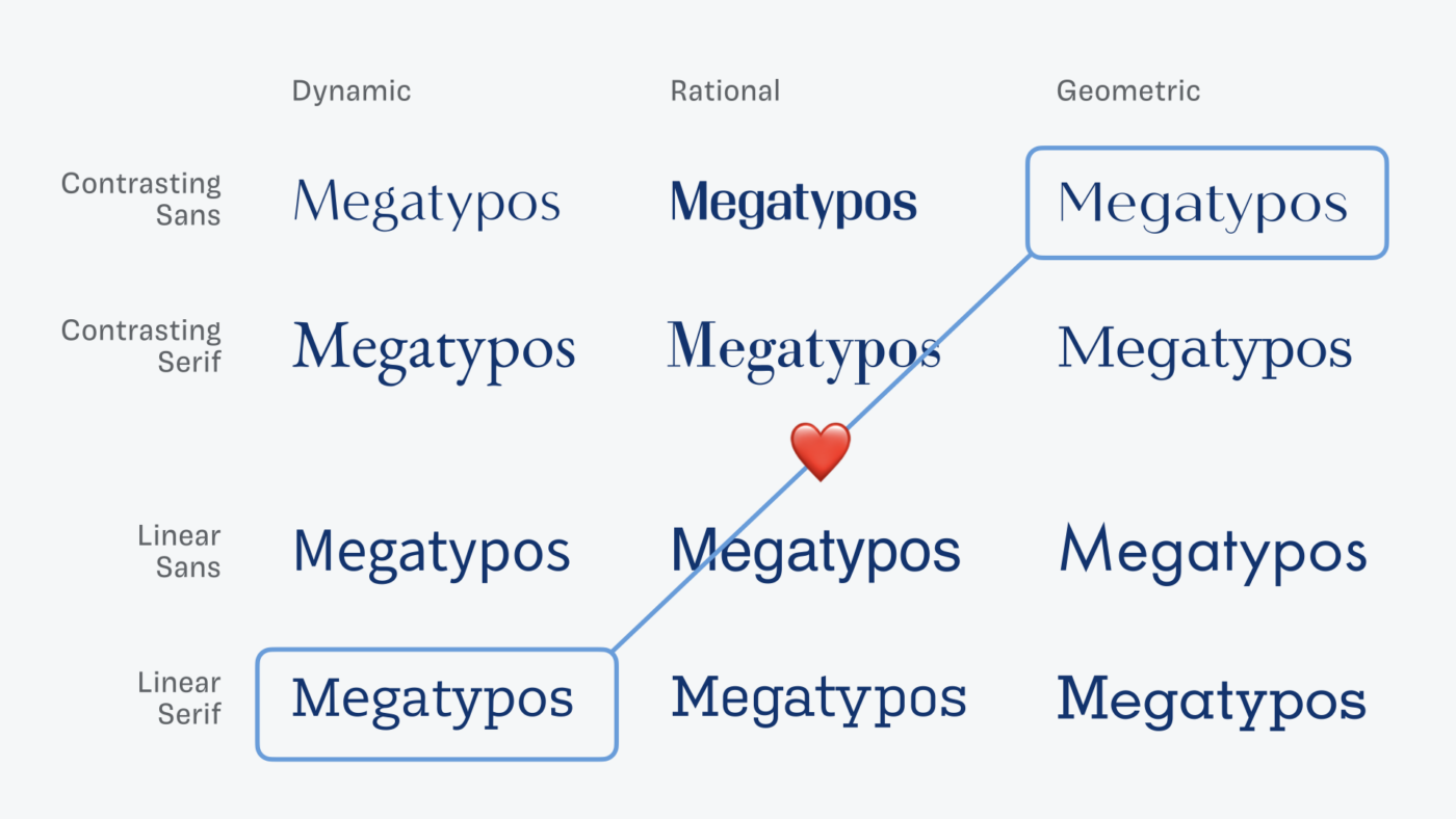
But what really does not work, is when they are in a row. That’s when they are very similar on a superficial level, and you will be able to hide this by choosing different weights to make it less dramatic. But underneath it all, they are vastly different.
Coming back to the various sans-serif and serif typefaces from the beginning. Now you should be able to see their skeleton and have a hint if they are good matches based on their construction. The key is the first layer, the form model.
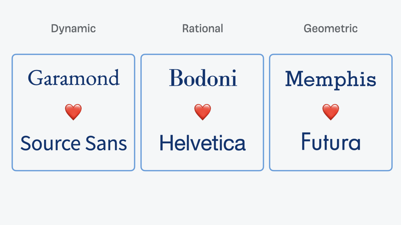
Once you have seen this, you can not unsee it. This now makes clear why Bodoni and Helvetica belong together. And it also makes the differences of the all so similar sans-serif and serif typefaces from before more obvious.
You still have to do the work
Please, bear in mind that these are some pretty obvious examples here and the whole system is a starting point. You still have to do the work, practice, apply it in your design, and check for your font combination:
- if it fits to your project,
- how close you combine them,
- how the proportions are,
- how large x-heights are,
- what weights or styles you’re using, and so on.
But it is a better mindset and way of looking at typefaces when finding matches, than just saying mix any sans with any serif typeface.
Layer 3: Skin – Finer Differentiations
Our final layer does not serve the font matrix, it serves to better describe the typeface. Here we can add some additional finer differentiators. Like the shape of the serifs, decorative features, such as stencil, inline, shadow, or genre-like descriptors that might be associated with the typeface (e.g. western, horror, or sci-fi).
Practice this approach with me
There is much more to add to this, to have better ways to combine typefaces. This is why I decided to offer a complete online course to help you apply the Font Matrix in your daily practice as a designer. With many examples and exercises you will become more confident in finding a good match. Especially in these tough scenarios, where you want something that matches a given typeface, only with or without serifs or for small or large sizes. If that sound’s interesting to you, check out my course Pairing Typefaces like a Pro. But you really don’t need to wait for that, you can start applying it right away in one tiny step.
Pimp my Type on Patreon
Get several benefits while supporting my content creation.
Join Patreon
Start seeing type differently
The best way in becoming better in seeing the differences in typefaces, is starting to look for them – everywhere. So I challenge you to go out into the wild and spot any typeface on a poster or sign and see what form model lies underneath it.
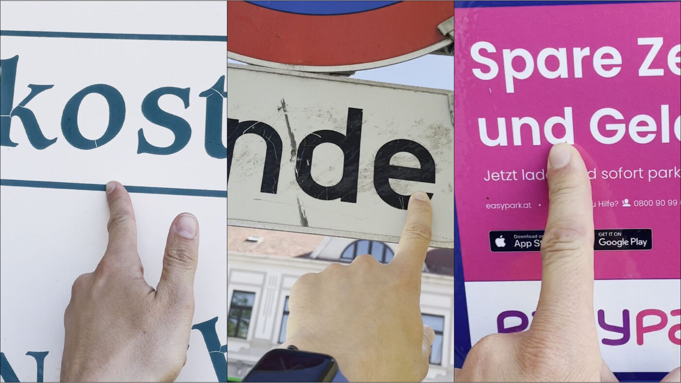
Take a picture, describe if you see it as dynamic, rational or geometric, and tag me on Twitter @glyphe or Instagram @pimp_my_type, if you want to. Make it a game and try to discover typefaces with a new perspective.
Glitches in the matrix
After all my excitement about the Font Matrix, please bear in mind that this is not a perfect system. Not every typeface fits in there, and you won’t be able to apply it in every scenario. And soon you will find plenty of cases that are in between the different form models or the other layers. And that’s okay.
Many typefaces have various influences, and can not be clearly put into one category. Roboto for example. It originates from a rational form model, but the apertures have been opened to make it more legible and a little friendlier. So I would call Roboto rather rational. In the Font Matrix, it would live between the dynamic and the rational column, but closer to the rational one.
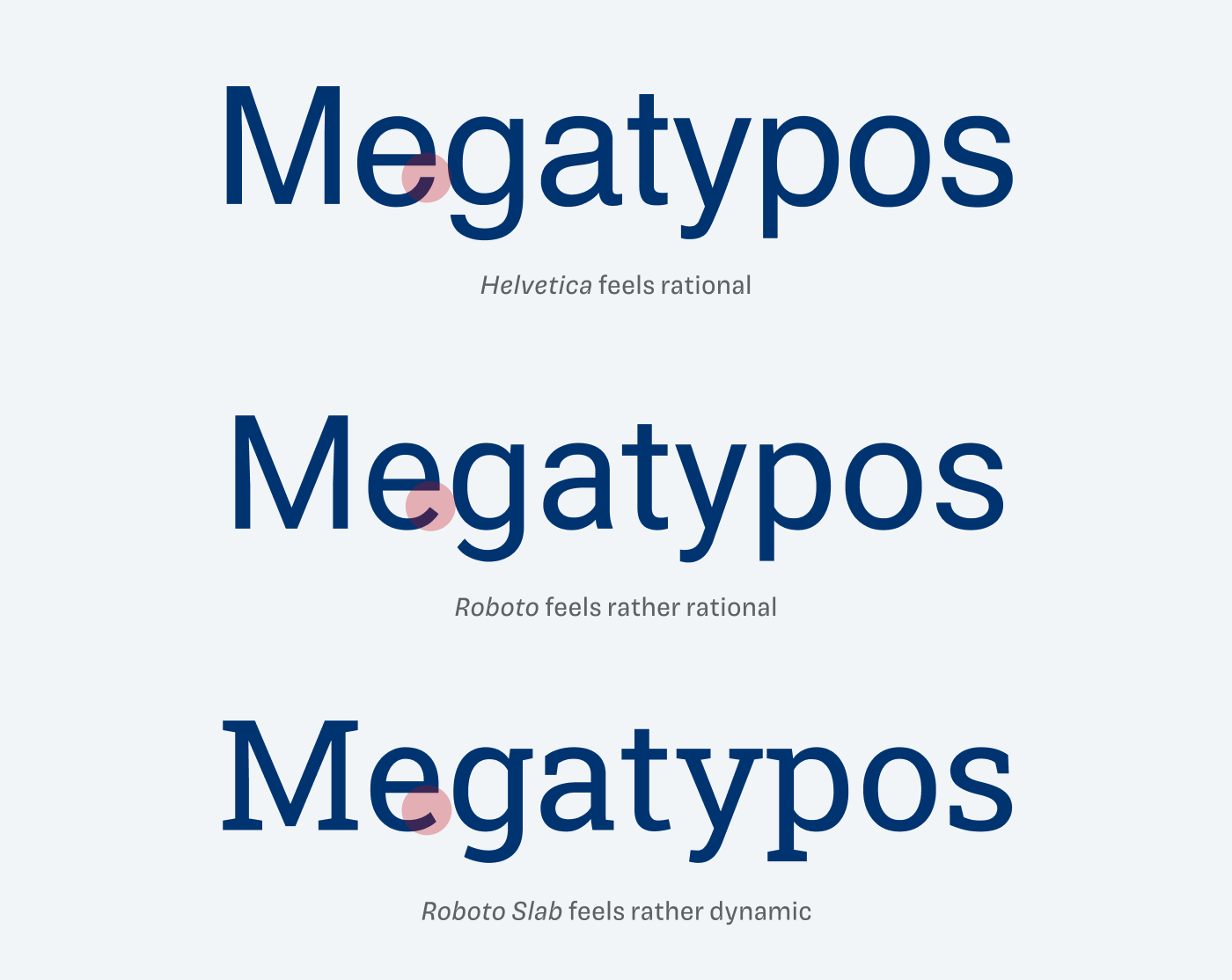
On the other hand, Roboto Slab feel a lot more dynamic. Since the added serifs opened the apertures even more. Here, I would describe Roboto Slab as rather dynamic. In my first graphics about the Font Matrix, and also in the video, I showed Roboto Slab as a rational linear serif typeface (see below). But it’s not. So I replaced it with Kulturista, which is much stricter and a better orientation point. Indra made me aware of it, so thanks for that. This space in between shows, that you could combine Roboto with something that’s more dynamic and something that’s more rational.
But in the end, the most important thing is, what you do with that information. See this as an opportunity to change your visual perception and as a guideline to make better decisions. Even Indra Kupferschmid says you should not see this as a straight jacket. It is one way, not the only way.
Article on Google Fonts Knowledge
I wrote a variation of this article for Google Fonts Knowledge. I really enjoyed the process writing it, and getting feedback by so many great people. One major addition there is the case study how to combine typefaces step by step with a tricky example.
Font Pairing Generator
If you are looking for a jump start and some inspiration, Dan from the Endearing Designer created a Font Pairing Generator only using Google Fonts, that is based on that system and works quite well. Bear in mind that some combinations might be not that ideal in the shown roles, sizes and styles. But it’s a good place to play around and get some initial ideas.
Learn more
More about this system, and why Indra Kupferschmid developed it, here:
- My conversation with Indra Kupferschmid (Video & Podcast)
- Indra’s article on type classifications
- Indra’s Talk at Type Paris
- Pairing Typefaces Online Course
I hope this was helpful to you. Tell me in the comments below how you feel about the Font Matrix, play around, discover and evolve!
Wao! great extra tips and a very fantastic article. So clear and easy to follow. I like all these pairing combinations. I will try to use these tips in my upcoming projects.
Thanks
Thank you, David! Glad you found it helpful!
This is extremely helpful. No conceptual framework can cover all cases, but doing it with a naïve eye can cover not much beyond serif vs sans
Glad to hear that, Richard!
Hi!
I’m really interested into this topic especially the idea of skin flesh and skeleton is mind-blowing ! Do you have any books which could explain this topic much further to recommend ?
As it seems only in German books. Indra writes in her article:
Hi Oliver,
I just wanted to say thank you for all the work you’ve put out on professor Indra’s Font Matrix System!
I’ve been through lots of her stuff.
But I think you explained her work and broke it down easiest to understand…
Though it was still a bit hard for me to use efficiently on a large scale (I’ve tested nearly A THOUSAND font pairings over the last week for my new app to the point my eyes and fingers hurt!) , and I ended up creating a simpler variant font pairing system for myself that seems to work well for me when needing to filter through HUGE amounts of font pairs quickly. 🙂
Long story short:
I created a Font Pairing Generator on my website to help my wife with her children’s book typography (she’s an author and illustrator). I wanted the very best for her work. So I spent a lot of time reworking everything so that my new tool only generates pairs filtered using the Font Matrix now.
So I just wanted to say…
Thank you for your work on the Font Matrix! It was indispensable for this mini-project.
I’m linking from my tool back to this page for anyone who uses it, but is still interested in learning the theoretical principles of font pairing using the matrix.
Just thought I’d let you know. 🙂
(Sorry, the link seems to disappear when the button is pressed. I’ll fix that once I get some rest and recovery.)
Many thanks once again!
Will send you an email in a few minutes…
Dan
Thanks a lot, Dan! Happy my content inspired you to take on that side project ☺️, I liked it in the article. It is a good first step to find font pairs, and the combinations I saw mostly worked. Of course, it later needs an extra assessment if the suggested fonts really for that specific role and in that size. A few times I saw a combination that was good, but the way the type was set on your page then did not work. But anything that makes this cumbersome process easier for people, is a good thing 😀.