
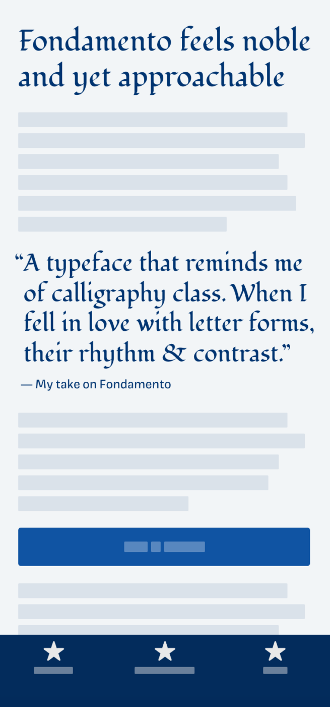
My thoughts on Fondamento
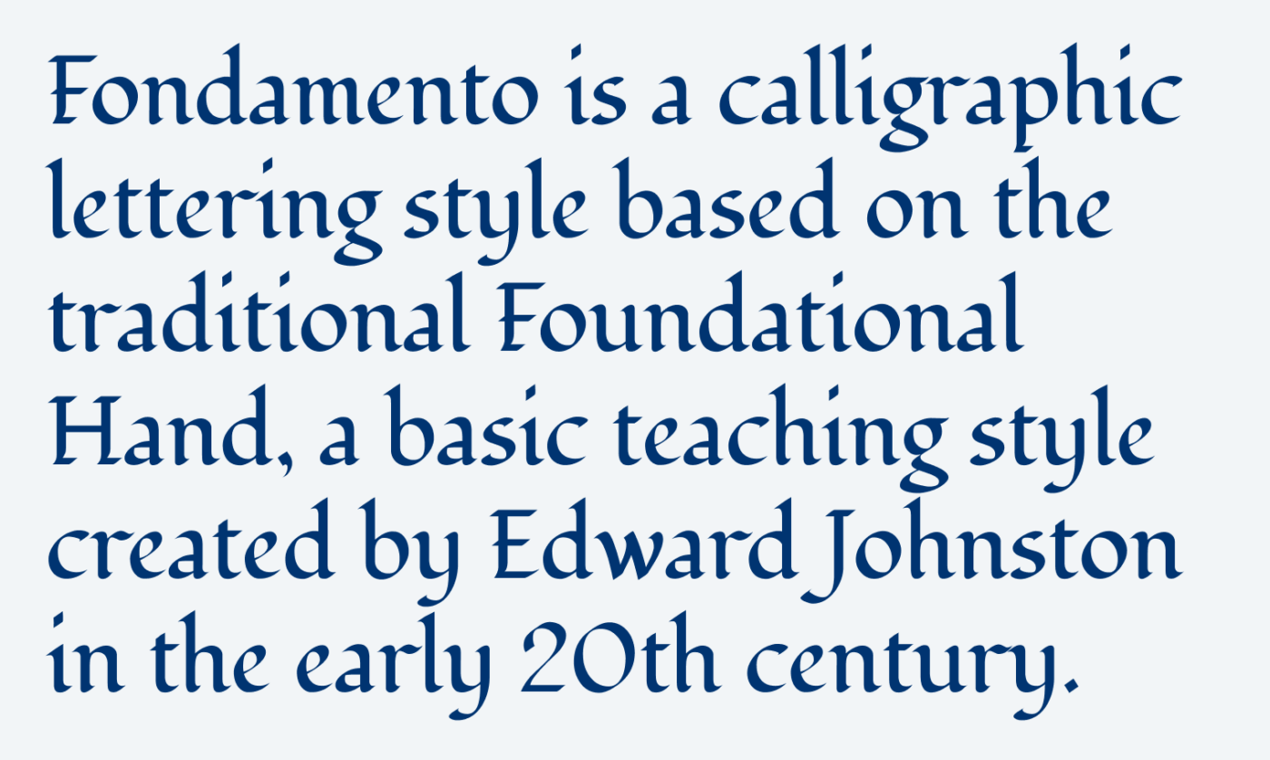
The free typeface Fondamento is based on the Foundational Hand, a calligraphic teaching style I can remember very vividly from design school. It is rather easy to learn, but it requires so much practice to make it harmonious and rhythmical. This typeface imitates that.
It is written with a broad nib pen that is held at an angle, creating this beautiful contact which makes it visually so appealing. This is important, because the writing tool highly influence, how type feels. So when picking a digital font, think about that. To set it in perspective, see the three following examples. All are imitating handwriting, yet they seem very different.
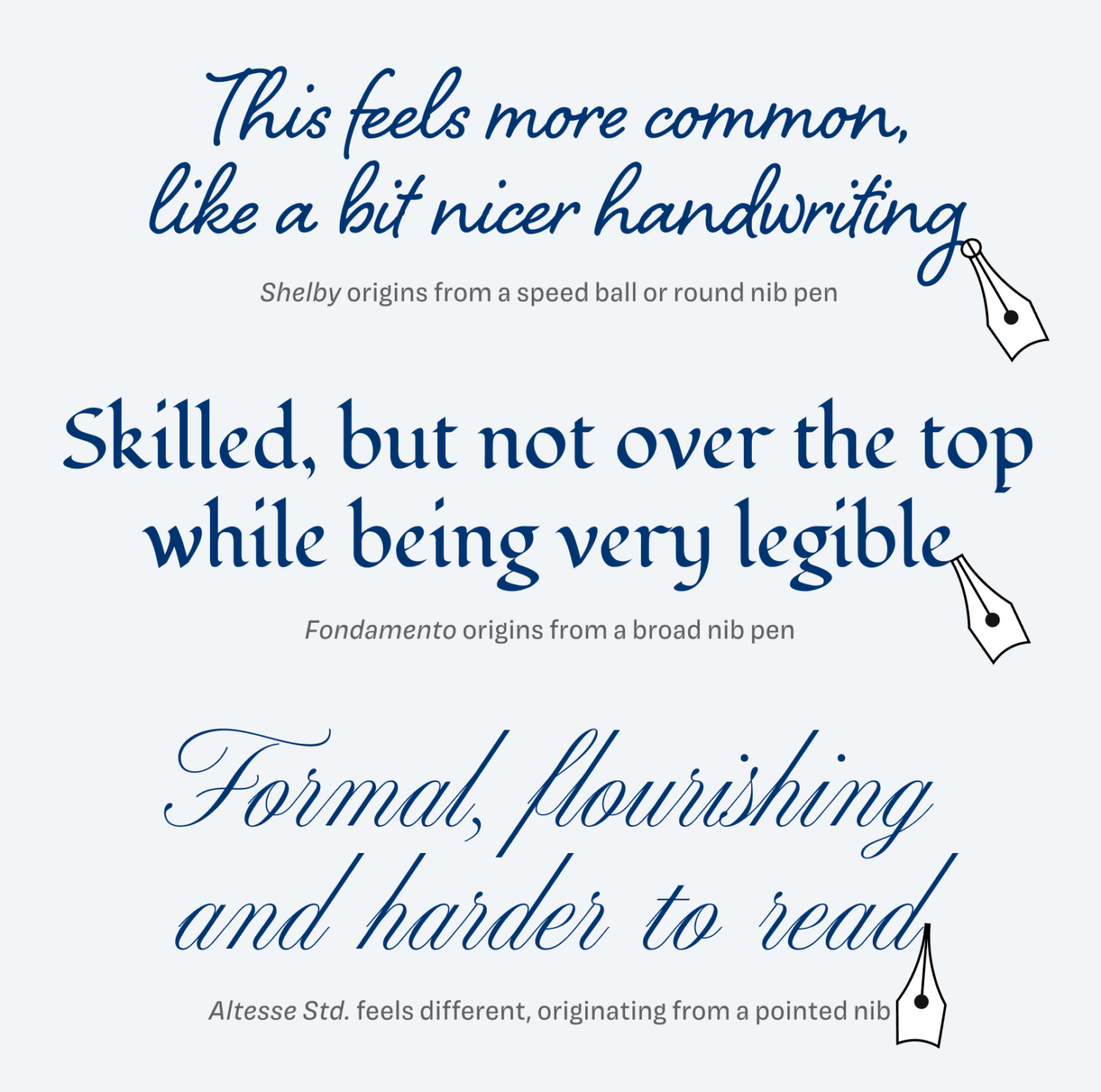
Fondamento still feels like something an average person can pull off with a little practice. Skillful, historic, but not over the top. Not like this super fancy scrip typefaces that are very flourishing and delicate. You can add some variety to it by using caps or the Italics.
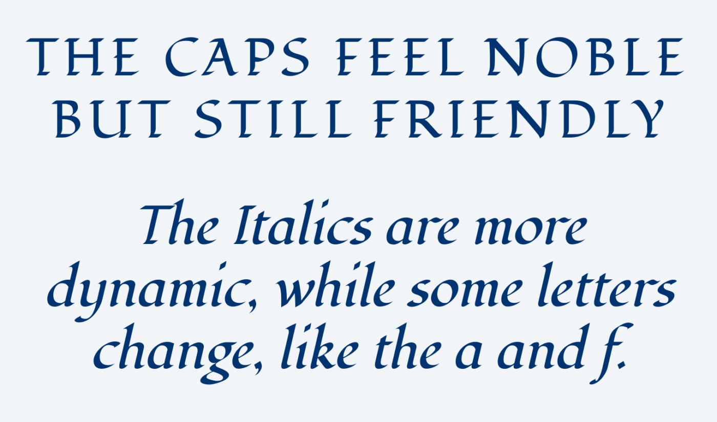
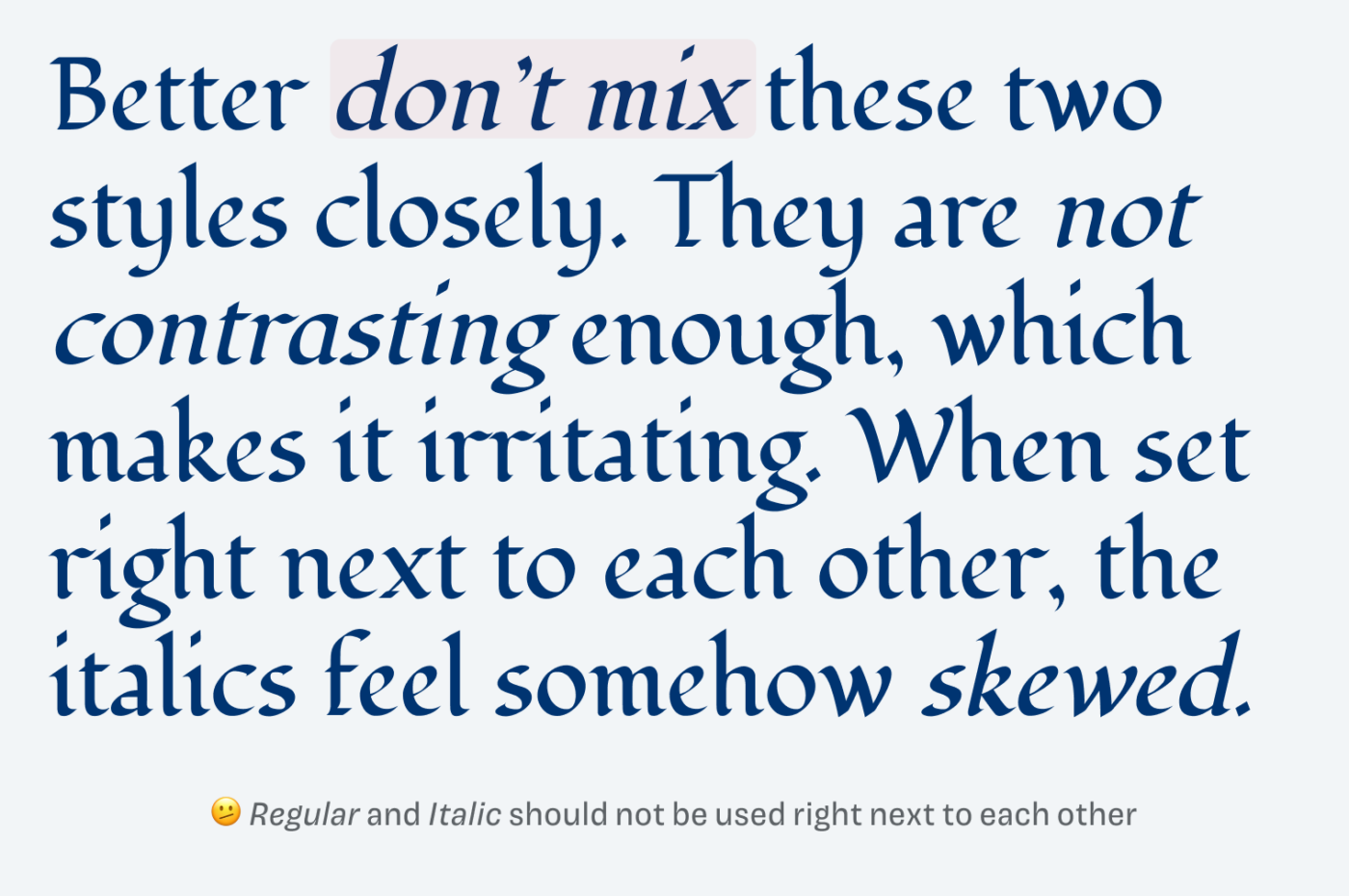
But I recommend not mixing Regular and Italic close together. They are not different enough to be contrasting. Decide for one style and then go with that.
Besides headings and titles, a good use case for Fondamento could be an intro text or a pull quote. Something in editorial design that spices up the body text with a traditional and yet human note.
Font Pairings with Fondamento
Fondamento is a dynamic, calligraphic, contrasting serif typeface. Pair it with any other dynamic typeface for body text, like one of my suggestions below.

- Headings


Learn more about pairing typefaces using the Font Matrix.
What do you think? Is Fondamento something for an upcoming project, or do you have a font recommendation? Tell me in the comments below!
Thank you for sharing this font and your learning story 😀, your tips for using it are very appropriate. Cheers!
Garcias, Caco! Glad you enjoyed it 😉.
Does not appear to have true italics.
qp and db are mirror images
Hard to distinguish between uc “I” and lc “l”
For clarification – you’re referring to Captura Now (sorry for the wrong link in the newsletter) .
I had that issue too, Steve. Only accepting a typeface with true italic shapes, after I learned about the differences. With time, I came to realize that for some styles these italic shapes do not really fit, like for geometric or grotesque typefaces. And I am not speaking of artificially tilting and skewing a typeface to generate an italic out of it. With Captura Now, they definitely are made well, in that slanted style. But yes, obliques won’t be that striking for text highlights compared to true italic shapes.
About the differentiated shapes – yes, also true. So I would not recommend using them for extensive, long reading text or names that could be easily mistaken.
I do wish someone like you could have visited my class way back when. It seems that the children in your daughter’s class had a wonderful introduction to the art of calligraphy. As for me, I’m learning a thing or two from your illuminating typography emails.
That’s so kind of you! Anything particular you would be interested in for future topics?