
My thoughts on Comma Base
I treasure John Boardley’s blog I Love Typography since forever. So when he recently announced that it has a shop for fonts now, I was super thrilled! One of the many gems that caught my eye, was Comma Base, a new typeface by Martin Majoor. I know Martin from his precise work on the beautiful serif typeface FF Scala, so that name stands for quality.
With Comma Base the mood of a serif was blend with a sans. I like how elegant and airy the typeface comes across. It has narrow proportions and even in the lighter weights, a sturdy stroke. When getting bolder, Comma Base is more contrasting, reminding you of a broad pen. The open shapes make it very legible even in smaller sizes. So besides display and body text, it will work beautifully a user interface as well, while conveying this classical, human vibe.
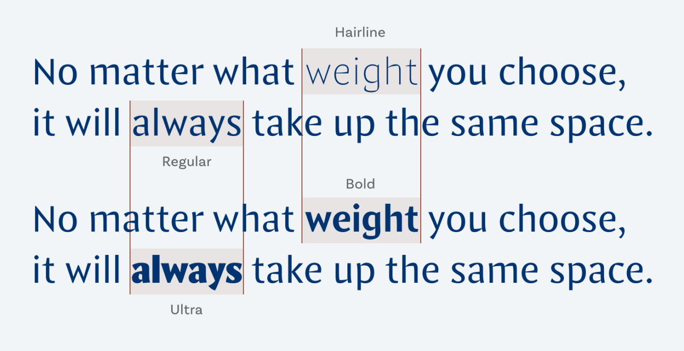
What excites me the most is, that Comma Base is a uniwidth font. This means changing a text from for example light to black doesn’t effect the set width. A feature very, very, useful in digital design. It gives you the possibility to create text highlights or hover effects that won’t create a reflow of text. Everything will stay in its place. How cool is that? I’m always irritated when a link in the navigation changes its weight and then everything else shifts. So Comma Base elegantly solves this problem you might never have thought about 😉.
You can download and test drive the Regular weight for free on your desktop computer and see if it fits your design.
Recommended Font Pairing
Looking for an interesting font to pair it with? Choose Sharpie for snappy display text, or Ferryman for headlines with a historic touch.

- Headings
- Copy
- UI Text


Learn more about pairing typefaces using the Font Matrix.
What do you think? Is Comma Base something for an upcoming project? Tell me in the comments below!
Interesting shapes – should we classify that an “evil sans”?!
beautiful & trending! 😀
Glad I picked something you enjoy as well, Caco! ☺️