
My Drika Font Review
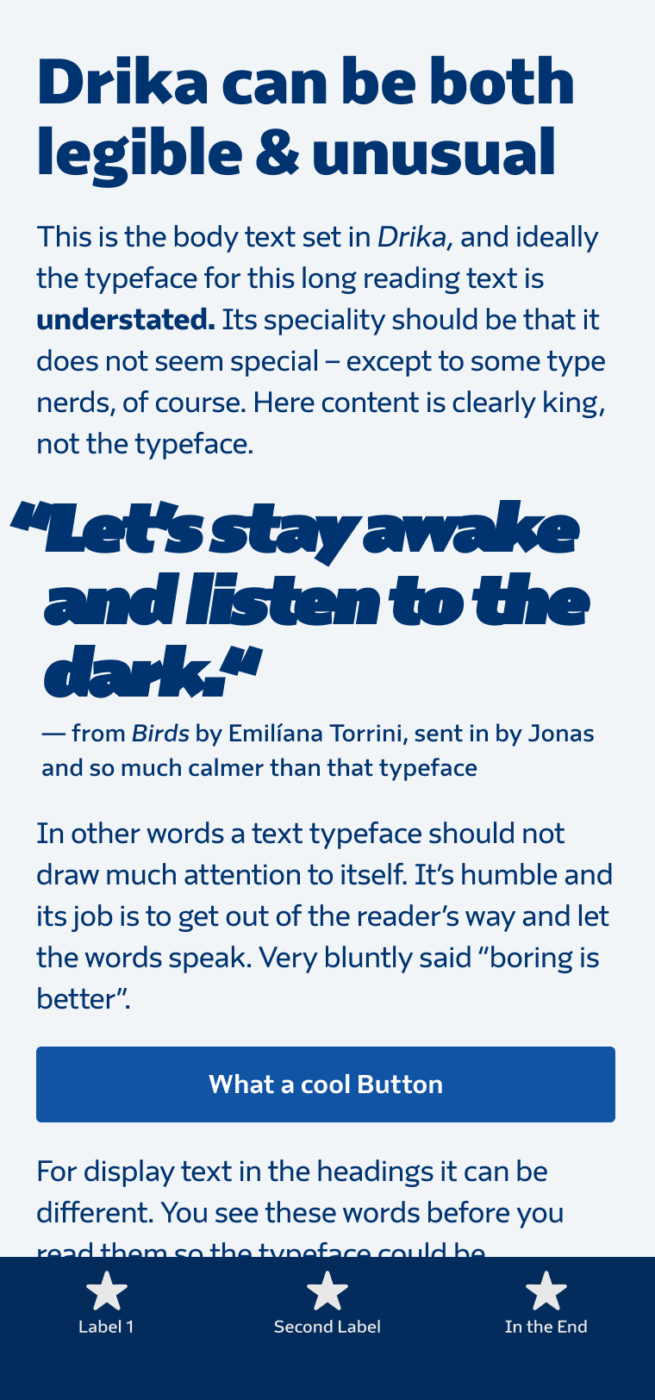
Drika is one of the rare typefaces that works from small functional text, to body text, and striking branding projects. At smaller sizes, Drika is a calm, friendly, a bit quirky typeface. Ideal for UI design, very legible and durable. But the larger and bolder you set it, the more its strong and playful character comes through.
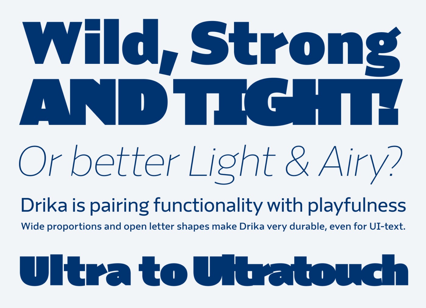
Drika is equipped with 14 weights, of which most notable is the Ultratouch weight. At its ultra-boldest, the letters snap together, creating a dense, striking texture of letters. See how much impact the touching letters have in all caps. But also mixed case looks so sophisticated, here it really shows how much attention went into kerning it. This is obviously only something for headings or other attention-grabbing display text.
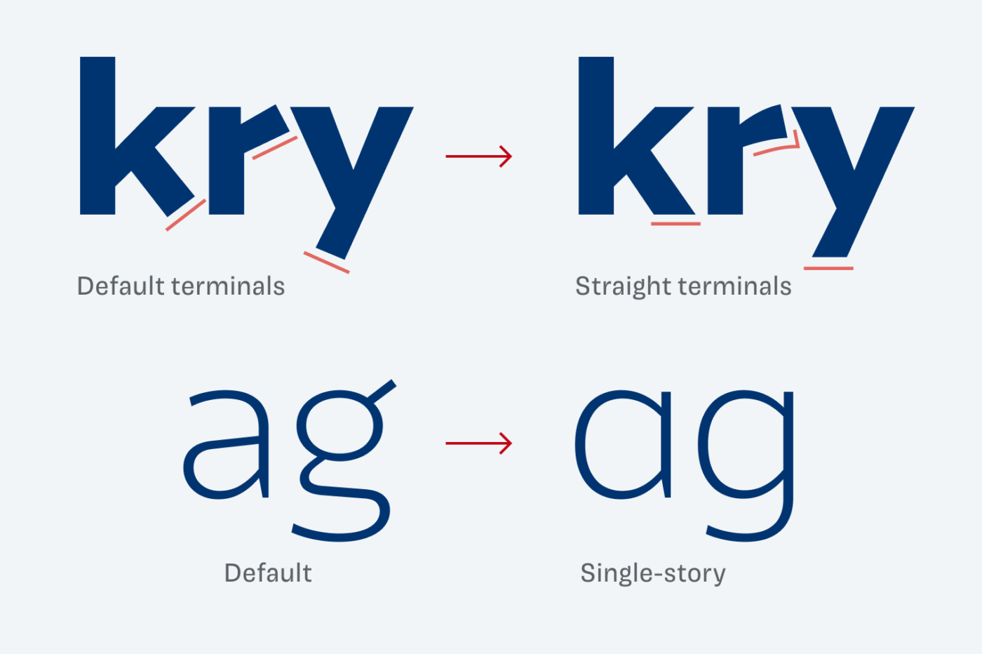
By default, Drika has angled terminals, a capital ‘I’ with serifs, and a lovely open looped lowercase ‘g’. Plenty of stylistic sets let you modify these and pick alternates. This makes it incredibly versatile for all kinds of applications.
Font Pairings with Drika
From its construction Drika is a dynamic linear, sans-serif typeface. Pair it with Sahlia or Kalnia if you want something classy and interesting for headings, or something else from this list.


Learn more about pairing typefaces using the Font Matrix.
What do you think about it? Share your thoughts in the comments below, I’m always curious how you receive me recommendations.