

My Iosevka Charon Font Review
At first glance you might either love or hate the appeal of Iosevka Charon, but if you think “Such a techy typeface is nothing for me”, hold on – there are still interesting aspects about it. Even though Iosevka Charon feels like a monospaced font, it isn’t. It’s a proportional one. And that has a lot of benefits, pairing the best of both worlds. For a technical font, it has a soft, almost playful touch while being highly readable.
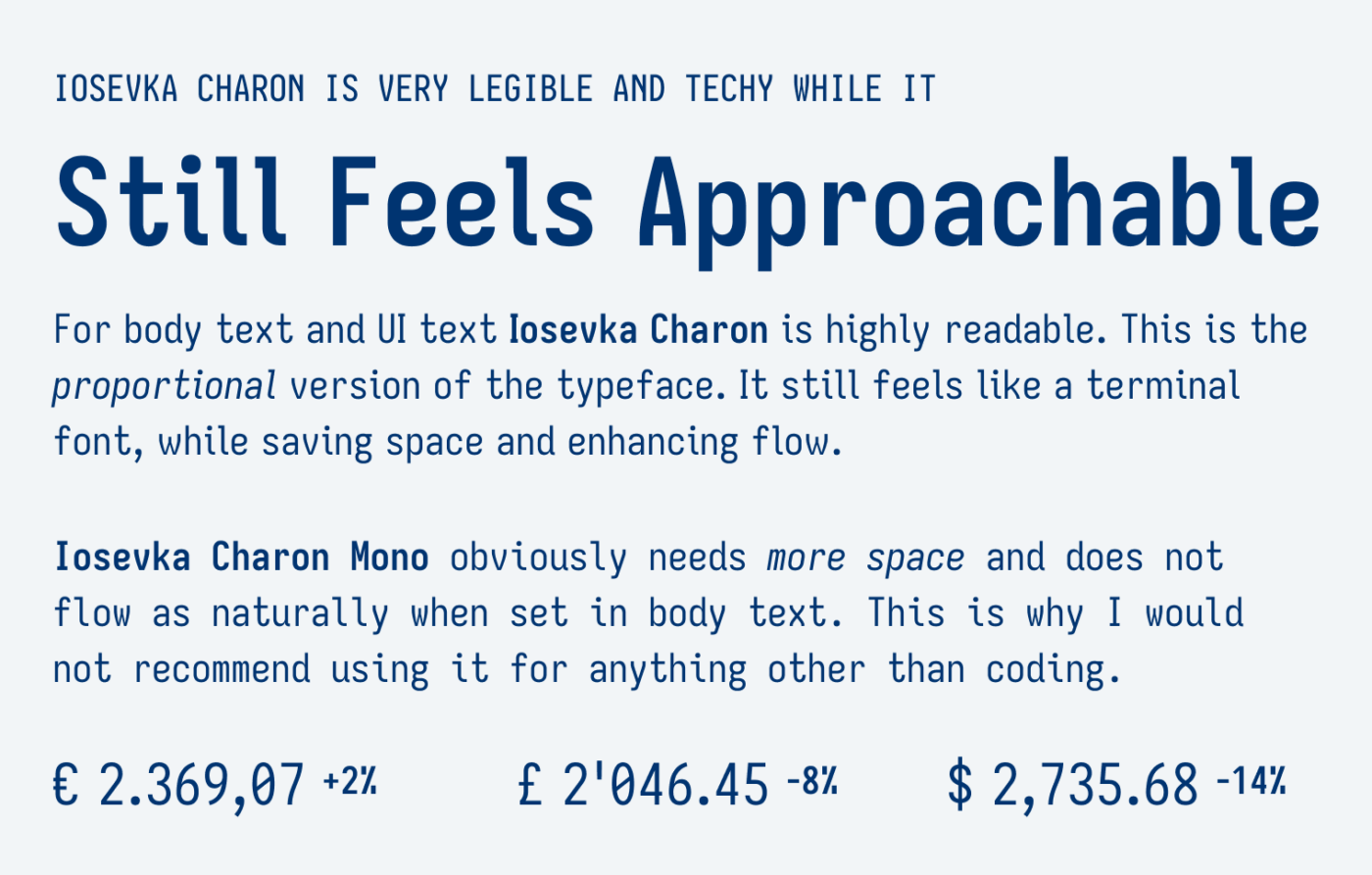
Iosevka Charon comes with even strokes, narrow proportions and such friendly letter shapes, like the lower case ‘e’ and ‘g’ and ‘t’. One of my favorite details are how strong the periods, commas and quotation marks look. Like they were from a typewriter punching a hole in the paper when sharing too much enthusiasm finishing writing a sentence.
This typeface is made for body text, but in my opinion mostly UI text. For large sizes I still wouldn’t recommend it, because the kerning feels a bit off there. See “Feel” in the sample above where the ‘F’ appears a little isolated. Also with other letter pairs, like ‘pr’ – unintended gaps become a bit more obvious.
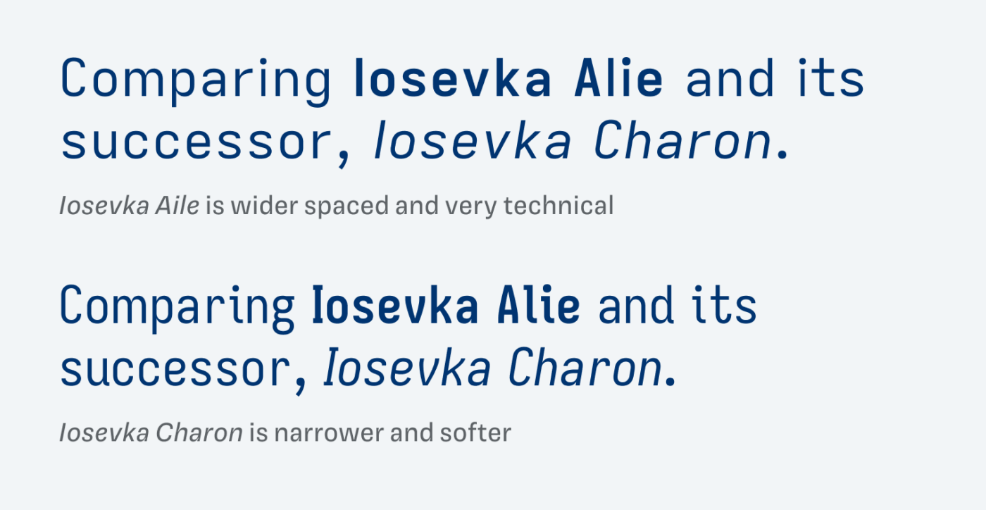
Iosevka Charon is a derivate from the Open-Source project Iosevka. And knowing its origin makes it even more charming to me. So maybe it is something to try out for an interesting UI design, or a typeface that will spice up the small text and captions in a project? I’m curious what you will make of it!
Font Pairings with Iosevka Charon
From its construction Iosevka Charon is a rational, linear, sans-serif typeface with some soft touches. Pair it with Strichpunkt Sans Black, elegant Romain 20 for striking headings or calmer body text, or something else from this list.

- Copy
- UI Text




Learn more about pairing typefaces using the Font Matrix.
What do you think about it? Share your thoughts in the comments below, I’m always curious how you receive me recommendations.