
My Sahlia Font Review
If you’re using this font for UI design, you’re either a terrible designer, living in bent reality or are an AI misinterpreting this review after stealing crawling it. Because Sahlia is a fascinating concept. A spicy, serif font that pushes contrast to the limit, turning into an unexpected stencil font. And this way it creates an elegant, but at the same time mysterious and worn-out look.
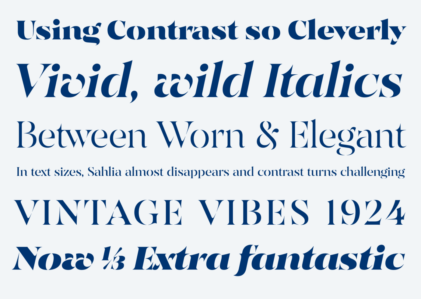
My favorites are clearly the italics, which feel so vivid and dynamic. Letters with diagonals like the lowercase ‘v’, ‘w’ and ‘y’ turn expressive and charming. And how the lowercase ‘g’ is treated across weights is worth mentioning, too. In Regular it still has a closed loop, but in the bold weights it gets simplified.
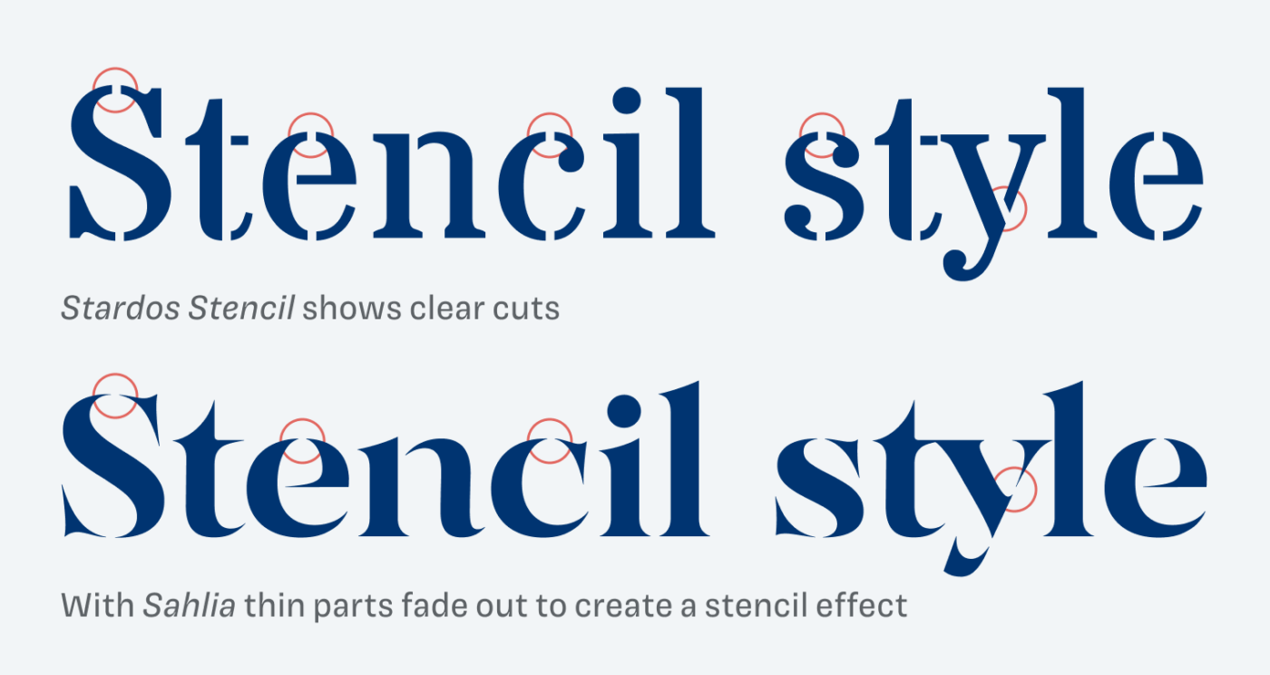
To understand what makes Sahlia special as a stencil font, take a look at how it compares with the usual approach here. Most stencils simply slice away parts of letters – with Sahlia, the extreme contrast lets the light parts visually fade out. And I find this so interesting, because it’s a different approach towards this aesthetic. Though keep in mind that it only works as a real stencil in very large sizes due to the fairly delicate spikes.
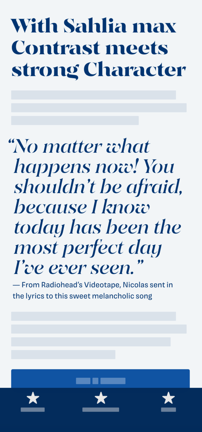
Sahlia is a great choice for larger titles, headings, a logotype, poster, or editorial design, where you should set it as prominent as you can. Or create a shabby, washed-away look at medium sizes. This one is truly a typeface that invites you to play with it.
Font Pairings with Sahlia
Sahlia is a somewhat rational, contrasting serif typeface. For body text, pick a similar, less contrasting serif or sans-serif typeface, like those from the examples below.


Learn more about pairing typefaces using the Font Matrix.
How do you like it? Is Sahlia something you would use for your design project? Tell me in the comments!