My Corsair PE Font Review
The handwritten style all caps typeface Corsair PE appealed to me, because of two reasons. Firstly it has something casual, friendly and easy going to it. And secondly, it does not overemphasize that. The typeface remains somehow calm and simple and therefore versatile, equipped with some clever details. To better show you what I mean, let’s compare Corsair PE to another handwritten style, all caps typeface.

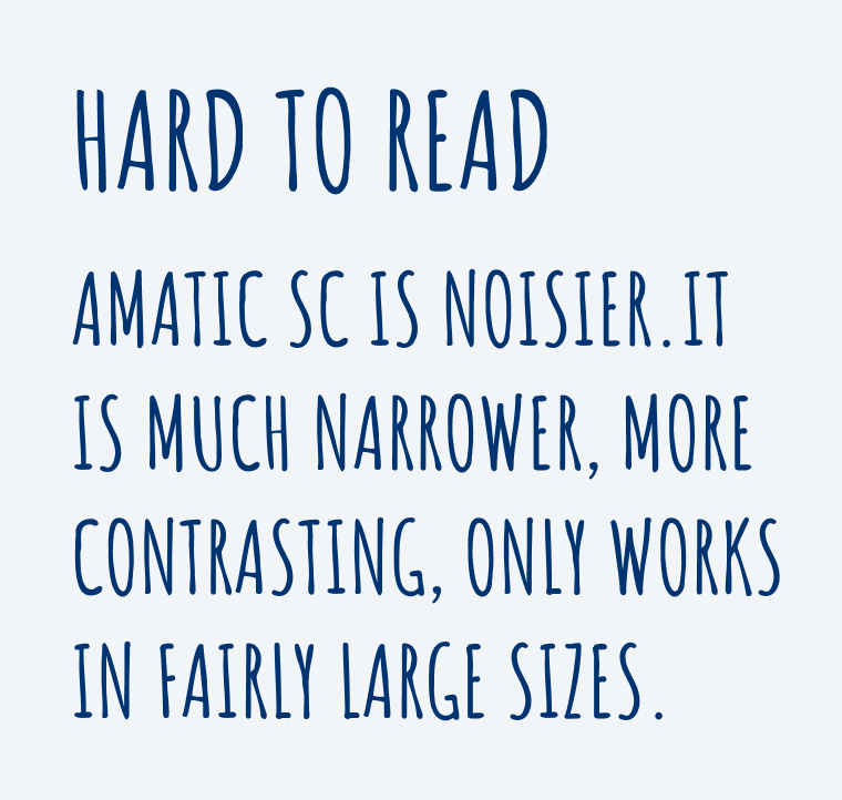
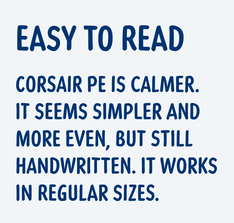
One of the most popular handwritten style typeface is Amatic SC, ranking 151st of over 1600 Google Fonts. Every time I encounter it, it shivers down my spine 🥶, because Amatic SC is so noisy, narrow and horrible to read. Corsair PE on the other hand is a bit wider, and more rugged, creating a more even texture.


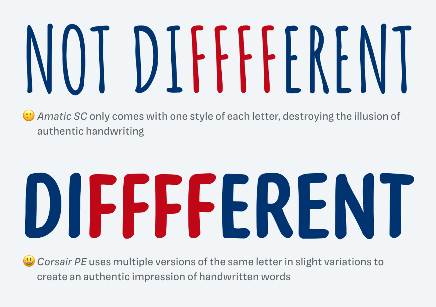
Also, the individual characters of Amatic SC are very striking. When you see them exactly repeat, the illusion of authentic handwriting is immediately destroyed. Corsair PE has less peculiar letters, therefor repetitions are not that obvious. Above all, each character comes in several slight variations, so letterforms feel naturally randomized.

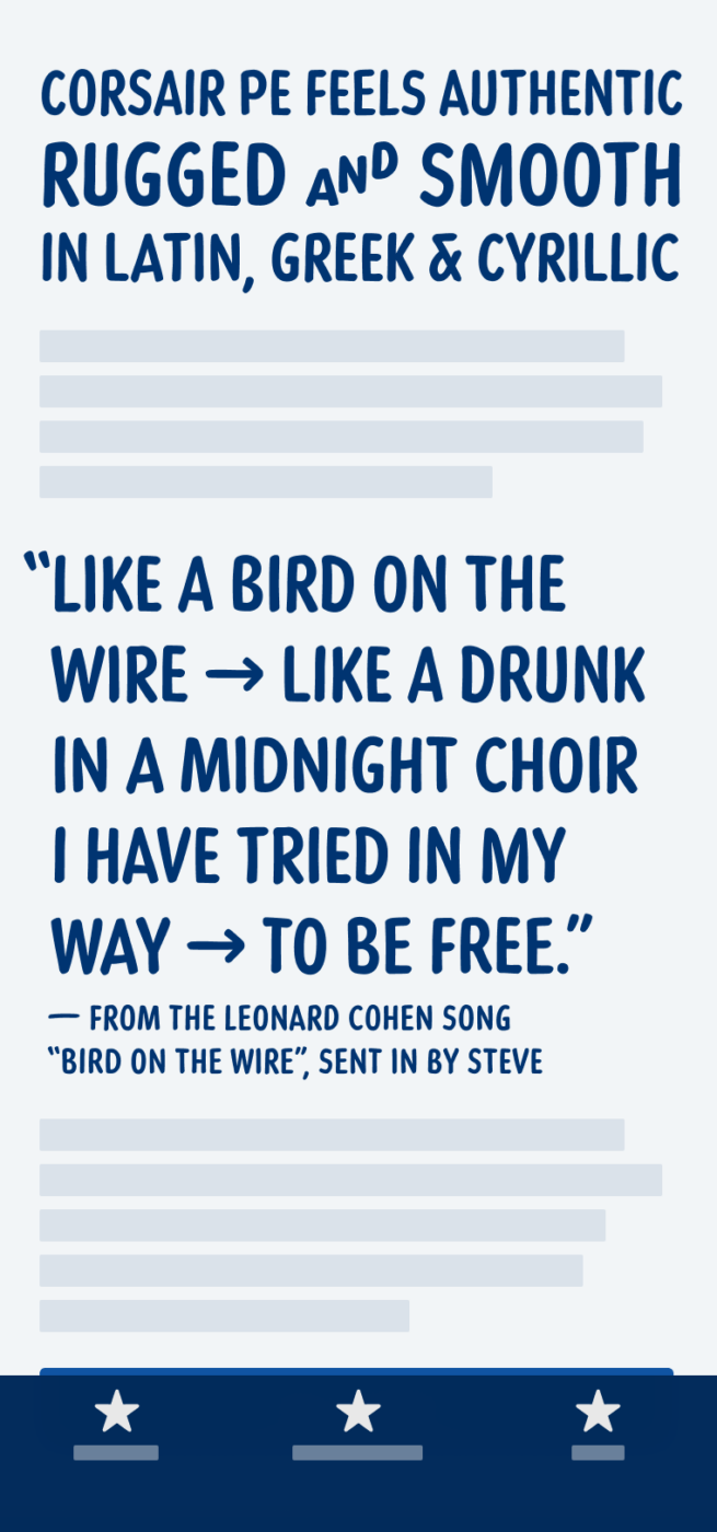
I wish Corsair PE was also available in one or two more weights, since this would make it a bit more versatile. Because it is an all caps typeface, it soon becomes trying to read, so use it only for a few words, up to three or four sentences at most. When you keep that in mind, Corsair PE will make you happy in headings, on packaging or in other short, larger text.
Font Pairings for Corsair PE
Where Corsair PE is located on the Font Matrix is not that relevant, since it’s both handwritten style and caps only. I recommend pairing it with something that is also quite narrow and a sans-serif, like Georama.
- Headings
Learn more about pairing typefaces using the Font Matrix.
What do you think? Do you like that handwritten vibe? Tell me in the comments!


CORSAIR PE was born for ћирилица 😉
Actually, one weight makes it authentic because, if it’s one person’s handwriting, then it’s usually the same line ‘thickness’, at least in my writing. 🤔
Epic family picture!
No rest this weekend, Oliver, I’m packing my stuff and moving into another apartment. 🥴