
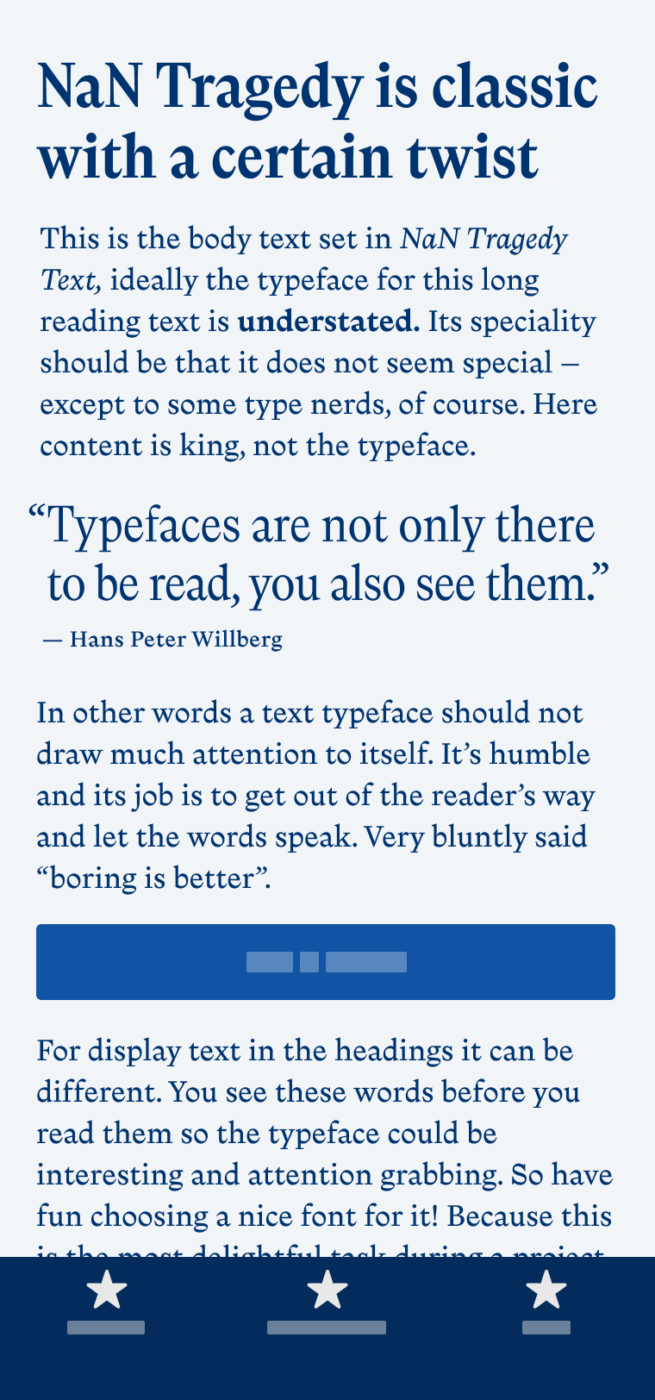
My thoughts on NaN Tragedy
At first glance, you might say – man, this looks just like Times New Roman, booooring! Default! Why should I use this? But look closer – there is so much extraordinary in Nan Tragedy. Designed by Jean-Baptiste Morizot and published by the hip NaN foundry, this typeface is a fascinating mix of styles. You’ll see this, when you compare it with a classic, like Times New Roman. Foremost, it has a very different vibe, it’s more edgy, contrasting and less restrained.
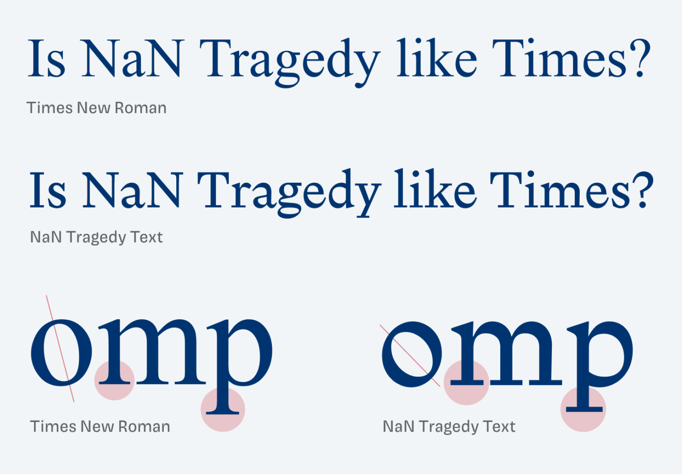
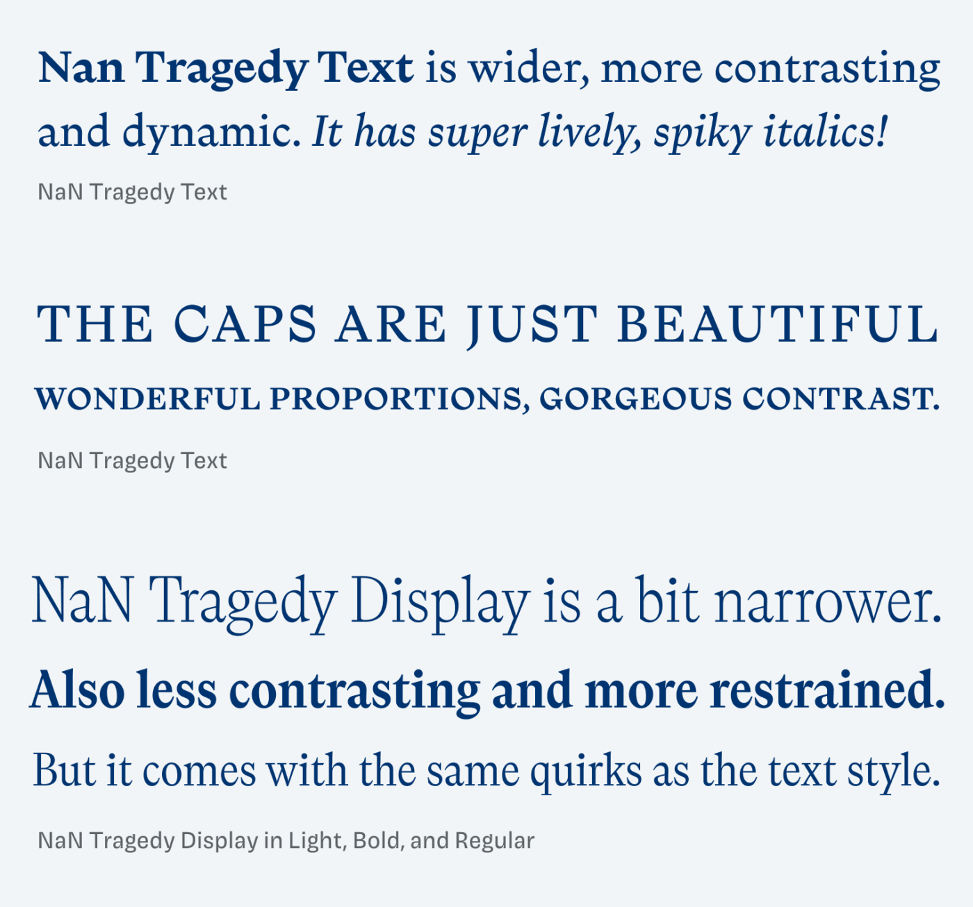
A classic serif typeface, like Times New Roman, has bracketed serifs, and ball terminals at ascenders like the y. NaN Tragedy just goes crazy and with straight serifs! And this is just one example. The more dynamic shapes, the steeper angle, the striking g and the lively italics all add up. And this makes it an unusual blend of styles.
And even if you don’t look at those tiny parts, this all creates the vibe of NaN Tragedy. Everything looks a bit goofy, wonky, I could lively imagine it for a hip project. Also check out the cool microsite showcasing the typeface.
Font Pairings for NaN Tragedy
Wild NaN Tragedy is a quite dynamic, contrasting serif typeface. Ground it a bit by pairing it with dynamic linear sans-serif Commissioner.

- Headings
- Copy

Learn more about pairing typefaces using the Font Matrix.
What do you think? Is NaN Tragedy something for an upcoming project? Tell me in the comments below!
It’s the balance of straight serifs that act as type pillars and other quirks such as dynamic angles and lines. A masterpiece, if you ask me. This font is so versatile while having a bold character. Rich work! 👏🏻
THE CAPS, Oh Gosh, something ancient in it but not obsolete.
Have a personal showcase!? Com’ on Oliver, this is authenticity delivered. Worth each €
Haha, Jana, the caps got me as well 😉.