My thoughts on Asap
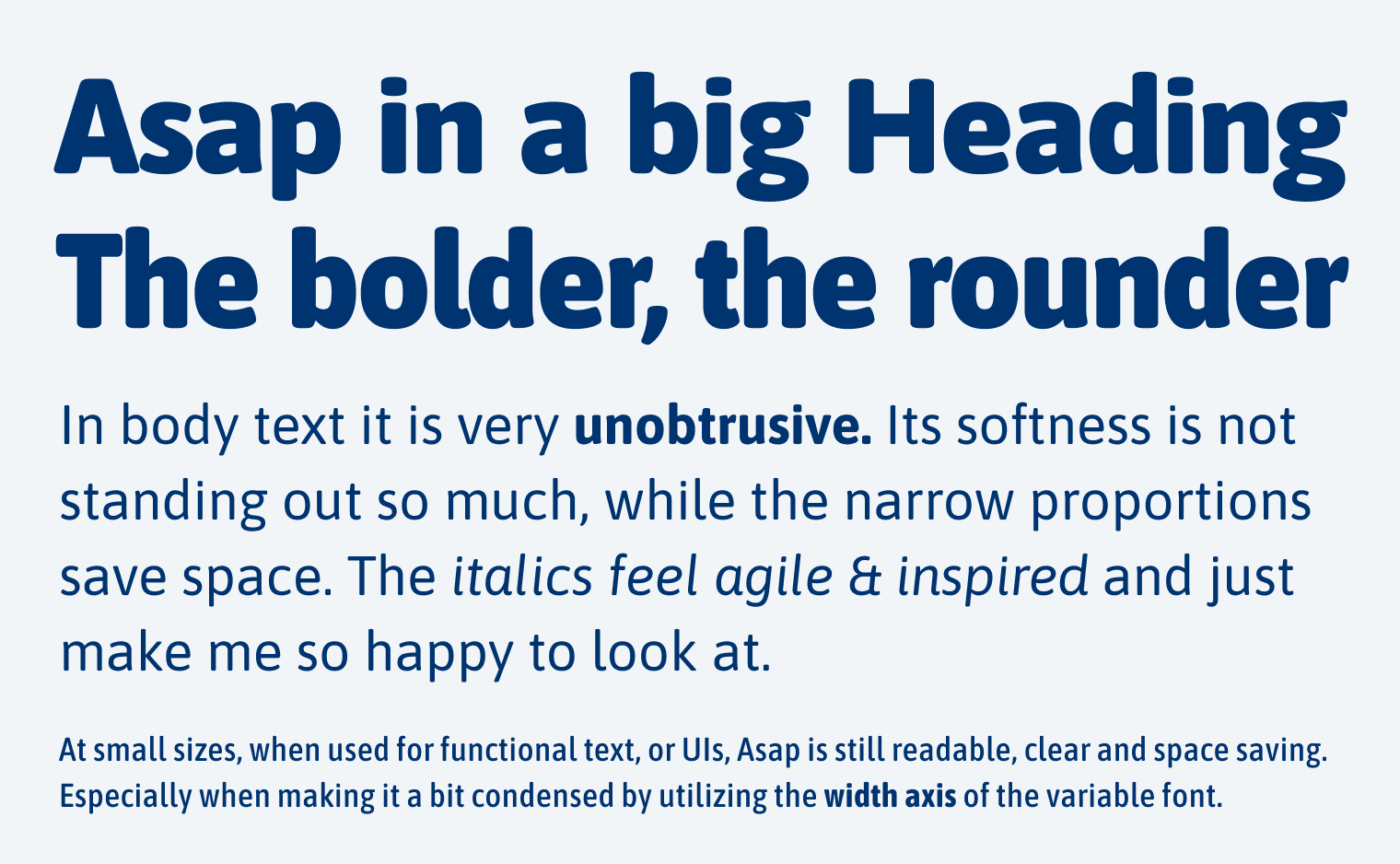
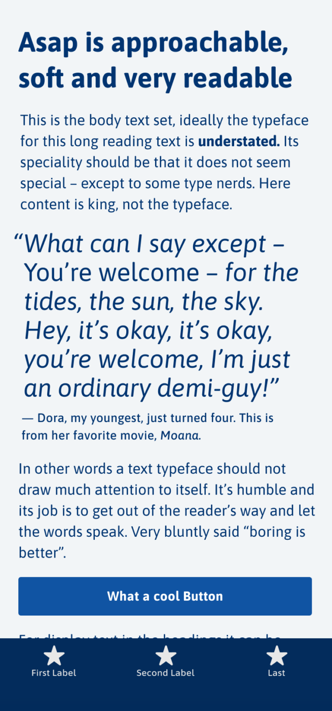
The friendly sans-serif free font Asap, was designed by Pablo Cosgaya for Omnibus-Type. Its subtle rounded corners add to the approachable atmosphere the typeface creates, while the relatively high lower case letters contribute to ideal readability on screen and other media.
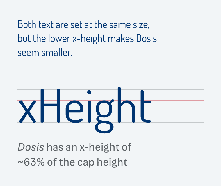
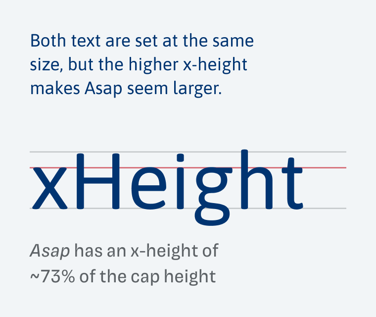
Let’s take a closer look at that x-height, and compare it to Dosis, a typeface that also looks soft and friendly, but with a quite low x-height. Because of this, Dosis appears very small. Also, the typeface has very striking letter shapes, making is less than ideal for running text. This why I replaced it with Asap in the website redesign of the State of the Browser conference page. It still conveys a similar mood, only calmer, more readable and appropriate for body text.
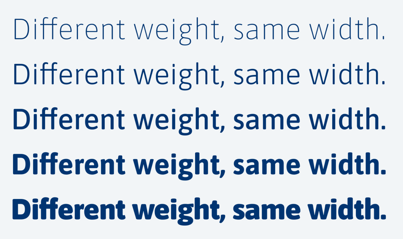
A rarely highlighted feature of Asap is, that it’s a uniwidth typeface. Don’t confuse this with monosapce – where every character has the same width – uniwidth means that across all weights the width of the same character stays consisten. So when you change one word in a sentence from Light to Bold, it will happen without reflowing the text. I’ll dive more into some other advantages and disadventatges with this in the Font Friday Video Digest for Patrons.
Additionally, Asap comes in several widths as well, going from Condensed to Expanded and everything in between thanks to the variable font. This all makes is a very versatile typeface, working in user interfaces, set as body text and on posters.
Recommended Font Pairing
The dynamic linear sans-serif Asap pairs well with dynamic serif typefaces that comes with a larger x-height, like Andada Pro.
- Headings
- Copy
- UI Text
Learn more about pairing typefaces using the Font Matrix.
What do you think of Asap? Tell me in the comments below! Also, if you have a suggestion for a future Font Friday.

Good, old, warm Font Friday hug in my mailbox. On Thursday afternoon, while I was hiking into the woods, I thought “Hmmm, if Oliver doesn’t show up tomorrow, I need to check if everything is OK”. And, Voi-La! Happy birthday to LOVEly girls🤗
Where is the cake with typography on it?
Asap is that nice customer service guy, who serves diligently but without too much personalization, at times (Light weight) even dry. But not in a bad sense, that’s just youth, he isn’t as confident. 😉
LOL, there actually was a cake, with some poorly designed sans serif letters 😅.
“Nice customer service guy” is brilliant and on point!