
My Niven Font Review
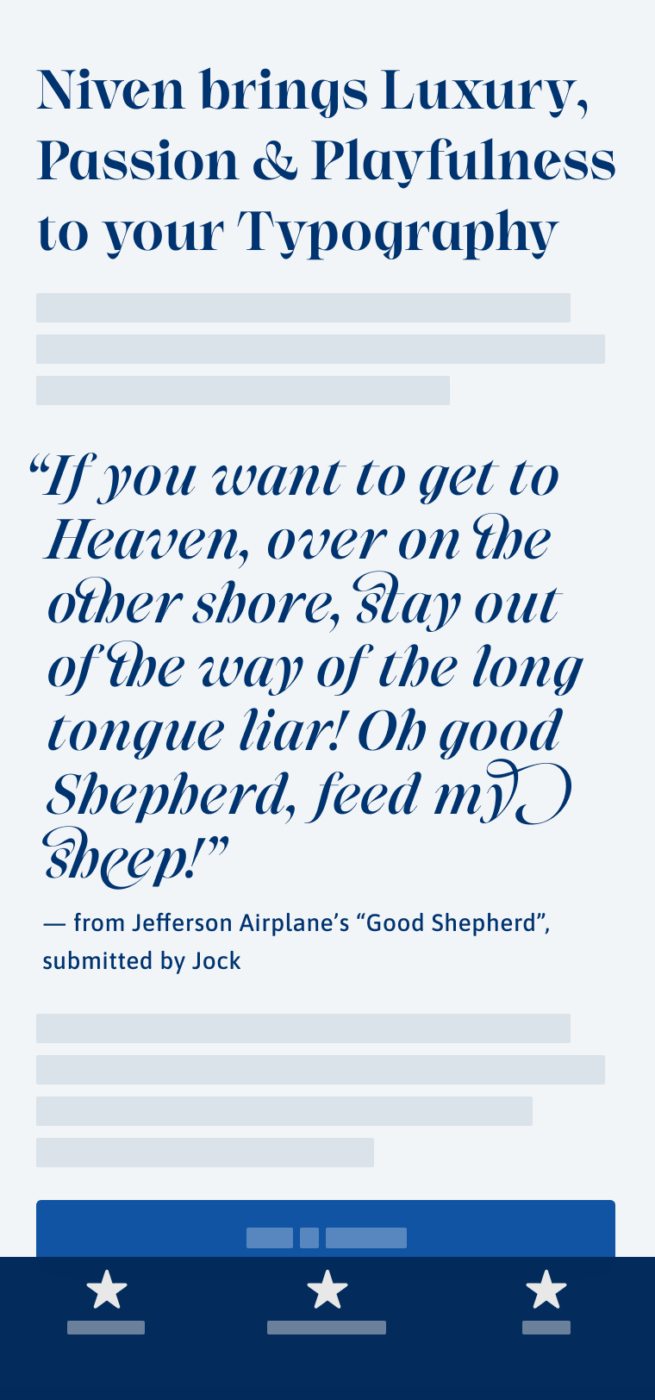
This serif display font may not be the most legible one, but it’s undeniably beautiful. Niven is a delightful blend of lavish, delicate, playful and elegant elements. Coming in two styles, Normal and Italic, it gives your designs a very distinctive look.
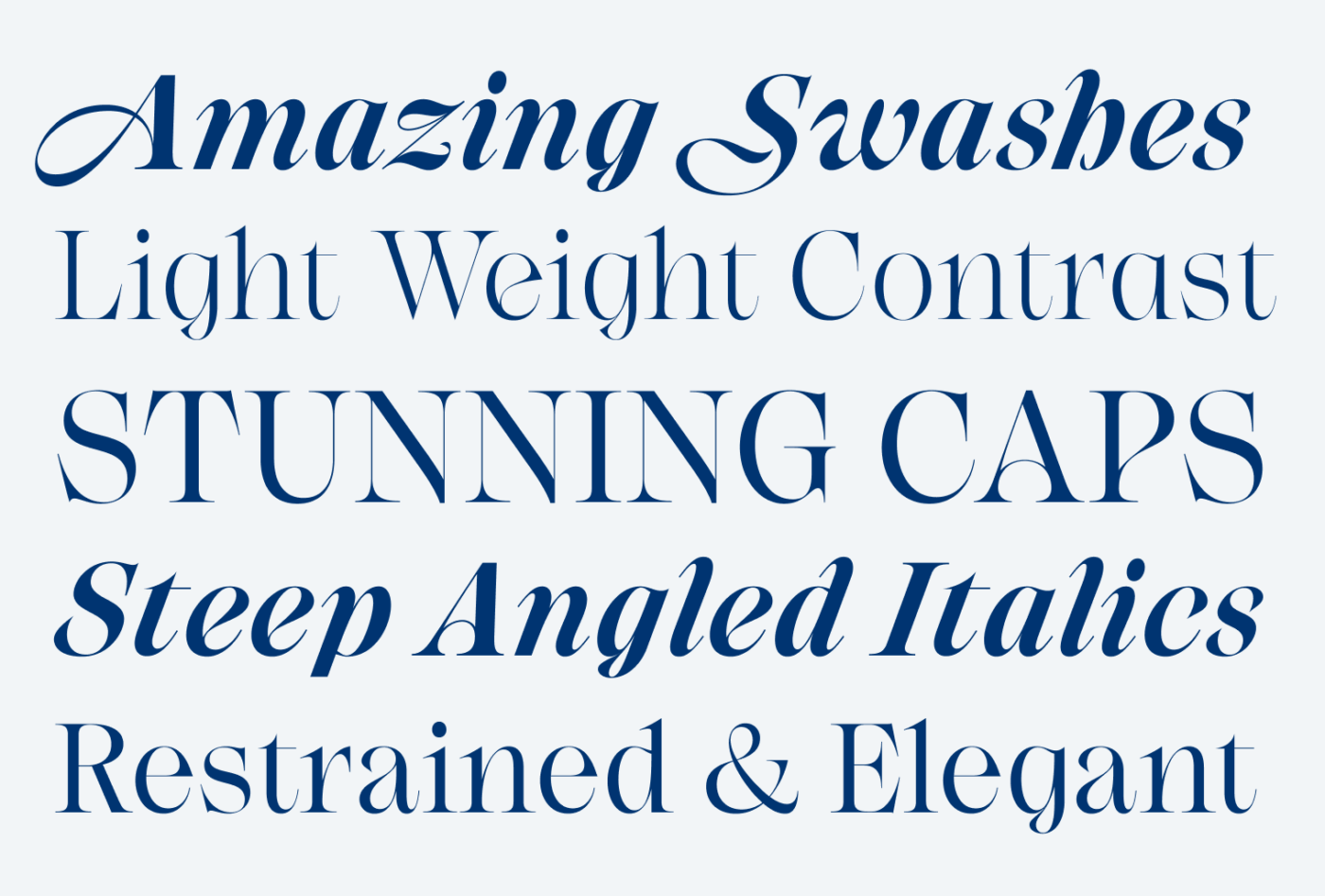
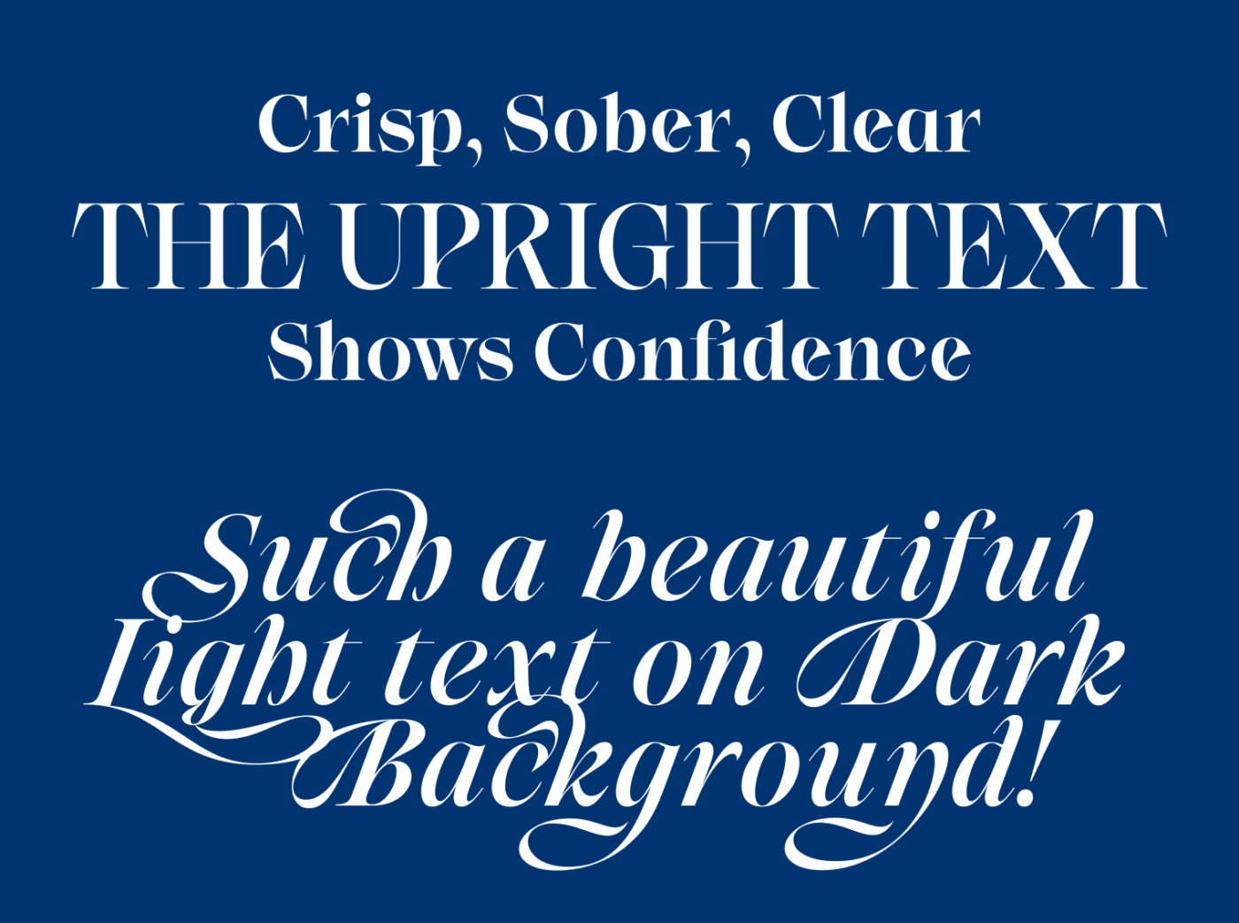
While still being very contrasting, the upright style of Niven is more sober. It conveys nobility in a more reserved way, as it is balancing organic curves with spiky, almost aggressive serifs. Niven Italic on the other hand shines with its sweepingly playful swashes, showing a strong calligraphic touch.
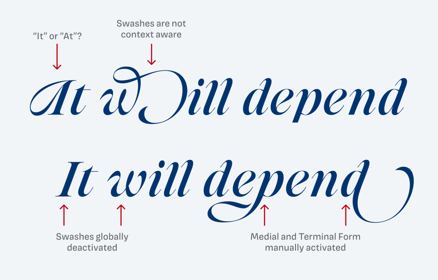
Note that special ligatures, swashes and other stylistic alternates are only available with the Italic style. While the default italics already look quite interesting, by activating certain OpenType features, you can gradually take it up a notch, as you can see below.
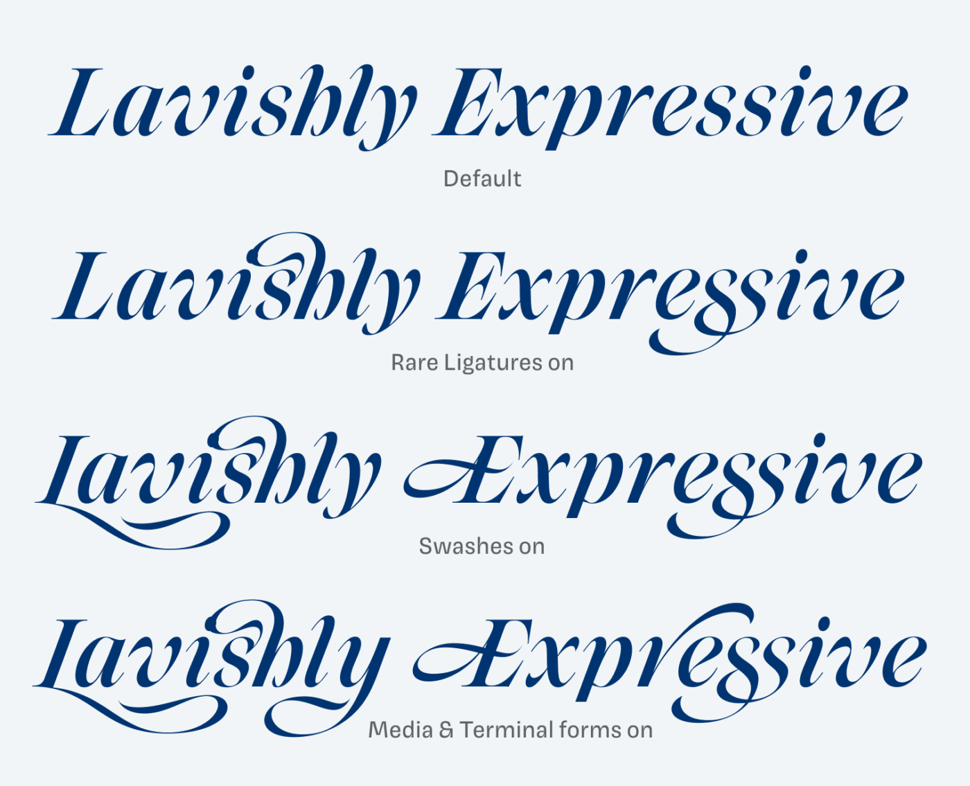
But you have to do this with caution. One limitation is that swashes lack contextual awareness, which may lead to irregularities when activated globally. This means Niven Italic can not be used with all of its features in a context where text is set dynamically, like on a website. It always requires manual adjustment, which in turn, makes it more unique.
Overall, Niven is a true eye-catcher. Try it for luxurious branding projects, packaging or posters. But it will also shine on a fancy blog or in editorial design. Depending on your preferences, make it more sober by using the upright style or more expressive by using Niven Italic – the choice is yours.
Font Pairings with Niven
Niven is a contrasting, quite dynamic serif typeface. Pair it with a very classic, humanist serif font to highlight the traditional aspects of it or with something clean and geometric for more variety.

- Headings


Learn more about pairing typefaces using the Font Matrix.
How do you feel about Niven’s elegant vibes? Would it fit into one of your projects? Drop your thoughts in the comments and suggest the next font to review!
Wow, this one is so beautiful! I can imagine this really well for posters, editorial or branding purposes. Interesting observation though: one would need to obtain a dedicated license to use Niven for a branding project which comes at quite a prize. I am not saying that this would not be deserved, but it could rule out Niven for some projects. Anyway: Thanks, Oliver, for the weekly inspiration!
You’re absolutely right, Alex. Licensing is quite complex in this case, you got to take a close look at your desired use cases.
The uprights make me think of carnivals and circuses. The italics are entirely different: clay, classic, stylish.
That’s a very interesting association, but now since you said it … yeah!