What’s the right font size in web design?
If you want your text to be read, set it at a sufficient size! But what is a good font size, and how can you apply it in your web design? This article and video has answerers for you with some practical examples focused on body text in responsive web design. Ready – then let’s size up, how to size your fonts!
TL;DR: Start with your body text and set it at a default size of 1em, which is calculated as 16 px in most browsers. Use relative units and from there, scale up the font size and ideally also the layout proportionally and make it larger on bigger view ports, since we can assume that the viewer is further away.
The holy trinity of typography
A font is only as good as it’s being set. You can choose the best typefaces ever for your web or app design, and still f*** it up big time (pun intended) when setting it so small or in other ways inappropriate. The holy trinity of typography when it comes to setting your text is:
- font size,
- line height (or leading), and
- line length (or measure)
These three parameters are strongly related to each other, and effect if your text can be easily read the most. So when adjusting the type size, the other parameters might be adjusted as well. I always start out with picking a proper typeface, followed by setting the appropriate font size, and then take care of line length and line height.
For this article, let’s do the same and focus on size. I will not go into modular scale (which is beneficial) or more advanced fluid typography. For the purpose of clarity, I want to keep it as simple as possible to be a solid introduction.
Different kinds of text have different sizes
As with picking a proper typeface, ask yourself, what’s the main application of your text? Is it a long reading format, like a blog? Then body text is the star of your show. Is it a portfolio or a more marketing show-off site? Then display text comes into play. Is it an app or a UI with very short precise information, then functional text is your main actor. Here are values I use in my projects. Use them as helpful guidelines.
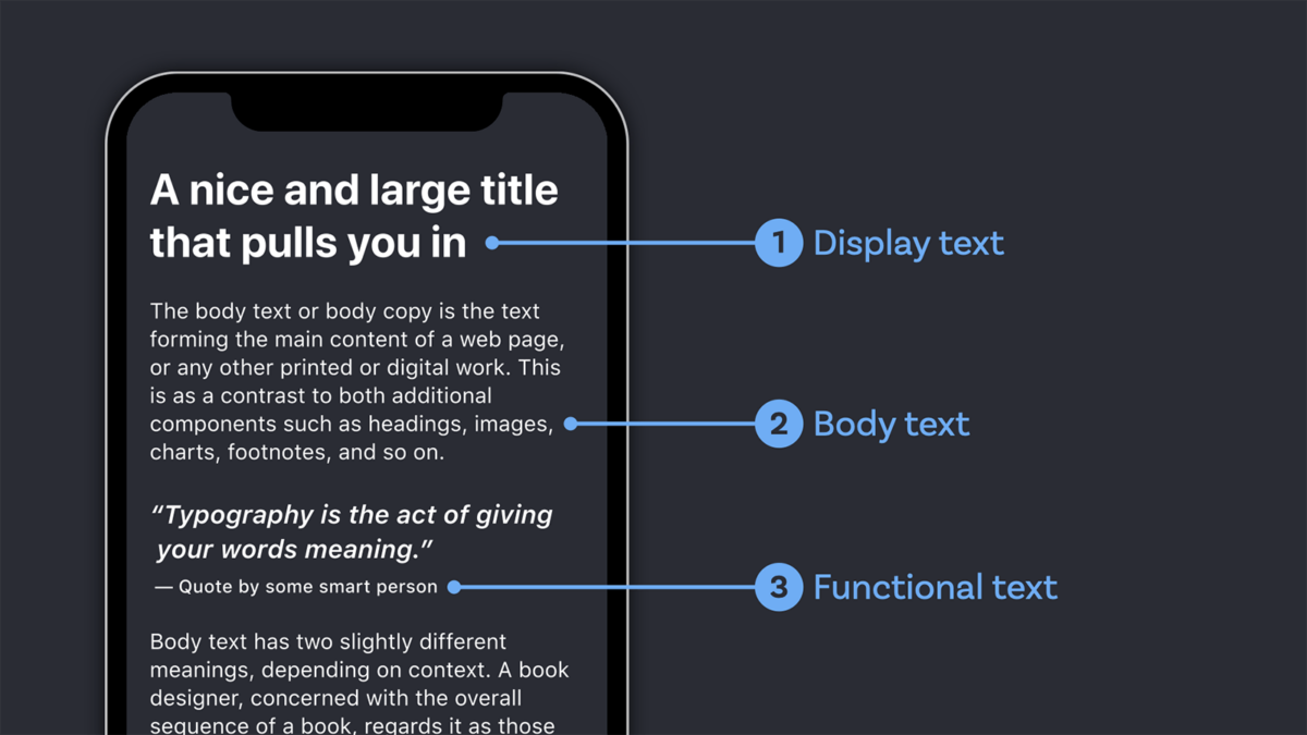
Body text
Default: 16px or 1em
On mobile: Use the defaults, at times 10% smaller
On Desktop: go up until 24px or 1.5em
I see a lot of sites that set the body text too small. In the video, I show a horrible example of a hotel’s website where the body text is set at only 11 px on desktop, which is ridiculous. Even for mobile, it would be too small.
Display text (Heading 1)
Default: 40px or 2.5em for an <h1>
On mobile: 32px or 2em or smaller, since it uses up too much space.
On Desktop: go up until 64px or 4em
I use this as the maximum for my font sizes. For the other headings, you would pick some values in between that will still create a visual hierarchy. In most cases, you only need to style your <h1> to <h4>. The <h4> could have the same size as your body text, but set in a bolder weight or a different typeface, so it still stands out as a heading.
Functional text (captions, nav)
Default: 12px to 14px or 0.75em to 0.875em
On mobile: Don’t go below the defaults, it’s already very small
On Desktop: go up until 16px or 1em
This text can be smaller than the body text. This is because otherwise you would have a hard time fitting it into your design. It should still be readable, though. One tip here is to use a slightly stronger weight (like medium) and increase the tracking as well (at 1% or 0.01em).
Pimp my Type on Patreon
Get several benefits while supporting my content creation.
Join Patreon
Relative units rock
em and rem are both relative units used in CSS, and for this article, let’s treat them as interchangeable (but if you want, find out here when to em or rem). The reason why I love relative units is, because they make things easier for us typographers. Of course, your text will eventually be displayed at a specific pixel size and your root size should be sufficient for it (look at the minimum sizes above). But for designing and coding, I find it very helpful to think in relations between the different elements, rather than exact sizes.
Looking at the following code example, the rem are easier to understand and process for me as a designer.
p {
 font-size: 1rem;
}

h1 {
 font-size: 3rem; /* 3 times the body text */
}

h2 {
 font-size: 2rem; /* 2 times the body text */
}

h3 {
 font-size: 1.5rem; /* 1 ½ times the body text */
}

figcaption {
 font-size: 0.75rem; /* ¾ of the body text */
}
Increase the font-size on larger displays
We talked about a good default size as starting point, and about relative units. Let’s bring it all together to the one thing I find most crucial for sizing your text right in responsive web design. It is sizing your text appropriate to the reader’s distance from the device. Let’s assume that the larger the viewport is, the further it is away from the reader. A width of 370 px might be a smartphone, held closer to your body. On the other hand, a 1920 px wide viewport might be an external monitor or an iMac positioned on a desktop further away from the reader. Besides my rough guidelines, a great tool for that is the Font Size Calculator by leserlich.info.

This means you can increase the font size at certain steps. Here the relative units from above bring you a big advantage. You can scale up everything proportionally, by changing the root size of the html element at certain breakpoints. In the video I explain this in detail, so I won’t do it here. Also, play around with it on CodePen and change the width of the view port there.
It depends on the typeface
These were all rough guidelines to point you in the right direction. Bear in mind, that it will always depend on your exact application, and the typeface you choose. Because of the design of a typeface and super complicated technical stuff called vertical metrics, you can almost lose yourself in that subject, and I could go on forever about more details and exceptions. Eventually it does not matter that much.

This short video and also the review of Captura Now, also goes into the details of the font size in Relation to the x-height.
Judge what you see, and not what is calculated. Use this article as another step of your typographic journey to train your eye, taste, and assessment. If you have trouble with that, you can always book a private coaching call for assistance!
I hope this article was helpful, so you can make a more educated decision, when it comes to font sizes. Do you miss something, or have questions? I’m happy to answer them in the comments below!
Thanks for this excellent info. One item not covered: printing. A font size that works great on mobile and desktop ends up being way too big when printed, in my opinion. At least it’s much bigger than what we usually set the font size to when making documents intended for printing using Microsoft Word and the like. Do you agree? Do you just use a media query to get the font size right in print too? (Eg `@media print{ html{ font-size:80%;}}`?)
Thanks for your thoughts, Michael! Totally agree. 16 pt are ridiculously large printed. Something like around 10 to 12 pt are more appropriate. So I absolutely agree with your approach with a specific print media query. If you set relative units, I would write something like:
@media print{

  html { font-size: 11pt; }

}
If the units are all set in relative sizes, it should keep all the proportions, just set to points now.
It depends on font, what kind of stroke contrast it has, x-height, … usually font sizes for print are between 12-16 pt if you are looking thru the accessibility lens. Functional text can be smaller.
Absolutely, my recent article on light fonts also points that out quite prominently, comparing the x-height of with Josefin Sans and Geologica.
mich würde interessieren, welches deine 10 schönsten Schriften aus der Rubrik sans-serif und ebenso die 10 schönsten serifen-Schriften sind.
Wie wäre es mal mit einem Artikel, indem du deine schönsten Schriften vorstellst?
Das interessiert bestimmt viele andere auch.
Gruß, Simone
Liebe Simone, Danke für den Vorschlag! Ich ich werde mir das für das Jahresende aufheben und darin meine persönlichen Top Schriften in einem Video oder Artikel präsentieren. Gute Idee!
Great article, thanks. I am unclear about retina displays. Does the fact a device have more pixels per screen inch require additional consideration in your view?
Great question, Peter! It does not. When you have a higher pixel density on a screen, it does not calculate it 1:1, it scales it up proportionally. So it’s not the actual size of one pixel, then.
Thinking specifically about screen usage, perhaps I am wrong, but I tend to think we would be better off abandoning reference to text in px sizes these days with multiple screen sizes and resolutions.
I also dislike the idea of equating 1 rem as specifically being 16px and never give the pixel value a second thought. This is actually liberating, since we do not really need or care about the px value. All that matters is whether it works or not.
Another observation I would make is that not all fonts are equal and there are times where having an H1 header at 2.5 rem might look quite large with one font type or fairly conservative on another font.
Due to the number of screen display sizes these days I have recently started applying font sizes flexibly within certain ranges at times, rather than at specific sizes, so you can end up with something like a header changing dynamically between 2 – 3 rem dependent on the available screen width. This has proven useful for example in managing the flow of text on narrow screen mobiles.
Thank you so much for that comment, Ashley! I totally agree with you, that it’s more about the ratio of font sizes between different elements like a heading and a body text or a caption. So using rems and ranges is definitely the better approach. It sure feels more liberating and embraces the nature of the subject.
I still reference the pixel values, because a lot of people use design software (myself included) where you can’t switch to other web based units. And of course, one pixel is not one physical pixel. As you mentioned, the landscape of devices is super fragmented, I observed that as well. What struck me the most, for example is, that an iPad and an iPad Mini have the same logical resolution of 1024 × 768 px, but the physical diagonal screen size differs by almost 5 cm (or 2 in). So you can’t be sure that even in rems it’s appropriate.
Thanks again for your input, I’ll keep highlighting that these numbers are more guidelines and you should see them as ranges rather than exact numbers.
Totally agree, but with one proviso; let the reader decide. I always set my body font size to one REM, the visitors’ browser setting then determines the size.
Let’s face it, we don’t all have perfect vision.
Love that comment, Hywel! Totally agree, rems are the way to go, but wanted to suggest a pixel value for design software and other situations (app development) as well.
Hi. Good article. Once thing that confuses me is that Amazon, Walmart, CNN and countless others basically ignore what are often given as best practices with regard to font size. The vast majority of the content on those sites is 12px to 14px, and it obviously works. Why are the presumably best web designers on Earth ignoring best practices in areas such as this? What do they know that we don’t? Thanks.
I love your question, David! You’re right about this, they use smaller font sizes on their websites. The thing here is, that I focused mostly on long reading text, these websites are mostly e-Commerce and because of that even their product descriptions I would count as functional text, which can be a bit smaller then. If it was a news site or magazine, or blog, it should be definitely larger. But, I guess they don’t focus on that so much, unfortunatelly.
I am really amazed by this amazing textured size guide article. Yes, you are right the font size in displays matters the most. Definitely, we should use a larger font size in the larger displays, and on smaller display sizes we should go with the default size or maybe slightly smaller. Thank you for sharing this informative set of knowledge.
Of course, Kate! Happy you found it useful!
Just found this great article in looking for modern best practices in determining type sizing. But curious if/how you approach the pretty drastically different pixel densities on some same resolution devices? I’m thinking mostly of laptop or desktop screens, where the variance can be so large. So, for instance, at the most common ‘desktop’ resolution – 1920 x 1080 – a user may be viewing that on a 13-15″ laptop with a density of maybe 150+ ppi or a big 24-27″ desktop monitor at more like 90+ ppi. For a font that renders out to say 20px at that resolution, it might look a bit small on the laptops, but big & horsey on the large desktop monitors. And how would a developer even simulate this if they didn’t have a number of devices laying around?
Thanks for that question, Kenny. I’m familiar with that and it is tough! Not just on Desktop, on Tablets as well (iPad mini and iPad have the same resolution with a very different size). So my answer is – I don’t a have a good solution for that. I’d aim towards type always being a little bigger, though, when it comes to reading text. 20px would be a good starting point there, but it could be even more. Hope this helps you.
Awesome
Your teaching skills are exceptional. It will definitely helps me in making my site look better.
That’s great to hear! What’s your next step on your site?
Nice article! Small typo here,
h1 {
font-size: 2.5rem; /* 3 times the body text */
}
😱! Thanks for sharing. Fixed it. 😉
Hey! thanks for your information it helps me a lot. Just one thing, you say that minimum size for mobile I mean body text is 16px or 1 rem, but many often I’ve seen apps with 13px for body text and I think is kinda problem for devs because we must use multiples by 8. What do you think about it?
Thanks for your question, Renato. Do you have a concrete example to share? I’d love to do a follow up then on this.
For now short answer – there a so many apps and sites out there that have too small text sizes. For some functions text, a tag or a caption 13 px is okay, but not for long reading text. And it does not always depend on the number, it’s the impression of the typeface. There are 13 px typefaces that look larger than 16 px typefaces.
Question back – why do you need to eight?
Great article, Oliver!
Quick question about the total number of fonts you should use on a website. Best practices say 3, but I assume that doesn’t include the H tags? Am I correct?
Can you give me a bit more context, Scott?
If by fonts you mean typefaces (like Arial or Times New Roman): Three ore only one can be sufficient. But it always depends on the application. If your primary typeface does not perform well in a certain role, pick something else.
If you mean styles (like Roboto Bold, Roboto Regular or Roboto Italic) it can be more.
Does this help you?
Very useful for my website, i loved going through it and i learned so much…
So happy to hear that you could use something out of it right away, Kalsang!
Great article and thanks for sharing.
I use px most of the time, now I think I should keep in mind the design with of the em value.
Happy to hear that, Tao!
Hi Oliver,
I am writing to inform you that my previous website was seized by easyGroup following a default court order, which claimed that I failed to attend the proceedings. In fact, this outcome resulted from the deliberate failure to serve any court notices or communications to me.
As I was no longer residing in the UK at the time, and given easyGroup’s long-standing relationship with the UK legal system, it was extremely difficult for me to seek effective legal remedy. Moreover, the term “easymarketing” is widely used in commerce and arguably lacks distinctiveness, and therefore should not qualify as a valid trademark.
Since I am no longer using or managing that website, I am in the process of removing and updating any remaining references or links to it. I kindly ask that you remove any links to the previous website from your site as well, to avoid directing users to a domain that I no longer operate.
Thank you for your understanding and assistance. Please let me know if you need any further information from me.
Best regards,
Tao Sheng