
My thoughts on Captura Now
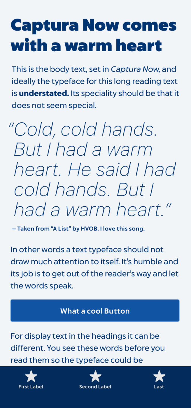
Captura Now is another cool example of the revival of more approachable geometric sans-serif typefaces. It feels to be some kind of trend, after having reviewed Capitana, and Grato (interestingly all from German foundries). What I like about Captura Now, is that it definitely is the most approachable of them all. It is not so much rooted in that constructed feeling, coming with a very clear balanced appearance.
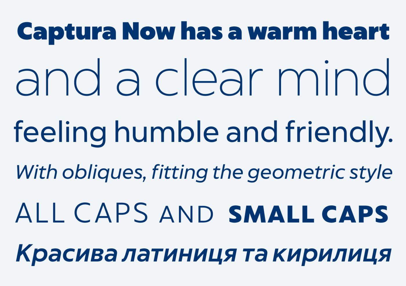
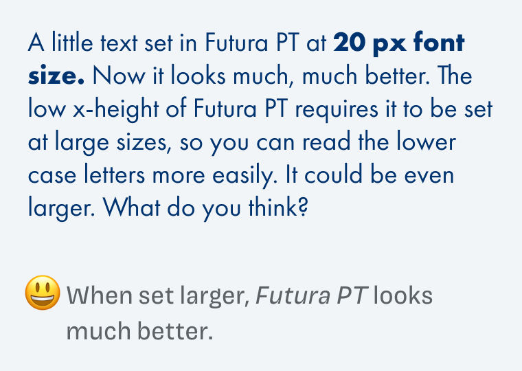
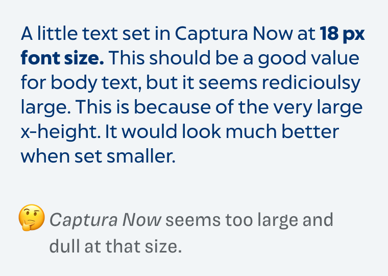
To make it clearer, what I mean by “warm heart”, let me compare it to the mother of all geometric sans-serifs: Futura, here shown in the version by Paratype. Futura PT feels colder, distant, and maybe noble, due to the low x-height. Also, the letter forms are more constructed and closed. Captura Now is very smooth and grounded, less constructed, and with a much larger x-height.
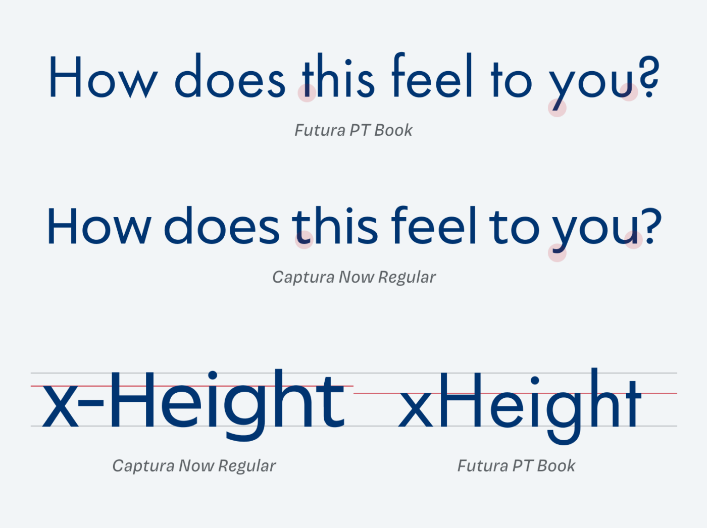
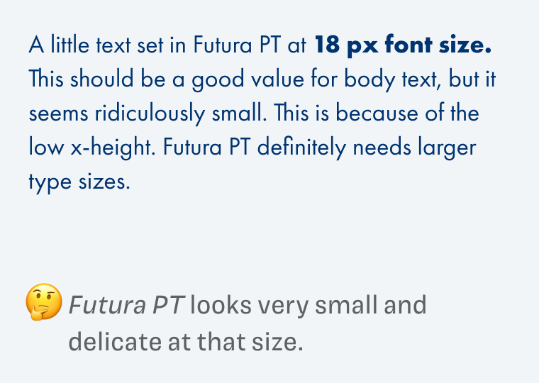
The x-height plays a big role in how to use this typeface. You can set Captura Now relatively small, and it will still be readable. The strokes are much stronger, too. On the other hand, Futura seems very delicate, and needs to be set at larger sizes to achieve a similar result.
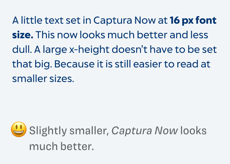
It always fascinates me, how the x-height influences this and shows us, that you always have to adjust the font size to the typeface you’re using.
Thanks to Ashley, who shared this typeface with me. If you have some suggestions for other typefaces you like, tell me in the comments below!
Recommended Font Pairing
You are looking for an interesting heading font, choose playful slab serif Larrikin.


Learn more about pairing typefaces using the Font Matrix.
I am so happy you managed to review Captura Now and that you like it as well. It has been a favourite of mine since I first discovered it about a year ago. Another one you might like to check out is Biennale.
At the moment I am working on a project where I am using Captura Now for the body text and experimenting with Bodoni for the headers.
Biennale is a pleasant cute circular font. A similar fashion to Coco Gothic, Geomanist, Quicksand. Thanks for sharing!
Thank you, Ashley! Biennale is very friendly, too! You’re into geometric sans, right? 😉
Bodoni and Captura Now could make an interesting pair, very contrasting regarding width, weight and construction. If you want to share it, I’d gladly take a look at it.
Wow, love that calligraphy class to awaken motor skills, a pause from the digital world!
Captura Now is not my cup of tea. Although it’s a legible, nice font applicable to the UX especially.
I actually don’t like it at all when the x-height is high, letters feel loud and bulky. 😳Forever Futura✌🏻
Some font suggestions on your email soon!
It all depends … 😉. Futura’s cool, but it is very vintage, looking at the details. So some contemporary updates are a good things taking it into another direction.
I like low x-heights, too. If it’s for a heading, noting against that. Verlag was one of my favorites for a long time.
I just discovered this new free font available on Github or Google fonts. https://www.erikdkennedy.com/projects/figtree.html
You’re going full speed, Ashley! Thanks for another great recommendation! Added to the queue 😉.
I was looking at these as I was looking for a geometric sans to swap in to complement the lovely flowing spiky Messer on my own blog/website. In the end I went with Phantom Sans. I quite like supporting Future Fonts in a (very) modest way.
https://www.futurefonts.xyz/phantom-foundry/phantom-sans
I was interested in how much smaller it originally looked, to your point about font size.
https://www.lorcandempsey.net/workflow-is-the-new-content/