Skip to content
Primary Menu
Free Type Check
Articles
Font Friday
Speaking
YouTube
Mood
weird
1
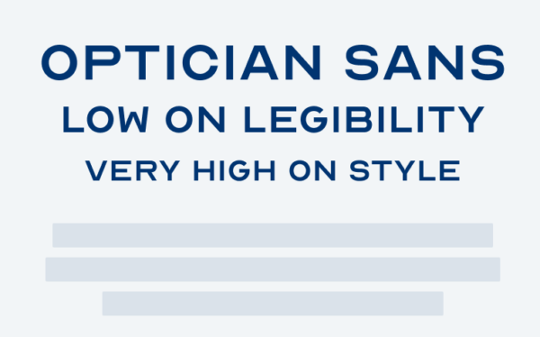
Optician Sans
Display
Sans-serif
Free Font
3
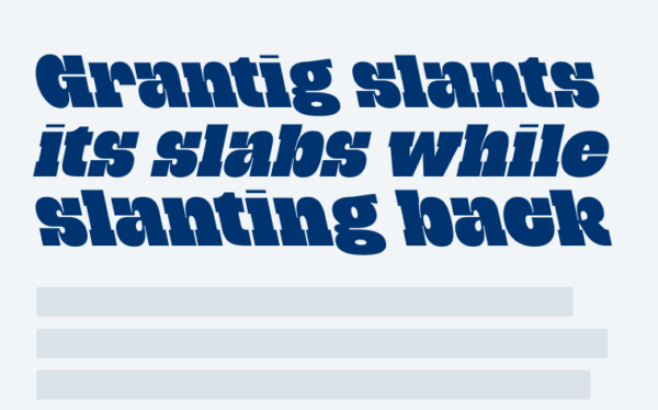
Grantig
Display
Slab Serif
5
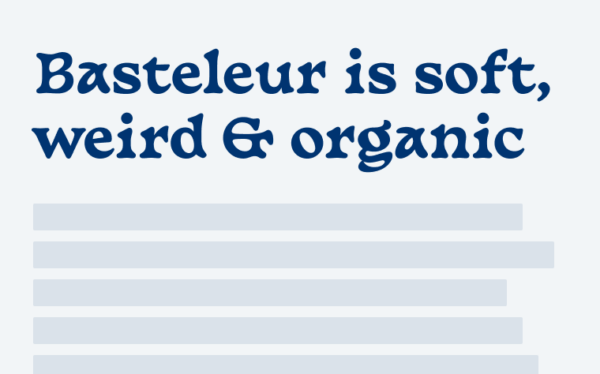
Basteleur
Display
Free Font
10
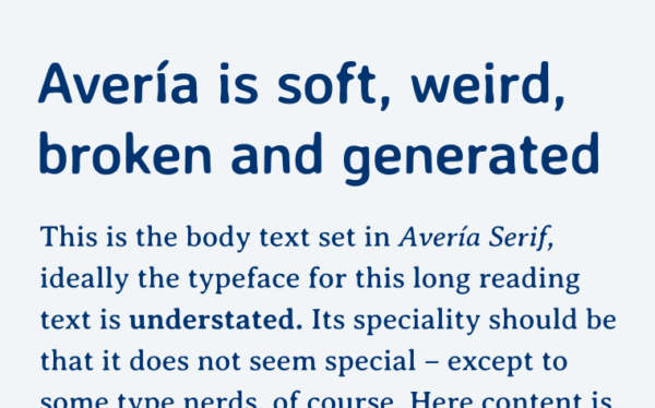
Avería
Display
Sans-serif
Serif
Free Font
2
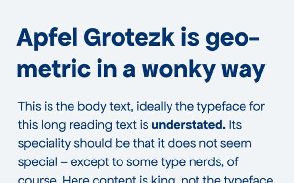
Apfel Grotezk
Sans-serif
Free Font
9
Faune
Display
Sans-serif
Free Font
2
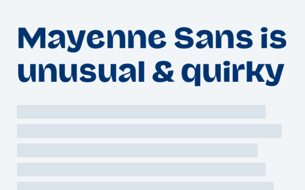
Mayenne Sans
Display
Free Font