Typography has a utilitarian purpose, you want your text to look approachable and be easy to read, right? The functional part of a typeface plays a large role in that and is often overlooked. This is a checklist of what 5 aspects to consider when choosing a typeface for your website or app. Watch the video or read the article with more details below.
TL;DR: Before I pick a typeface for a project, I go through a checklist of functional considerations that my type choice has to live up to. It covers weights and styles, language support, characters and OpenType Features, file formats (static vs. variable fonts) and licensing models.
I already wrote about the different kinds of text and their specific needs. This checklist is something in addition to that, depending on your application.
1. Weights and Styles
What weights and styles do you need for your application? Making your mind up about what you want to do with your typeface, will make it easier to narrow your focus. Some examples:
If you look for a typeface for headings or large, short text only (hence a display typeface), one weight might be enough. This could be a bold or a maybe a light weight then, depending on what contrast or atmosphere you want to create.
If you’re looking for something for long reading text (also known as body text) you most definitely need a regular weight. And for emphasis, think about a bold or an italic in addition to that.
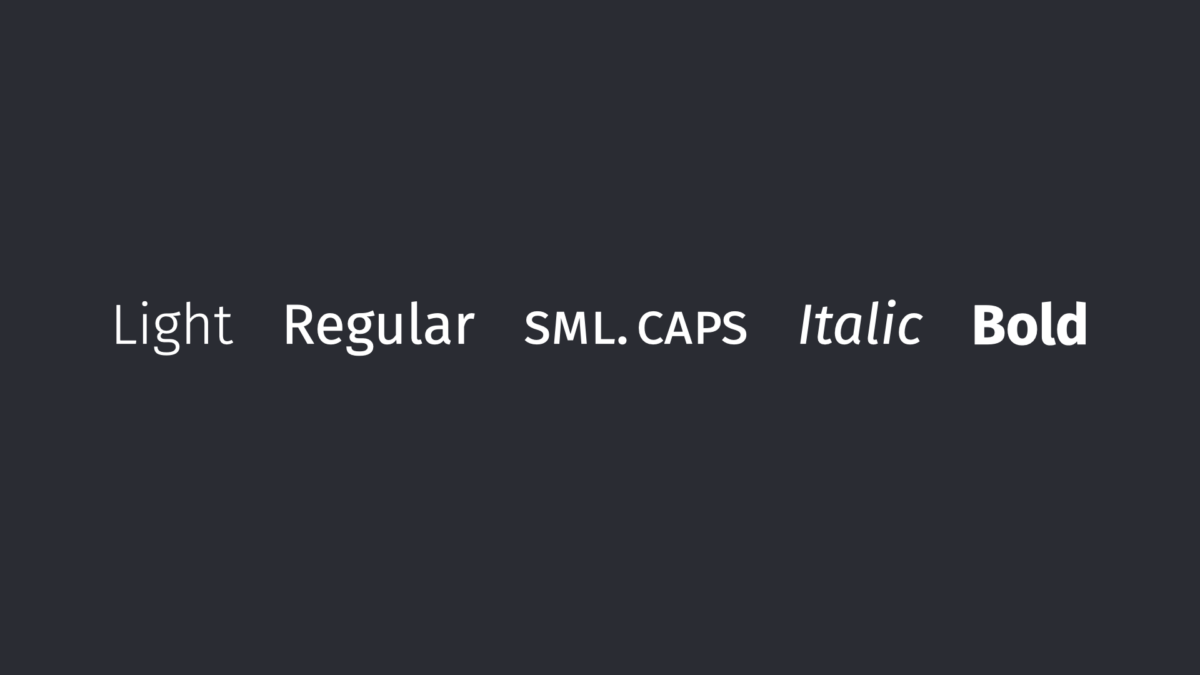
If in the text a lot of abbreviations appear, like WWF or WHO, they always stand out due to being written in capital letters. Small caps, which are uppercase letter forms that have approximately the height of lower-case letters, are a way to make these blend in better with the overall text. Set in small caps, WWF or WHO won’t appear that loud like you can see right here.
If you are looking for a text used in a user interface (also known as functional text) it might come handy to have a medium weight that maintains a sturdy stroke in small sizes for tiny labels.
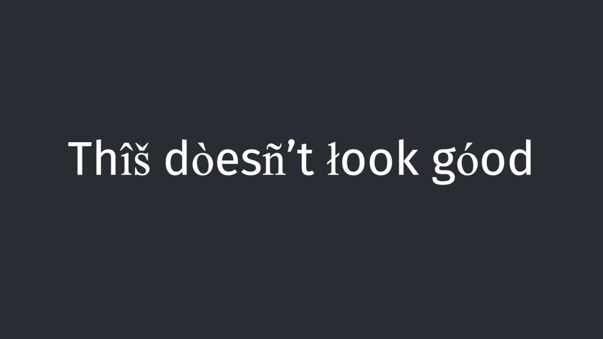
And this might kind of seem obvious, but it also nicely leads over to the next point: Check for basic characters support. Many beginners, myself included, have been burnt picking a typeface that misses basic punctuation marks or an at sign (thanks, for this comment).
2. Language support
What languages should your application cover? I constantly see menus in restaurants or websites where the free font they chose misses German umlauts (äöü) or other characters, even quotation marks. On the web when a certain glyph is missing, the browser switches to the fallback font for that character. This creates weird word zombies with letters from different typefaces.
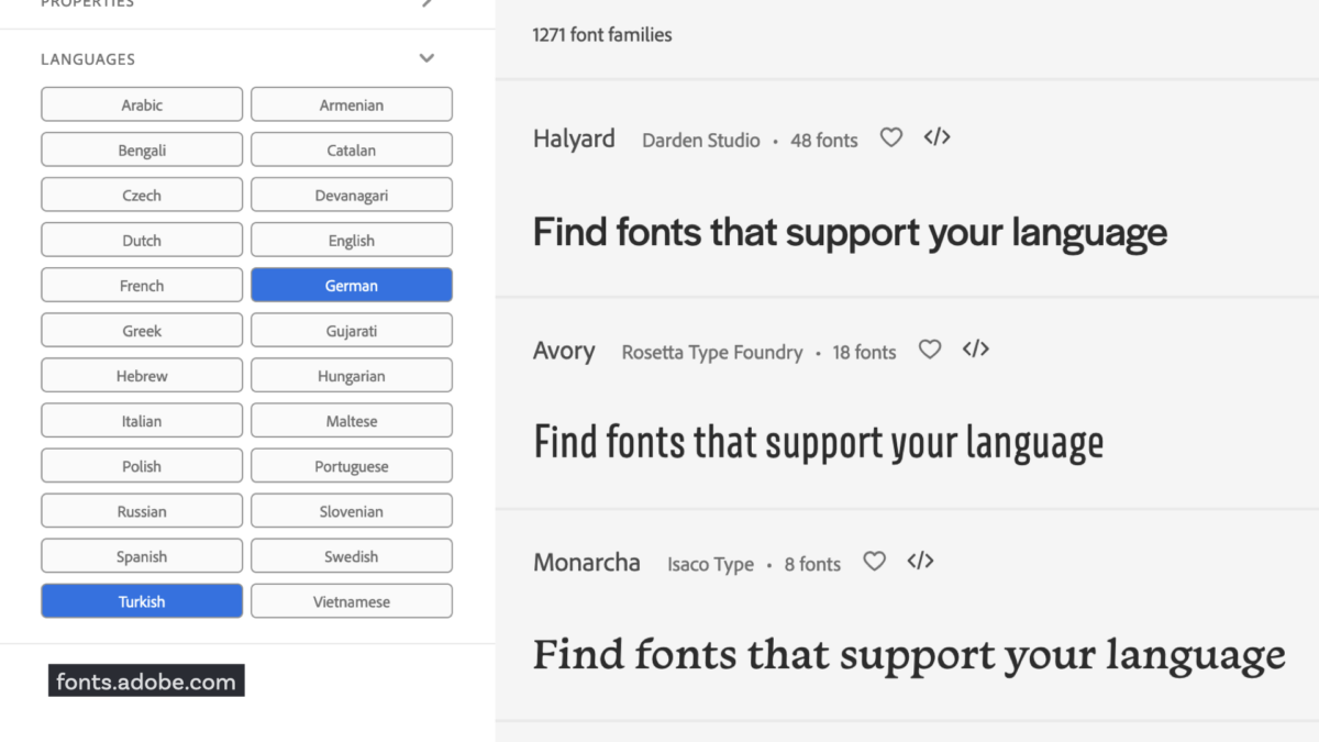
Prevent this from happening by checking what languages you need and that your typeface contains them. To browse typeface by language is a solution for that. Almost all foundries and font libraries, like MyFonts, Google Fonts or Adobe Fonts offer that opportunity.
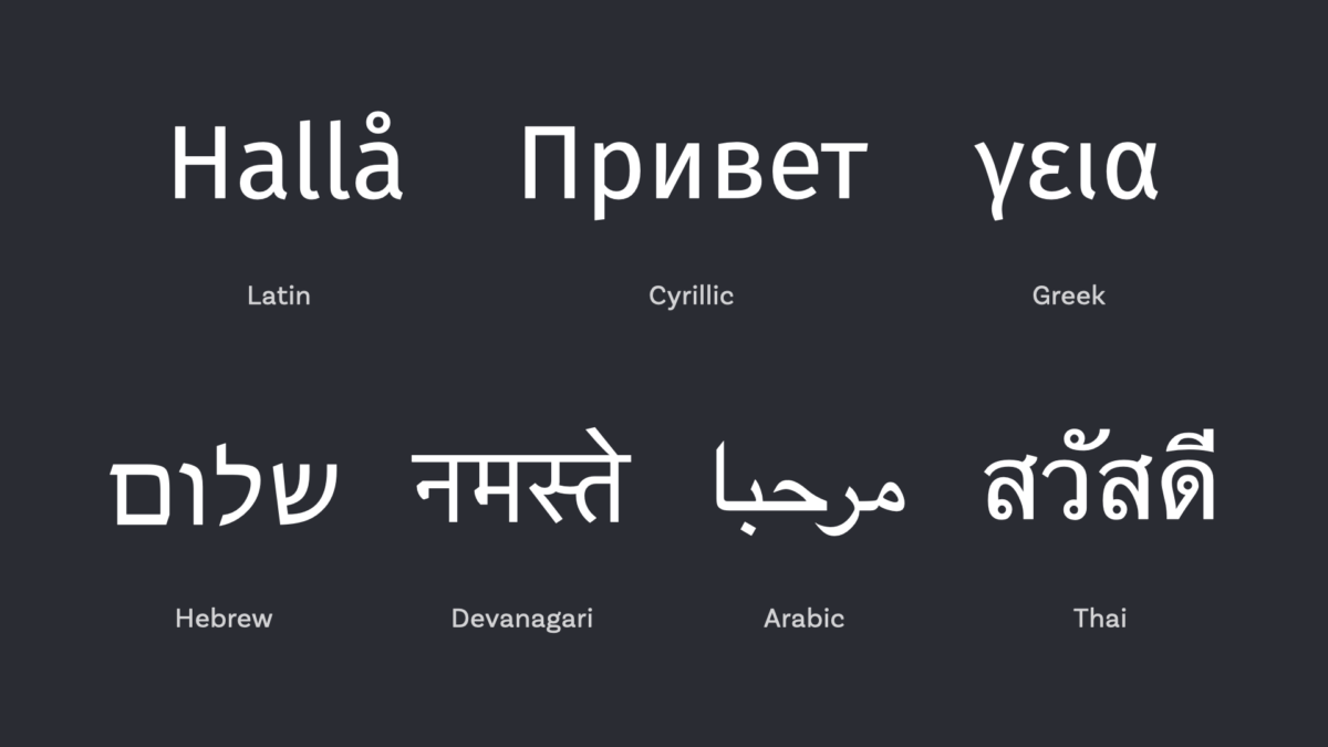
Also think beyond the Latin script. If there is a Polish and Russian version of a website, look for a typeface that contains both scripts, Latin and Cyrillic. The same goes for Greek or Hebrew. For scripts that are not that closely related to Latin (like Devanagari, or Thai, Arabic and so on) you could look for super families that contain the same vibe or characteristics in this very different writing systems.
3. Characters and OpenType Features
Do you need any special characters for your project? You might say – how do I know what’s special? Well, a lot of fonts offer sexy OpenType Features and you can browse them in their specimen sheets here are some examples:
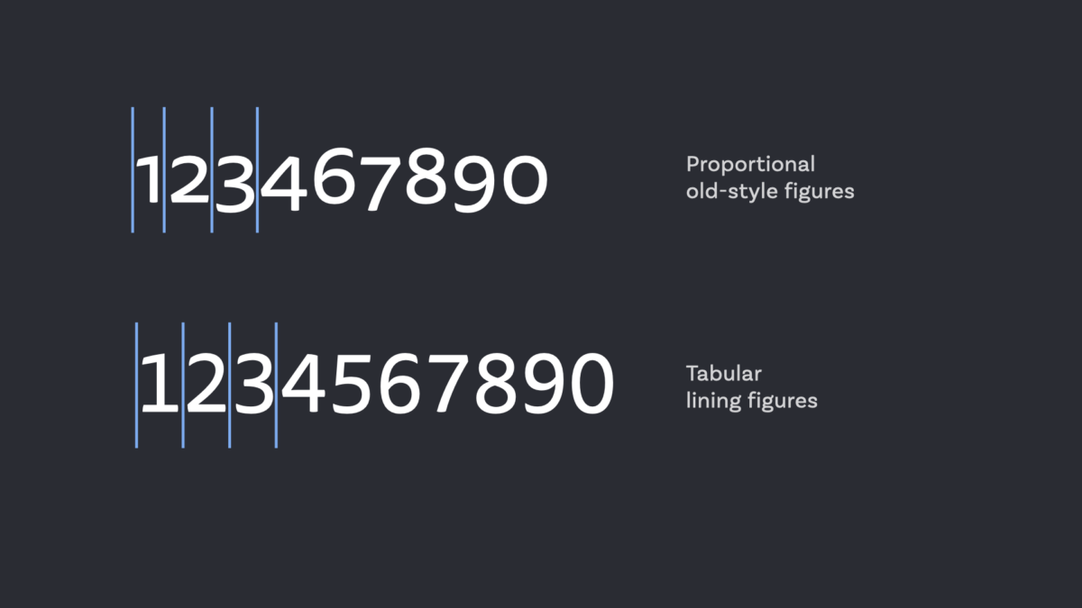
Different kinds of numbers – proportional figures that blend in nicely with body text and tabular figures for vertically aligned numbers or UIs (find more about this in my article about the iOS time display).
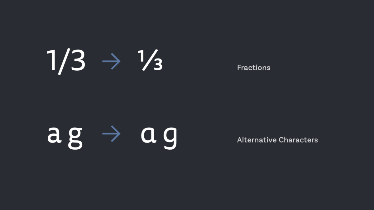
Alternate characters, e.g. a single- and a two-story version of an a or a g. Or fractions and sub and super scripts for scientific or finacial content.
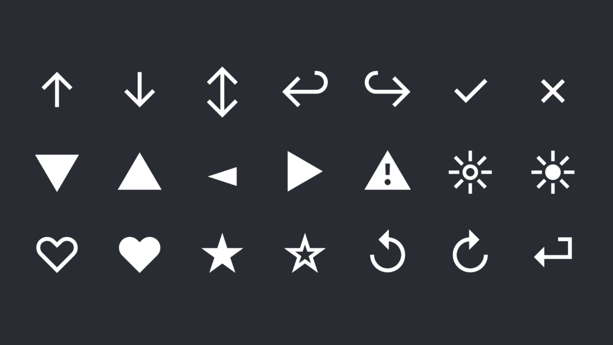
Additional special characters, like symbols, also could be a part of your typeface to make it more versatile for your project.
4. Format and size
What font format do you need for your application? Is it a website or an app? Is the typeface available for this platform in the needed format? And, is it available as a variable font, which could help you save on file size and provide you with more design options?
For iOS and Android Apps, you can use True Type Font (.ttf) or an Open Type Font (.otf) file as described by Apple, and Google.
For the web, WOFF2 is the way to go, because it offers the best compression and is supported by almost 75% of all browsers. Browsers that support its less efficient, larger predecessor WOFF also support WOFF2, so you could just go for it. See the Web Almanac of 2020 for more.
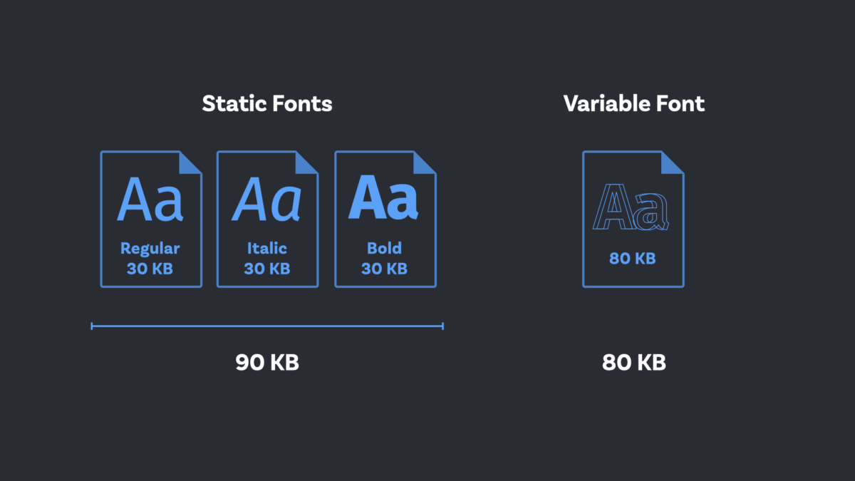
Variable fonts are basically the wet dream of a typographer (quote me on that). It’s a rather new format that can contains different designs (like weights) in one single file. You can seamlessly transition between these styles which gives you the ability to fine tune a lot. It is supported by all major browsers and operating systems since September 2018, hence only very recent typeface or very popular ones are available as variable fonts, but the list is constantly growing since they kind of become the new industry standard. And if you’re using about 2 to 4 styles of a typeface, the variable font might be smaller than the static files too, which is good for performance. Here I wrote a detailed primer about variable fonts.
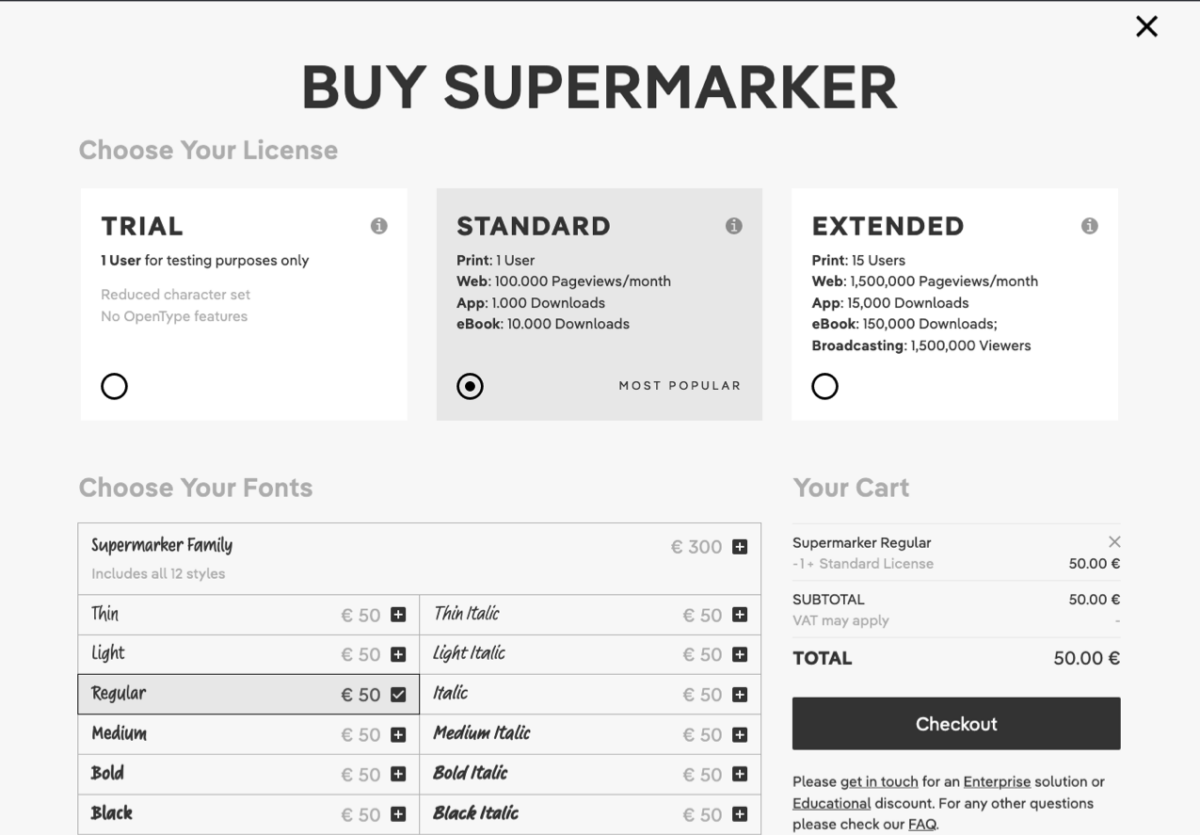
5. Licensing
Is this typeface in my project’s budget? Check the costs for licensing before picking a typeface. Nothing is more frustrating than choosing the perfect font, showing it and then finding out that licensing exceeds the allocated budget.
There are good free fonts but many of them are overused. So always convince the stakeholders to set aside a budget for quality typefaces. Investing in unique typography is investing in the uniqueness of your project and for most web projects around € 200 to € 400 could be sufficient. And of course there are also badly designed paid fonts, so use demo fonts if available and try them out first.
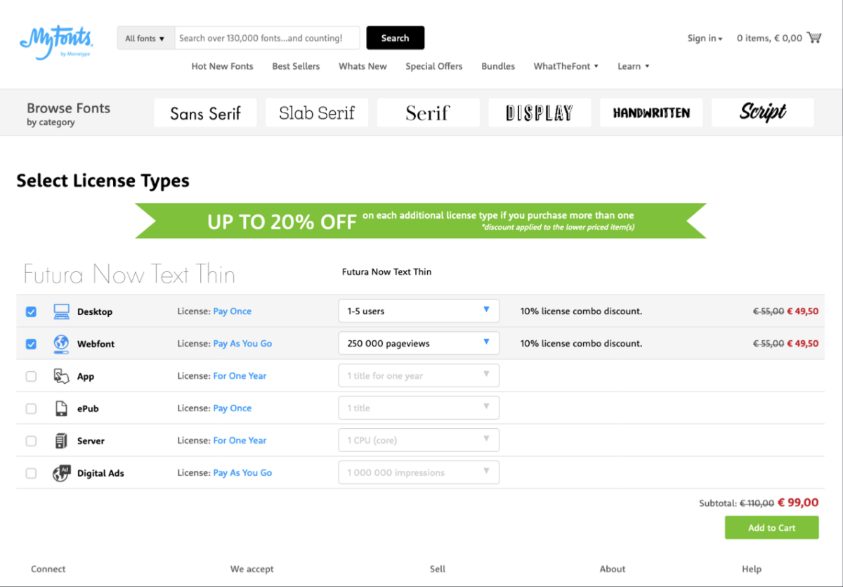
The hassle with licensing is, that every foundry has its own terms and this makes it hard to compare. Try to buy directly from the designers, prices are almost always better there, and they get a larger share. Some foundries, like DJR or Fontwerk offer very affordable packages that contain desktop, web and app licenses in one package. With others you have to buy a license for desktop to try them in your design software and then a license to get the web fonts. This always kind of feels very print focuses, old-fashioned to me, since I only need the desktop version temporarily and not for the actual thing.
These are the basic things, I check before picking a typeface. I hope they were helpful to you and your project! Did I miss something? Leave it in the comments below, happy to hear your thoughts!
Great article. I’ve been burned a few times in my life.
– Finding a font only has one weight after applying it to a brand
– Even finding one that only had caps!
– Finding out late that the @ sign was inverted in a circle.
This last one is probably worth mentioning in the article. Basic punctuation glyphs are super-important to check.
Thanks for sharing, Alastair! That’s some great advice, added it in the article.