
My thoughts on Grato & Gratimo
You know I love a good type family, because for more complex projects it gives you so many possibilities to always pick the appropriate style for a specific situation, and in the end it will all work nicely together. This is what I appreciate at Grato and Gratimo by Jakob Runge at TypeMates.
Grato is made for display text, like a title or a heading. It comes in two styles, the cool geometric Grato Grotesk, and the more humanist friendly Grato Classic with sharply cut terminals and apexes. I see Grato Grotesk as a great alternative to the widely popular and overused Montserrat.
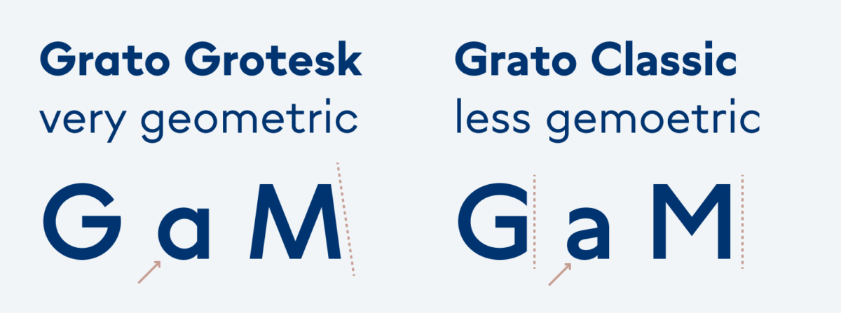
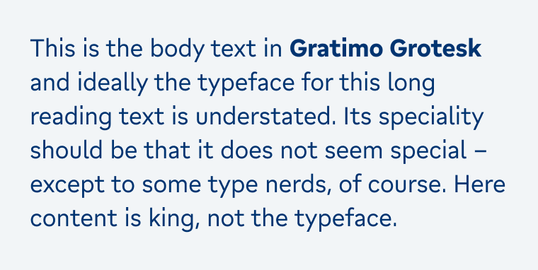
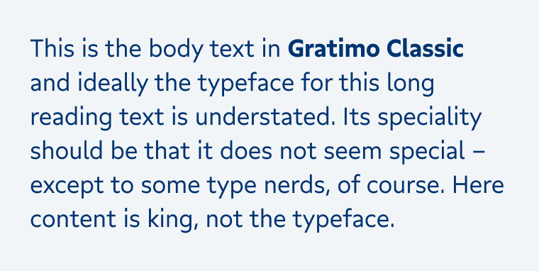
The Gratimo Family is made for smaller sizes, which means it’s optimized for body text and functional text in UIs and apps. This is also the reason why it comes with italic and Grato does not. Here you can also choose between the more geometric feel of Gratimo Grotesk and Gratimo Classic with a softer, more humanist touch, like a Gill Sans or Arpona Sans. If you want to dig more into this, the process and concept is beautifully shown and described in this article by TypeMates.
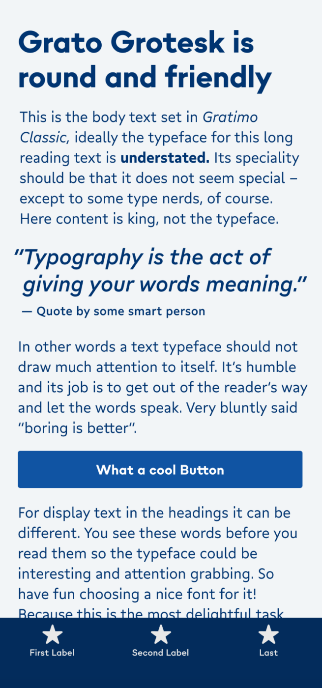
Now, should you mix the Classic and Grotesk styles? I’m actually not certain about this. In the title image I used Grotesk for the headings, quote and functional text, and the classic for the body text. I think it works just fine, however Jakob, the design, has not intended it to be mixed. In the end, you decide if it fits.
Font Pairings for Grato & Gratimo
Since Grato and Gratimo both live between styles, you can pair it with many different typefaces. For interesting historic themed headings, I recommend Avona. Dynamic Piazzolla works well for body text.

- Headings
- Copy
- UI Text


Learn more about pairing typefaces using the Font Matrix.
So, what do you think about this? And is Grato or Gratimo something for an upcoming project? Tell me in the comments below!
Well, I agree with Jakob. It’s not an ideal mix of Classic & Grotesk. But separately, it’s useful, mild, somewhat sweet, simple, friendly font. The place where I see it works best is functional UI for microcopy. It doesn’t look sterile, it has spirit. It will add a humanistic feeling in otherwise all look-alike-designed websites. Grotesk reminds me of Karla, a little, hm? I’m especially in love with the lower cases.
Oliver, you don’t need to blew us every time with some exceptional display, headings. This one is pretty fine. Applause for Grato!