Skip to content
Pimp my Type
  • Free Type Check
  • Articles
  • Font Friday
  • Speaking
  • YouTube

Articles

Faux italics
Review2

Avoid Faux Italics – Website Review

Logotype: spacing review
Review2

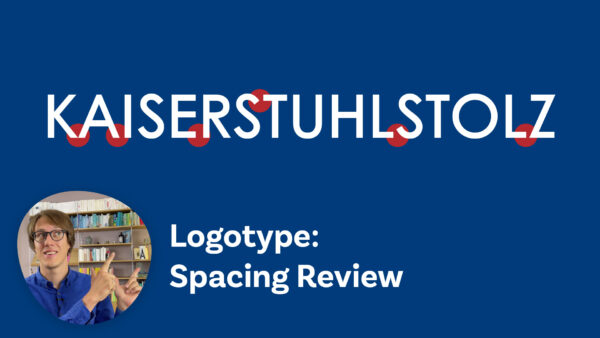
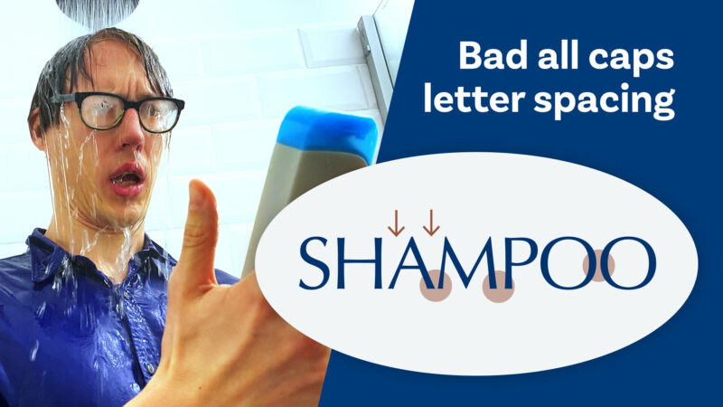
Spacing out an all caps logotype

Top
Review

Top 5 Web Typography Mistakes – Podcast Guest

Three effective ways to combine typefaces
Typography10

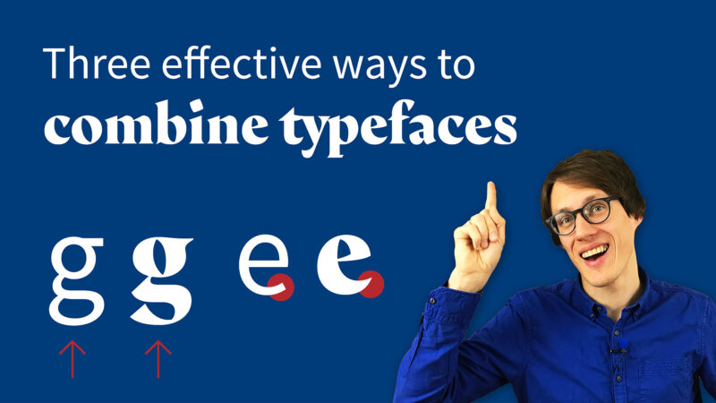
Pairing fonts – 3 ways to find great typeface combinations

Three
Q&A4

Three book recommendations when getting started with Web Typography

Font
Q&A17

Font licensing: Personal use vs. commercial use

Fashion Website Review Make Headings compact
Review

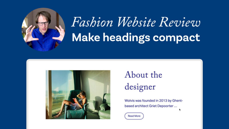
Make headings compact – Review of a Fashion Website

Should
Q&A5

Should you follow your typographic taste or conventions?

Bierstadt, Grandview, Seaford, Skeena, or Tenorite? What’s Microsoft’s next default font?
Typography21

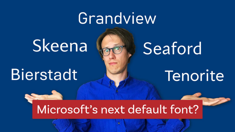
Microsoft’s 2021 default font – my thoughts and suggestion on it

Good
Typography

Good ideas with bad typography and vice versa

Bad all caps letter spacing
Typography12

How tracking and kerning improves all caps text

Monospace Love – Pimpin’ a tech blog
Review2

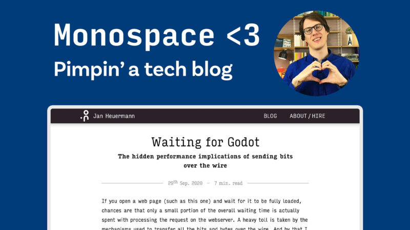
How to treat monospace alike fonts in a tech blog?

Posts navigation

Older posts
Newer posts
Oliver Schöndorfer

Smarter Typography, Stronger UX

Hey, I'm Oliver Schöndorfer – typography consultant, speaker, and UI designer from Austria. Let's chat about how to boost your UX with better typography. I love sharing insights in my enthusiastic, entertaining style – whether at a workshop, conference, or on a podcast. Drop me a line!

  • E-mail
  • YouTube
  • LinkedIn
  • Instagram
Oliver Schöndorfer, © 2018–2026 | Imprint | Privacy

¶ I love type, but typos seem to love me! If you find one, send it over so I can fix it. The typefaces Piazzolla and Magnet that are used on this site were neither stretched, faux-bolded nor harmed in any other way. Please be good to type.