Microsoft’s 2021 default font – my thoughts and suggestion on it
Bierstadt, Grandview, Seaford, Skeena, or Tenorite? Microsoft commissioned 5 sans-serif typefaces and asked on Twitter, which should be the new default that will replace Calibri. I share my first impressions and tell you what I think would be the best choice.
TL;DR: All fonts are well crafted and represent different popular sans-serif styles. My favorite is Skeena, the most interesting one is Seaford. Both represent the humanistic sans-serifs. Bierstadt is a more readable Helvetica, Tenorite a friendlier Futura, and Grandview a wider and more body-text suited DIN.
What a default font should do
Most of all it should not stand in your way, let you put out your content, and will eventually disappear. Like Calibri did for us all these years. Calibri was fine, it was soft, rounded and friendly, also a bit small. After over 12 years I think it’s okay to start a new era.
Right now you only get the fonts with an Office 365 subscription, then they are activated automatically, and you can try them out in Word or any other application. And you should really do this, because you can only get a feeling for them when you apply them. In their “Beyond Calibri” blog post, Microsoft only showed some nice individual letters of every typeface. This is pretty wired, since they want people to state their choice, but you can’t see them on the article in a document. Maybe they want people to go into the application to test them out? So I had to sign up for a trial version of Office 365 which was painful enough. Save yourself this trouble by downloading my pdf-sample, or watching the video 😉 .
Bierstadt
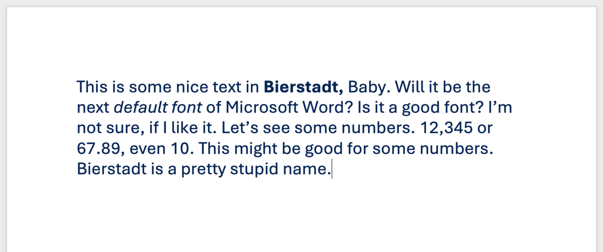
This is the Hellvetica-Arial-Roboto-San-Franciso-Univers-and-so-on super-popular mid-century Grotesque sans-serif style we have all seen so many times. It’s not bad. It’s a good take on it regarding a text-typeface. The letter-space are pretty open, there is a double-story g and a serif at the lower case l, which makes the letters more distinguishable, hence better for long reading text. I’t rather friendly. My problem is, that this style is so overused within the last decades years. That’s why I would not want it as a default.
And as a German speaker I think this name is horrible. I read it’s named after a mountain that’s named after an artist, okay, but it feels so stupid to have “Beer city“ as the default font name. Or it will make the office environment more fun? Who knows … And it might be hard to pronounce for non-German speakers.
Grandview
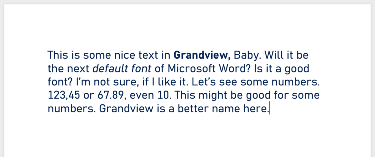
This one is based on the industrial and popular DIN typeface. You find it on the German freeway signs and I already used the beautiful version by Parachute for a project. It’s also well crafted, but as it is with this kind of typeface, it’s pretty outstanding. It draws too much attention to itself, especially the figures draw a lot of attention to themselves, and it feels a bit cold and awkward for a multi-purpose default font.
Seaford
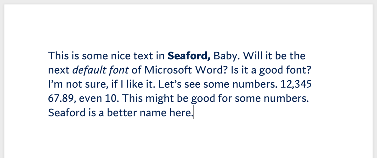
Seaford is by one of my favorite type designers, Tobias Frere-Jones (I recently featured this font from his foundry in my weekly font recommendations). The man who gave us Gotham shows a different sans-serif in Seaford. It’s a so-called humanist sans-serif, which means that it’s letter shapes are based on classic serif fonts but without the serifs. One of the most famous in this category is Gill Sans. Seaford has a lot of character and a beautiful true italic (where the letter shapes of certain characters like the lower case a changes). It creates a very calligraphic vibe and is definitely the most interesting among these five. But that’s also the reason why I would not pick it as a default. It’s too special.
Skeena
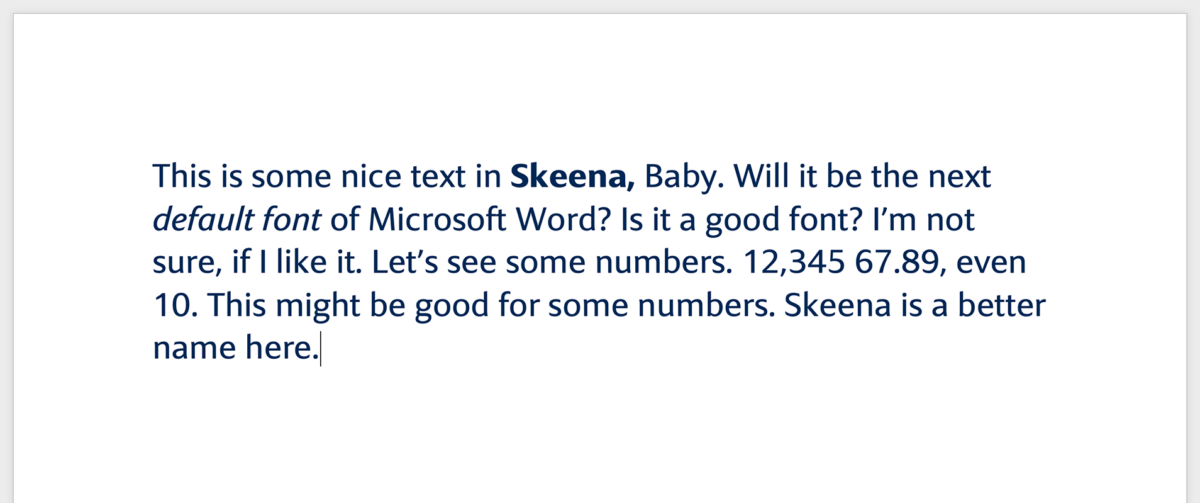
Skenna is my favorite. Like Seford, it’s a humanistic sans-serif, but less calligraphic, a bit more modern. I like how soft it feels and still certain a certain grit in the tilted ascenders, descenders and terminals. Skeena is very readable and yet compact, seems elegant, has open counters, everything you need for a good body text typeface. The upper case I and the lower case l are also the same shape, which is not ideal, and only Bierstadt, and Grandview add a serif to the l. But I’ll live with that since the serif might be too out of style for Skeena.
Tenorite
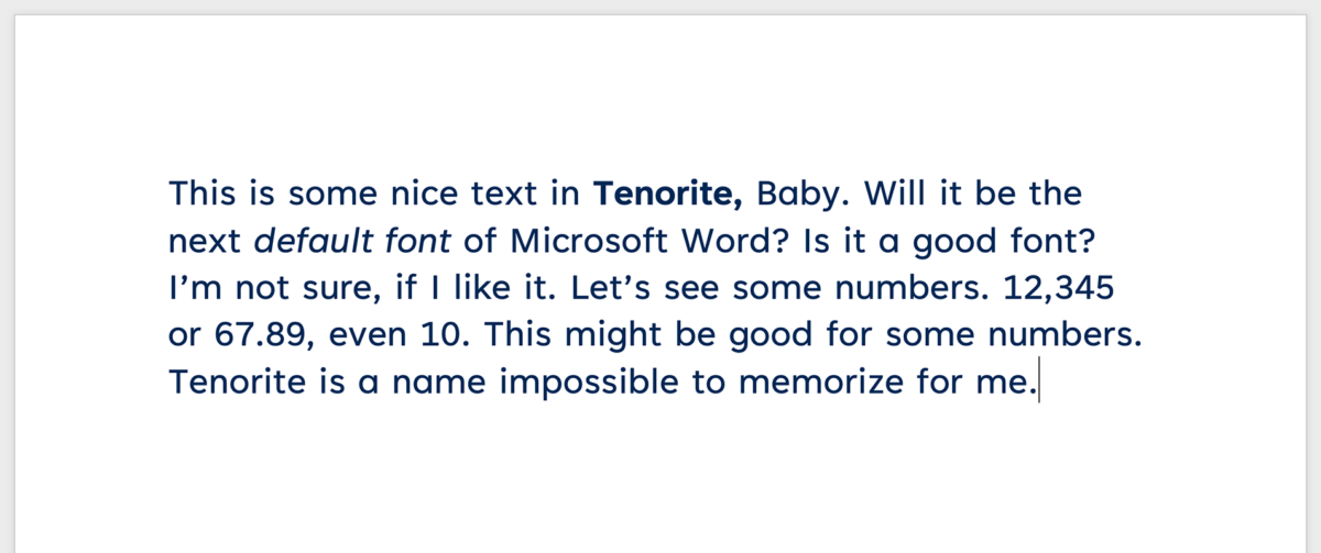
Tenorite represents the category of geometric sans-serifs, like Futura, which is very popular as well. You see this at the lower case a, which is only a perceived circle with an vertial line. This looks fancy, but it might be a disadvantage for long reading text, when the shapes of a, g and q are quite similar. It’s definitely more friendly and open than Futura, but it also need a lot of horizontal space and seems quite spaced out. Compared to the other four it is the widest design. That’s another reason why I would not pick it as the default.
My suggestion
As I wrote before, I’d pick Skeena, but I think they will pick Bierstadt, since this groteskque style is so popular. I hope they won’t pick Grandview or Tenorite. If it becomes Seaford, I would be really surprised! That would be a statement. I wonder if not-yet-type-lovers will change it, because it strikes them too much? And I have to say, that I’m happy that Microsoft made this an open discussion! It’s a smart marketing move and also a brilliant occasion to shine some light on the topic of typography.
Ralf Hermann did a brilliant and detailed video review, where he also shows the glyphs and examples. Olivia and Micah from the Weekly Typographic also analyze the suggested fonts in this episode. They don’t have trouble with pronouncing Tenorite, but with Bierstadt.
Update: What did the pick?
Only two years later, in 2023, Microsoft made up their mind, chose Bierstadt and named it Aptos. As I expected back then. So this is the new default font in Microsoft Office from there on. A bit stricter, but all the other fonts are also included. So use them!
What do you think about it? Happy to hear your thoughts in the comments below!

Like Gill Sans, Seaford, Skeena, & Tenorite do a poor job of distinguishing among lowercase “l”, uppercase “I”, and the numeral “1” — I can’t see myself choosing any of them ever.
That’s definitely true. I don’t know why, but I guess Bierstadt will make it anyway 😉
My favorite is also Skeena. It’s the most harmonious and very pleasant to read.
Grandview would be a terrible choice, since it’s so uniformly.
Great choice, Eddi 😉
Love Tenorite, as it has round shapes on the A, O and E.
Absolutely, Vincent! It’s very open, friendly and seems clear. One disadvantage is, that it needs quite some space. A great typeface, but not necessarily for a default.
Hey, thanks a lot for the samples and the short analysis, it’s exactly what I needed. Based on my first impression, Skeena seemed like the best choice, partly based on personal preference, partly because I’m a technical writer and the most important thing for me is good readability. So after all they are all fine except Tenorite. Gosh I hope they forget about Tenorite quickly, those round uniform shapes really make longer texts hard on the brain. And as we know, no text is short enough for a brain that wants to soak up information as quickly as possible and move on.
Thanks for sharing your thoughts on this, Benedek. As I wrote in the article, I absolutely agree with you, Tenorite would be a bad default, you explained it very well, too. And yes, Skeena would be a blast! But no sure if they already picked a default … I’ll look it up.
Thanks for sharing your insights. Skeena is my choice too! It is not too stark, so it will work for long pieces of text. The weight is good, not too pale grey or too black. But I like to use contrasting headings, and would choose a clean sans serif font like Arial for those.
Cool, Anna! Thanks for sharing it with me! When it comes to pairing Skeena with another typeface, Arial would be a bit too close regarding its first appearance for my taste to really make it contrasting. But if you set it in bold it might work.
I tried Tenorite for headings with Skeena for paragraphs, and I like it!
Awesome, thanks a lot for your post Oliver. Like we know skeena seems to be crowd favourite. When can we get these fonts in our machines.
Wow, I wish I knew … obviously this kinda went silent somehow … I’ll tweet at them 😅.
Hi I came across your article. I agree Skeena is a beauty. Did they choose already? Microsoft takes a long time for these.
Unfortunately not, Raj. Don’t know why they announce it big and then do noting about it 😅.
My favourite is Grandview because it’s something different, but I don’t think it’s suitable as a default font. Seaford and Tenorite have too much character to become defaults.
That leaves Bierstadt and Skeena. Bierstadt is nicer than Arial, which is my second-least-favourite font (my least favourite being Comic Sans) and I hope that, if they make Bierstadt the default, it will gradually replace Arial as the standard font for documents. I live in Germany, and Germans are obsessed with Arial. You see it *everywhere* here and it’s tedious. Using it shows a total lack of creativity and imagination.
Do you know when Microsoft are planning on announcing the decision?
Thanks for sharing your thoughts, Mark. Unfortunately, Microsoft seems to have gone silent on that topic. Not sure why they made such a fuzz about it, in the first place … tried to ping them and asked around on Twitter with no results so far.
I share your dislike for Arial. Absolutely agree. Here in Austria, it’s the same. The problem is not the typeface. It’s how ubiquitous it is and how replaceable things that are set with it become. In some cases that’s good, but in most I wish there was more though and personality put into it.
Looks likes you’re right, Microsoft picked Beer City as thr font. And took your advice and renamed it.
Yes, just saw this. Haha, not sure if it was exactly my advice 😉.
I only just saw that Microsoft is choosing Bierstadt and thankfully changing the name (to Aptos). One article mentions how the typeface is inspired by mid-20th-century Swiss designs. It would be cool if you could do a comparison between Helvetica, Matteson’s own Arial, and Aptos—maybe including another font that closely resembles Aptos. I know they’re not your favorite. But it would be interesting to see how the new choice compares to the competition and the legacy fonts.
That’s a good Idea, Jordan. I might add it as an update to this article about Arial vs. Helvetica.