It was an honor to be a guest on the Website 101 Podcast. I loved the fun, and easy going conversation with the two hosts, Mike and Sean, and truly appreciate how they provide tangible information to their audience. They often say: “A website is like a garden. It regularly needs attention.” I totally agree. Find my notes for this show below, among other things:
- I share some basic knowledge on typography for the web,
- why I prefer Comic Sans over Helvetica, and
- give some typographic feedback to their podcast website.
My top 5 web typography mistakes
1. Not caring about typography
- Type is the clothes your words wear
- Of course content comes first, but right after comes its shape
- It’s an integral part of your visual identity, especially on mobile
- Why your font choice matters (video & article)
“If you choose Open Sans, you’re like Mr. Smith from the Matrix, rather than Neo. Because all the agents look the same.”
Sean summing up why you should stand out, at 28:00
2. Inappropriate font choice
There are different kinds of text: display text, body text, functional text. To find out what what you should pick, here are 3 questions to ask:
- What is the key application?
- What is the key audience?
- What limitations are there (budget, brand requirements)?
Get weekly font recommendations in the Pimp my Type Newsletter.
3. Too many typographic styles
- One or two typefaces might be enough, one for headings one for body text
- Repeat the same styles as often as you can
- Make clear decisions on hierarchies – is it the same or different?
4. Setting text to small
- Don’t go below 16 px (1em) for body text
- On desktop set it larger (up to 22, 24 px)
- On mobile maybe slightly smaller, but not really
5. Too little line-height
- Ideal line of body text has a length of 60 to 80 characters (~34 em)
- set
line-heightaround 1.5 to 1.7 at full width - on mobile it could be 1.4
- For headings it can be a bit tighter, 1.1 to 1.2
Typographic review of their website
Listen to it at exactly 1:00:00, where I tear apart website101podcast.com. See the screenshot below of what the website looked like at the recording.
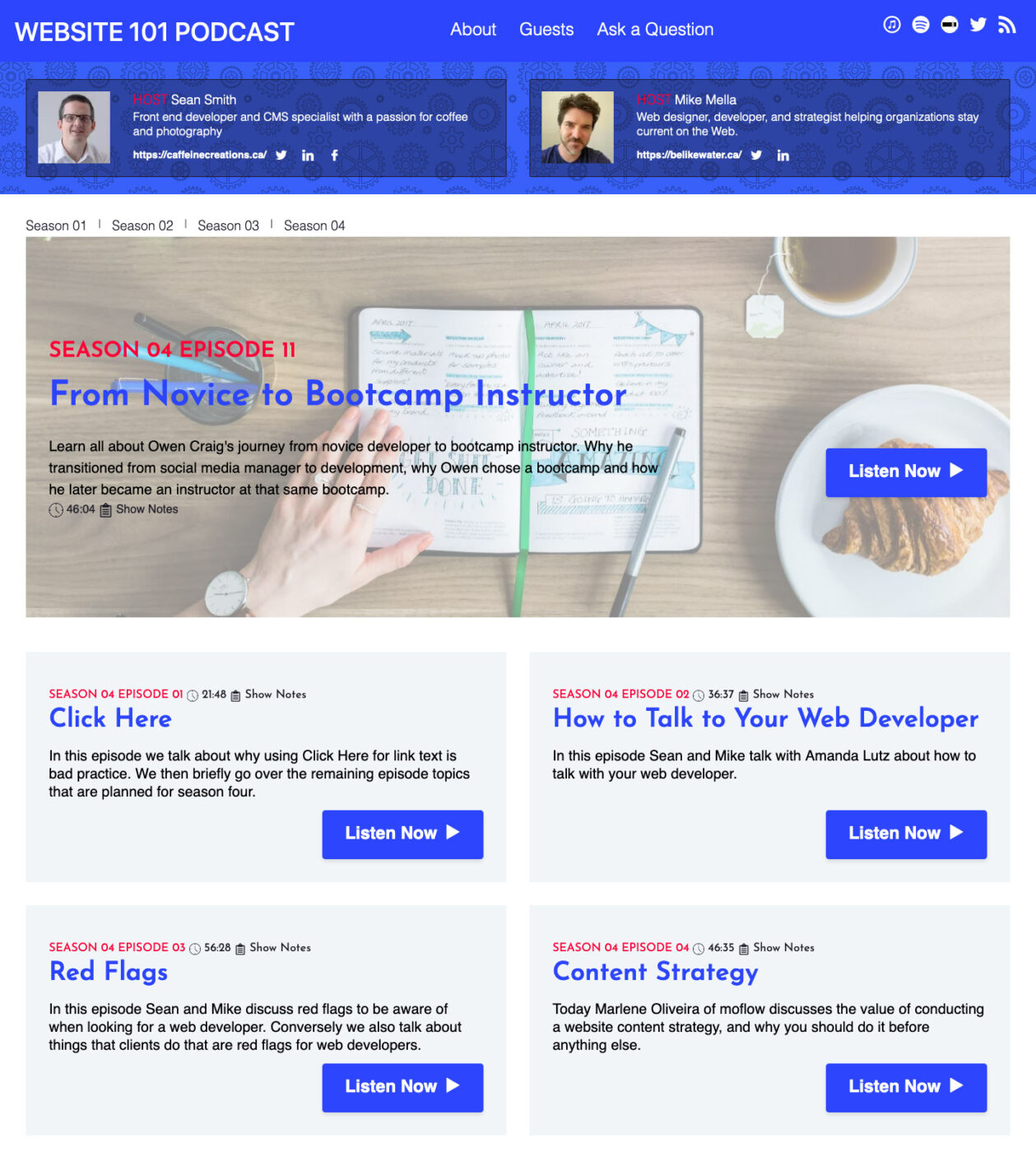
- The biggest problem was, that Raleway, the font for the body text, is not loaded and the fallback font Helvetica is displayed.
- Also the Listen Now Buttons are too prominent.
- You could micro adjust the stroke weight of the icons and the text
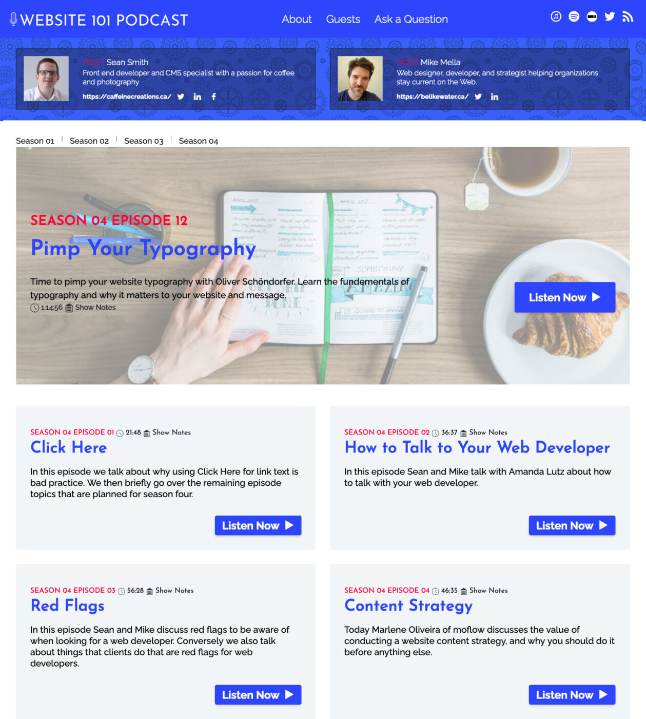
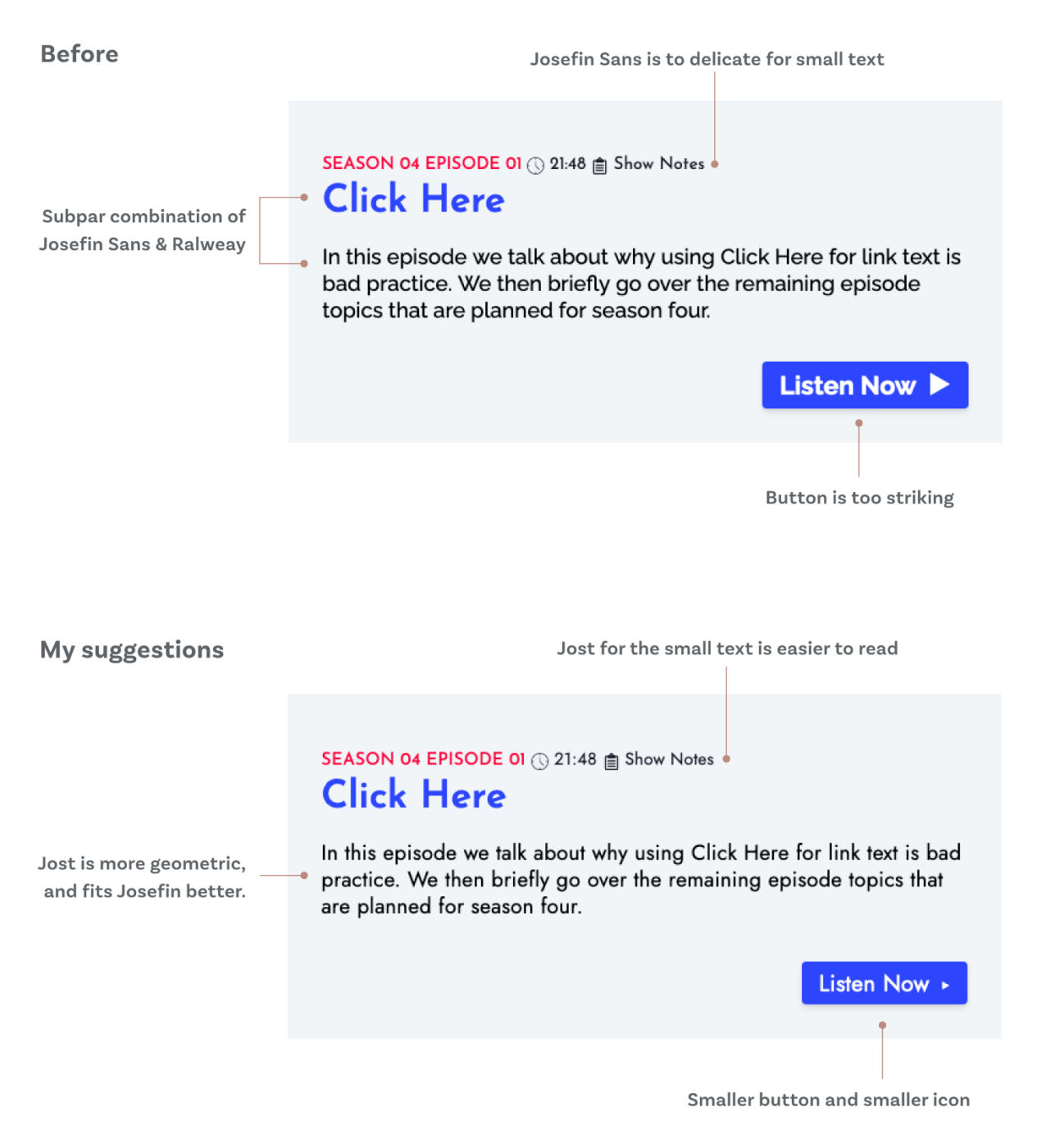
Sean already fixed this issue on the current site and also integrated more feedback. With the correct fonts loading, Josefin Sans for the headings and Raleway for the body text is a not that ideal combination. They are two sans-serif typefaces, similar, but not the same enough. Maybe I’ll do a review on YouTube about this, but for now here are my tips on how to find a good font combination and here a short graphic with a suggestion.
Happy to hear your thoughts on the podcast or my review, just leave it in the comments below. If you have a podcast and think web typography is something your audience would value, I’d love to be a guest on your show as well.