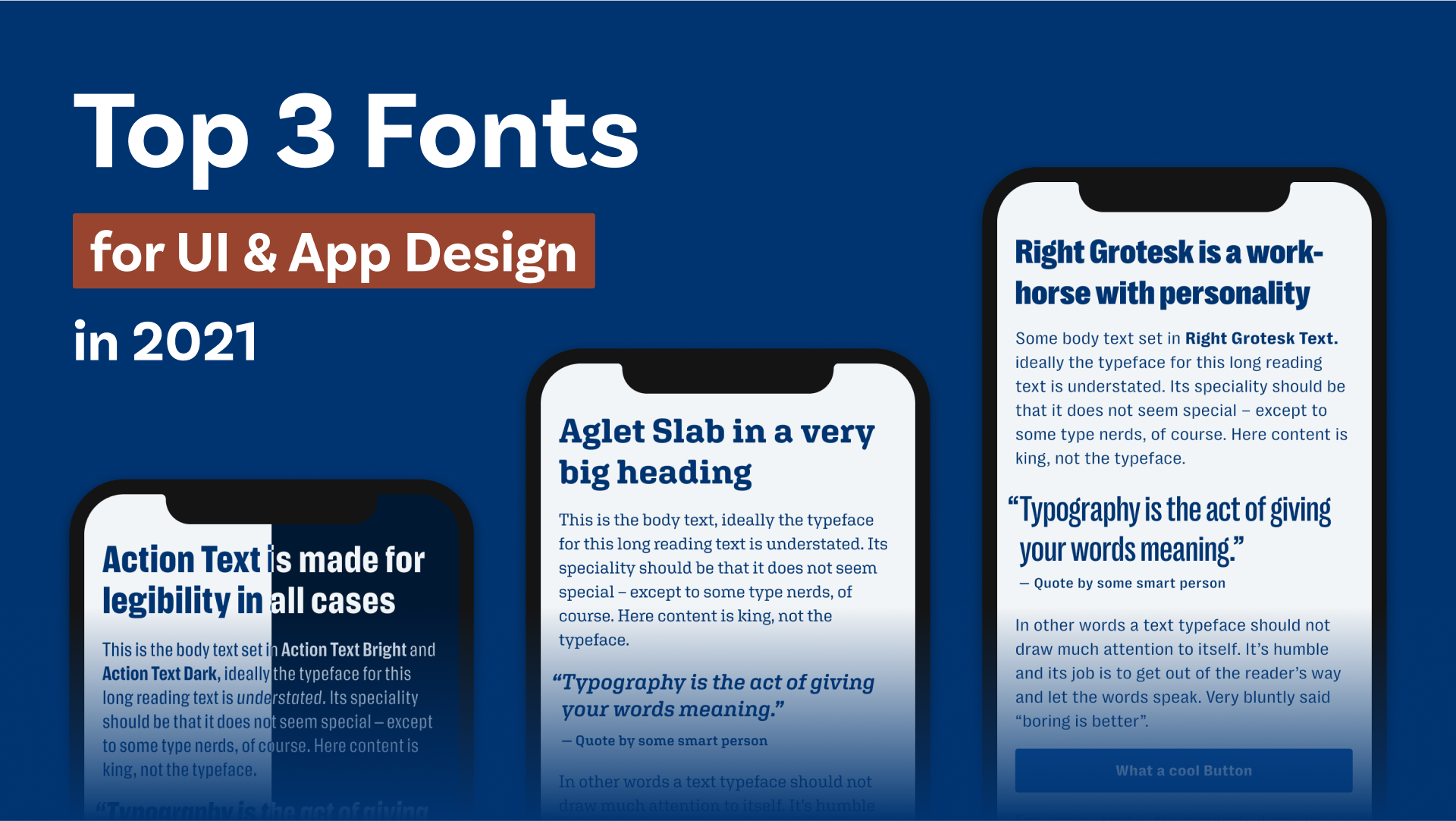
With 2021 coming to a close, I want to appreciate the 48 past Font Friday recommendations by giving you my personal top 3 fonts for user interface and app design. If you’re not sure what to pay attention to when choosing an appropriate typeface for functional text, I made an article and video just about that.
This time, there are no free fonts among them. I find it especially hard to get a good free font for UI design, but I think investing in good fonts is investing in the uniqueness of your project. What is your favorite typeface for UI or app design in 2021? Let me know in the comments!
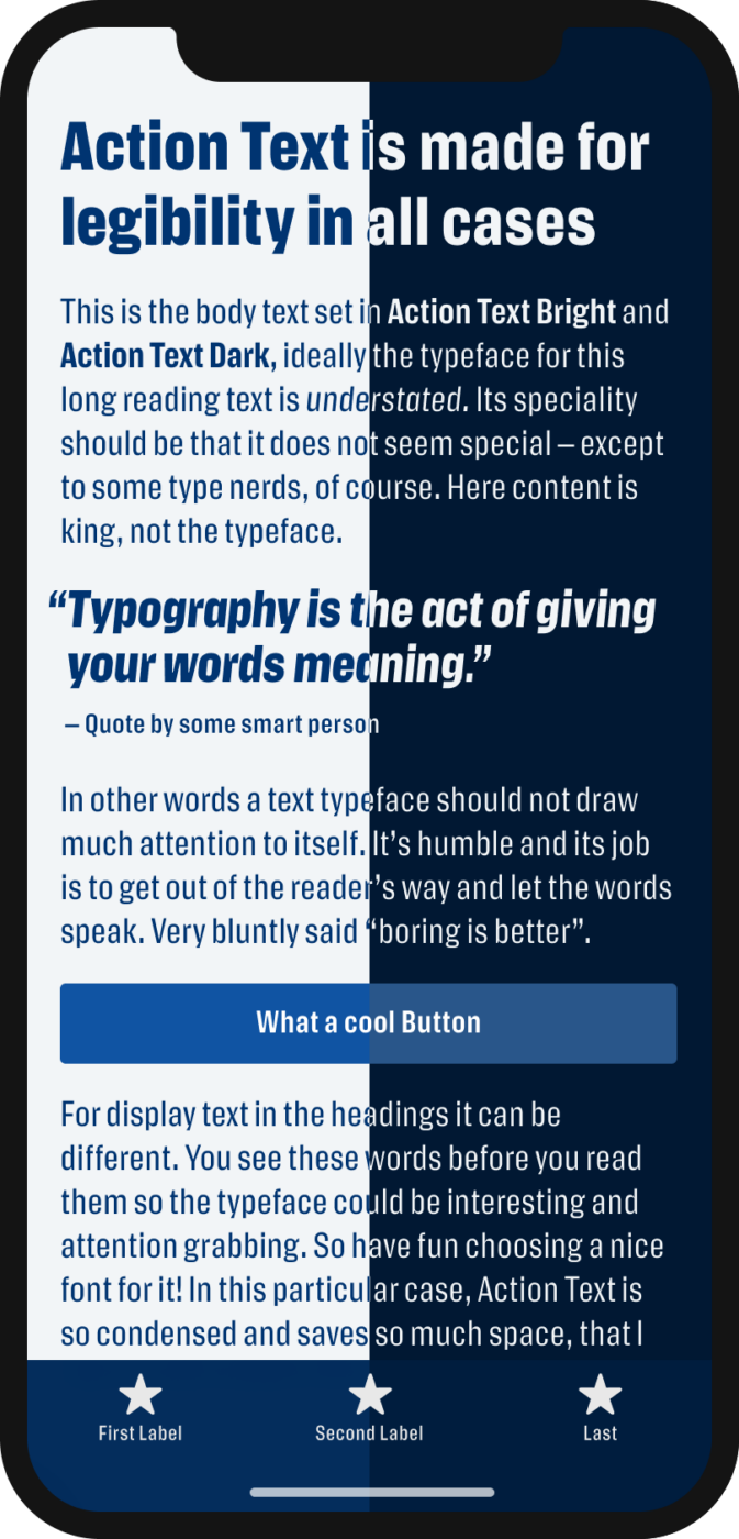
3. Action Text
Sans-Serif typeface
by Erik van Blokland on Commercial Type
Over 16 styles (instances)
4 weights from Regular to Extra Bold with matching italics in the two grades Bright and Dark.
License
from $ 50 (web), $ 75 (app)
Why I picked it
The trend towards Darkmode does not decline. The two modes of Action Text, Bright and Dark, optimize it for light and dark background. The narrow design saves you space, which is always useful in mobile app design. Full Action Text review
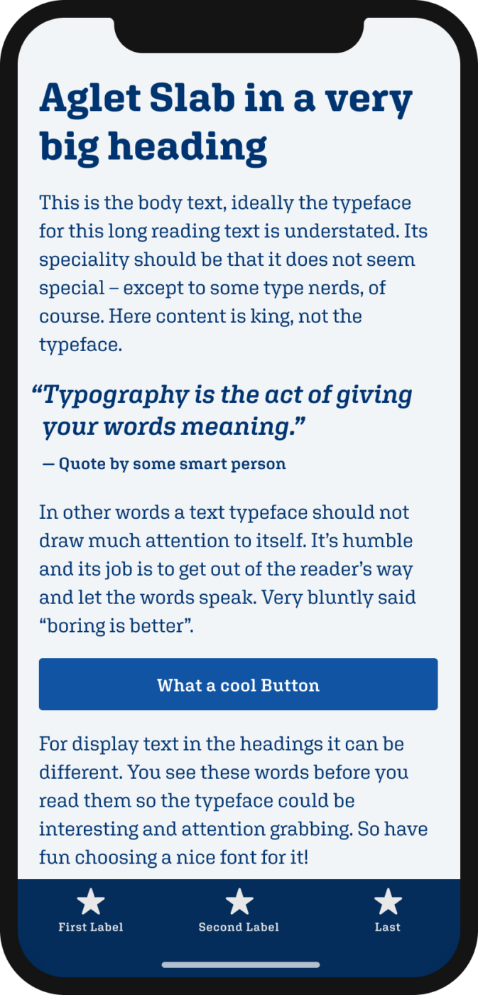
2. Aglet Slab
Slab Serif
by Jesse Ragan on XYZ Type
14 Styles
Extra Light to Ultra
with matching italics
License
from $ 40 (web), $ 140 (app)
Why I picked it
Aglet is techie and still approachable. It’s well-equipped with all the OpenType features you need, cool icons, alternative characters, and different figures. And I think slab serifs are the upcoming stars in UI design. Full Aglet review
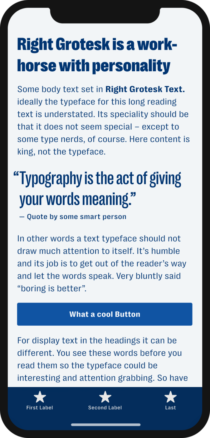
1. Right Grotesk
Sans-serif typeface
by Alex Slobzheninov, at Pangram Pangram Foundry
130 styles (instances)
From Tight so Spacial, Display and Text styles, just too much to list them here
License
from $ 30 (web and app)
Why I picked it
I used it in a big app design project this year and was very happy with it. So many widths and weights in one giant collection make Right Grotesk super versatile. Depending on the application, it can be quieter and more expressive. Full Right Grotesk review


When I saw that monster pardon, W at the entry, I thought, What the hell Oliver!?😄
A headline for this week’s letter made my eyes into stars for a moment. UI fonts are a challenge!
All the respect to the paying fonts. It’s just that my client’s profile (personal brands, smallish enterprises) is quite reserved for even acquiring my service, a creative SME. But I recommend paid once whenever I can.
I don’t remember some of these which tells I wasn’t your follower at the time of publishing. It came in handy, thank you!
Action Text fits (almost) perfect, but nothing special for my picky eye! Move on… the slabs became my love recently! Especially with the headlines. They have an attitude but do not yell at you. It’s an intellectual dignity, more for informative content-rich sites. The little g in Agled slab is questionable on mob screens. Mhm. Overall, 9/10
Grotesk… One has to be a true master (like yourself) to work with these kinds of fonts. I’d love to see the project(s) where you included them. They are quirky. Right Grotesk still looks fine compared to other grotesks I know.
OK. I extended my comment. Hopefully won’t be punished. Happy holidays to all your followers whoever is reading!🤗
I agree with Jana
Yeah – the W! It’s crazy, right? Not so sure about that either, expect a comment on that in an upcoming video 😉. Font Budget does not have to be that big. Some foundries have super reasonable entry prices if it’s only a SME it could be around 100 to 200 €. That’s fair for more individuality. Or just starting with 50 € for just one striking cool display typeface and then mix it with free fonts, maybe?
Hi Oliver,
ich habe den Eindruck, dass die Frage an deine Nutzer zu ihrer schönsten Schrift im letzten Artikel zu spät kam, dass deine Leser das nicht mehr gesehen haben.
Ich würde es begrüßen, wenn du bei Gelegenheit einen neuen Artikel veröffentlichst und deine Leser explizit nach ihren Lieblings Schriften fragst.
Das wäre jedoch sicherlich für alle interessant.
Frohe Weihnachten!
Liebe Grüße, Lena
Danke für das Feedback, Lena! Ich werd’s für das nächste Mal etwas prominenter bringen.
I like Aglet Slab and Right Grotesk – – both are very readable for me even on a small screen but they still have some distinctiveness.
Aglet Slab in particular is a pleasant surprise. I generally avoid most serif fonts as they tend to be a little too visually “busy” for me, which has the side effect of making the letters within a word appear more crowded to my eye, but Aglet Slab is nicely understated and manages to avoid that.
I find Action Text really difficult to read though, particularly the body text and the italics. It isn’t as bad as Impact, but the characters are still a bit too narrow, which again makes them appear too crowded to my eye. It may not be particularly legible for those like me with visual or learning disabilities.
Thanks for sharing that! The clarity comes with the sturdy slab serifs. And Action text might be to small as well in my example.