

My Aglet Slab Font Review
Aglet Slab shows some confidence, but not in an arrogant “look at me”-way. It’s a modern, strong, slab serif that comes with rounded terminals. This gives it a soft, friendly, almost funny touch. The underlying geometric shapes blended with the rounded serifs make it techie and still approachable. It’s well-equipped with all the OpenType features you need, like alternative characters, and different figures.
I see its strength in UI and app designs, but a wide range of weights make Aglet Slab suitable for a lot of applications. Bear in mind that for very long reading text it might be a bit too eye-catching, and in very small sizes for functional text it gets a bit critical, as it appears a little dense (see the labels in the bottom navigation).
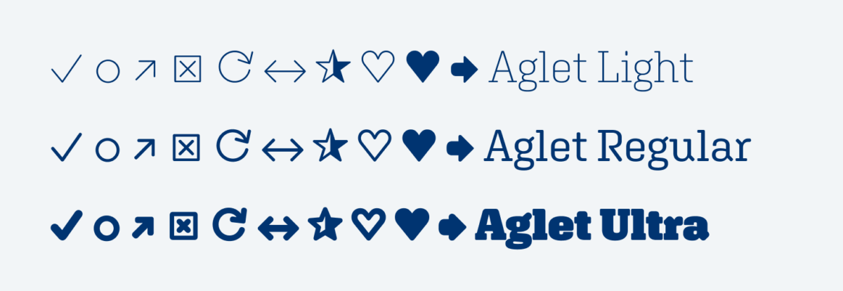
What I particularly love about Aglet Slab is, that it comes with some common symbols designed to match each weight. So the strokes of a check mark will always look right next to text – very handy in UI design! In combination with Aglet Sans and Aglet Mono it’s a broad type family.
Font Pairings for Aglet Slab
Aglet Slab is a rational linear slab-serif typeface. If you want expressive headings, all-caps Amboni would fit very well, since it is also quite narrow and shows a rational form model.

- Headings
- Copy
- UI Text

Learn more about pairing typefaces using the Font Matrix.