
My Maven Pro Font Review
This Google Font is neither brand new nor unknown, but I recently discovered it for my Quicksand alternatives article, and wanted to take a closer look. Maven Pro is a free sans-serif font family that strikes the balance between being interesting and functional. With its distinct curvature, it brings something friendly and unique to your text.
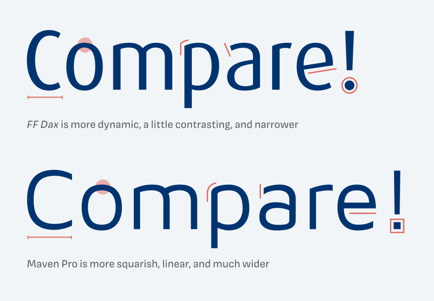
At first glance, it reminded me of FF Dax from the late ’90s. I’m sure Maven Pro drew inspiration from it, but it’s executed in a more contemporary way. FF Dax feels elegant because of its narrower proportions, slight contrast, and more dynamic letter shapes. Maven Pro is wider, more stable, and feels sturdier. See this by comparing the lower case “e”. These features let it perform well in small, functional text, too.
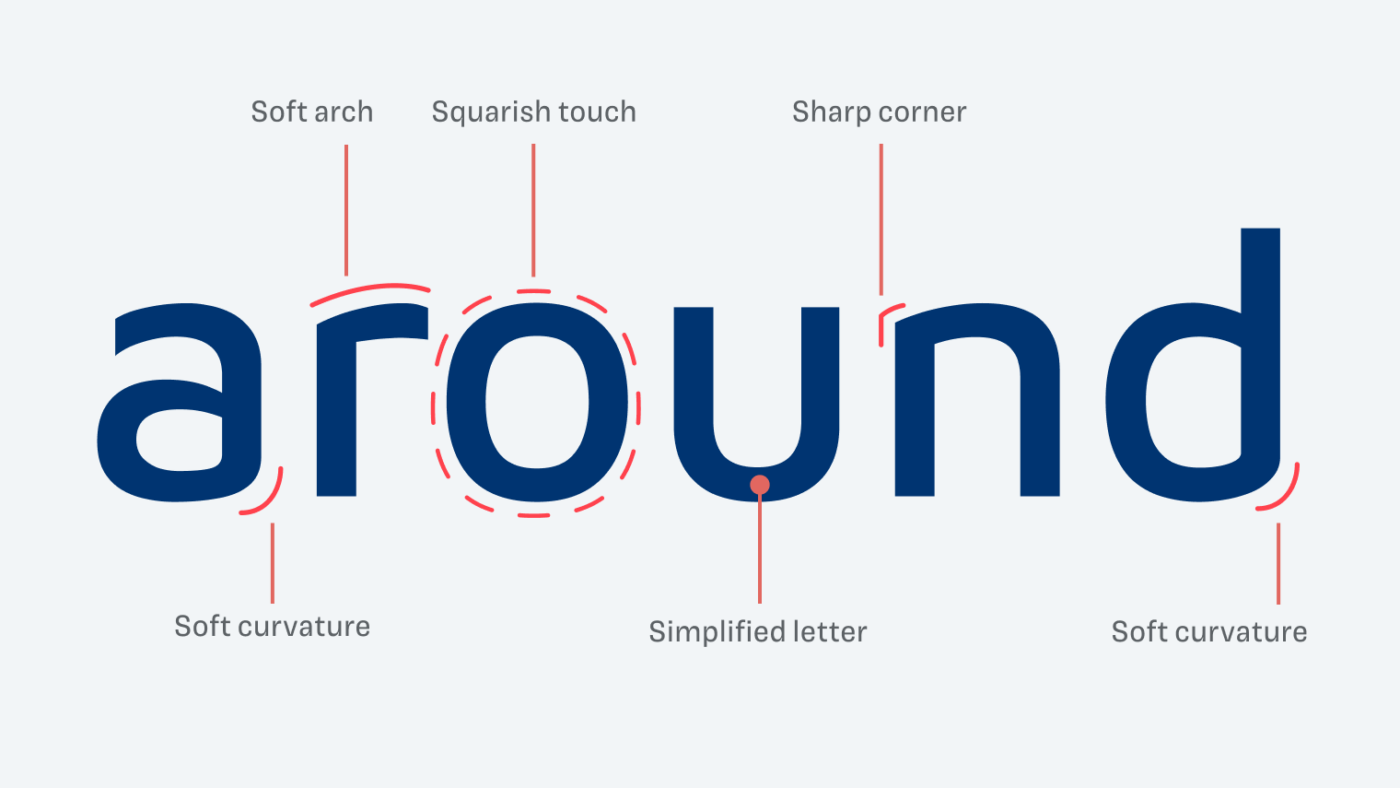
When examining the typeface’s details, it shows that Maven Pro surprises with its soft curvatures, especially at letters like “a” and “d”. It gives some letters a simpler, more unique shape. Additionally, the gentle arches in the lower case “r”, “m” and “n” make it distinct.
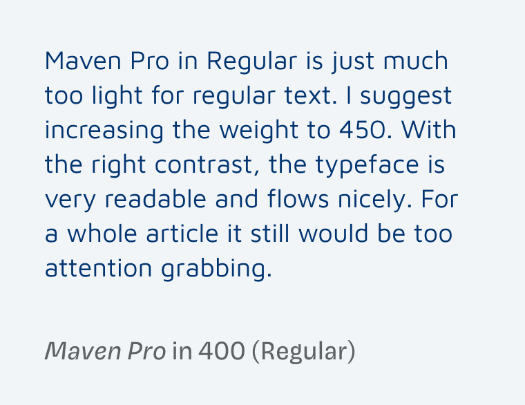
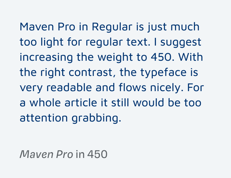
What I observed when I recommended it as an alternative for Quicksand, was that the Regular weight is quite light. Setting the font-weight to 450 helps when working with text sizes around 16 to 20 pixels. I did not do that it in the Quicksand article, but I’m making up for it here. See for yourself, which of these samples do you find more pleasant to read?
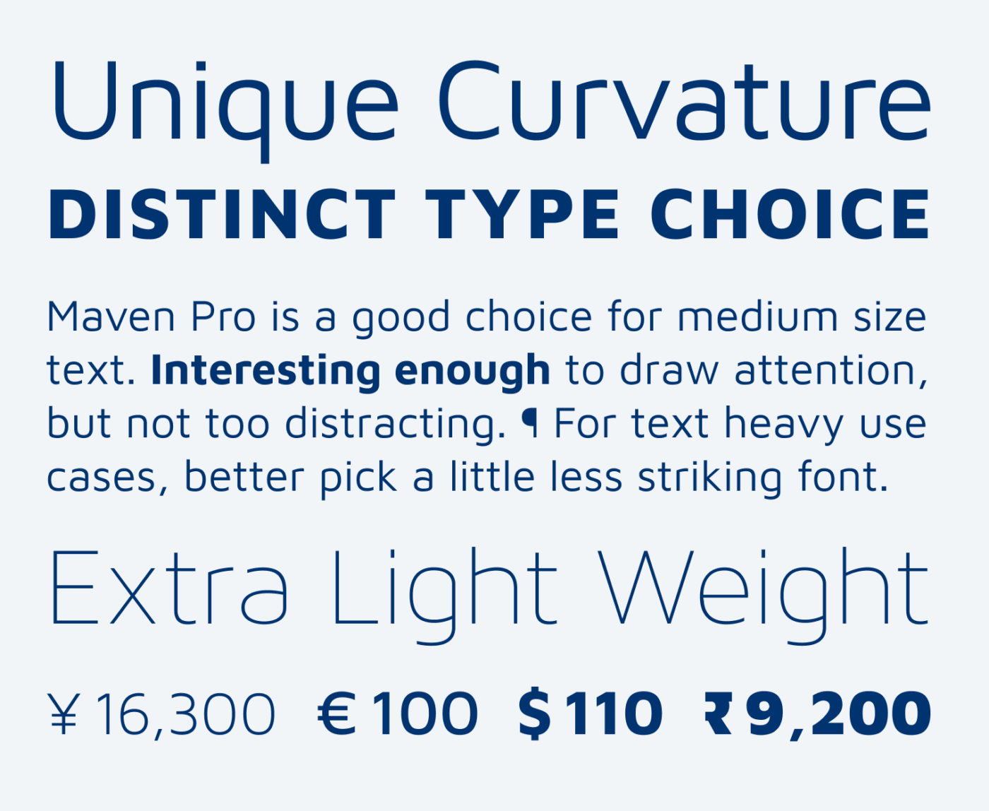
On Google Fonts, Maven Pro covers the weights Regular to Black. If you want it light, you can buy a license on Lost Type for the three light weights. Unfortunately they are not included in a variable font then, also the character set it much more limited. But at least for the Google Font, give Maven Pro a try in your next design project, especially when looking for a balance between style and functionality.
Font Pairings with Maven Pro
Maven Pro is a dynamic, linear, sans-serif font. I recommend pairing it with one of these suggestions for long reading text or striking titles.

- Headings
- Copy
- UI Text


Learn more about pairing typefaces using the Font Matrix.
Tell me, how did you like my deep dive into Maven Pro? Write it in the comments, also which font I should review next.
Hidden gems and Popular fonts, interchangeably, Oliver!
Don’t like Maven, it’s like a bald guy in his 40s 😣Any font that doesn’t have serifs, or is sans with soft roundish “edges”, I see it as an absence of hair 🤷🏼♀️
Haha, afraid what you’ll say about me once I’ll turn bald – but then I’ll be even bolder! 😜.
I was immediately reminded of Diodrum, from Indian Type Foundry, which is familiar to me from its use by Aer Lingus. Ubuntu also.
Absolutely, these are also very close matches! Thanks for adding them to the list, Lorcan.