Widely spread Inter is one of the most common typefaces for UI design. But since it’s so popular, it’s also dramatically overused. To make your type choice more interesting and uniquer, I recommend pairing it with another typeface. In this video and article, I share three suggestions.
Inter for UI text and copy
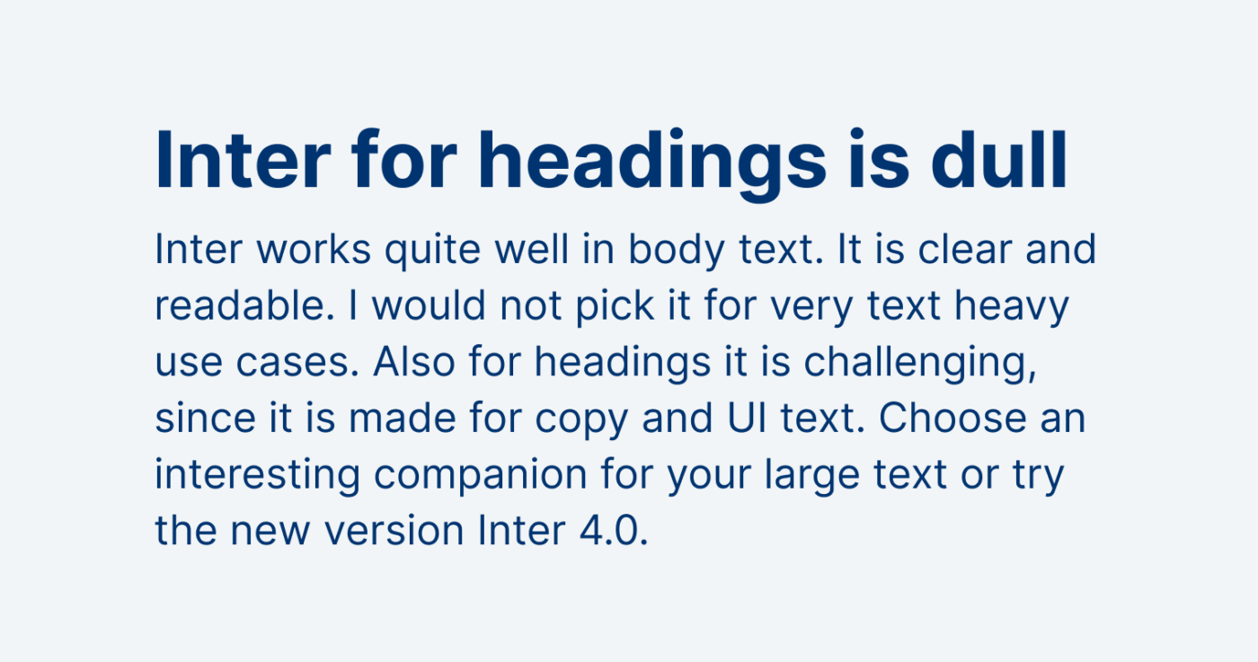
Inter is a rational, linear sans-serif typeface – learn what these classifications mean in my Font Matrix article. Inter works best for small UI text, also some copy. But in headings it soon looks very generic or dull.
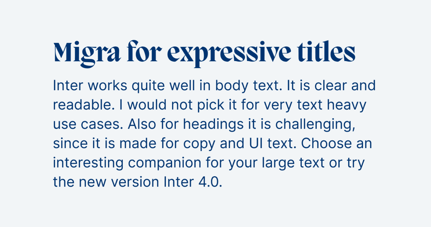
1. PP Migra
If you want your titles to be crisp and wild, go into a totally different direction! Choose dynamic, contrasting, serif typeface PP Migra by Pangram Pangram I reviewed it in more detail here.
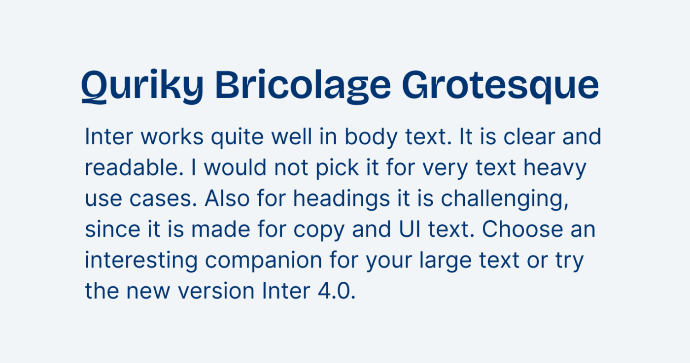
2. Bricolage Grotesque
Quirky, rational, slightly contrasting, sans-serif Bricolage Grotesque by Mathieu Triay will give your text a softer touch and make sober Inter a bit friendlier. Bricolage Grotesque is free and can be made narrower and has an optical sizing axis, which I describe in my full Font Friday review.
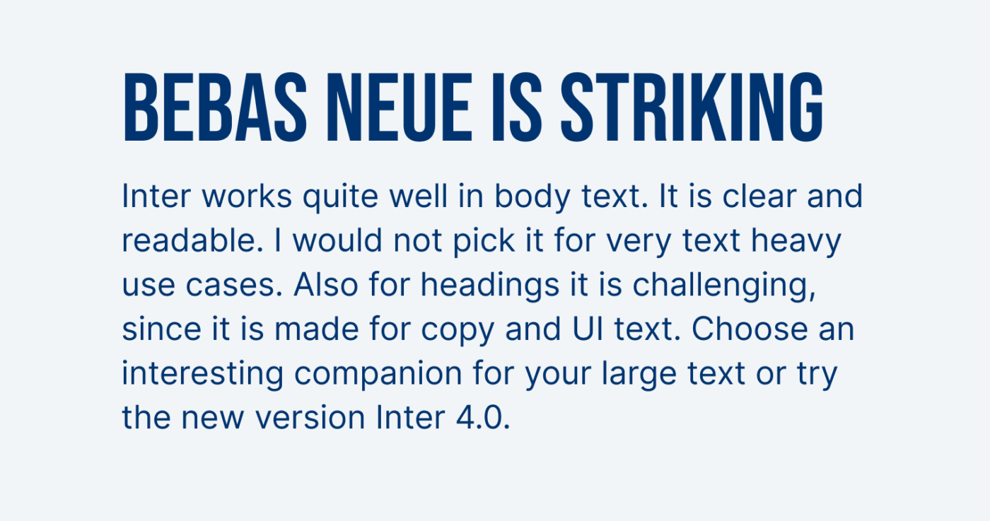
3. Bebas Neue
But also rational, condensed sans-serif Bebas Neue would be ideal for large, bold striking headings. When it comes to its construction, the typeface is very similar to Inter, almost like a narrow bold display version of it. Bebas Neue is a free font, also available on Google Fonts, but only comes in one style.
There is another option: Inter 4.0
In the latest update, Inter was equipped with an additional display style, which is much more refined for larger sizes. Also learn about other font combinations in my full Inter 4.0 review.
What do you think of these suggestions? Tell me in the comments!
Bebas Neue Pro has lower case letters and a lot of styles, and is very cheap for a professional typeface. (https://www.fontspring.com/fonts/dharma-type/bebas-neue-pro)
Additionally, if you don’t have any budget, FontFabric seems to have expanded the free font with four extra weights: https://www.fontfabric.com/fonts/bebas-neue/#font-styles
Inter is popular and overused with a good reason. Whenever I step on the wide wide web, I spot a good font which turns out to be Inter. Especially in shorter copy.
I’d love to see Bebas Neue with more weights and styles as this font looks great, compact, well-done, and refined.
I recently found an interesting font, Euclid Circular from SwissTypefaces. I’d love your expert’s take on it. 🤓